Replies (114)
They are both nice. I like the one on the right better. Without the picture.
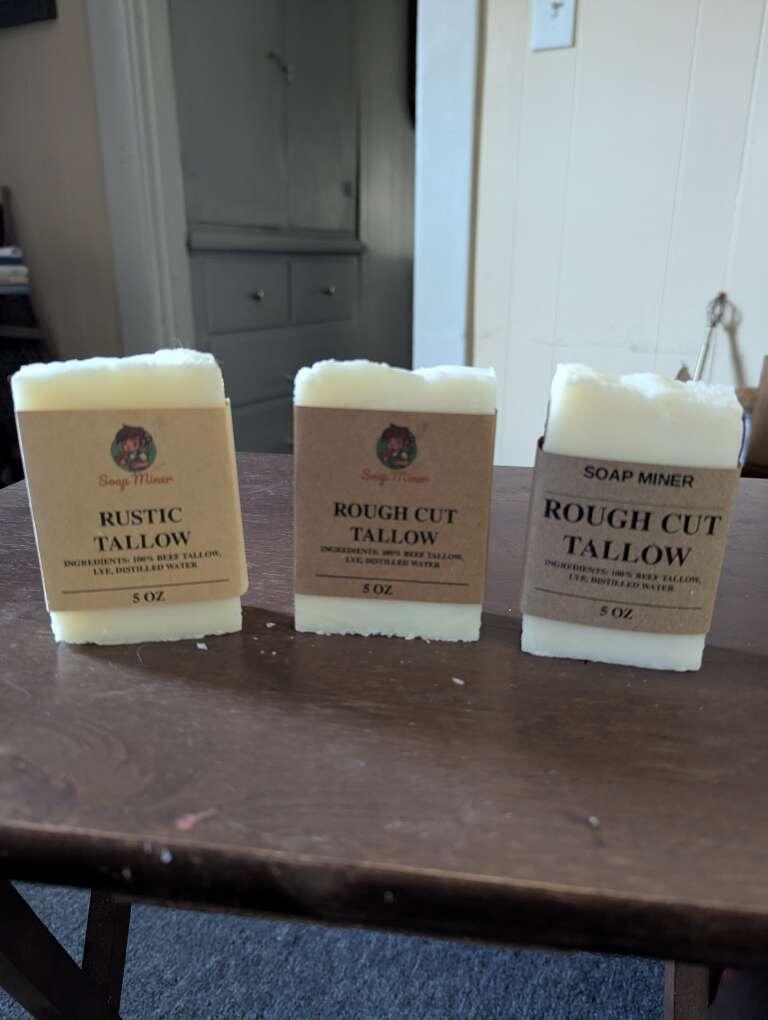
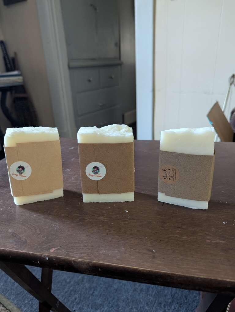
Right catches the eye and immediately tells you what it is. Left looks prettier but takes a few more seconds to process what “rustic” means in this context.
So for me… right.
I personally like the one on the right
I don’t know where to go to repurchase either one without a website or QR code. Drive sales thru clarity.
The logo addition helps with branding. I like it. Save the sats. Keep building.
Right
Looks more pro
And minimalistic
Https://soapminer.com
Both look great. Nice work!
I like the old design on the right. Looks classy 🧐🎩
🚨 Sats giveaway 🚨
First 21 Nostriches that respond, and repost this get 210 Sats. Want real opinion.
Going to try new packaging. Which is better, more attractive, a superior quality?
Left, or right?
I like the right because it stays in line with the "rough" and "rustic" branding (and without the modern logo)
I wonder what it smells like 😁
For some reason, can't send you Sats.
I like the left one 😀
Right better packaging imo, but I prefer the name “Rustic Tallow” over “Rough Cut”
Rustic Tallow is unscented
Right, but on the back I would put a QR code to direct them to more of your products.
Also I am curious about the expose of your product. Will it be vacuum sealed or open to the air and will this affect the shelf life or create a mess?
ahh I see, when I read beef tallow I was super curious 🧐
Left for sure bro!
Shelf life can be years for Tallow. The scents will fade however. Plain tallow is fine. I do not vacuum seal.
In Japan I get tallow for free at the supermarkets. It comes in nice easy single use packaging. Good luck with your packaging and business!
Right for sure. But find a way to throw in the logo. Even if it's on the sticker or something.
Right. Looking more boujie
The right one seems more "professional"
The left one seems more family business
No need to zap
Can't zap you
I think a black and white logo sticker would look great. The simplicity of the original wrapping is perfect.
All g
Make that *black and brown*
I got enough sats, but left.
I prefer the darker color and larger text but that could be it appealing to my aesthetics. The newer packaging feels playful which could appeal to a larger demographic
Left ✅
Left
What if you combined old packagin with new sticker om back?
LFG!
Left 💯
Right
Left. Good mix of text and imagery.
おひとり様一つよっ!
Rustic is my favorite 🤙
Aren't you special? 😏
Right
Right looks nice
Too late for says but I like the rustic simplicity of right.
Respond and repost
Left
I like right but keep your logo
it really depends who you are targeting. the left one is more towards the mass women in the market, and we all know that they are the main buyer in a house hold. the right one would appeal more to men (which means women may also buy for their husbands for home or to add to a gift pack) hipsters, people who like simple life. great work 👏👏👏
I would use the packaging on the right but still use the new sticker to close it with your logo
Left
A lot for right. 🤔
right
Left too don’t understand people for right, left is much better
left
Right
🤷
Right
In a free market, the majority is always right. They drive the market. 🤷
I much prefer the left one, the lighter and less rough colors inspire cleanliness, the logo adds a touch of personality to it. The only thing I prefer of the right logo is the spacing at the bottom, on the left one the 5 oz looks too cramped
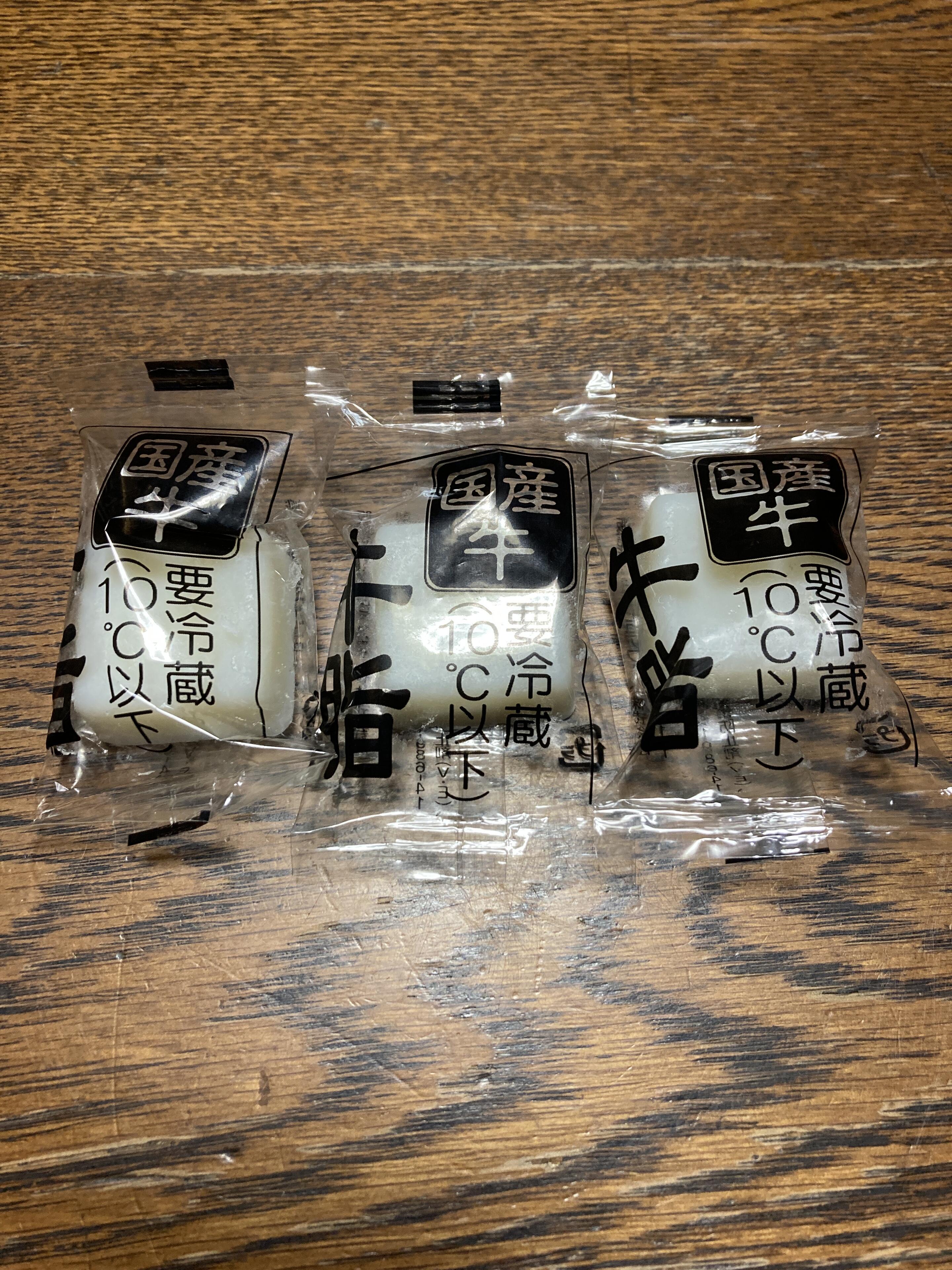
Never seen this before, been to Japan often (and usually 1 to 3 months at a time).
どうなってるの? 店員に牛脂を聞いたら、ただくれるの?
Dude. Nothing is free. Don't pay attention to anyone that claims there is.
Of course haha but supermarkets do often have deals to make you spend more where if you buy X bucks worth of stuff they throw in something [[for free]] (I.e. you already paid for it)
Exactly 💯 Nothing is free.
As soap should be.
the left
Left Purely off gut reaction
Left but both good 👌
Right.
If you want to be anal, the opportunity cost of this conversation is more than that of buying tallow. 
Right. Straight forward, no frills, rough yet appreciative. Sandpaper texture wrapping, nice touch.
I'm late to the party but love tallow. So 100% the one on the right--I would buy this, and will, if you ship to Australia.
I would not buy the one on the left.
Signed,
Christopher The Carnivore 🥩
I like the packaging on the right. 🤗
@jack like this soaps bro 🧼 👏🤩
@SoapMiner
For a handcrafted, premium feel, go with the left (Rustic Tallow). The right is more utilitarian but less distinct.
Actually this looks like front and back to me, but I'm probably just #weird
Left
Soap miner logo from the left, on the right setup. Same with the sticker. 🤙🏽
Do you make hair products too “shampoo”?
I prefer right
QR Code is a great idea
I like the right, more manly looking if you are going for that.
The one on the right for sure
You can actually use the the soap as shampoo. Made from beef Tallow, so won't dry out your hair.
Left one!
I use it for my hair.
I thought you were bald? 🤣
I do as well.
No, I have glorious hair.
I am sure 😁
Right. No doubt
I wish you all the luck Buddy! It's a different culture, they don't value tallow the same here, and yes I am lucky. 😉
I prefer the color of the paper on the right and how the font works with it. Not opposed to images but would need to see how it works with that.
Right
I'm female, I like the one on the right. The aesthetic matches the product better
Left is more visually interesting IMO
Uncircumcised tallow
Right
R
Right
I prefer the name on the right but thing a small logo would benefit it's credibility.
🚨 SATS GIVEAWAY 🚨
210 SATS TO FIRST 21 NOSTRICHES THAT REPOST, AND GIVE ACTUAL ANSWER IN COMMENTS. I NEED REAL FEEDBACK.
WHICH PACKAGING LOOKS BEST OUT OF THESE THREE? LEFT, CENTER, RIGHT?
ONLY FIRST 21. Everyone else gets 21 Sats. Those are the rules. 🤷
I’m draw to the left because it has color. Both are good!
The left is great. I’d like your picture to be a bit bigger. It’s clean and bougie.
The problem with the one on the right is that it looks like it could be from anywhere/anyone.
The one on the left just needs a bigger logo.
Im a fan of the packaging on the left. Feels more organic and visually appealing. I also like having your graphic for brand familiarity, definitely a premium product feel.
Left
Left
I like Tallow best, increase the font size. Use the Soap Miner sticker on the back an simplify the branding. Good luck with your business.
Left one
When it comes to the back of the label, you have an opportunity to add more meaning and personality. Add a slogan or quote that describes your brand or a specific soap.
The round stickers could add a pop of color based on your brand choices.
Soaps make great #gifts, but we don't always think about that when we buy them. You might encourage soap gift giving, by adding a to & from to the back of the label.
Make sure to leave enough left padding to have room to place your sticker.

All of this has given quite a bit to think about. Appreciate your input friend. Will take all into consideration.
The growing pains of a small start up are far more than you think in the beginning. Lol. But Bitcoiners never do things the easy way.
Thank you for your expertise. 🫡🫂
The most important part of this journey is the care you put into making your soap, and nostr can see that. The design is part of the many details you will choose over time to make it a more meaningful journey for you and your audience.
Yes, never settle for easy. Glad to be of help. 🫂
Appreciate those kind words. Means a lot to me to know that I am creating value in a meaningful way, and doing, at least, a small part to further the circular economy. 🫂💜