Replies (71)
Right. Clean UI. Would buy
left 👈🏿 bro
Right. Def
Right!
I prefer no. 1 'cause it feels lighter and displays only essential info.
I like the left one most.
Same answer as before.
(Because it looks more like a family business)
No need to zap, because no repost
I like right
The one on the right has the text too big and wide, it feels imo somewhat too loud to read. I like the center, but the brighter paper of the left (I suppose it's just in a shadow?) Anyway the logo makes it more soft to view on both, more approachable and less looking like some motor scrub.
I like the right one the most.
I like the last one, the one on the right, because it doesn't have a logo, it makes it more professional.
Left.
No need sats😄💪
I like all the right side versions. keep it simple and rustic. no distractions
One on the right looks better
Right is the best, would buy in a heartbeat. Simple, straightforward, to the point.
right. and maybe reconsider your logo
Eu prefiro o da direita. Parece embalagens antigas e rústicas
I’d say that you could put the sticker from 1 & 2 on 3, that would be legit
Reconsider how?
Love the color scheme on the left but enjoy the double black lines on the right
Logo should be on it as it stands out for me and says this is a quality brand.
El de la izquierda, las letras grandes con pocas palabras sy esta conciso es lo q se precisa!
feels like a vibe mismatch …
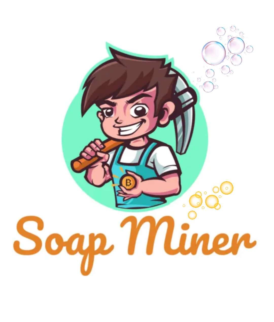
logo is super playful but the font/style used on these packaging slips is professional and serious
That's a point, for sure. Have to give some thought.
Descartaría el de la derecha
center, but make sure the 5oz is centered xD
Can I use it for cooking?
You’re a soap company, keep it clean.
Padding is off (live area is too close to the edge due to inconsistent label trimming), print yourself crop marks.
Leading on the large type needs work. Fonts could definitely use a rework. All caps could work but use sans serif if you’re going that route.
Perhaps consider a wordmark for Soapminer rather than that logo.
If you get stuck, I can have 3 label concepts designed for you for 0.00386 btc (no logo design). Pick one and we supply the fonts and package it up as an indd doc along with pdfs. If you can’t use indd lmk what you do use and we’ll use that for the native files. We can do the whole thing publicly over NOSTR for fun. 🤩
I had many soap tacos
Og one.
You value yourself highly.
I like the right
Maybe do one in a hemp mesh bag that can hang in the shower so the soap doesn't go manky.

Good, Fast, Cheap — Pick Any Two
IIs that your product?
Fair. I prefer good, and cheap.
Left>Center>Right, I like the logo personally
No sorry.
ah, long time preference: a true bitcoiner.
Always
Center at first glance but I think I’m primarily drawn to the logo. If you can work the logo into the right, I think that font layout is a little more appealing. Cool stuff either way!
Right one looks best to me, I agree with what
@limitlesslaurel had to say
Id say the left is my preference out of the 3. Most aesthetic and premium feeling to complement the product.
Left
Don't like size of font on right. Prefer middle with darker paper. Offsets light color of soap. Left might be a bit too delicate.
Thanks 🙏 already made up mind.🫡🤙
We still talking about tallow? lol
I always stay clean sir!
I prefer the Rustic (lighter colored one.) Lighting is not even among them, which may skew the comparison.
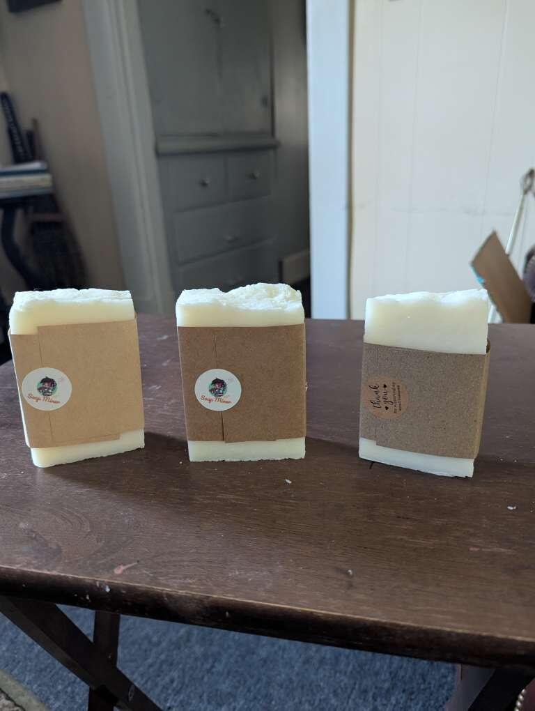
View quoted note →#2 second pic
OK, let me be more specific for you the first one I don’t know what rustic tallow is so I would immediately be confused if that was on the shelf number three I liked better, but the letters are too far apart for me and it doesn’t look like a beauty product. It looked like maybe something that you used to clean the kitchen so I went in the middle because I understood what it was and I understood it was not for cleaning your stove so out of those three, that’s what I came out with just being honest I do not want to hurt anyone’s feelings
I like the idea behind the third one, but visually i prefer the first one.
Left
The left sticks out, but I think the product name font should be larger.
like the one with the logo
Right 👍
Right
I prefer the one on the right. The soap miner is too small on the others.
I also prefer the one on the right.
Nice work!
 SoapMiner
🚨 SATS GIVEAWAY 🚨
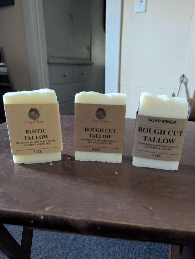
210 SATS TO FIRST 21 NOSTRICHES THAT REPOST, AND GIVE ACTUAL ANSWER IN COMMENTS. I NEED REAL FEEDBACK.
WHICH PACKAGING LOOKS BEST OUT OF THESE THREE? LEFT, CENTER, RIGHT?
ONLY FIRST 21. Everyone else gets 21 Sats. Those are the rules. 🤷
View quoted note →
I like the one in the middle. Not sure why. I'm too tired to put together words to explain. Just letting you know that's where my preference is.
Left one- everyone gravitates to packaging with logos/pics…
I like center.
However I have a concern. If it gets shipped in a hot truck, or gets bought and sits in a hot car on the way home for any length of time then it's going to make a big mess if that is the only packaging that it will come in.
It takes a lot of heat to melt soap back down after it's saponified, and cured. 🤷
Oh I thought this was raw tallow! I for some reason didn't see the word "Soap" on the packaging.
It happens. That's one of the reasons I'm trying out new packaging. 🤙
Left
👏
Right one catch the eyes and makes remember fastest.
Maybe I would consider to add also that small logo on top.
Right for me for. Plain and striking.
If your target is Men definately the right, looks like buying from a military surplus store, rugged, direct and made to get the job done
Take the color of the middle packaging and combine it with the right’s design. Perfection.