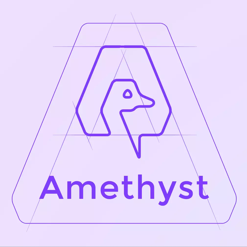
Hi Niel, your approach is interesting and perfectionist, I understand, I'm like that too, you went into detail, however I can't agree with some of the details you mention, the round corners are a solution, but in my view, they don't look so good , I experimented, and I don't like it, I prefer it the way it is, then, the eye, it may not be 100% aligned, nor is it mandatory, especially because visually it's fine like that, afterwards, I agree with the alignment of the logo, the shape of the "A" with the word Amethyst.
Now, I don't know if you followed the redesign of this logo, Vitor Pamplona let the community choose, and among many proposals presented, mine was really the best, however I was bombarded with hundreds of different opinions, which made the creation very complicated, to give you an idea, there were many elements to take into consideration: (Letter A, Amethyst stone, the Ostrich's head, the colors, the old logo...).
There is a directory on Github (from Vitor Pamplona) with all the proposals presented, including my first proposal.
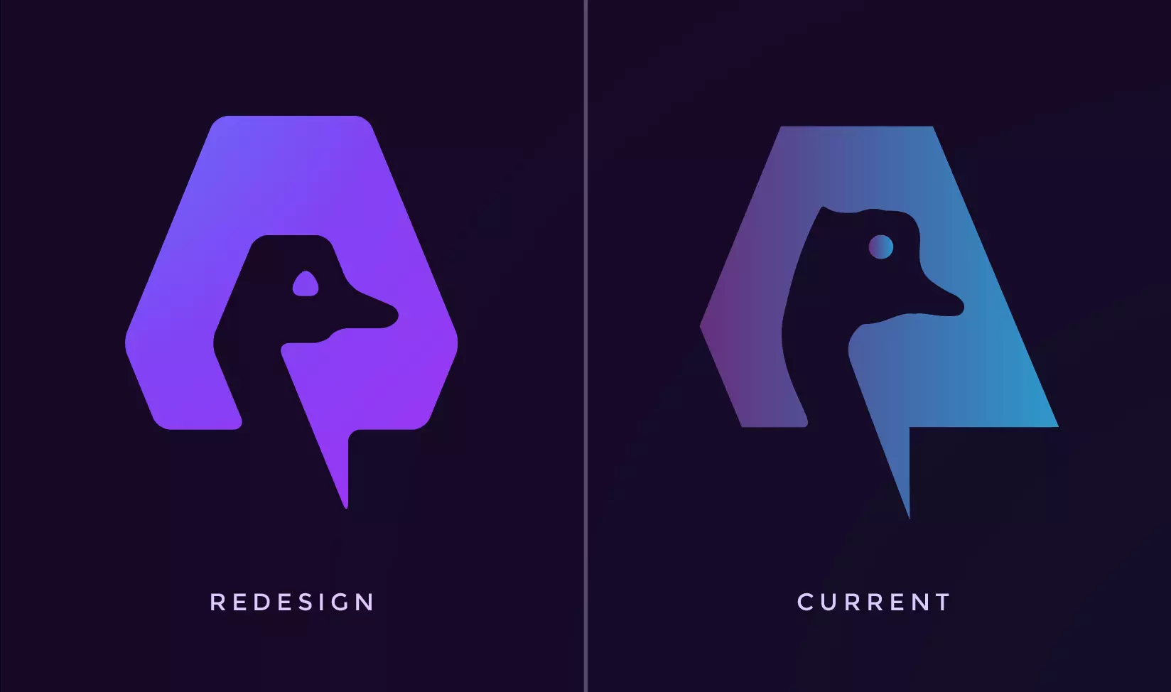
As for your monogram redesign, it's good, however, the Ostrich head, I don't like, it looks like a hand/fingers, but that's just my opinion.
Finally, I find your analysis very interesting, in my opinion, the future of Amethyst Identity / design does not involve this type of logo, the approach should and could be completely different.
I wish you the best, and keep up the good work.
José Ferreira: ZITRON DESIGN - www.zitron.net
Whoa, useful OCD! But I can't see the A, I saw an amethyst with a nostrich in it and a speechbubble,, and now I see a building or a hut. Or maybe some online shooter mmo. Colors were fine though