Replies (102)
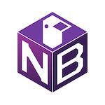
C
B
C
I like them all, was leaning towards B, but A is clear and I like that ostrich better..
B would be nice with a more clear ostrich on top
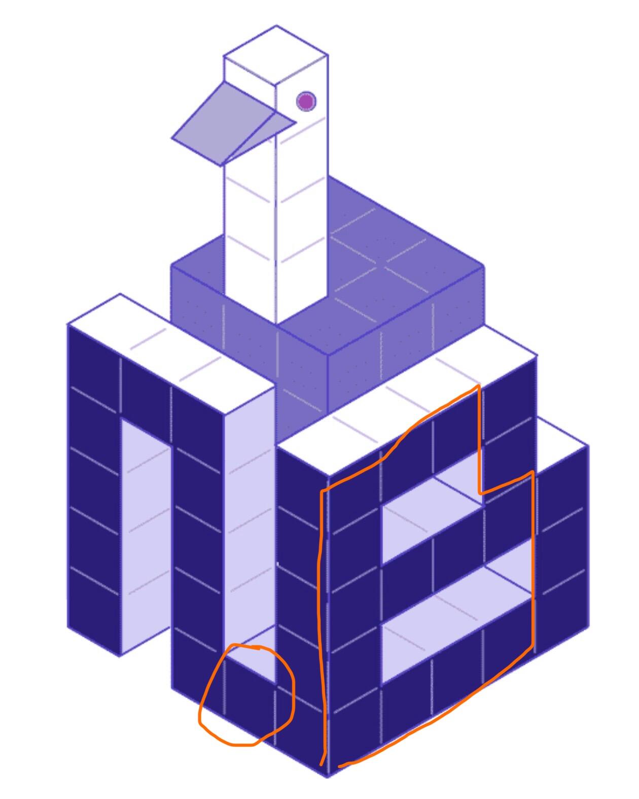
C but minus the tall nostrich neck, maybe the neck can be more 2d
None of these. Too complicated D
Yes, the feedback is to minimize the protruding ostrich :)
😬
Wonder if we can take the most simple, B, and make it more simple?
💯
A or C
I kind of like the random ostrich sticking out of it
I like C
A
C looks good at this resolution but it probably needs to be simpler if small icons are going to work. What if you removed the nostrich?
C is really good but I think the letters can be simplified. Maybe the N can just be an upside-down U and not connect at the bottom to the B. The B could also be one column narrower.
Non of it is really good in my eyes 🫣
A. I liked C at first, but the N started to look weird and the ostrich looks like a duck. The block idea is cool, though.
The ostrich on A isn't super obvious other than the legs. Those are great. The neck and head need to be more ostrichy.
I agree with this. I like the styles but they're too "busy"
A > C > B
C
C
We would fine tune it.
C
Trying to Zap you, says your Lightning address is invalid?
C
scarredfang72@walletofsatoshi.com
C
C
C
C
A or C hard to choose 🤔
A is The simplest, but C has a bit of GameCube nostalgia that I'm a fan of.
c is my fav. i like the voxel design, but agree with others they could all be simplified
A or C imo
B isn’t so clear to me.
C with the neck and head lopped off; cleaner.
B is cleanest and most scalable but the top isn't immediately clear. I assume it is an ostrich but it doesn't instantly read as one.
3
C
I mean C
C
A right
A
would go for C, if the N and B letters had improved legibility
A!
C
A
A, C, B
“C” but with a more diagonal “N”
I'm a fan of C
A
C
B looks the coolest but the top is indecipherable. I like A.
c
A
C
b
C
i like B. non/flat 3d icons haven't been a thing for a long time
C
C - far and away favorite
B
That’s my fav also, seems most like C 🤷♂️
🙏
Agree we need to fix the N
C >> A >>>> B
My least favorite but fishcake’s and most others favorite 🤷♂️
yup. c looks really cool as art, just not feeling it as an icon
“C”
Great feedback. Most like C, but same feedback around the N.
Thinking to go with C, fix the N and B, and flatten the nostrich
I like B on the left but they’re all cool
My fav is B also, but the majority likes C.. Gonna ask
@awayuki to keep C and make it look more like B, with an ostrich of A 🤣🤣
They are all really good
I agreee! You’ve got a tough decision on your hands 🔥
C 😍
Great idea!
A
C, and I second the comments from
@The Daniel 🖖C
I think you should flip a Bitcoin but C is cute
B
A
B
B looks best
I love like B
Other than that it make me smile 😃. Love it.
C
B is very pleasing in terms of colors and general aestethics but the nostrich (bird) element in B is almost unrecognisable and even confusing . A has the best bird representation out of all imo but A looks like it's missing something. C - the most original, creative and finished one, also lego connotations, vintage aestethics but for me this is not an obvious choice :) maybe bc the nostrich element sticks out of the general bounderies of the logo (cube)? There is sth unconventional in this but once you see C you will never forget or confuse it with another one, for sure.
C is cool and the (n)ostrich could later be animated to start ducked and then appear or turn/wobble its head.
C
C looks very 👍
B
C
C
C
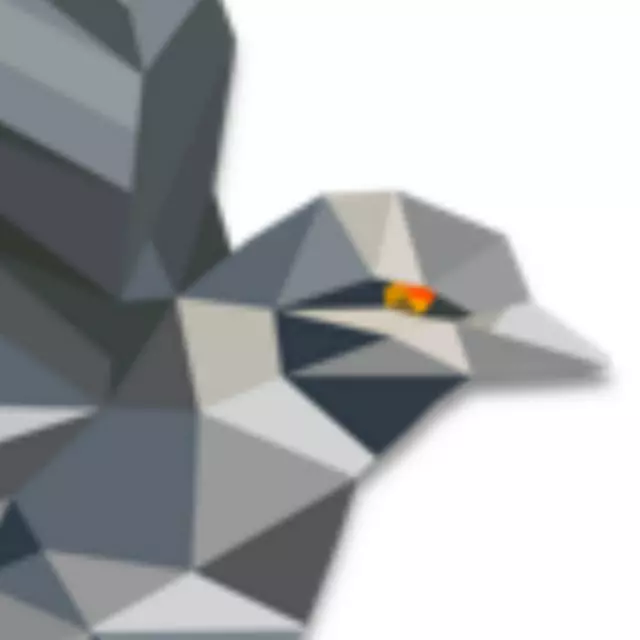
Made a quick logo using AI. Kept it simple though.
I like the concept! 👏
I think works. B is perhaps a little fat or conversely the N is a little thin. Just an idea. Free to use and modify. I claim no rights.
It’s not bad
C