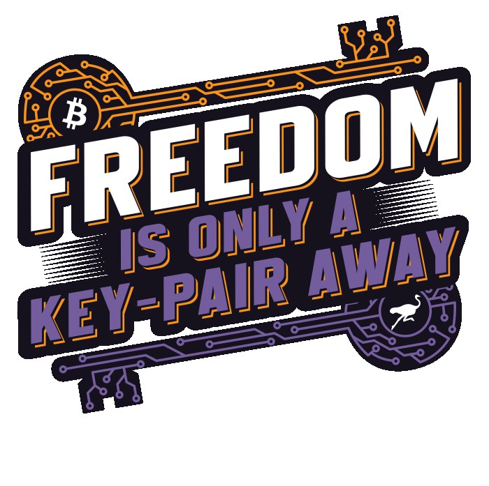
Ok, I think I am liking this version best.
 Some folks liked the horizontal, rather than angled, keys. They bugged me more and more as I looked at them, though.
I also felt like having the drop-shadow on "is only a key-pair away" was a bit too busy, and removing it makes "FREEDOM" pop even more, which is what I am going for.
#Bitcoin #Nostr
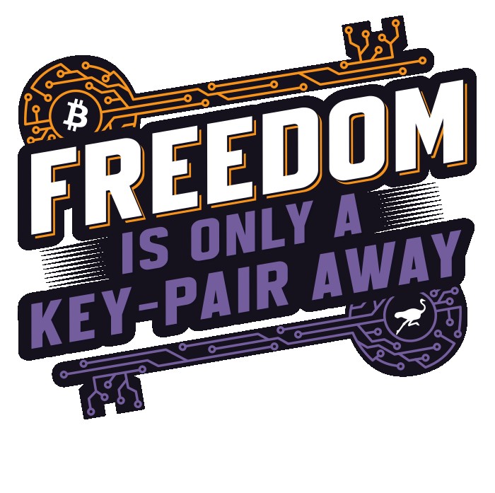
Some folks liked the horizontal, rather than angled, keys. They bugged me more and more as I looked at them, though.
I also felt like having the drop-shadow on "is only a key-pair away" was a bit too busy, and removing it makes "FREEDOM" pop even more, which is what I am going for.
#Bitcoin #Nostr
Some folks liked the horizontal, rather than angled, keys. They bugged me more and more as I looked at them, though.
I also felt like having the drop-shadow on "is only a key-pair away" was a bit too busy, and removing it makes "FREEDOM" pop even more, which is what I am going for.
#Bitcoin #Nostr