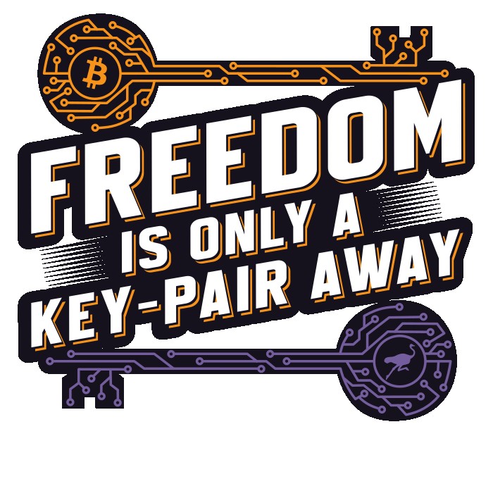
Dikaios1517 dikaios1517@nostrplebs.com 3 months ago Ok #Bitcoin and #Nostr friends. Which do you like better? A. B.
sato-g 3 months ago B, but maybe make the "text shadow" of "is only a keypair away" purple instead of orange so you don't lose the color association?
sato-g 3 months ago or something like this with more depth using gradient used Gemini 2.5 pro 🍌image:
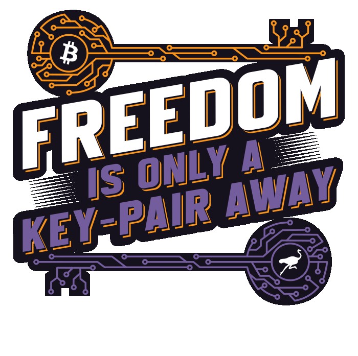 B.
B.
 B.
B.
B.
B.