the most eye opening think I’ve ever experienced design-wise was adding a new note pop-up feature that always popped up at the top of your timeline when you were scrolling, that showed when new notes have arrived.
It did this on every new note in realtime. It would keep popping up over and over, this was so stressful and jarring that it made me realize I have a huge amount of power to cause stress just from small design decisions.
This made me think: there is a large landscape of possible design decisions that can greatly increase or decrease user stress.
One example in damus is that I just show a dot on the home button, but I don’t show the number of new notes. Some people will consider this less helpful, but it’s damus’ way of saying: just chill, there are new notes, don’t worry about how many.
Saving the scroll position is another subtle design choice: it enables a way for people to scroll up to see every note they missed since last session. Is this necessarily a good thing? To me this is stressful, it’s like obsessively making sure I don’t miss any note.
We will still likely add this feature, at least to notedeck/android, but it does have some stress-level difference in the way the app is used.
Something to think about. Thanks for coming to my ted talk.
Replies (35)
🩵
> it enables a way for people to scroll up to see every note they missed since last session. Is this necessarily a good thing? To me this is stressful,
Interesting take.
But it could also be stressful for someone to go back through the history to look for the last notes viewed, and then jump back to the top.
I think we can find a middle ground and it dependes from the context: in a general feed (followed) is probably healtier let the notes flow; in a curated custom feed with a moderate flow I would like to keep the sign of where I was at.
Perhaps an option for each individual feed is the right choice.
/cc
@hodlbodI personally use nostr for “whats happening now” i might scroll down a bit but I don’t go down far. I miss a lot of stuff but I don’t fret about it
Wow, profound realization and so grateful you are you, and wish to add the least stress possible to our UX, thank you! 🙏💜
I remember once watching a short doc, called ‘The Dark Side of Smart Phone’, and it was really mostly focused on social media and how they had studied the endorphin rushes of people gambling and then used that to teach them how to get us as addicted as possible.
One of the bazaar things I learned was that they realized that if people kept winning, they lost interest quicker than if they won only sporadically, so they used that information to teach the algos to show posts to different groups so when you post something and get an endorphin rush from lots of likes, and then try a similar post to get another rush you get only a few likes on the second one.
This incentivizes people to keep trying to replicate the success of the previous post … ‘eyes on the screen’ being the whole goal, so they can increase ad revenue by boasting how addicted people are to their app
Here’s something that stresses me on Damus… when I tap on a note reply, to see what the replies are to that reply, to then go back, it jumps to home feed instead of going back one step.
So I find myself hesitant to tap, because I hate having to try and find the original note again when I’ve been sent to updated home feed that has since had new notes. Hope that makes sense.
Yes I enjoy this feature also
Makes you remember why big tech spends billions on this kind of work and has psychology experts on the payroll for an app to have like 3 buttons.
This is true, but I understand that with the function of starting the Feed from where you left off, could this also be fixed?
Think about a RSS feed reader replacement, that usually has a read/unread mode, similar to emails.
It's all about data volumes. And user inclinations, of course.
I used to have one of those as well and noticed the same thing. I removed it, and life is much better. I don't need to see notes that were published between one minute ago when I loaded my feed and right now when I'm a couple pages down.
Traditional businesses use these UX design choices to optimize shareholder value (by making things frictionless, personalized etc). We have a unique opportunity to optimize something else (like you said, minimize stress) 🙂
When i tried to google design books around this concept all i found were books and how to keep users addicted. Let’s not care about peoples well being, let’s just get them hooked 🙄

This was one of the books I had to read when I worked in digital marketing. Great design is addicting. But bad design makes people rip their hair out. Find a balance. You can reduce fomo by giving us a popular now feed. I usually find myself switching to primal because it saves where I stopped scrolling last. But I use damus for posting or notifications.
@jb55 There are some good books about those topics that don’t involve getting people addicted.
Donald Norman’s books are usually very nice, some examples:
- The design of everyday things
- Things that make us smart
In terms of designing for calmness, it brings to mind this concept developed at Xerox PARC called “calm technology”:
https://people.csail.mit.edu/rudolph/Teaching/weiser.pdf
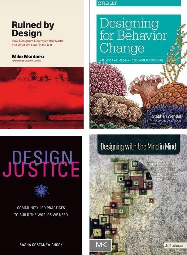
Yuck! I wouldn’t trust the “Top 10” lists for this haha. I have some recs tho if you fancy —
2010s: Design for Behavior Change, Designing with the Mind in Mind.
2020s: Design Justice, Ruined by Design
Hope this helps!
How about these books instead?
parc always ahead of its time. I just downloaded the audio book for the design of everyday things, going to listen on my next walks.
👀 📝
yep

Look how Primal solved it. If you scroll down you won’t see if new notes arrived. If you scroll up or refresh you can see them on top with the amount of new notes.
hmm it doesn’t seem to update in realtime for me
Optionality is nice for stressful features — keeping the default chill is definitely smart.
The knowledge gathered from these books is nicely reusable when you want to become a head of drug cartel...
Check out Universal Principals of Design
Unsure what you mean? Like the noti icon?
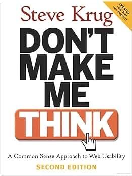
You know it's an OG book if usability's in the title
¯\_(ツ)_/¯
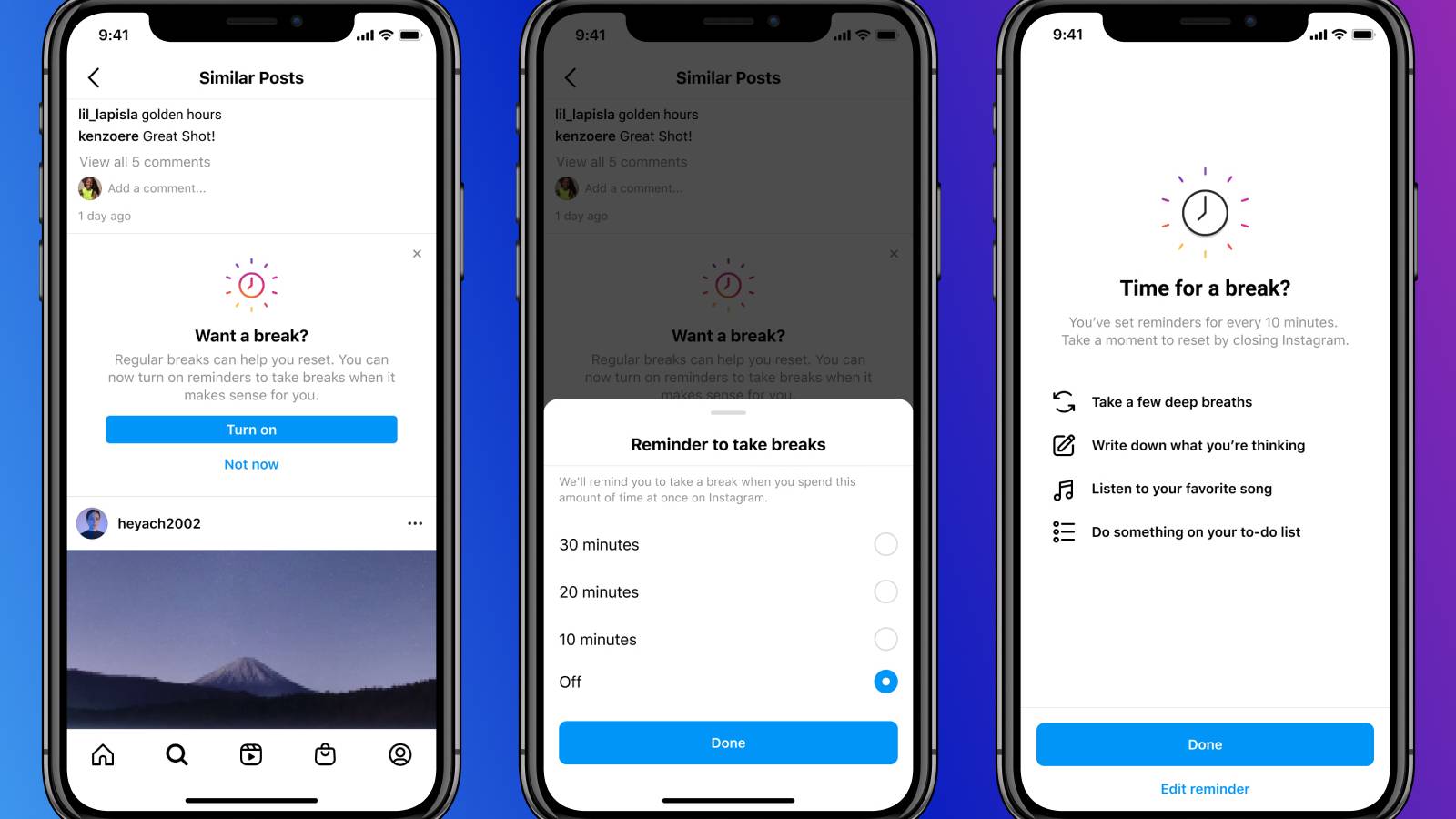
There have been some efforts to counter people losing themselves in feeds, like Instagrams “Take a break” feature.
Pocket-lint
Instagram Take a Break: How to turn the feature on or off
Instagram
Oh okay. You might be right
I find it very stressful on Facebook to lose what I was reading and be jumped back to the top of the newsfeed just because a minor “crisis” in the house required my attention. X doesn’t do this to me in the two general feeds, but it does in the notification section, which is aggravating.
Not receiving posts in chronological order also stresses me out. I check my social media twice a day, so I should have an idea what friends are experiencing, but no, I’m fed posts that can be 5 or 6 days old that say, no joke here, “Please pray for our baby. Mama had her in her front pack, tripped and crushed her. We’re headed to the hospital.” Just feed me what is sent out, please. I’ve decided what I want to scroll through by my follow choices.
cafe-society.news sorts the messages based on the user's own thumbs up/down feedback instead of "if it bleeds it leads" standard. Hides messages that have already been read, and doesn't mind presenting an empty page if the user has read everything.
Interesting … the part of the brain highlighted in that graphic is where I identify tension in my body emanating from when I engage in compulsive behavior 🤔