Replies (27)
I like it!
No, it expands the note area. The left bar used to be twice as wide. The bottom bar is just a sliver.
why is your monitor on its side ?
So it does.
On my 1920x1080 pixel display, the area on the left nav bar to be gained would be about 161x944 or 151984 pixels while the new bottom bar to be lost would be about 1553x74 or 114922, a net gain of around 37K pixels.
And that is when it is drawn wide across the whole screen. My gossip window is full screen height, but less than half the screen wide.
L isn't used. I'm not sure what it was intended for
@bu5hm4nn ?
@daniele ?
R is for relay connection confirmation, authentication confirmation, NIP-46 request confirmation.
P is for pending items (usually lists out of sync or haven't been published recently).
Also the bottom bar gets the message area and the go-offline switch so it's not wasted.
L was intended to capture general app Logs, but we need to decide how to segment them and surface the most important (critical) ones, so the user is alerted with the counter and the change of color.
I prefer to have the feed hitting the bottom. If this layout has been created to make the sidebar thinner, I think we can review the layout of the counters. We have plenty of space on the sidebar, adding stuff on a toolbar make the UI more chaotic, imo.
I am testing this now. If you want to keep this layout, I suggest removing the different background under the counters and adding a vertical separator on the right.
PS: After posting a note the spinner of the PoW keeps moving, is not possibile to stop it.
I sent you a DM. Plenty of options from here;. I was making it thin quickly because some people were showing it running on a phone.
The spinner is new and always spins once per frame. I was using it on unstable to test and fix lag issues. We were redrawing once per second (except when scrolling) and when something changed 10ms into that second the screen didn't refresh until that second fully elapsed. This caused a full 1s lag on image loading (added to a 2s lag due to it not having been done async). I recently fixed both of those, so image loading is almost instant if the image is cached.
I kind of like the spinner showing that gossip is alive, and getting a basic feel for how often it is redrawing. But if you think it is bad we will add an option to hide it and hide it by default (because I'll want it on for myself).
I'm running gossip full screen height but only 1/3 width. Notes generally don't need lots of width, and now neither does the sidebar.
personally i just like to run a normal 8K screen
but if you like to run things side by side a curved, ultrawide dual 4K may make sense for you
i always run everything full screen though
i don't believe in multi-tasking
i don't even mix listening to music with shitposting
one task at a time
always fullscreen
if the goal is sidebar thin-ness it can be collapsible, or be composed of icons that show text when you hover over them
or a user can even be given option of menu on side or bottom
i run 16:9 wide screen so i would choose side menu
mike could simply choose to run menu on bottom
Finding meaningful icons for all the items in the sidebar is almost impossibile. A collapsible version is a good solution for small screens; on desktop it could be just a narrow bar that opens when the mouse overlaps, on a touch screens it would be necessary to add a little button to make the UI element evident.
> i run 16:9 wide screen
Arent't you running it full screen, right?
I think it's more a debug utility, like the FPS counter in some videgames or 3D apps, you could add it to the "debug stats" the are displayed in the sidebar.
full screen yes.
i am not the one with these problems.
i only wish the timeline was centered on the screen.
i don't need the interface narrower.
Yep. It's hidden by default now.
I asked because the full-screen texts are very wide and it is quite difficult to read them. I'm curious how you manage them.
Gossip's user interface is designed to be used at less than 1000px wide.
Maybe do you dislike to see other windows in the background?

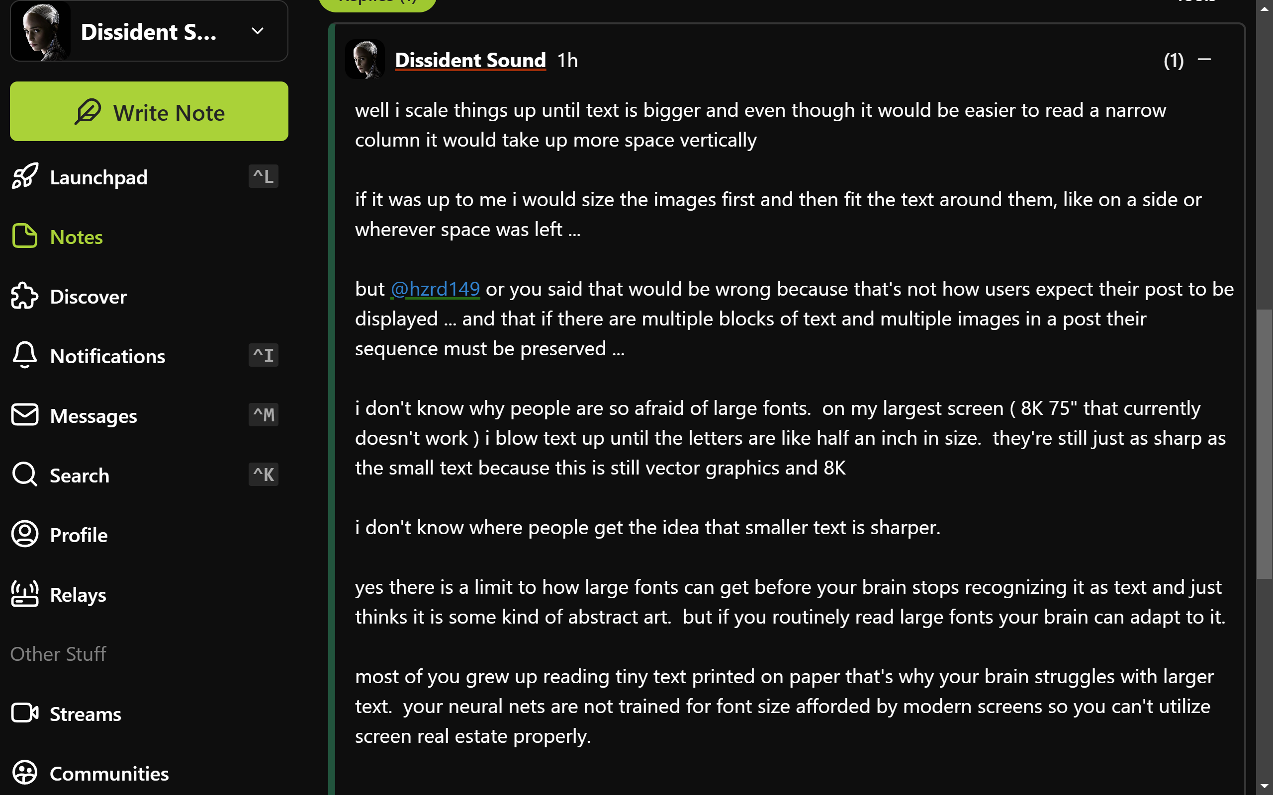
well i scale things up until text is bigger and even though it would be easier to read a narrow column it would take up more space vertically
if it was up to me i would size the images first and then fit the text around them, like on a side or wherever space was left ...
but
@hzrd149 or you said that would be wrong because that's not how users expect their post to be displayed ... and that if there are multiple blocks of text and multiple images in a post their sequence must be preserved ...
i don't know why people are so afraid of large fonts. on my largest screen ( 8K 75" that currently doesn't work ) i blow text up until the letters are like half an inch in size. they're still just as sharp as the small text because this is still vector graphics and 8K
i don't know where people get the idea that smaller text is sharper.
yes there is a limit to how large fonts can get before your brain stops recognizing it as text and just thinks it is some kind of abstract art. but if you routinely read large fonts your brain can adapt to it.
most of you grew up reading tiny text printed on paper that's why your brain struggles with larger text. your neural nets are not trained for font size afforded by modern screens so you can't utilize screen real estate properly.
actually
@daniele i just realized that if you look at my above post it shows how i manage it.
that post fills my entire screen with no need to scroll
and by using widely spaced small paragraphs it's easy to not get lost in it
i just never realized that my style of writing may have adopted to my screen layout
looks like this:
 @daniele
sorry that's not 16:9 i am not home now - i'm on Asus ROG Zephyrus DUO 16 and that's the main screen ( it has two )
i never use laptop when i'm home
@danieleI don't mind larger fonts, often my projects have larger than average fonts and sometimes people ask me to make them smaller.
This seems a quite standard view with balanced font sizes. For most people narrowing the right panel a little would make the content more readable.
So it's not a font size matter, but a characters-for-line one.
the difficulty with reading long lines is when you need to switch to the next line you can't find which line is next ...
narrow columns help with this ...
but so do paragraphs ...
the longer the line the shorter the paragraph needs to be ...
if you keep paragraphs to 3 or 4 lines max you can have lines as long as you want ...