Replies (43)
you know what? I actually agree
this is way better experience for users
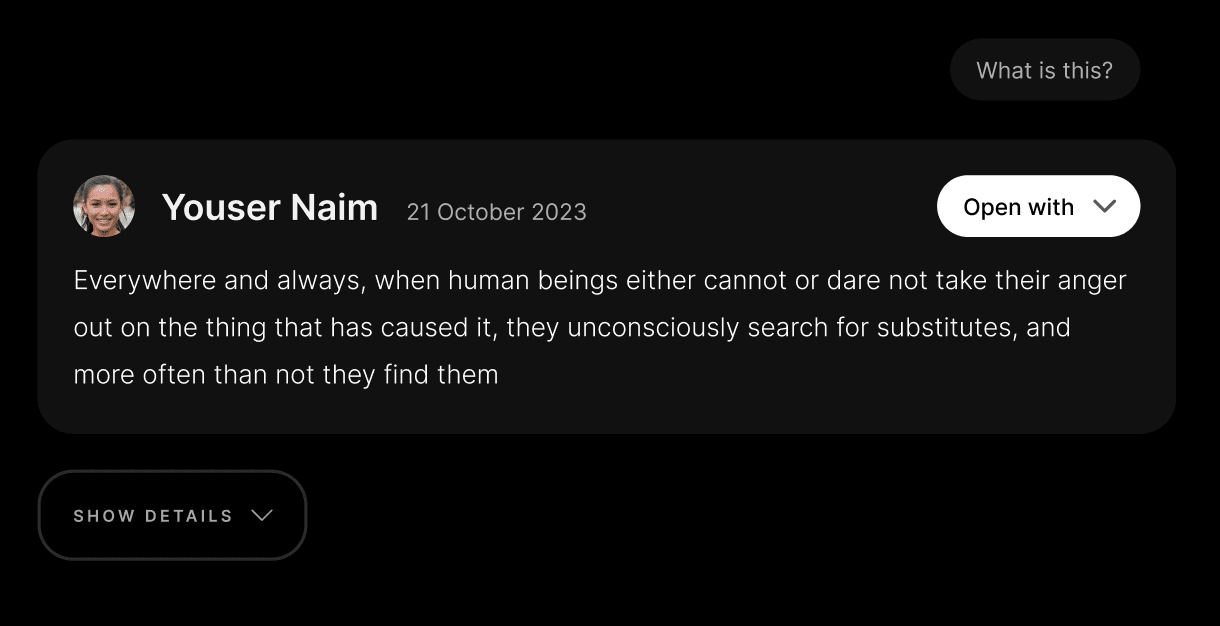
You can have a visible FAQ section under where the first question is “ where am I? ”
I have a “what is this?” But it’s also tucked away
If only figma could write frontend jsx and css.. too bad they got the kiss of death being acquired by adobe soon tho.. 😭
There are plugins for this but I haven’t seen anything that doesn’t produce monstrous code
Apparently "AI took our jobs" only applies to 3rd graders writing essays so far..
"nostril" - nice autocorrect. x)
I never really used njump, maybe once or twice. Is there any particular use case that it offers that Snort and Primal do not? o.o
I like the idea of it showing the input without too much hassle. A nitter of nostr.
The input field could be more feature reach (paste anything type) if not confusing. For example, I pasted an eventid in hex and got a syntax error.
Error handling could be more graceful and less intimidating.

100%
who or what is the input for?
No. It's useful only for clients that don't have pages to link to.
I'm sure it'll improve
💯 agree with this and started working on this too haha.
Here's my idea:
- included a "Jumpin N" logo I made as minimal branding
- integrating the call to action into the post-frame looks better and links the action very clearly to the event
- a grid is optimal for the details imo
Not sure about the Apps drop down though, might need some more info there.
What do you think?
@daniele #nostrdesign
Feels similar but more styled. Imo we should keep the styling to absolute minimum and no logo. The app logos are ok and I contemplated adding them but ultimately chose not to for the sake of minimizing friction (having to decide which app looks better based on the quality of its logo)
1. You might be right about no logo. Less distraction indeed.
2. I see what you mean (especially given the lack of well made logos) but it's look a lot more inviting though.
2. Yeah I could see that being the case.
It’s a edge case but clients offer eventids as hex and how do you get a regular event out of it?
Some clients accept it in their search bar but others don’t. And by input I mean regular string to the field.

I know that Njump has some technical points, but they are largely intentional; in fact, if one of the goals is to let the user jump to a complete Nostr experience, there are other goals as well, such as educating (perhaps even subliminally) about a new paradigm.
This includes showing, even if only in passing, some "strange" but necessary concepts such as public key, relays, and having multiple apps to choose from.
I am 100% in favor of a fluid UX, but I don't think babysitting users too much is the way to go; we need to leverage some awareness to promote a more informed use of technology. How is a continuous work in progress, with the necessary trial and error.
On the UX side: granted that hiding the main call to action below a dropdown, requiring 2 clicks (hover brings accessibility problems) where there is plenty of space doesn't seem the inevitable choice, we are talking just about the desktop view here, forgetting than about ~80% users use a smartphone :) And there the dropdown is present, for obvious reasons.
However thank you (and Niel) for the suggestions, I will take them into consideration; there are definitely some elements that can be improved, such as labeling, the date visualization, adding contestual helps, and the localization, of course.
Thanks Neil for mentioning me in the discussion.
As I already told you privately, I like the details grid layout, and the "What..?" hints are definitely needed.
I'm not convinced about the dropdown, as explained in my other note.
Got it! Thanks for (re)explaining.
Thanks for the hint Petri, indeed we can support the event id from the homepage too.
Currently you can load it with njump.me/e/<event-id>
Proper error handling is on my roadmap!
Error page added and /<hex-id> fallback supported
That was fast!
Agree with
@HoloKat and
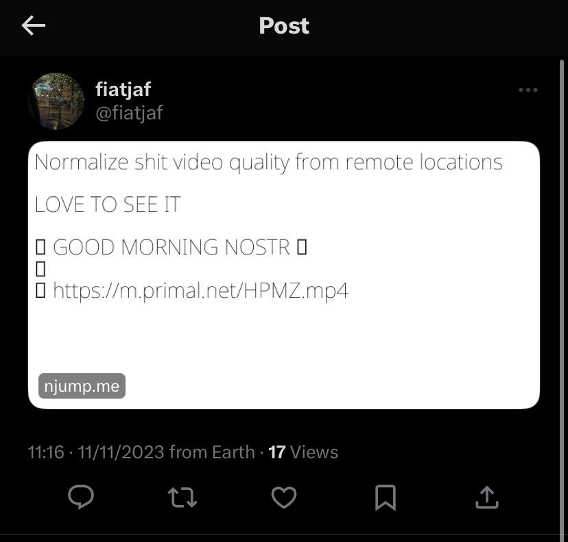
@Niel Liesmons on the overall UX and sure you’ll take these into consideration. Appreciate the work you’re all doing here 🫡. The link previews need some work as well imo - just seen this with emojis and video previews not being displayed:
I was born in New Jersey. And I still not sure what i am looking at.
New Jersey must be fun 😆
Ya. I’m gonna link to snort for now (though I don’t know what those preview links look like). Njump is just too confusing imo.
Now I really gotta visit to see what all the complaints are about
I have to spend most of December there and I'm already stressed out about it.
Y?
It’s actually not that bad, but it is what remains from an industrial city.
All backend development, minimal front end thought and design.
Which oddly fits the context of this discussion a little bit.
It’s a proof of work kinda place. 🤙
Tricky one to balance what new and existing users will want to see. Just tested snort and no link preview shown:
Yeah that needs to be fixed.
Has to be 2 different services
I’m not sure it does. I quite like both yours and Neil’s UIs with just the post and choice of clients to open that post in a client (maybe NIP-89 integration, if that’s applicable). Advanced users can click a drop down for more details.
For the education piece, a simple introduction paragraph and a link out to nostr.com to learn how the protocol works could be sufficient. I know there’s been some talks recently about making nostr.com more user-centric as opposed to develop-centric.
Obviously this isn’t my project, but just a few opinions from a non-dev. Hope it helps 🤙
Yeah I thought it could work too. Less styled, fewer things on screen while preserving ability to see all that stuff in details. How often do advanced users see njump an anyway? I dunno… I imagined this is mostly for new users where it makes sense to hide as much as possible. Maybe my UI is still unclear through. People may still get confused about what’s in front of them. Adding text to read won’t help - no one reads anything.
I think we may be fine linking to your client of choice. New users don’t need options, they can discover them later. But if this is not for new users then info density is fine probably. Fewer clicks
Totally agree with this vision. If an advanced users wants to see those details, they’ll go to a client that serves them.
This is a very condescending attitude, trying to hide everything from the visitors as if they were moron Facebook users.