
Since @Niel Liesmons just showed his proposal for a Nostr logo, I show something I sketched out some time ago but always kept in the drawer.
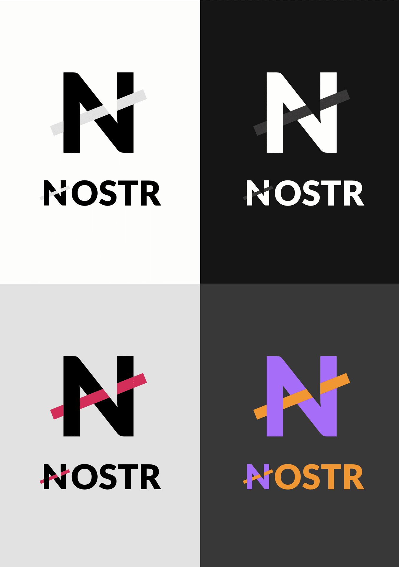 My motivation:
- Nostr already has a good "design" as a word; it is distinctive enough to be memorable and recognizable; we don't need to add images, so no ostrich;
- Focus on Nostr's main typographic reference, the first letter N.
- Give the idea of interconnectedness, but not neat and precise, something weird and cross-cutting, as per the Nostr style;
- Have something that is usable either as an icon (the simple N) or as a full name, in very different sizes and backgrounds, always with good readability;
- Choose something that works well with different colors, so that apps can customize and integrate it into their design giving room for creativity, but still be extremely recognizable;
View quoted note →
My motivation:
- Nostr already has a good "design" as a word; it is distinctive enough to be memorable and recognizable; we don't need to add images, so no ostrich;
- Focus on Nostr's main typographic reference, the first letter N.
- Give the idea of interconnectedness, but not neat and precise, something weird and cross-cutting, as per the Nostr style;
- Have something that is usable either as an icon (the simple N) or as a full name, in very different sizes and backgrounds, always with good readability;
- Choose something that works well with different colors, so that apps can customize and integrate it into their design giving room for creativity, but still be extremely recognizable;
View quoted note →


 And by the way, the ostrich makes it look from the eighties, it's unique, I like it most.
 I DONT LIKE OSTRICH
Why does nostr always have to be associated with ostrich, and why not "no str"? Just because an AI made a joke? We humans can do it too.😋
I DONT LIKE OSTRICH
Why does nostr always have to be associated with ostrich, and why not "no str"? Just because an AI made a joke? We humans can do it too.😋
