Today I spent some time reviewing typography in
@YakiHonne, since I believe that this nice app with some little touches can become really gorgeous.
Typography can seem a secondary element but it's really important. Consistent use of font sizes and line-heights throughout the app, including the UI, immediately enhances the quality of the design and significantly improves usability / readability.
There is a problem that applies to virtually all clients: optimization of paragraph spaces. I'm sharing this here for general usefulness.
Since Nostr notes are plain text, the only way to highlight paragraphs is to use a double carriage return. This is perfectly fine from a compose point of view, but creates a suboptimal display when notes are rendered.
Paragraphs usually are equal to one line-height in traditional print, and slightly larger (~ x1.25) in web design and digital UIs; instead of applying a double carriage return, you have a blank line and 2 line-heights (top and bottom), that sum up to ~ x4 the font size (or x.2.6 the line-height)!
Often these paragraph spaces are larger than other spaces used to separate areas in the note block, or even to separate notes in the feed, so this totally ruins the design and the readability of the content.
A similar problem arises when such spaces are used around media, note/article mentions, links preview, etc; the gap is too high.
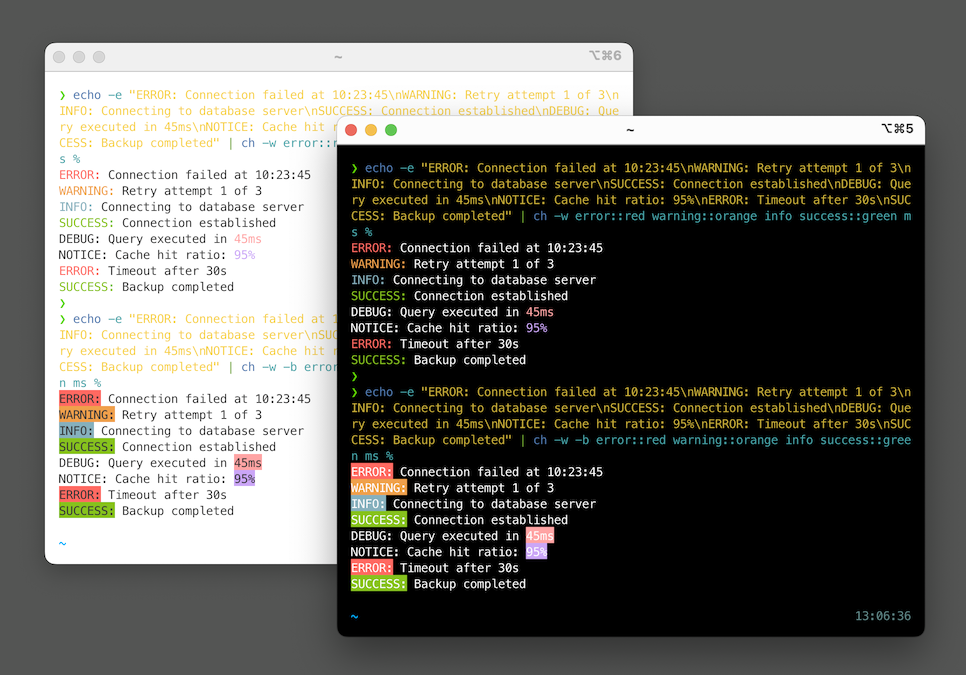
This is an example of the described problem in
@YakiHonne and
@Jumble
Spaces between paragraph are excessive and similar to the gap between notes, making it difficult to scan correctly at a glance:
The proposed solution is to parse blank lines and replace them with a space 30% larger than the line-height (so about x2.0 for the Latin character set and x2.4 for the Japanese one).
Before and above non text blocks (media, etc) another 10-15% additional space can be added.
#nostrdesign


 Read more and grab binaries & source code at
  Paris, 2007