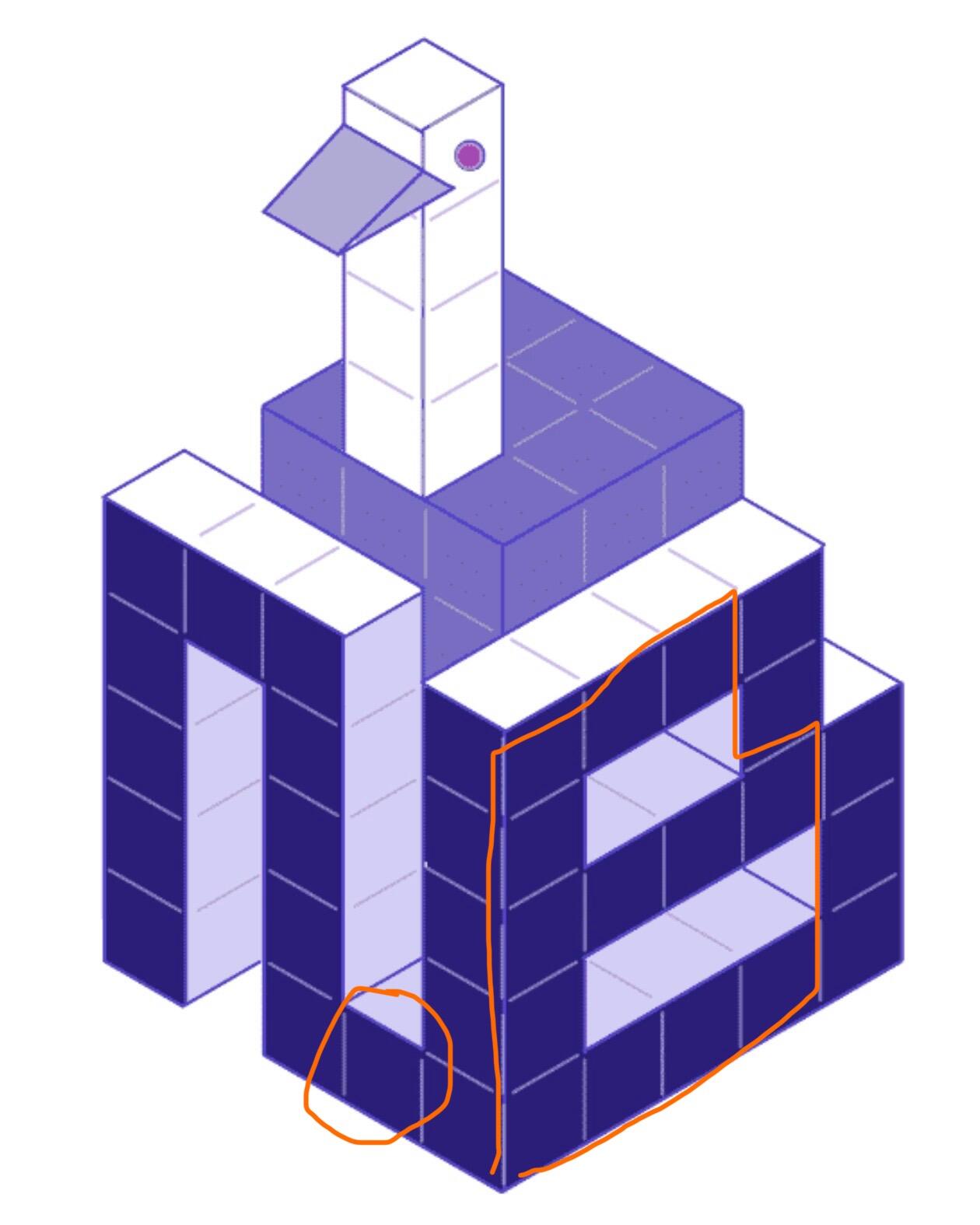
The Daniel 🖖 daniel@satsfactory.com 2 years ago C is really good but I think the letters can be simplified. Maybe the N can just be an upside-down U and not connect at the bottom to the B. The B could also be one column narrower.
Wayne kentender@iris.to 2 years ago c is my fav. i like the voxel design, but agree with others they could all be simplified