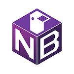
I like them all, was leaning towards B, but A is clear and I like that ostrich better..
Login to reply
Replies (2)
A. I liked C at first, but the N started to look weird and the ostrich looks like a duck. The block idea is cool, though.
The ostrich on A isn't super obvious other than the legs. Those are great. The neck and head need to be more ostrichy.
i like B. non/flat 3d icons haven't been a thing for a long time


