
Login to reply
Replies (21)

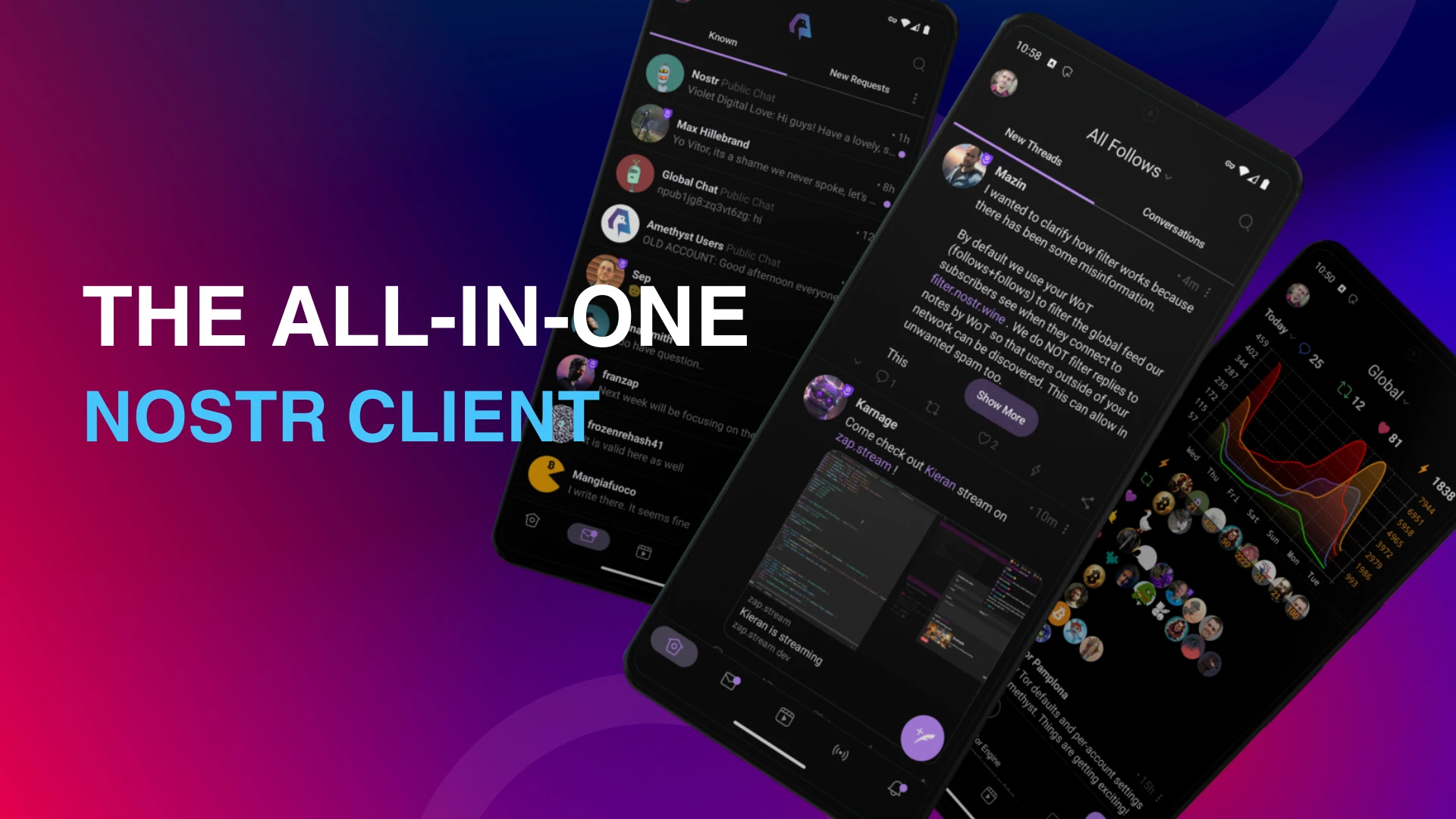
I did this guide for amethyst did I miss anything ?

Obvious one-shot slop. The copy has massive LLM smell. If I wouldn't know Amethyst already I'd dismiss it without a 2nd thought.

Humans will always be good at noticing. Super power.
But isn't it better than the current page (which kinda sucks... :( )?
Don’t get me wrong, I don’t want to discourage you to relaunch the page. My main comment is about the copy, i.e. the text. It’s very obviously AI-generated, and more and more people will notice that (and thus be turned away). My recommendation would be to go over each text passage and rewrite it yourself from scratch.
In terms of design it’s the same thing. It looks and feels generated, quite obviously. All these pages look the same, and as slopification increases people will dislike these types of pages more and more. Just something to be aware of.

Not a fan of the font.
Also feels very "AI made this", as others have pointed out.
It isn't just slop. It's a tragedy disguised as innovation.
AI Writers Room
Don't Write Like AI (1 of 101): "It's Not X, it's Y"
One of the most beloved writing techniques of AI is negation. This is when AI writes something like:
"It's not just X, it's Y."
"We're not just b...

bad is the new good

this is too slow and bloated for a static page
didn't you have a podcast dedicated to praising AI?
It's an amazing tool if used properly.

“It’s a machine that rewards coherence, which is why incoherence has never been more precious.”
Agree, the Serif font sucks
there are probably people who think your "proper" uses are awful too and you have probably dismissed them in your podcast

The current page is slower...
This is the way

Tor is written without all caps. Font after "Social & Communication" seems inconsistent with existing font choices made.
Apart from that, love it.

The design almost deterred me from reading through it. The generic icons & the uniformity of it all (for lack of a better word) alludes to what's ahead. I did, though, and... hmmm.
I don't yet know how to contribute to these types of sites, especially without making the delicate layouts even worse. It's already misaligned on my screen. I'm sure I'd botch that part badly, if I tried to give it some soul.