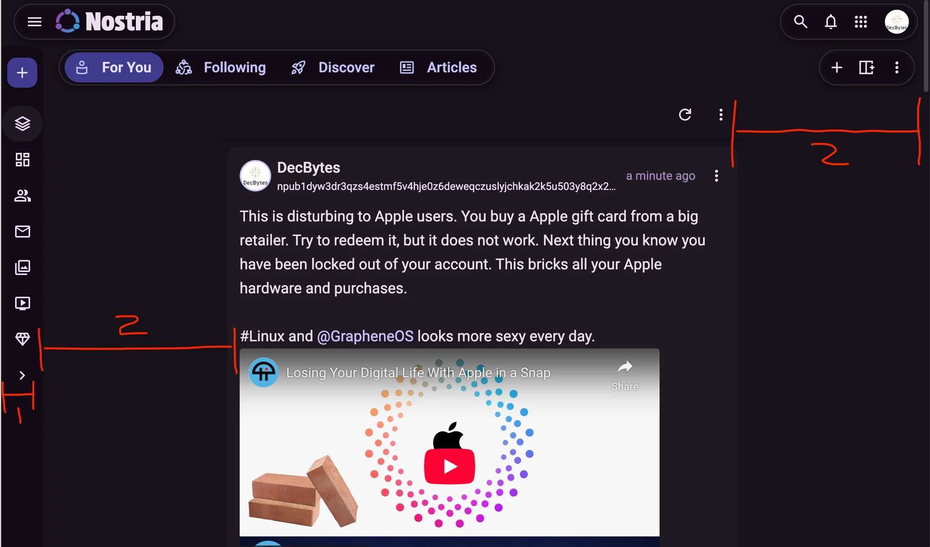
I have some feedback about the UI.
1. It looks so good if you can increase the navbar width a bit.
2. The space between notes and the navbar does not look good for me on big screens. Maybe you could decrease the two-sided space of the notes section and add some X padding/margin to the two sides of the whole page.
Login to reply
Replies (2)
Do you mean the width of 1 and 2 as marked here?


Fixed it! The content will stay centered, even with the menu opened. When you open and close it animates the content a bit, I'll see what I can do about that, it might be a bit annoying? There might be consequences on some screens where it's not fully correct, though this is much better. Thanks for reporting!

