The bodega-influenced visual language of an outsider campaign
 # Zohran Mamdani’s Campaign Logo Looked Nothing Like a Campaign Logo
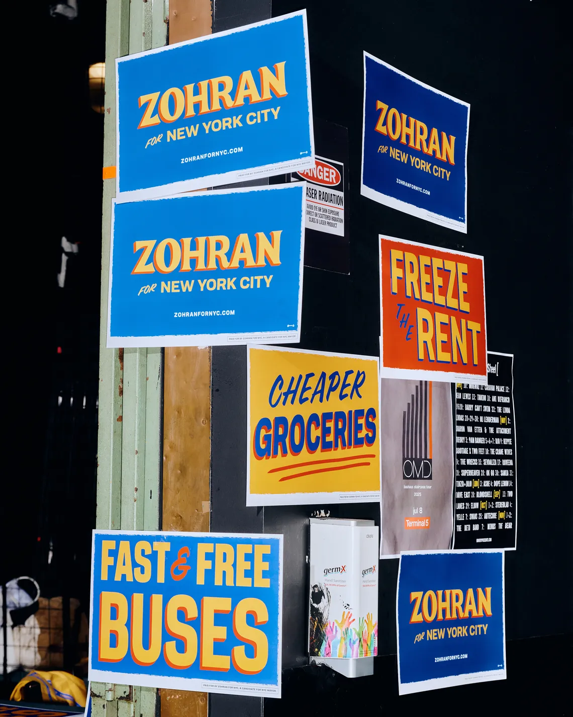
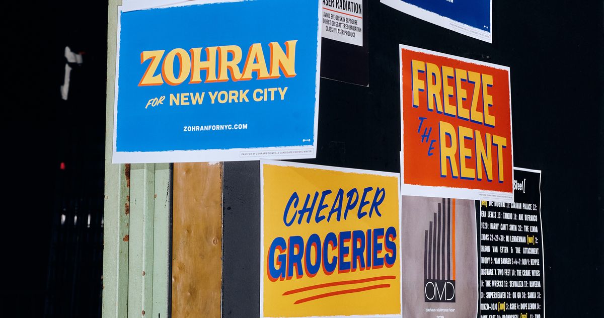
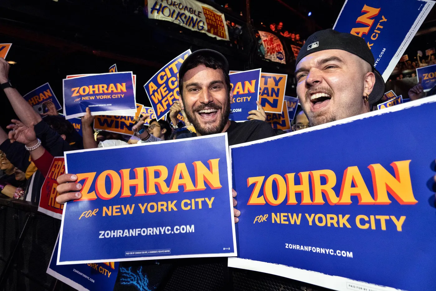
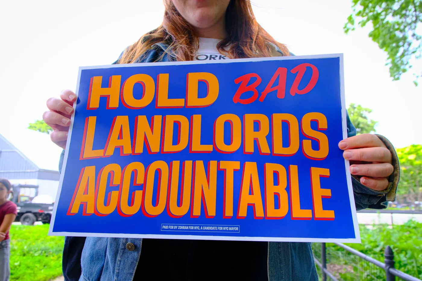
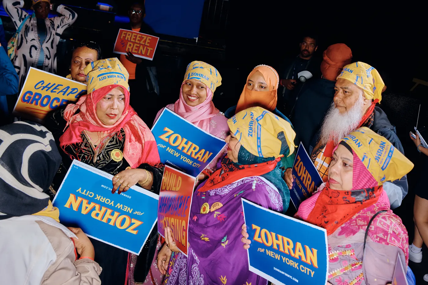
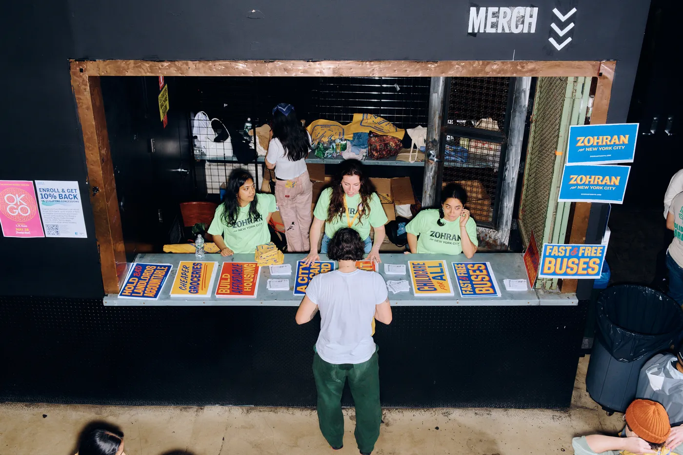
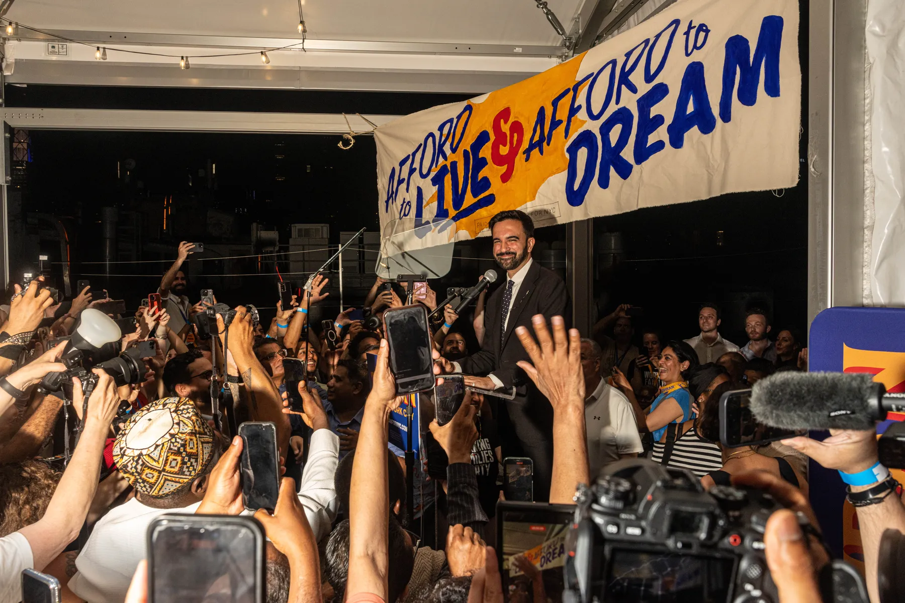
Nobody would credit Zohran Mamdani’s campaign graphics for his win, but they were, as was his campaign, like nothing else in politics. First, there’s the saturated color palette: A royal-blue field — brighter and more electric than [Biden blue](https://www.curbed.com/2021/02/joe-biden-interior-design-style.html) — backs up ochre-yellow letters with vermilion drop shadows. (Occasionally, the colors are reversed, with the ochre as the background.) The typeface has curvilinear flourishes and flares that suggest the hand-painted lettering on a storefront sign far from politics, like the [1-Shot lettering enamel]( on a Washington Heights awning reading “COLD BEER.” Other campaign materials are equally as memorable, especially the insouciant (and unofficial) [HOT GIRLS FOR ZOHRAN](https://www.thecut.com/article/emily-ratajkowski-endorses-zohran-mamdani-instagram-video.html) T-shirt. I cannot for the life of me tell you what Andrew Cuomo’s logotype looks like, and heaven knows you never saw a HOT GIRLS FOR CUOMO shirt anywhere.
# Zohran Mamdani’s Campaign Logo Looked Nothing Like a Campaign Logo

Nobody would credit Zohran Mamdani’s campaign graphics for his win, but they were, as was his campaign, like nothing else in politics. First, there’s the saturated color palette: A royal-blue field — brighter and more electric than [Biden blue](https://www.curbed.com/2021/02/joe-biden-interior-design-style.html) — backs up ochre-yellow letters with vermilion drop shadows. (Occasionally, the colors are reversed, with the ochre as the background.) The typeface has curvilinear flourishes and flares that suggest the hand-painted lettering on a storefront sign far from politics, like the [1-Shot lettering enamel]( on a Washington Heights awning reading “COLD BEER.” Other campaign materials are equally as memorable, especially the insouciant (and unofficial) [HOT GIRLS FOR ZOHRAN](https://www.thecut.com/article/emily-ratajkowski-endorses-zohran-mamdani-instagram-video.html) T-shirt. I cannot for the life of me tell you what Andrew Cuomo’s logotype looks like, and heaven knows you never saw a HOT GIRLS FOR CUOMO shirt anywhere.


Curbed
Zohran Mamdani’s Campaign Logo Looked Nothing Like a Campaign Logo
The bodega-influenced visual language of an outsider campaign.
Stacker News
The bodega-influenced visual language of an outsider campaign \ stacker news
Zohran Mamdani’s Campaign Logo Looked Nothing Like a Campaign Logo Nobody would credit Zohran Mamdani’s campaign graphics for his win, but they...