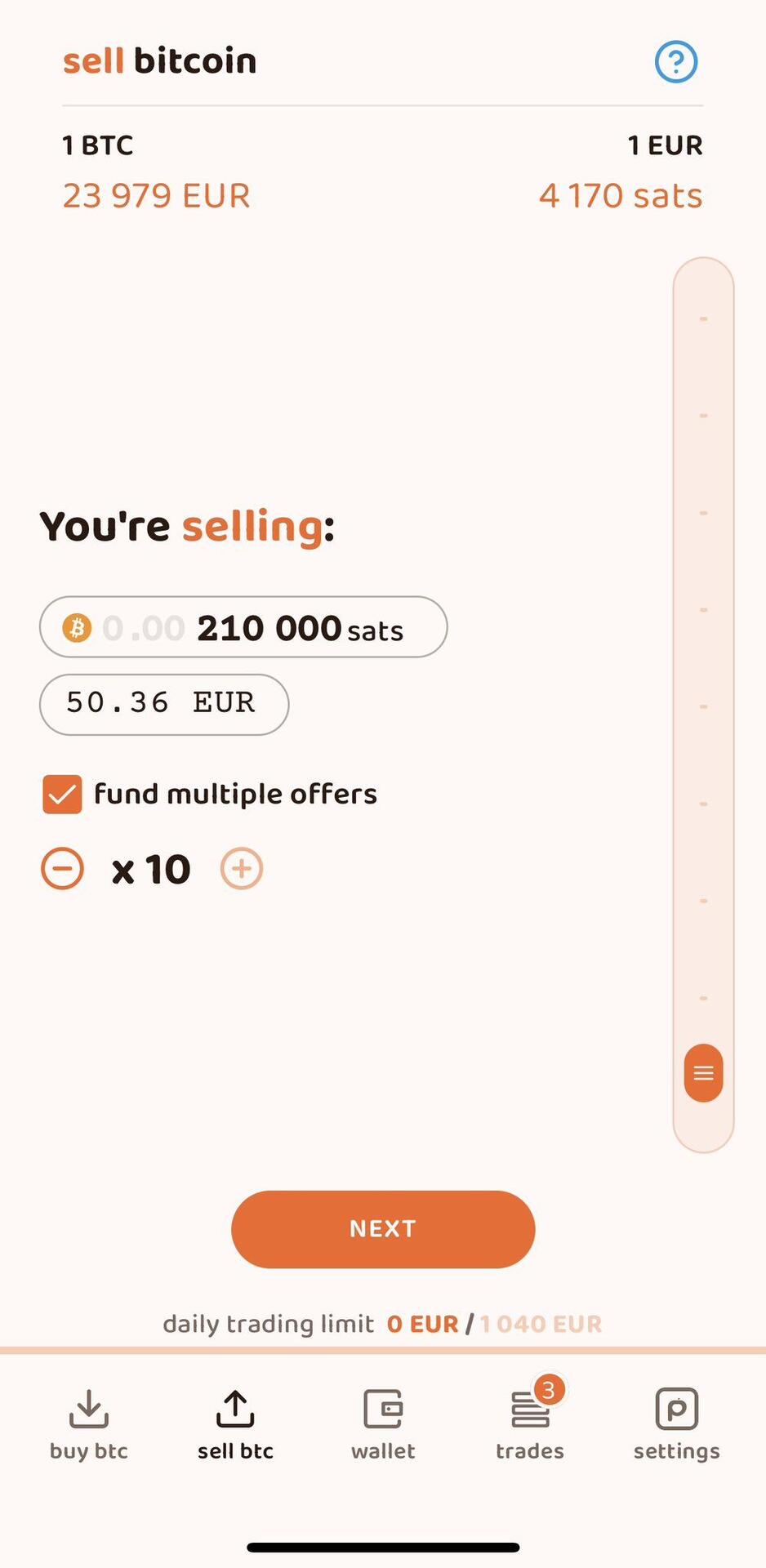
Decided that I wanted to show both sats and btc in the same UI. How does it look? https://video.nostr.build/d4eda84d39bcf9691b1d6e7852cae648b1ba7e0104c0a27c00a3c5eea8695295.mov
Login to reply
Replies (11)
I dig it, never seen it displayed like that
I like this idea, but would suggest taking it even further and graying out the leading decimal and zeroes so they're less prominent. You'd still be able to see the entire number as denominated in BTC but it would prioritize the sat display more.
I LOVE IT
BUT
SATS ARE CONSISTENTLY ALL ORANGE
WHILE BTC IS MIXED GREY AND ORANGE
WONDERING HOW THAT COULD BE SOLVED (COULD HAVE PREFERENCE ON WHICH IS ORANGE? NOT IDEAL)
The goal was to be different!
Hmm. Any chance you could send a picture of what you mean?
The colors are arbitrary. The goal was to have a distinct difference between each balance.
nostr:npub15369wu3wzzar5fclhecyqfv683x69n6nhlg7rxqnsg2dydgxflpq3apswl did it first.
It's the best implementation IMO too.
I’ll have to give it some more thought, because it’s not as easy to display as I was originally thinking.
Did they really? What does it look like.
Yep, and it's standard across the app UI:
https://twitter.com/peachbitcoin/status/1636759379973222403?t=MqsDd7W6hiKODJTJYKTaKg&s=09
Woah. Welp i guess I’m not different:(