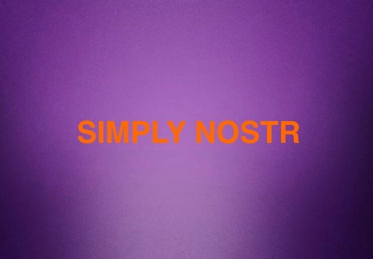
Worked hard designing our new profile pic @npub15jnw...8xjp
Looks cool right?
Login to reply
Replies (6)
#SimplyNostr
I’m going to give you a fair critique.
Orange text on a purple background is hard to read. Same with red on blue. The colors clash and become muddy. This is something you learn early on as a designer.


Thanx 4 the feedback and honest opinion.
The thinking behind it was mostly Nostr aka purple….
Then the lettering in bitcoin colors.
But I totally see your point on how it kinda makes it blurry/ muddy/ hard to read.
I’ll probably change it 💜💜thanks again 👋

My first time really designing anything
I suck at it🥲🤣🤣
Why don’t you ask for some help? There are a lot of talented people here!

