
We Should Be So Lucky House
#architecture
Architects: Multiplicity
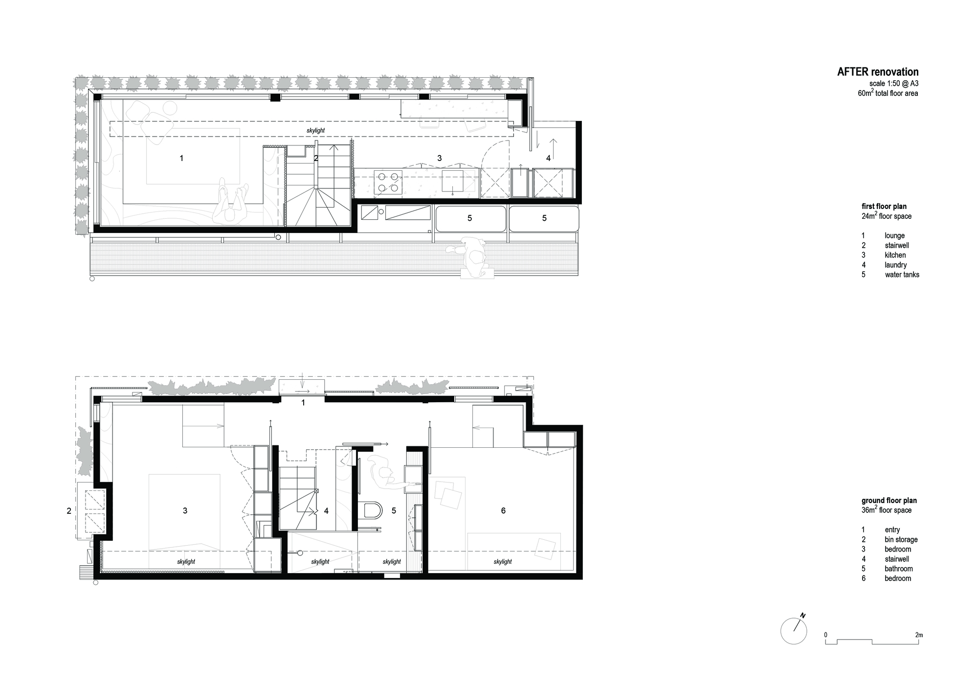
Area: 60 m²
Year: 2022
Photographs: Emma Cross
City: Melbourne
Country: Australia


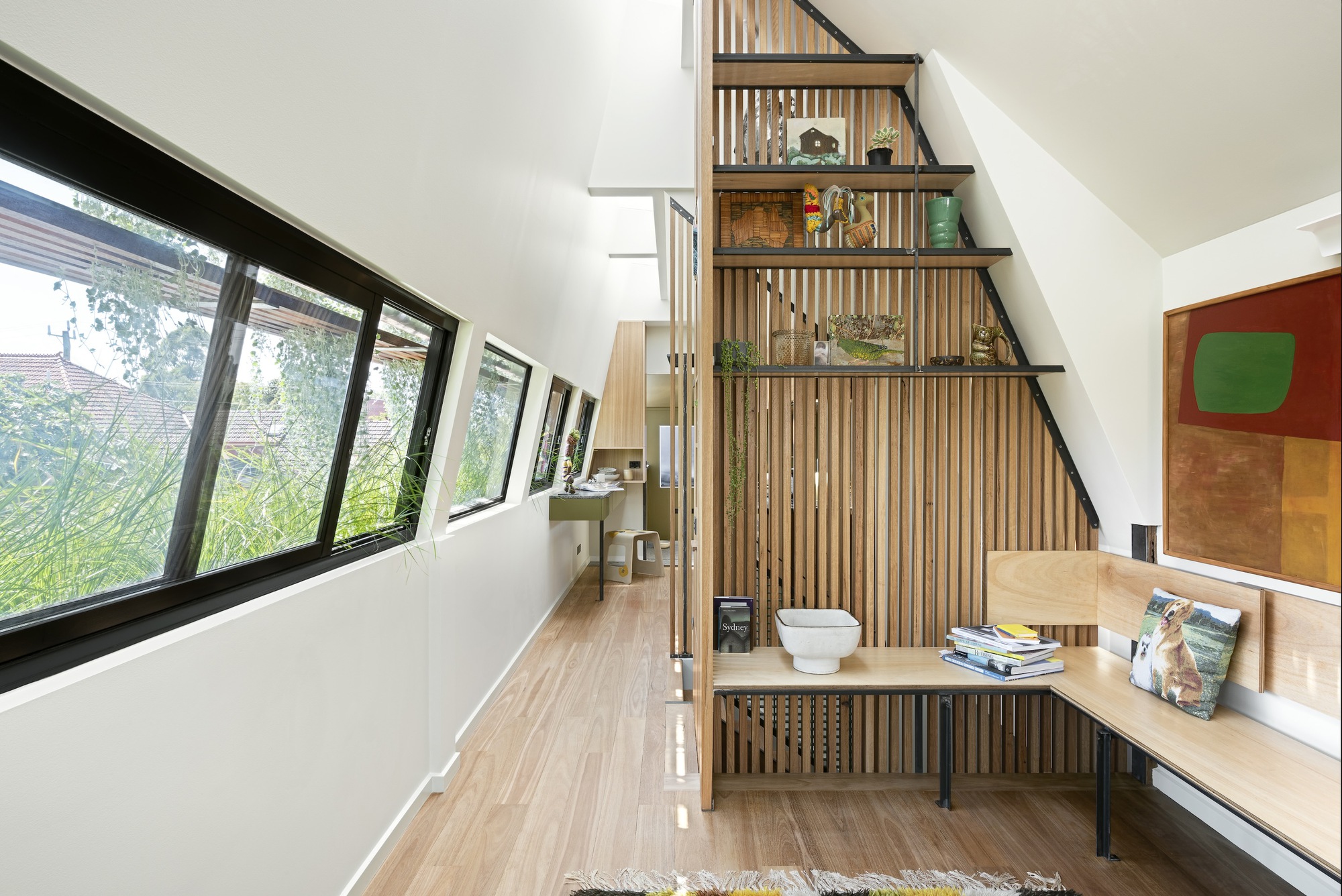
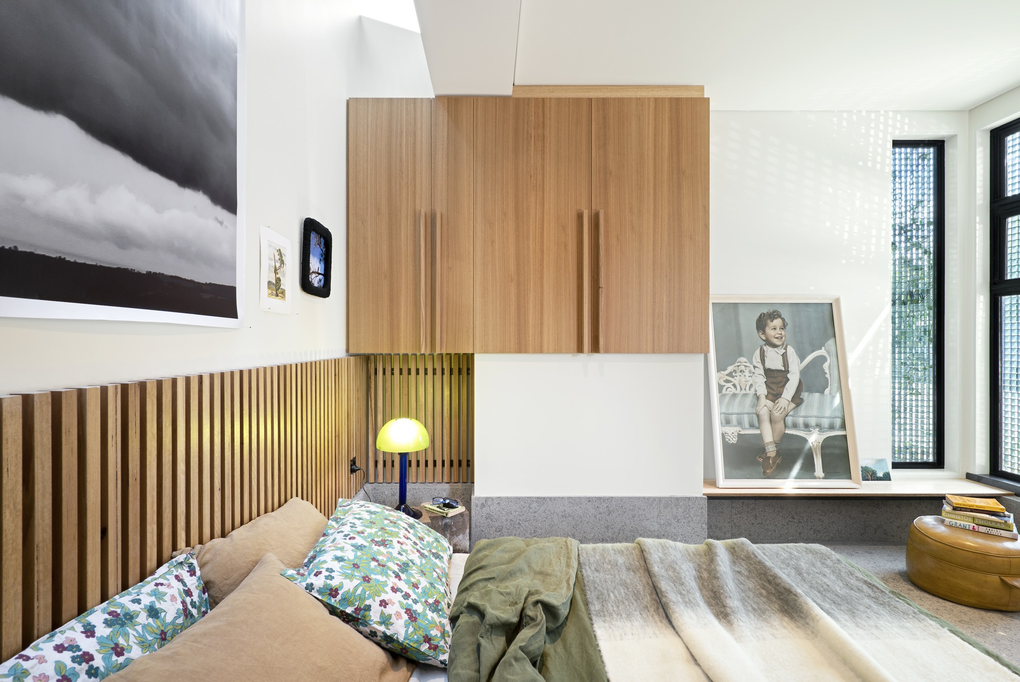

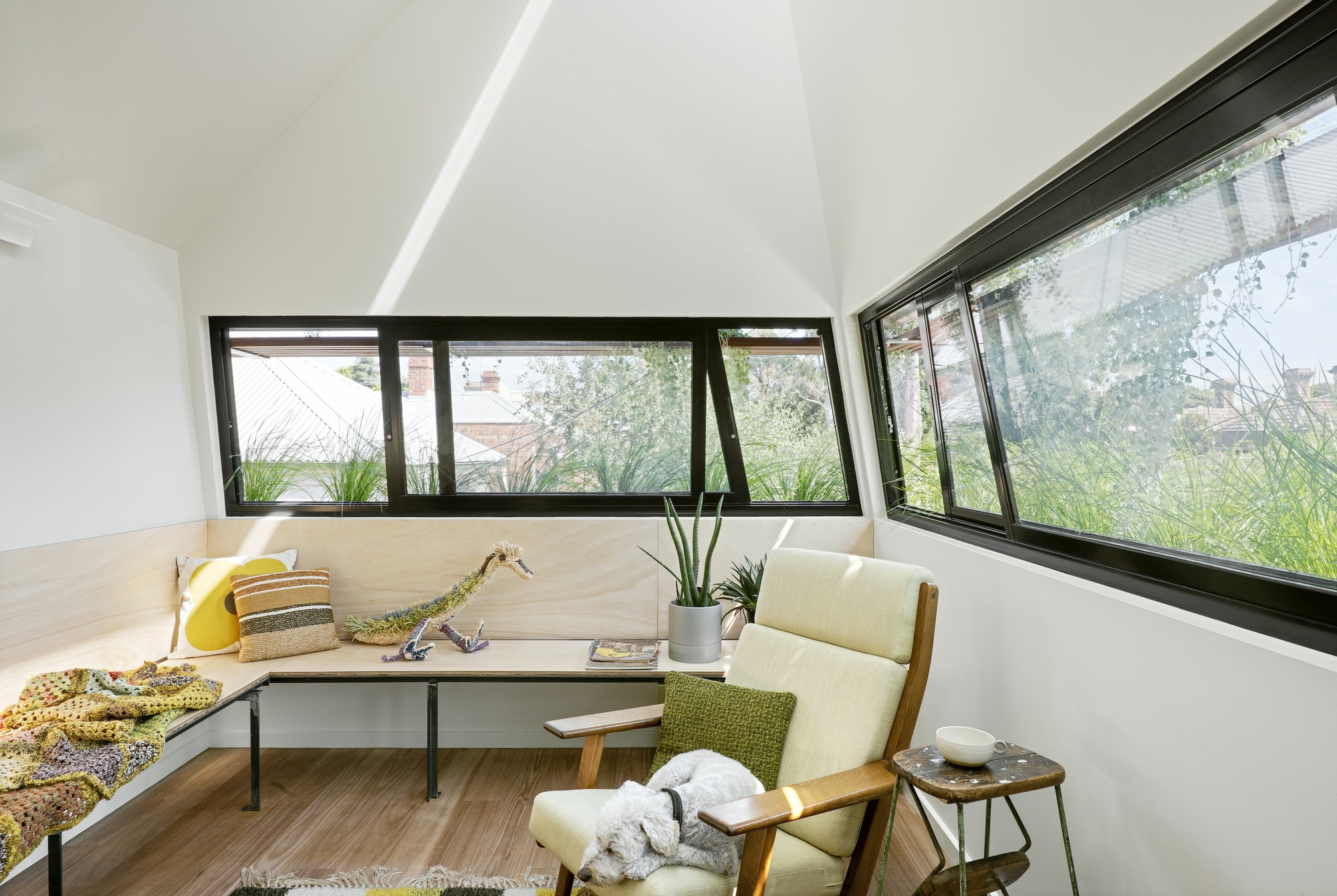

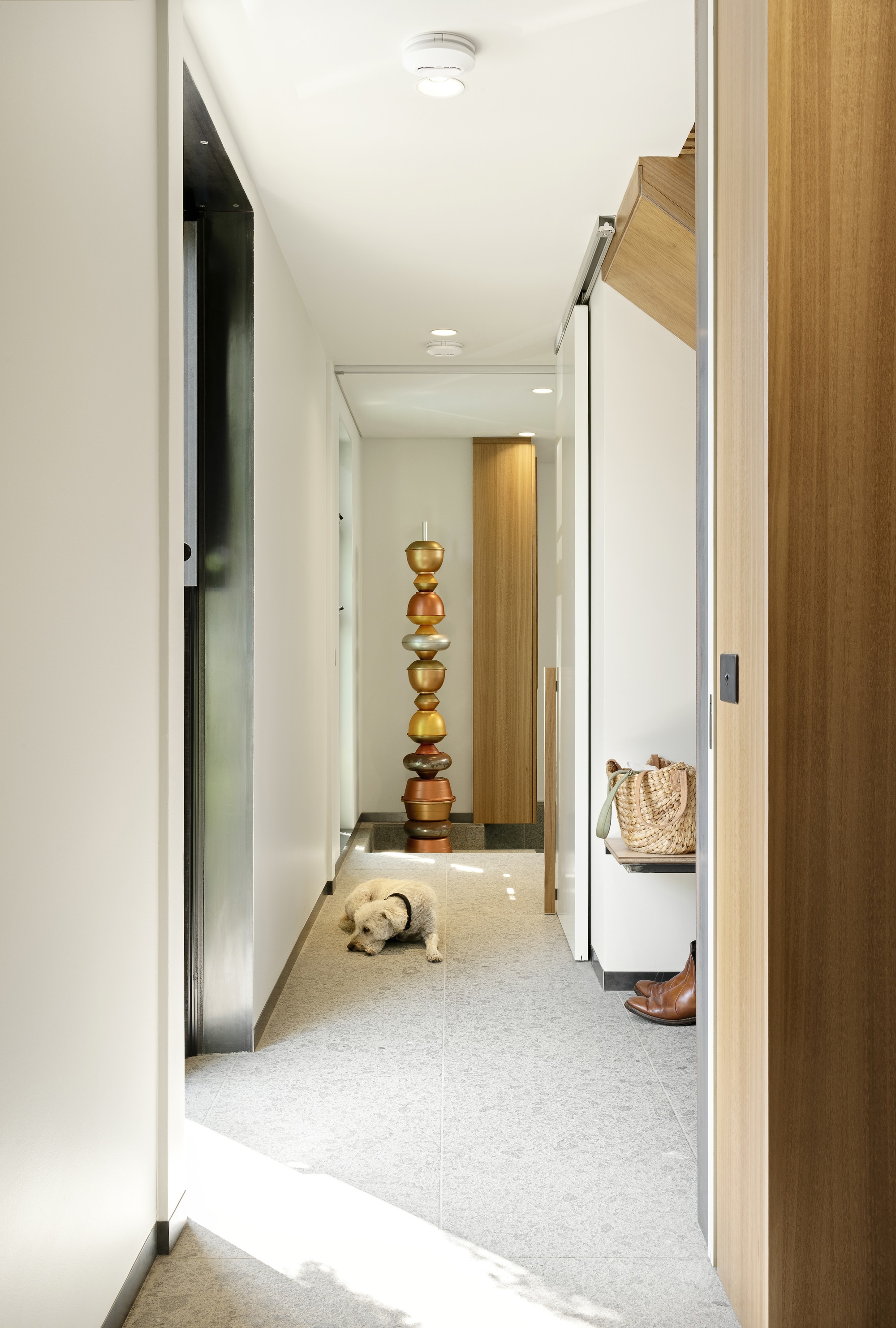

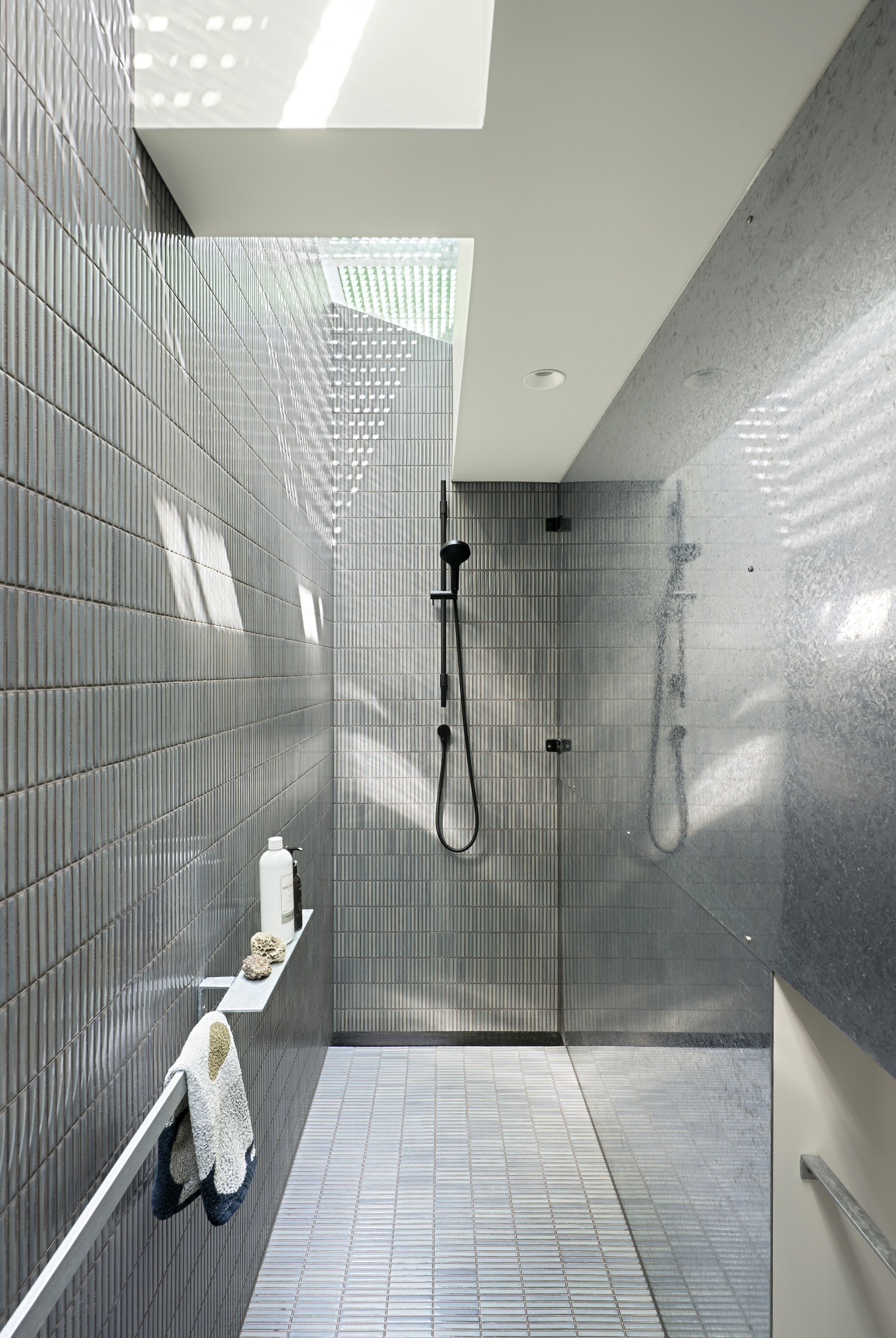


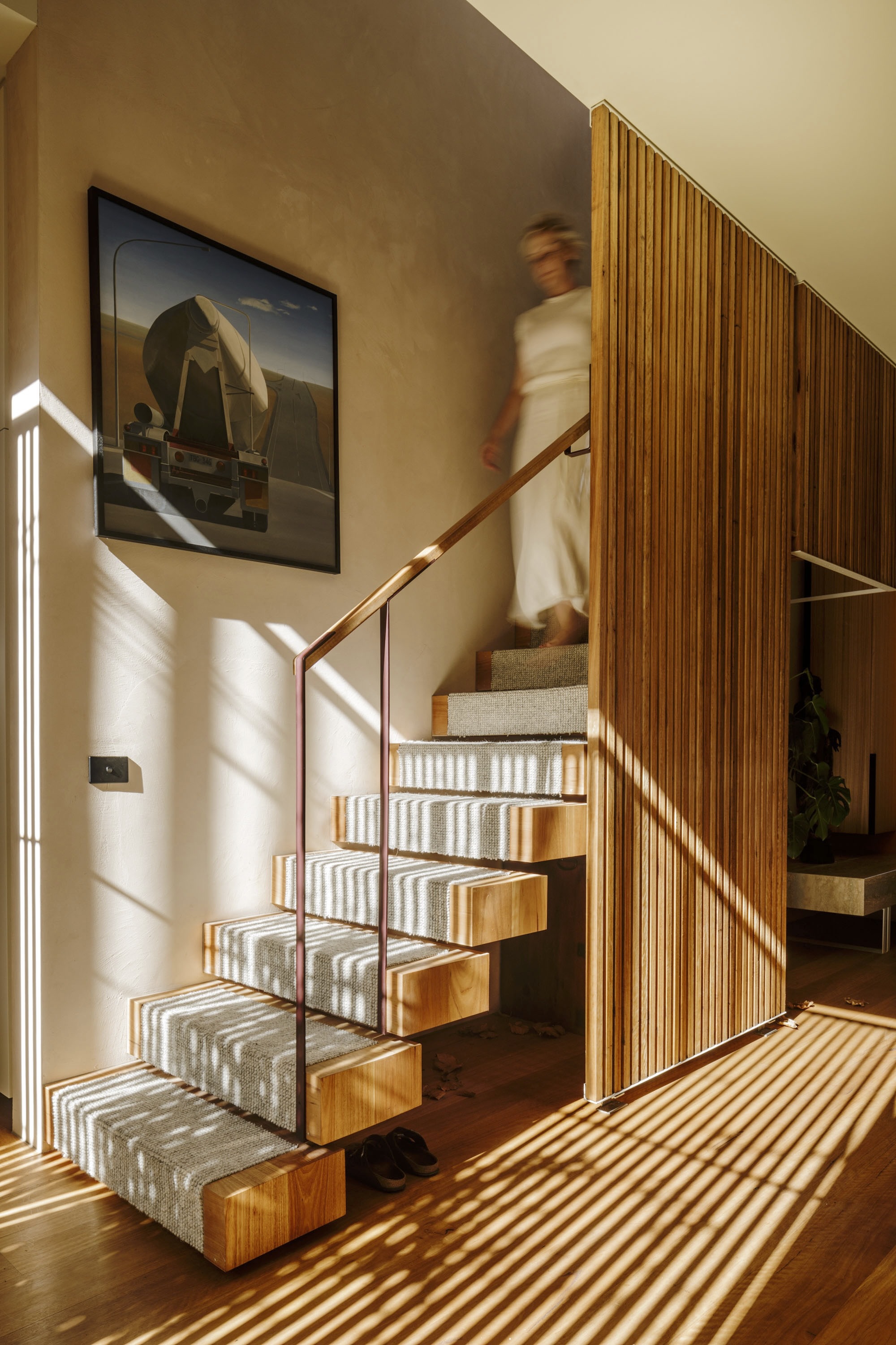
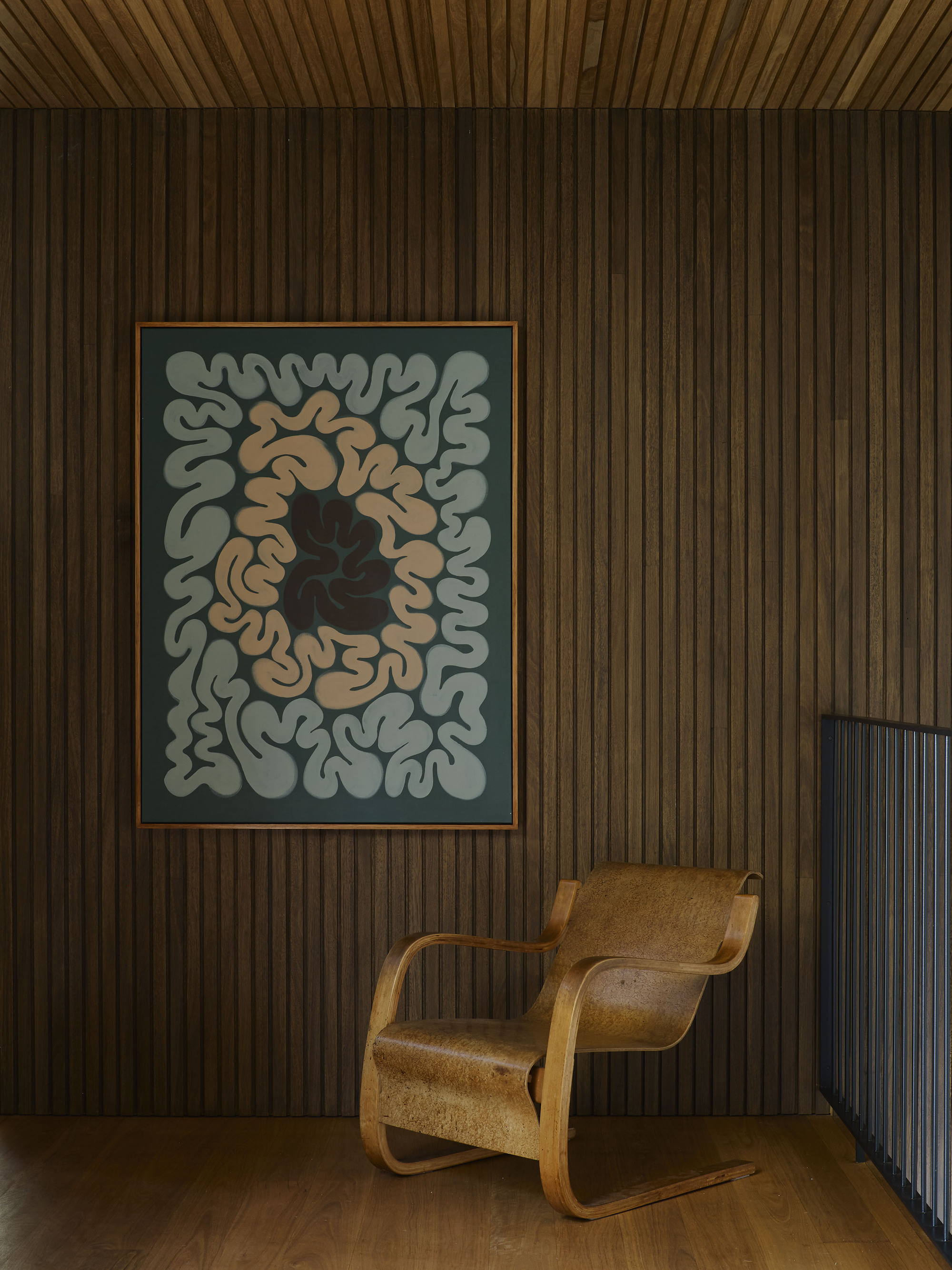
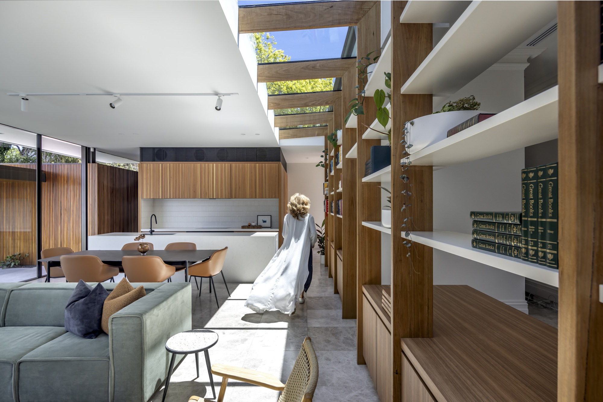
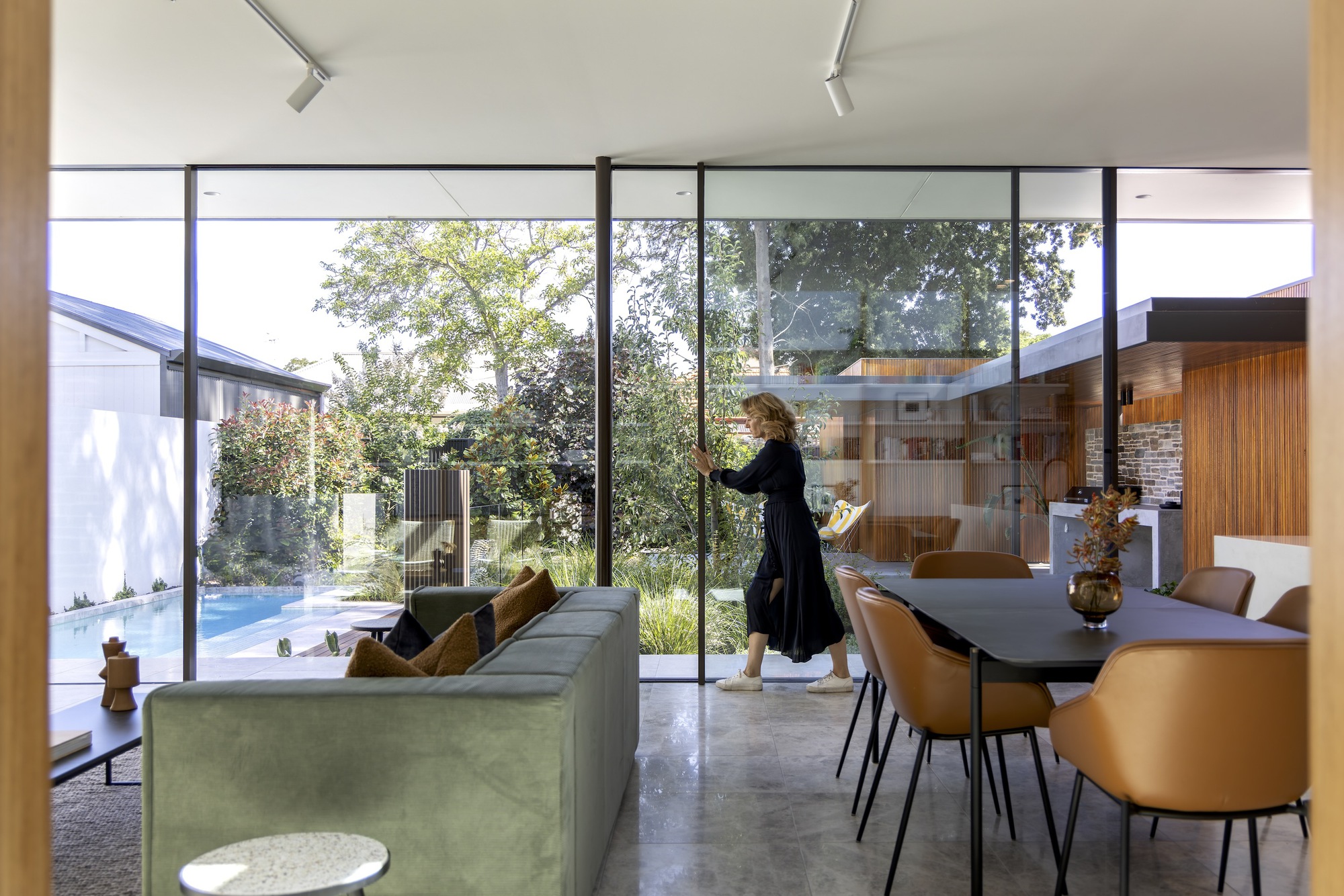
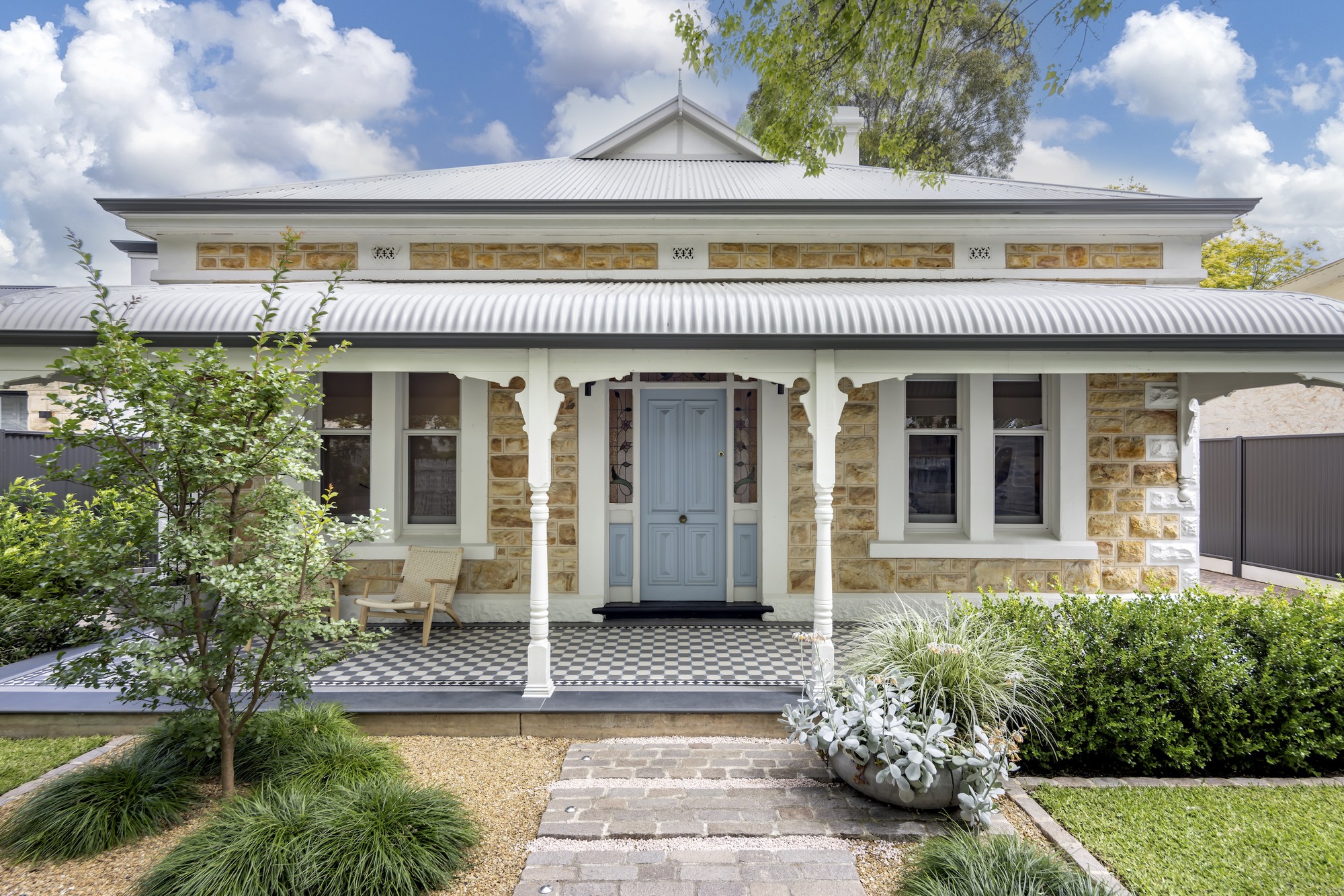
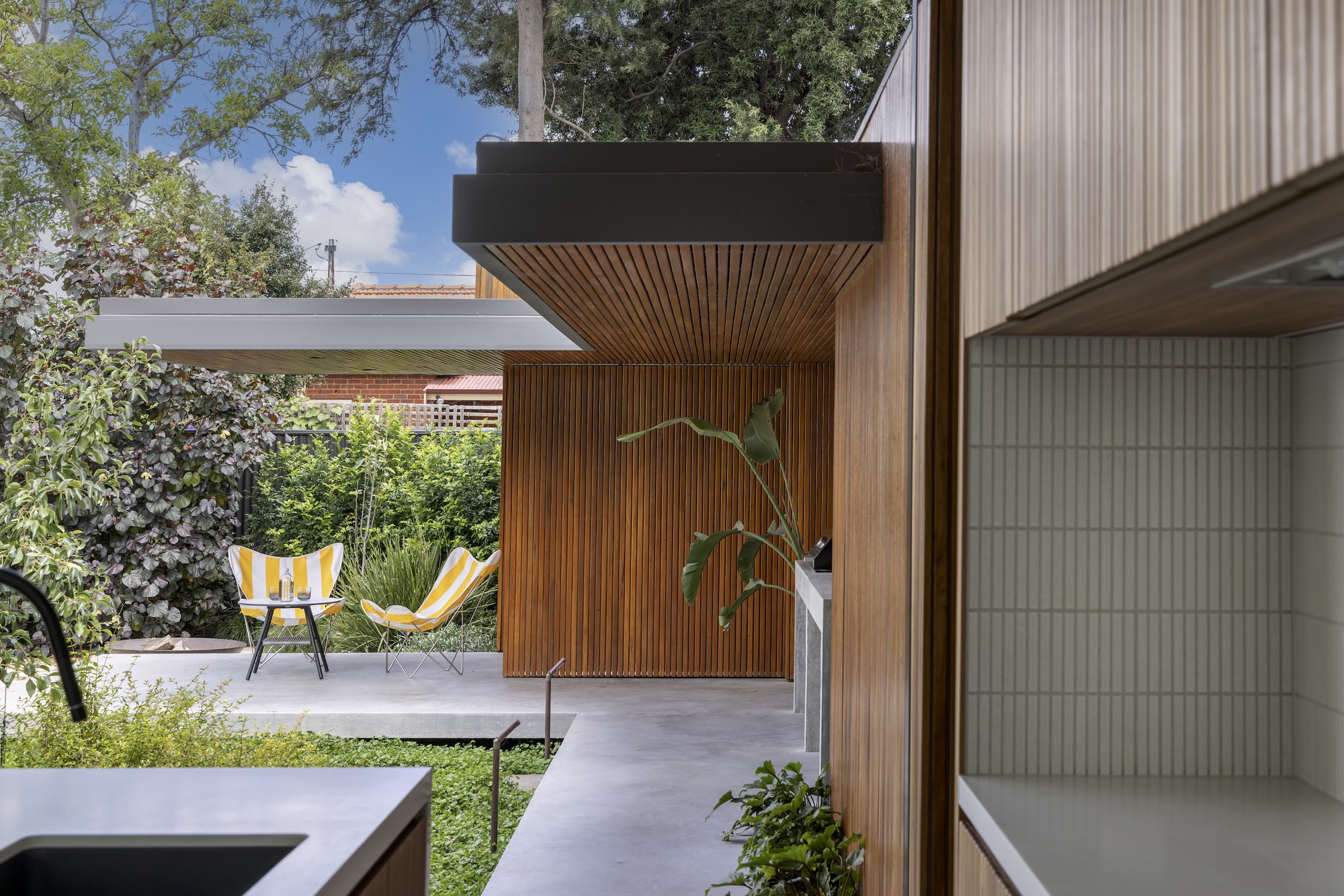
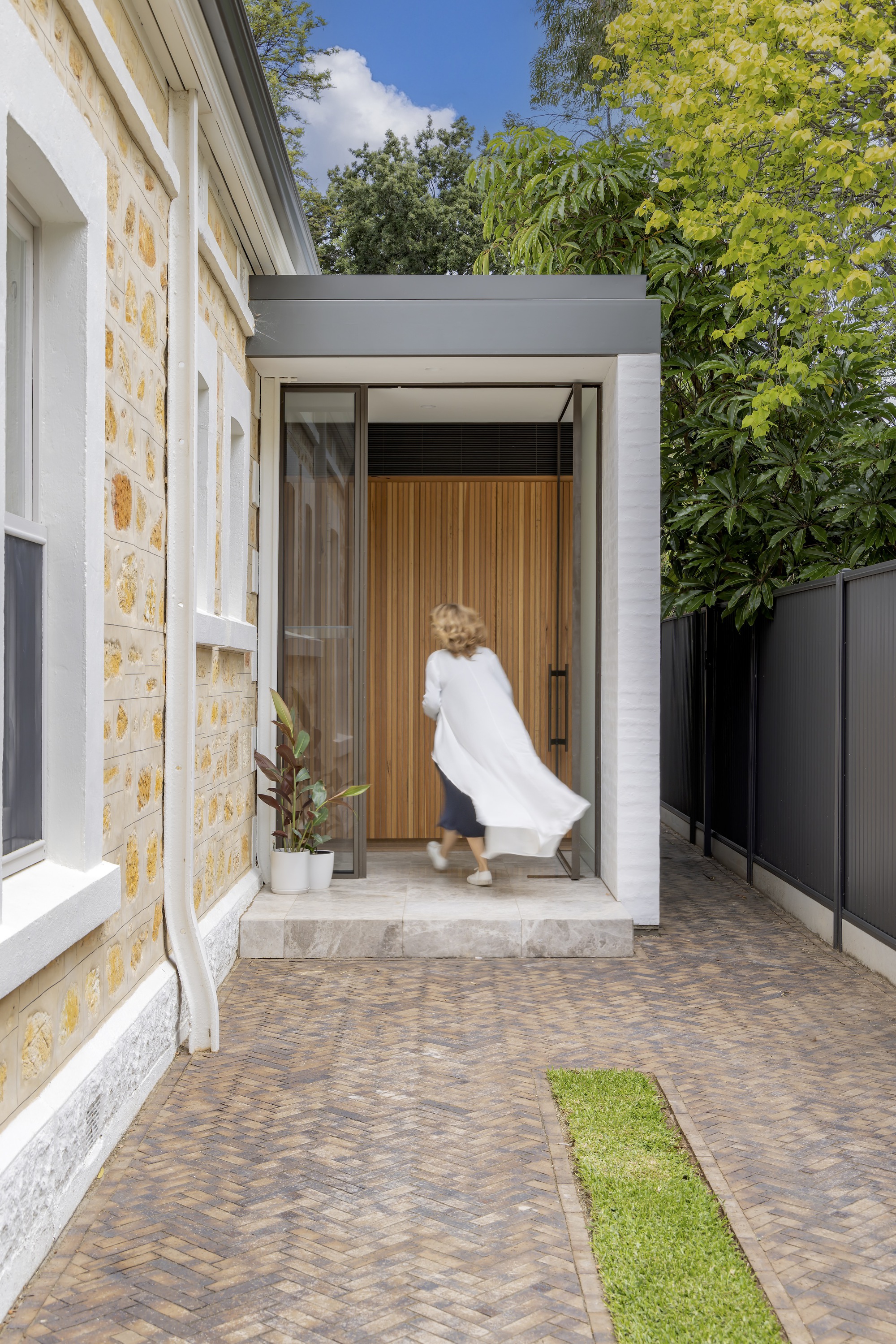
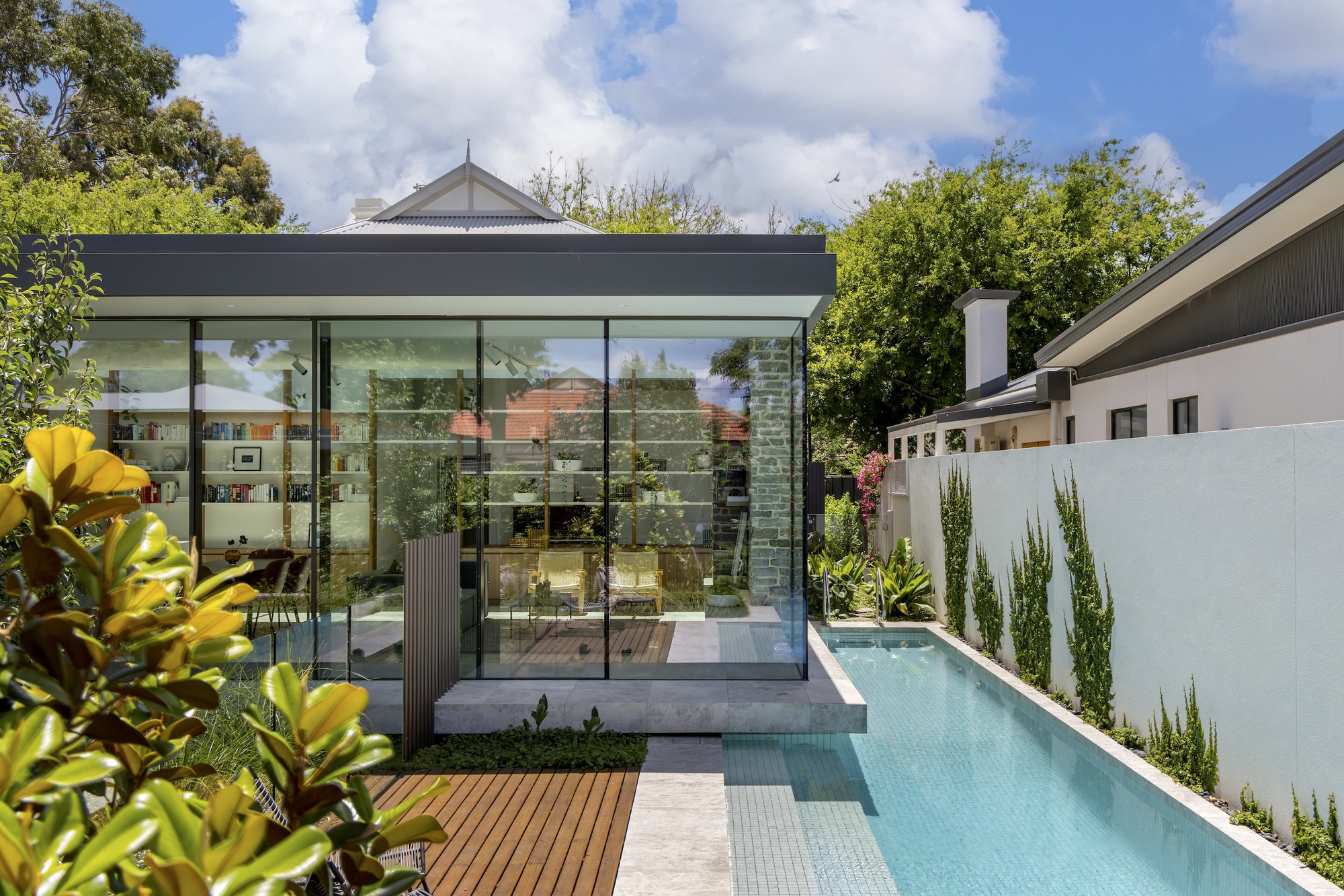
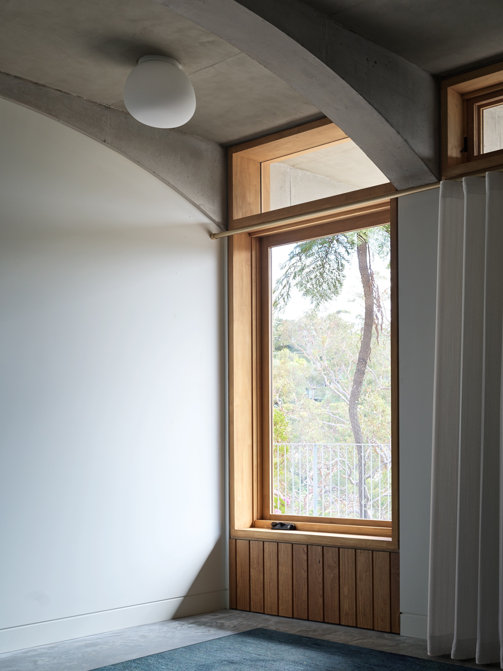
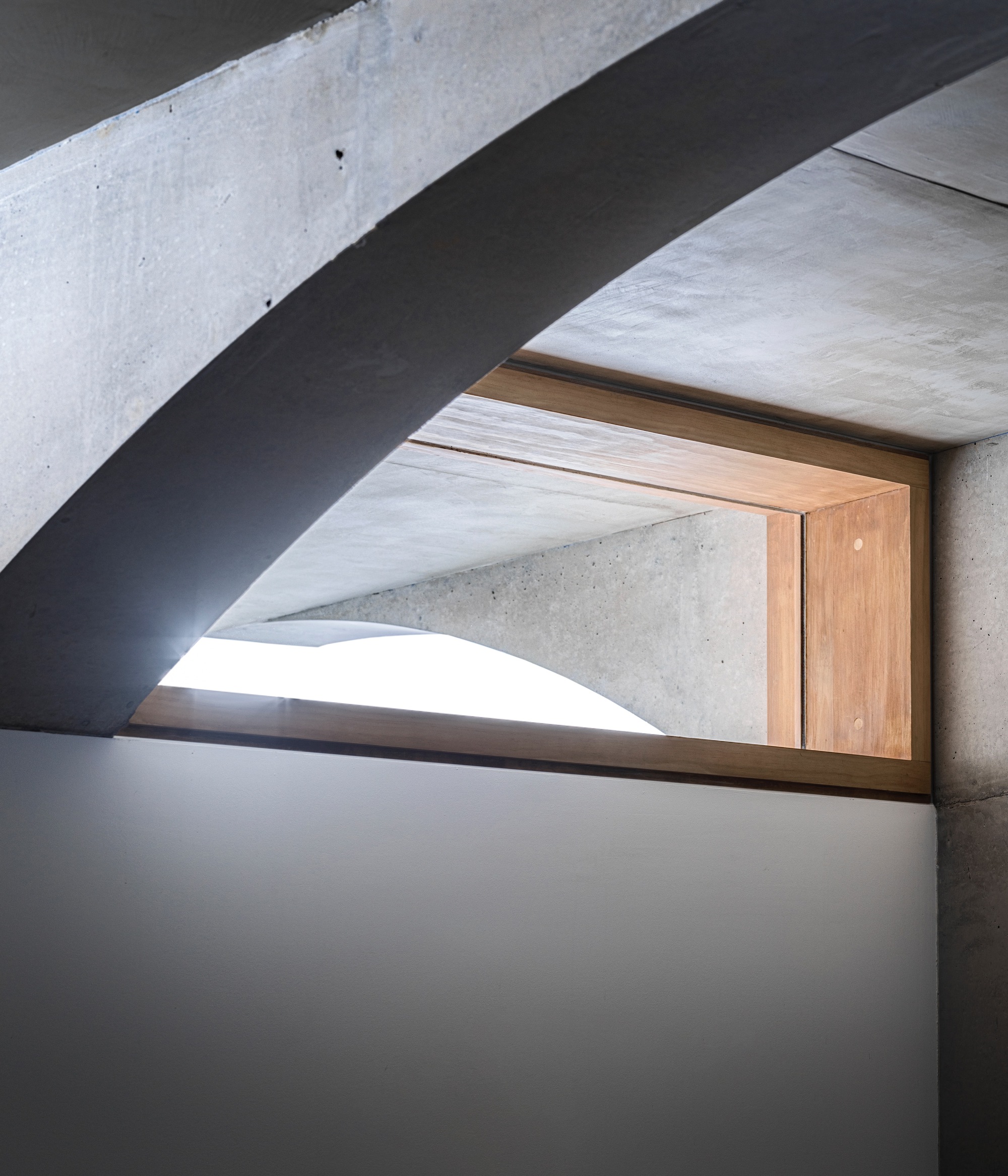
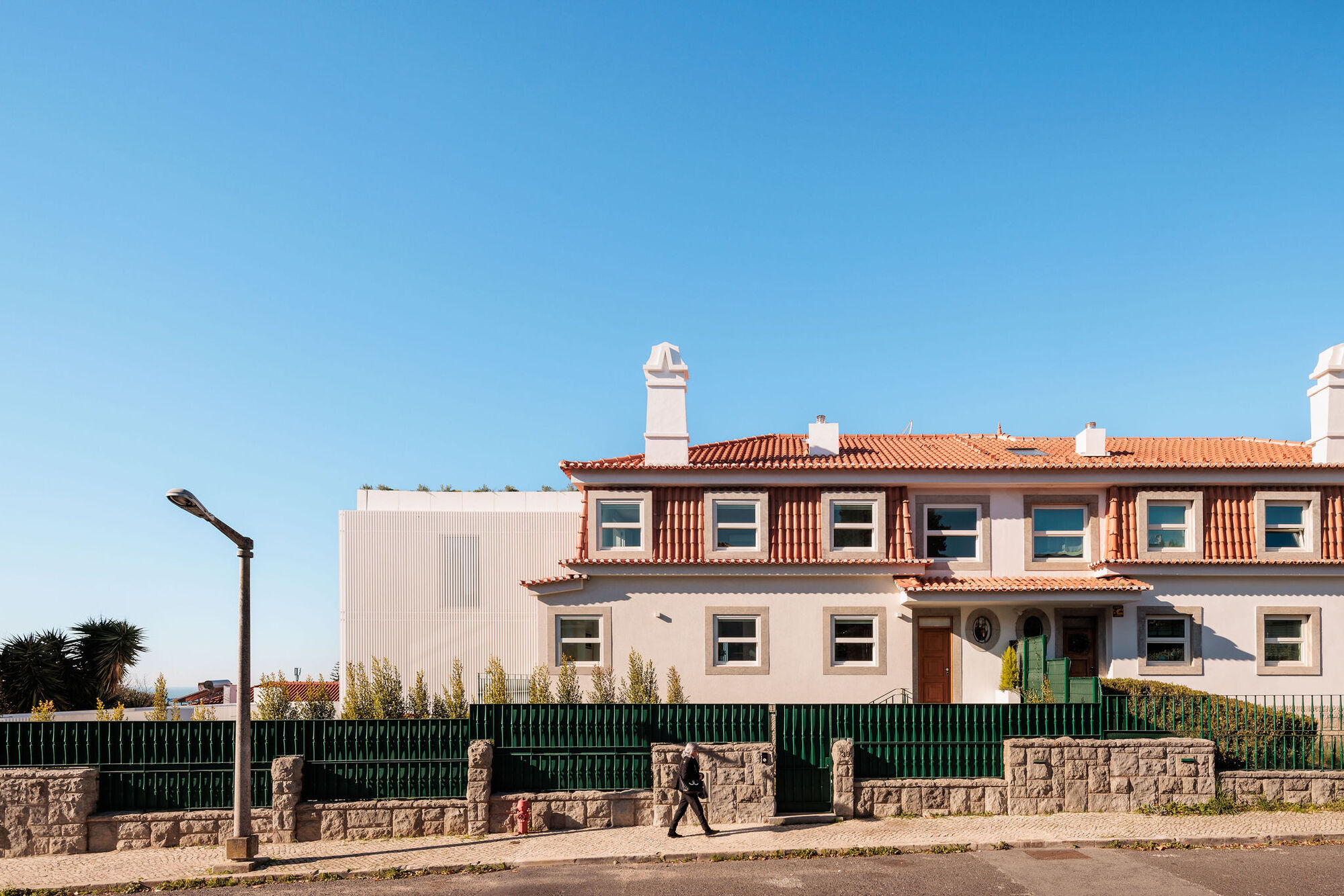
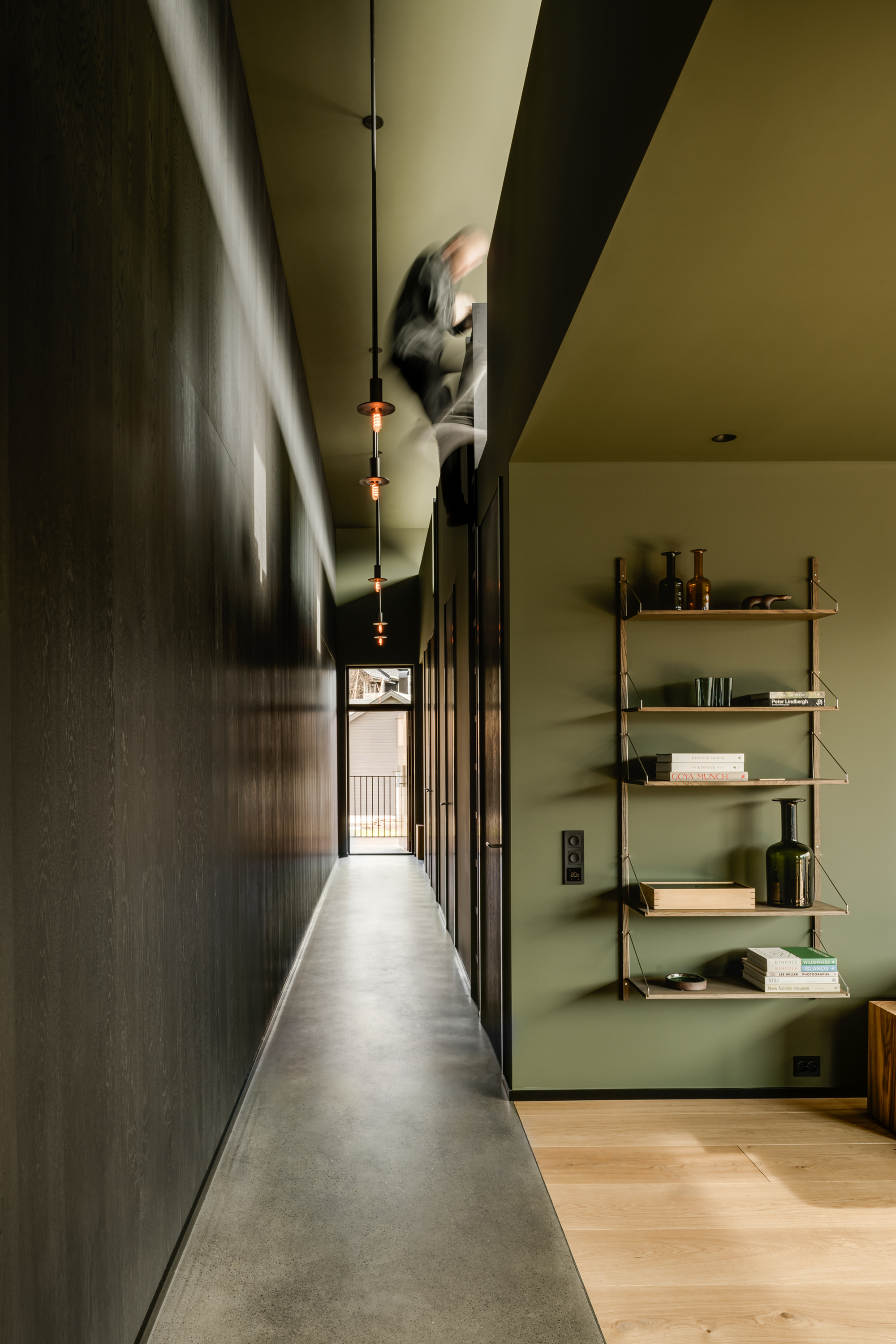
 This little house, originally designed by architect David Luck, is a well-recognized, iconic part of its urban streetscape. However, despite being less than 10 years old, the exterior required considerable remediation for it to shine into the future, and the interior to be reworked to eradicate builder faults and fulfill our client/s needs. Our philosophy when either renovating or adapting architecture for reuse is to re-purpose what we can. We are respectful of what is good and analytical of what can be made of what is there, intervening decisively and of our time as/where needed.
That said, an architect and their architecture always predate any renovation, and we have worked on many significant projects by the contemporaries of William Wardell and the likes of Henry Bastow, Anatol Kagan, Roy Grounds, and Robert Grace, but never someone we know personally. David Luck is a friend and a wonderful architect. We contacted him, of course, and he wasn’t overly concerned about what we might do, even suggesting we pull it down and start again. Given the relative newness of the project and its brilliant concept of adding greenery to the streetscape, our role was to make good, let it be its best representation of self, and layer the original with what was needed to fulfill our client/s brief.
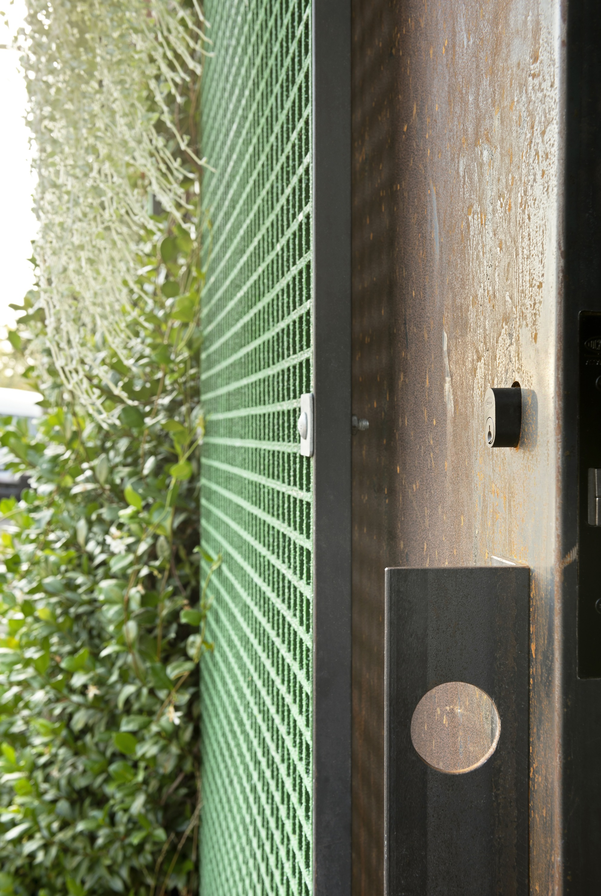
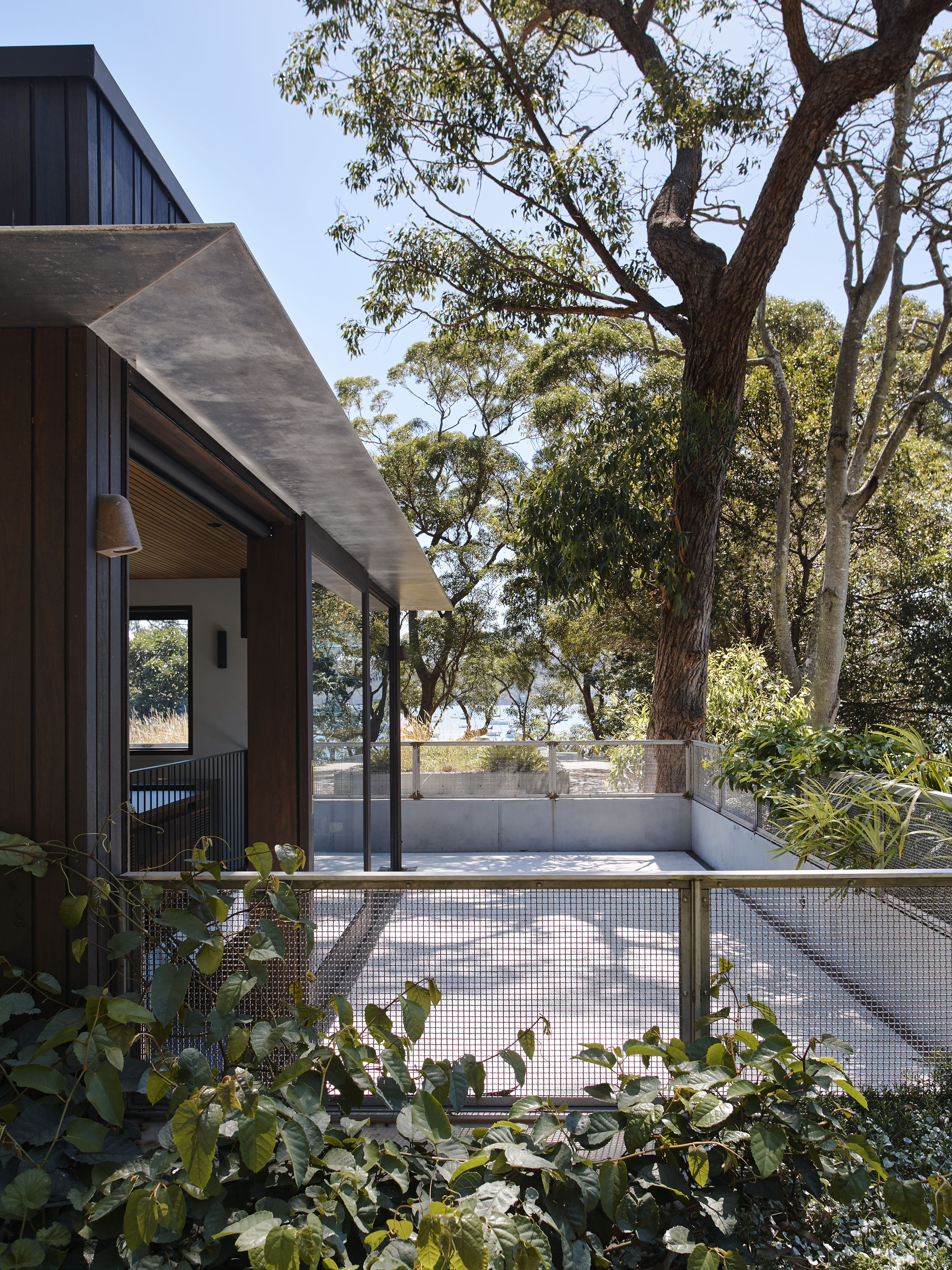
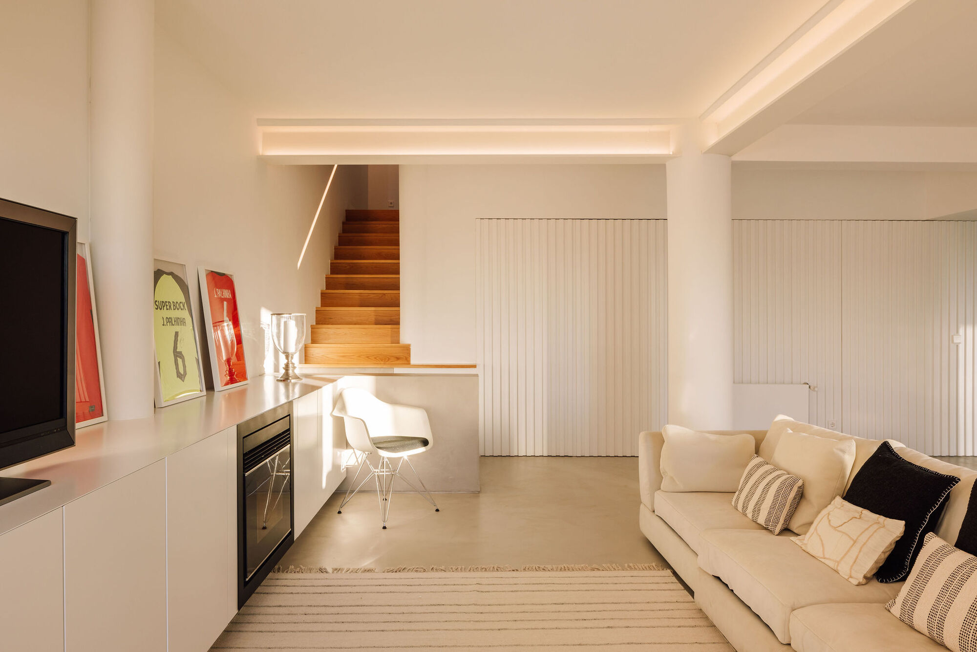
Our work consists of numerous interventions to resolve a set of specific concerns. Externally, this was done by remedying the galvanic corrosion of one metal to the other so as to ensure the longevity of the exterior, as well as resolving issues with the water pumps and irrigation of the façade’s garden beds. FRP security screens were also added to shield the interiors, not only physically but also visually. That said, there was little in terms of interior flair to be found.
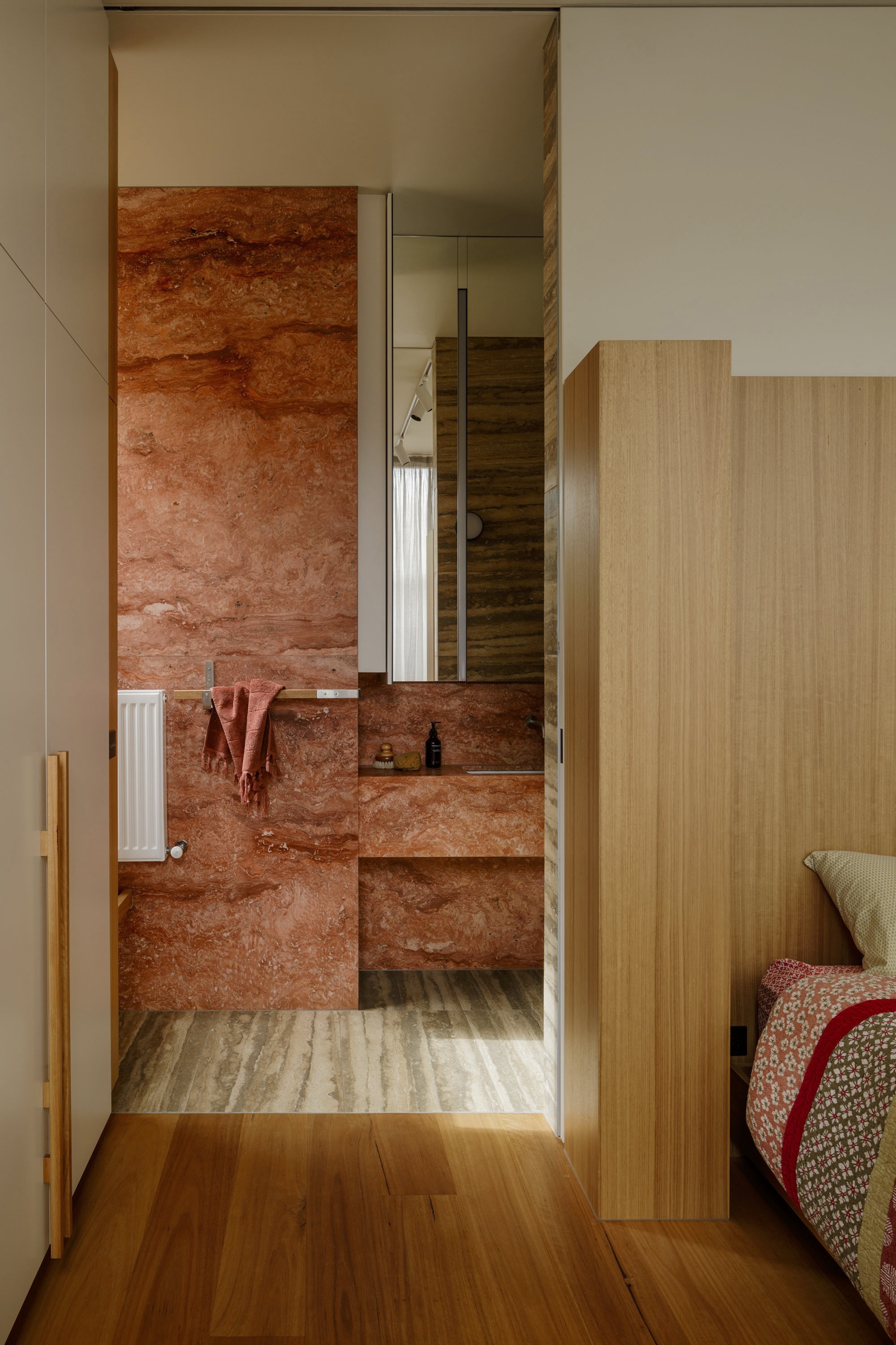
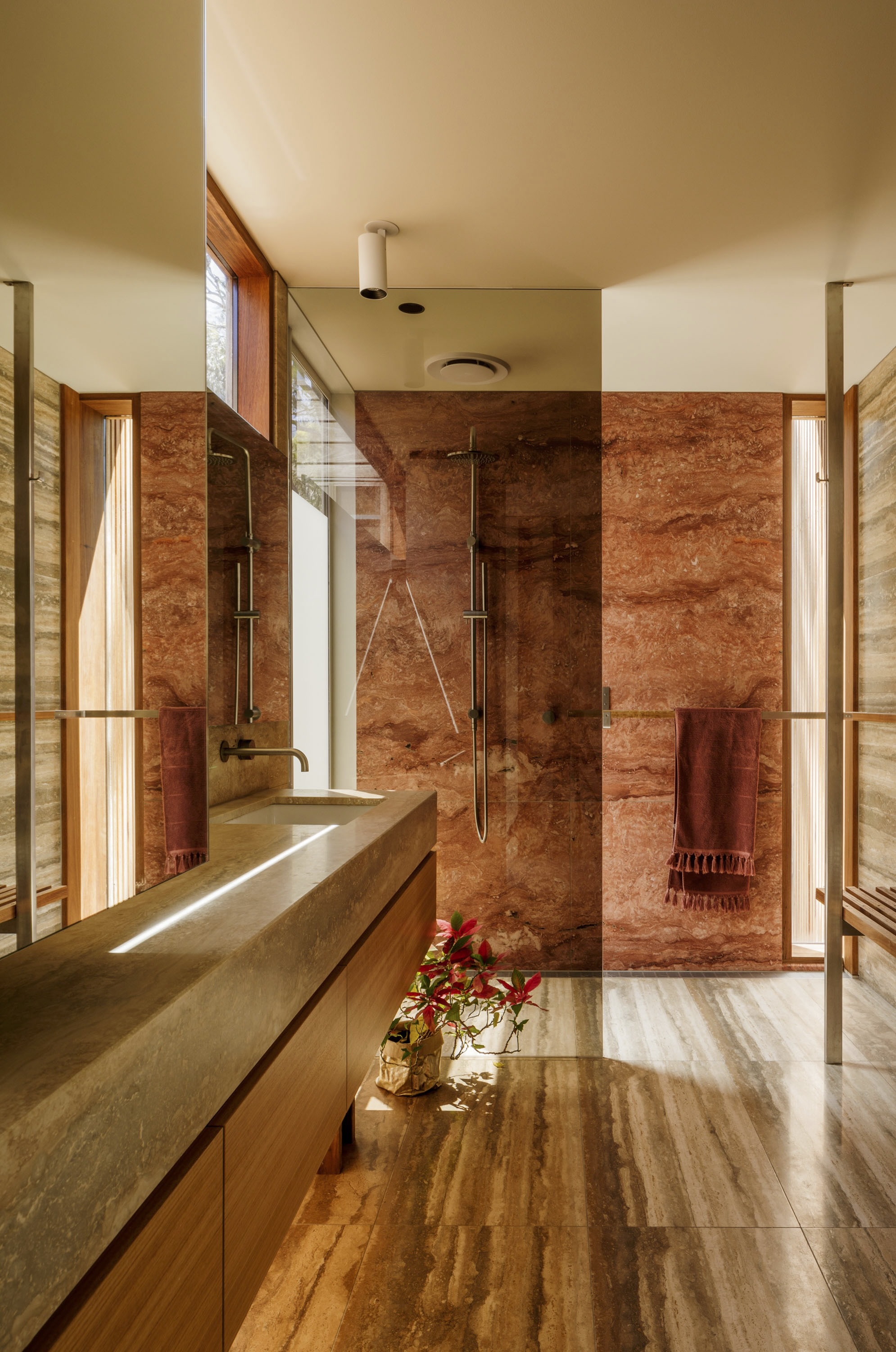
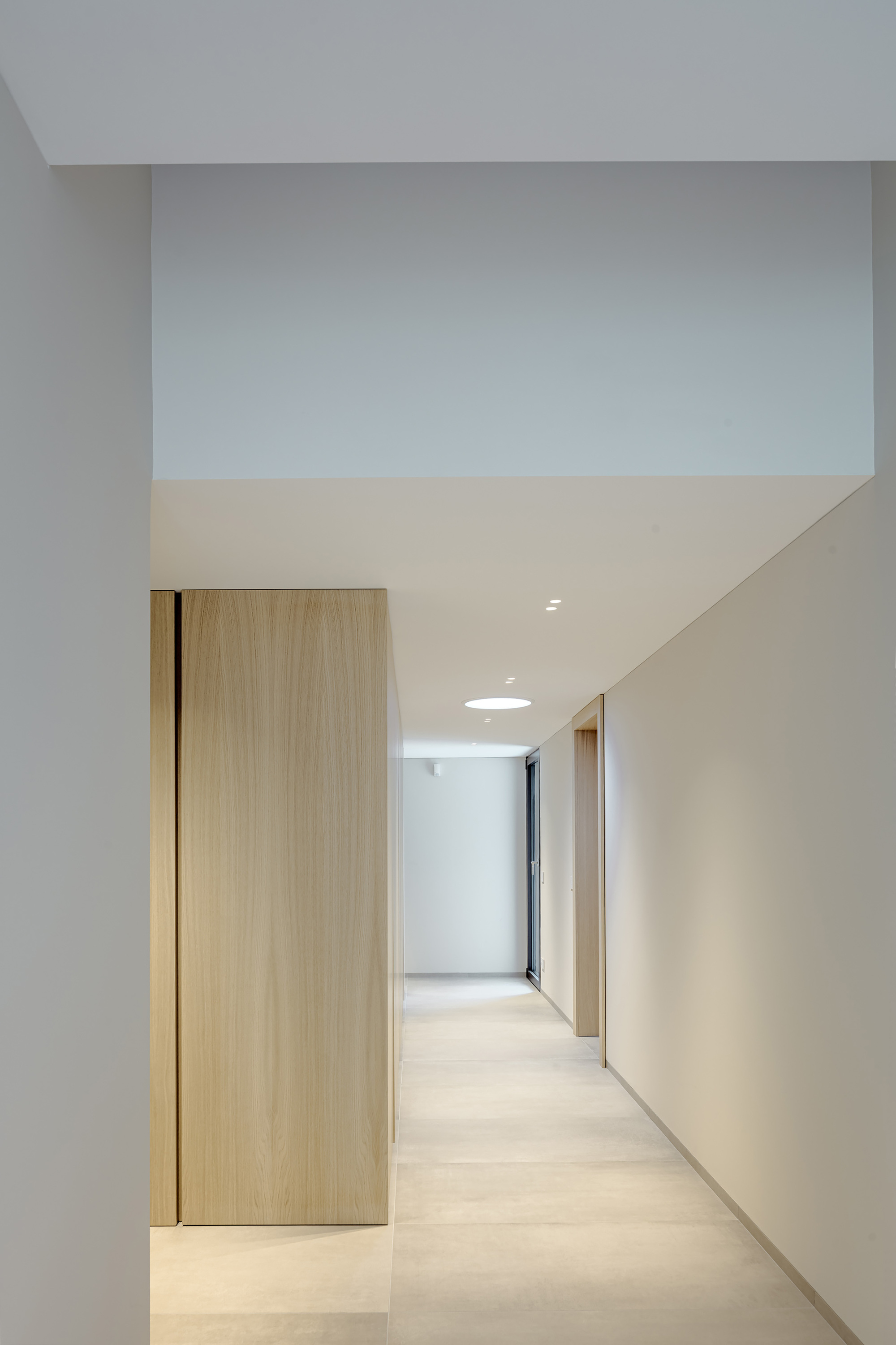
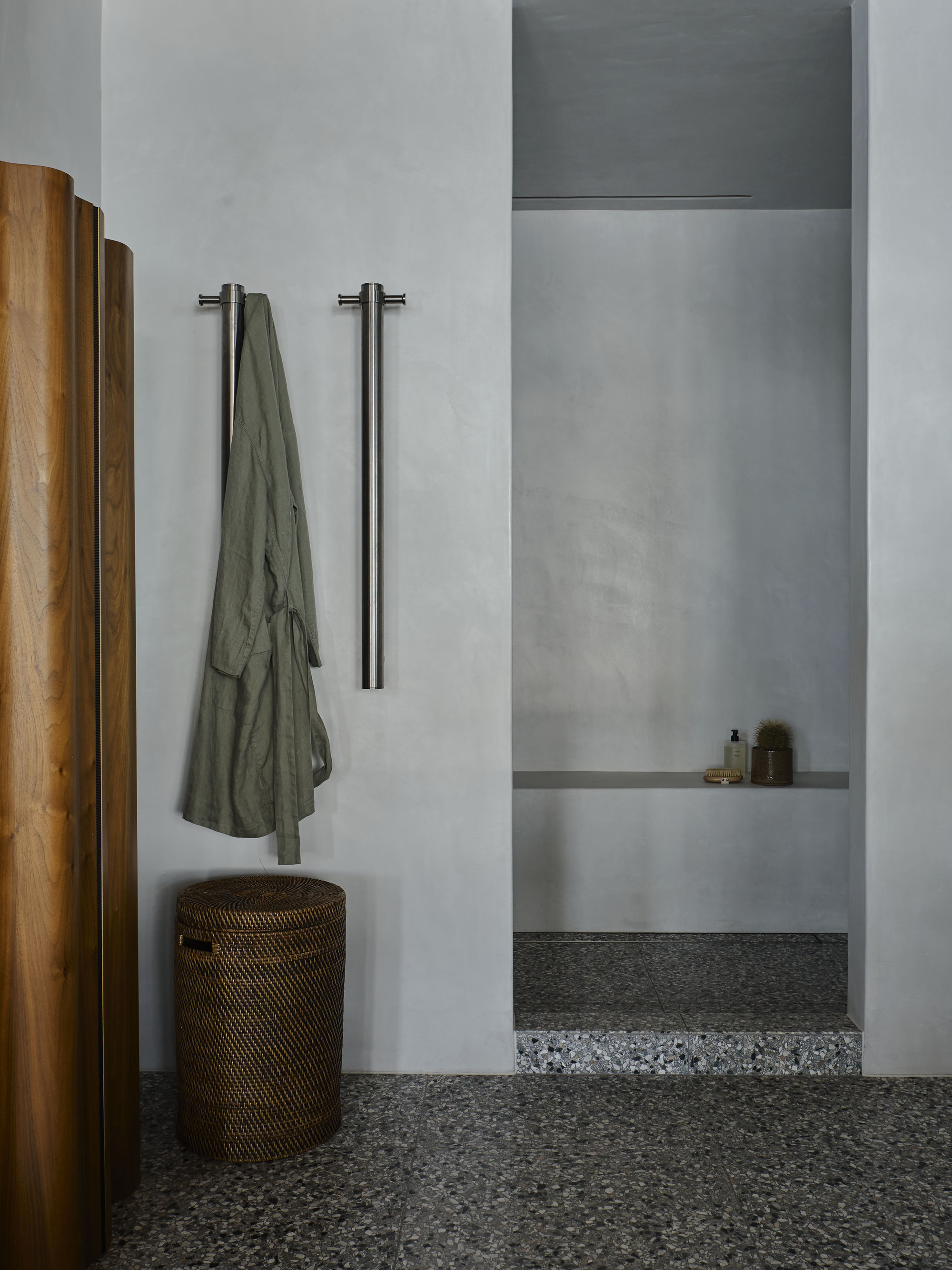
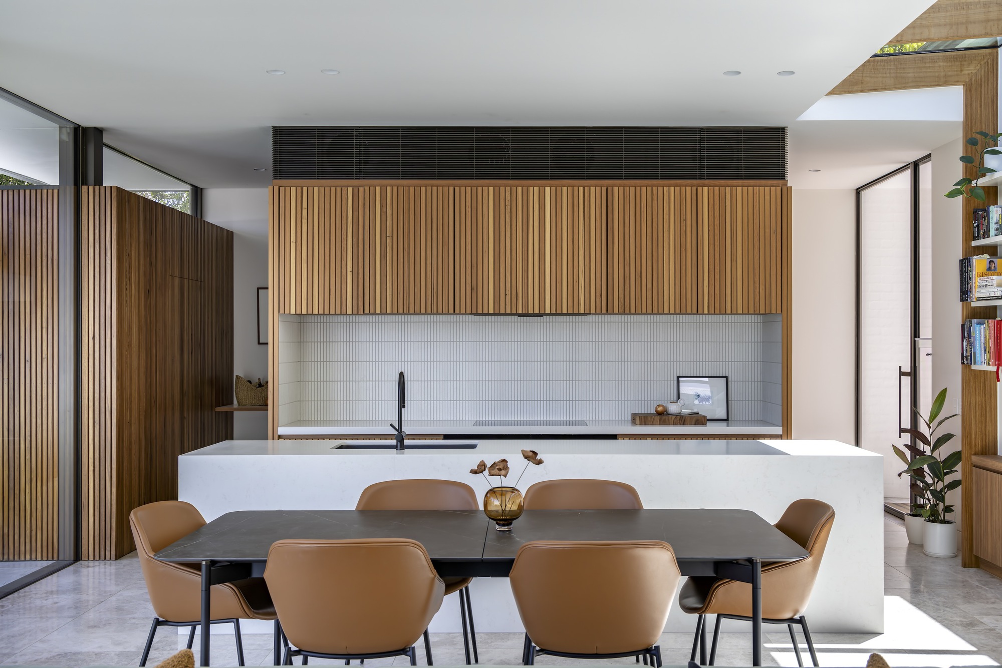
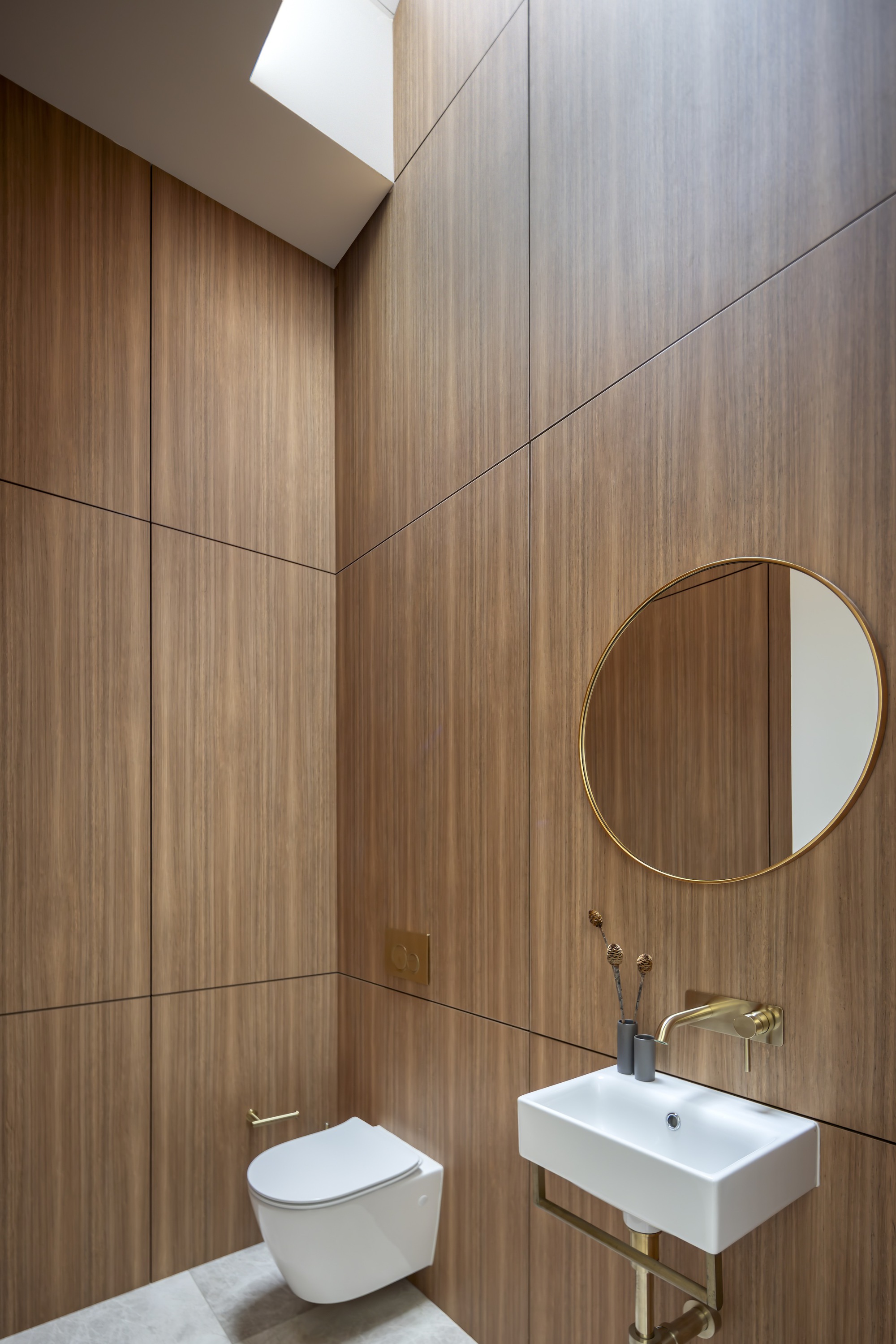
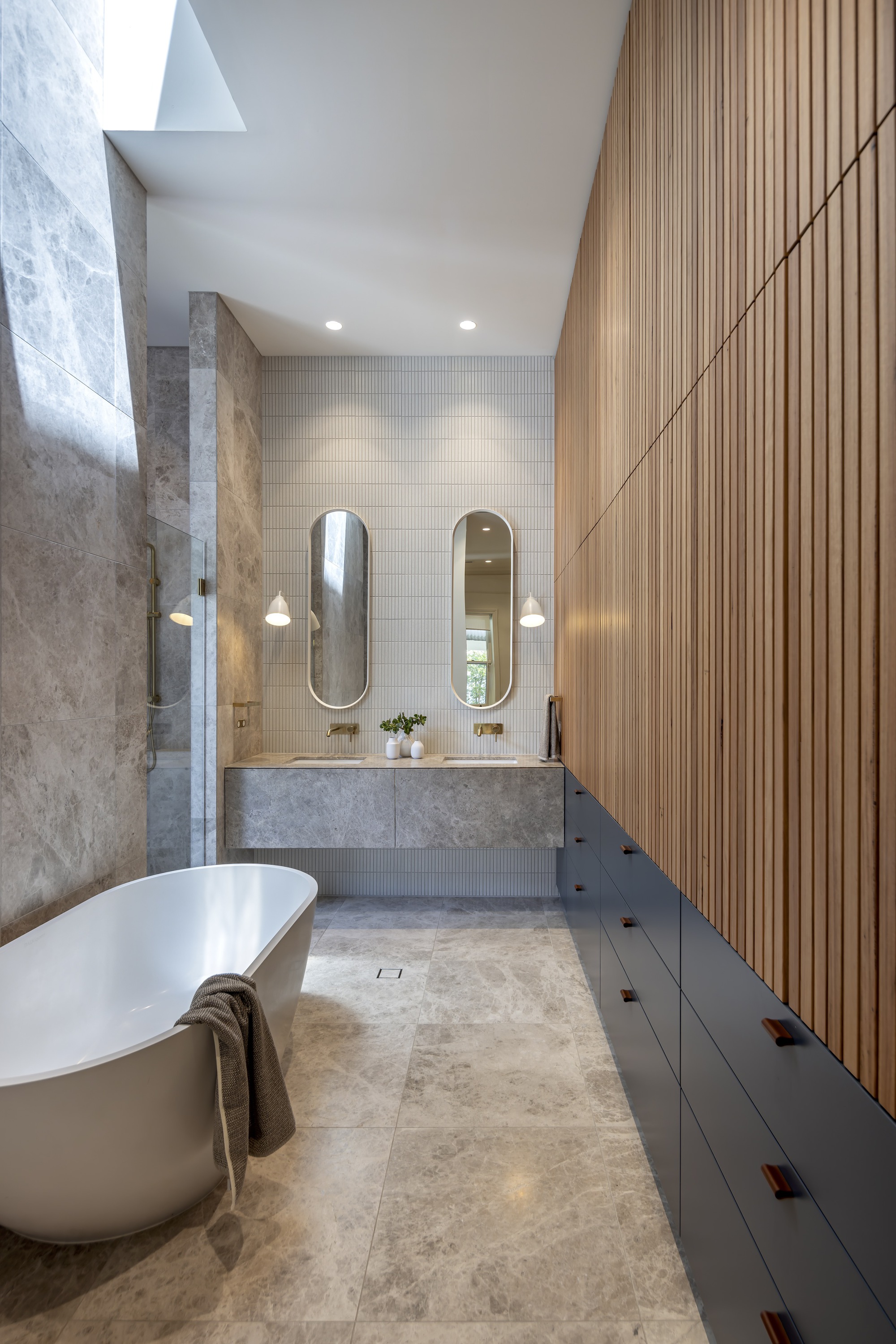
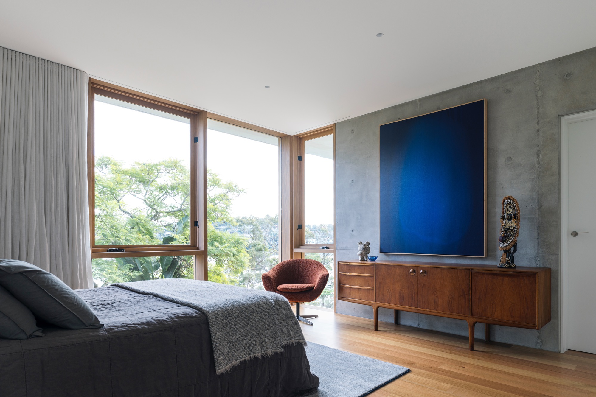
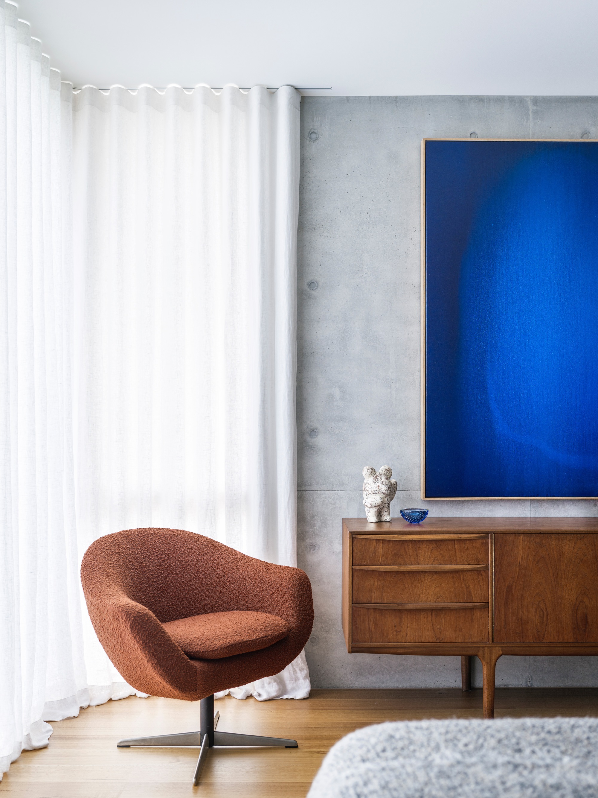
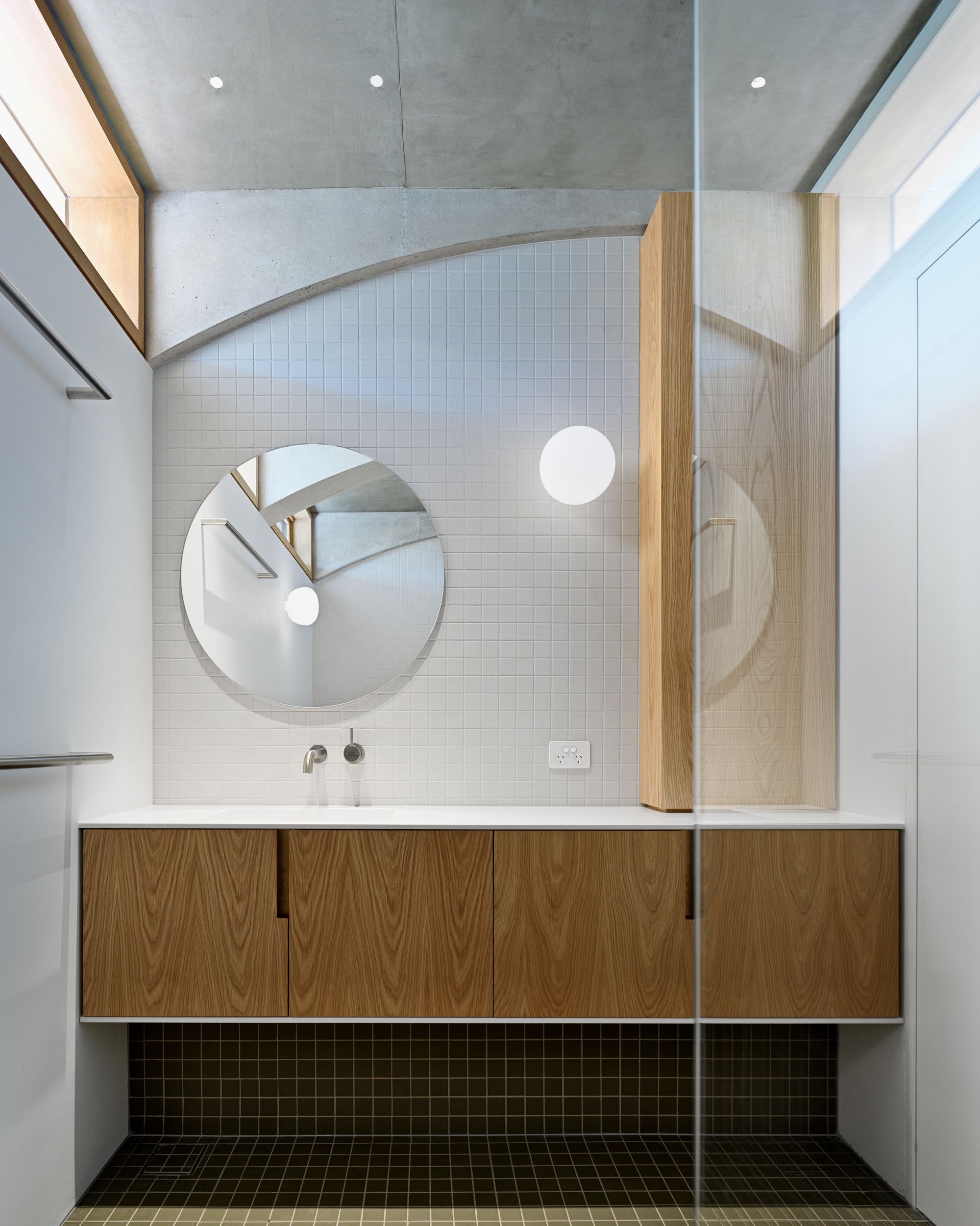
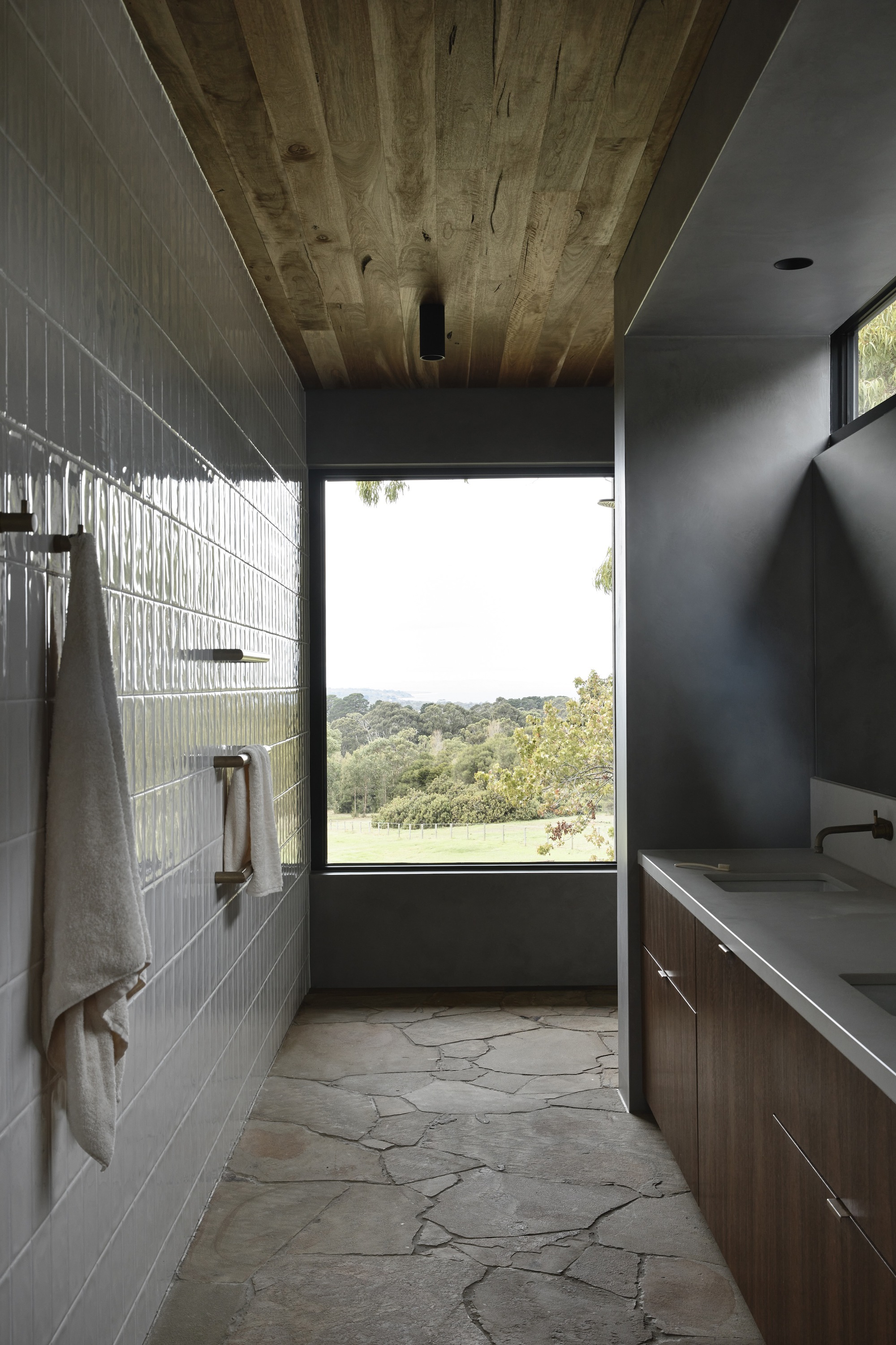
What was there could have been more spatially challenged, poorly executed, and certainly not commensurate with the original concept for the house. Our internal interventions were, we hope, respectful and, while important to give the building longevity, sit comfortably inside the original form. Hinged doors were replaced with sliders to reclaim what little space there already was, and custom joinery was installed to address the lack of storage. The bathroom was remodeled to address a leaky shower and oddly located laundry cupboard, the former being opened up to create a sense of spaciousness that belies the building’s small footprint, and the latter being relocated to the once rarely used upstairs balcony.
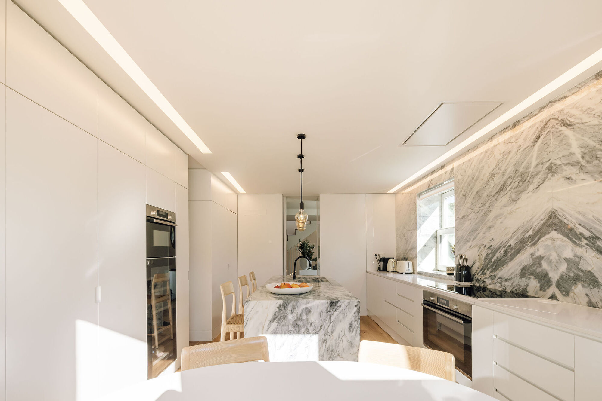
The dingy kitchen was reconfigured to provide more functionality and prep space so as to imbue a feeling of generosity and openness in such a small space, with the living area having custom seating built in to host the client/s dinner parties within the confines of such a small building. Ultimately, our aim was to convert this local landmark from house to home and make it work even harder on its pocket handkerchief site whilst always sympathetic to the original vision.
This little house, originally designed by architect David Luck, is a well-recognized, iconic part of its urban streetscape. However, despite being less than 10 years old, the exterior required considerable remediation for it to shine into the future, and the interior to be reworked to eradicate builder faults and fulfill our client/s needs. Our philosophy when either renovating or adapting architecture for reuse is to re-purpose what we can. We are respectful of what is good and analytical of what can be made of what is there, intervening decisively and of our time as/where needed.
That said, an architect and their architecture always predate any renovation, and we have worked on many significant projects by the contemporaries of William Wardell and the likes of Henry Bastow, Anatol Kagan, Roy Grounds, and Robert Grace, but never someone we know personally. David Luck is a friend and a wonderful architect. We contacted him, of course, and he wasn’t overly concerned about what we might do, even suggesting we pull it down and start again. Given the relative newness of the project and its brilliant concept of adding greenery to the streetscape, our role was to make good, let it be its best representation of self, and layer the original with what was needed to fulfill our client/s brief.
Our work consists of numerous interventions to resolve a set of specific concerns. Externally, this was done by remedying the galvanic corrosion of one metal to the other so as to ensure the longevity of the exterior, as well as resolving issues with the water pumps and irrigation of the façade’s garden beds. FRP security screens were also added to shield the interiors, not only physically but also visually. That said, there was little in terms of interior flair to be found.
What was there could have been more spatially challenged, poorly executed, and certainly not commensurate with the original concept for the house. Our internal interventions were, we hope, respectful and, while important to give the building longevity, sit comfortably inside the original form. Hinged doors were replaced with sliders to reclaim what little space there already was, and custom joinery was installed to address the lack of storage. The bathroom was remodeled to address a leaky shower and oddly located laundry cupboard, the former being opened up to create a sense of spaciousness that belies the building’s small footprint, and the latter being relocated to the once rarely used upstairs balcony.
The dingy kitchen was reconfigured to provide more functionality and prep space so as to imbue a feeling of generosity and openness in such a small space, with the living area having custom seating built in to host the client/s dinner parties within the confines of such a small building. Ultimately, our aim was to convert this local landmark from house to home and make it work even harder on its pocket handkerchief site whilst always sympathetic to the original vision.


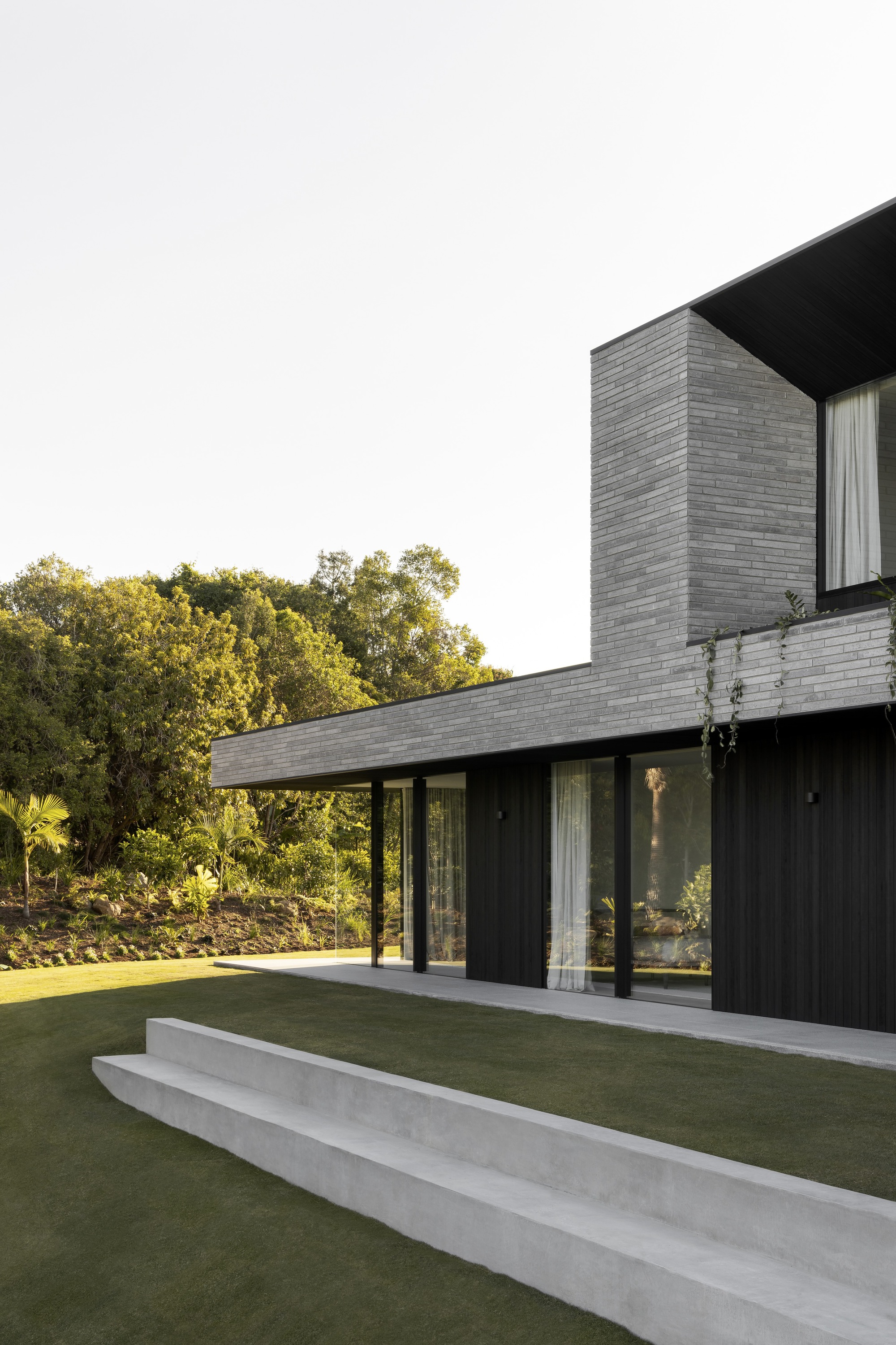
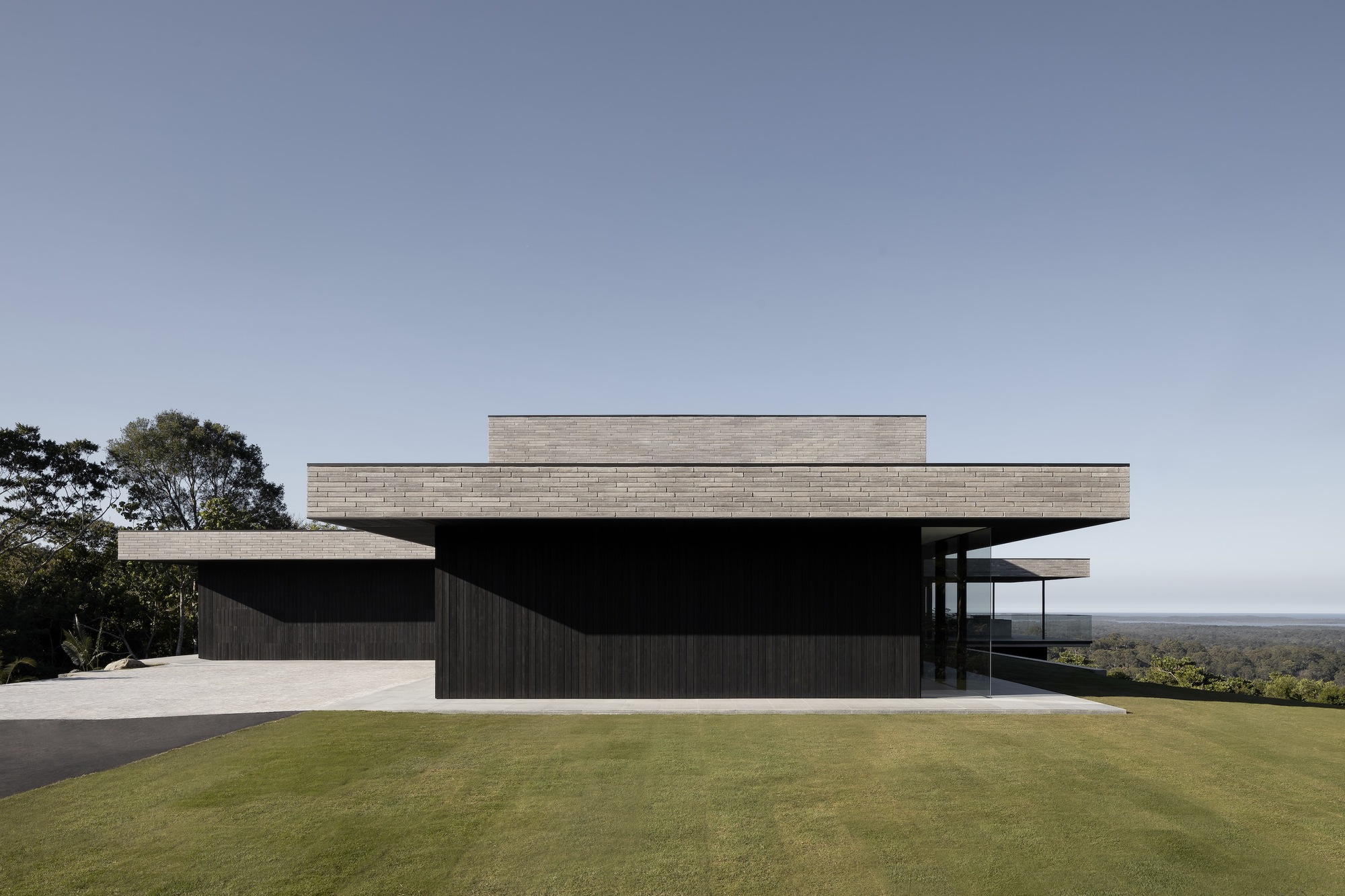
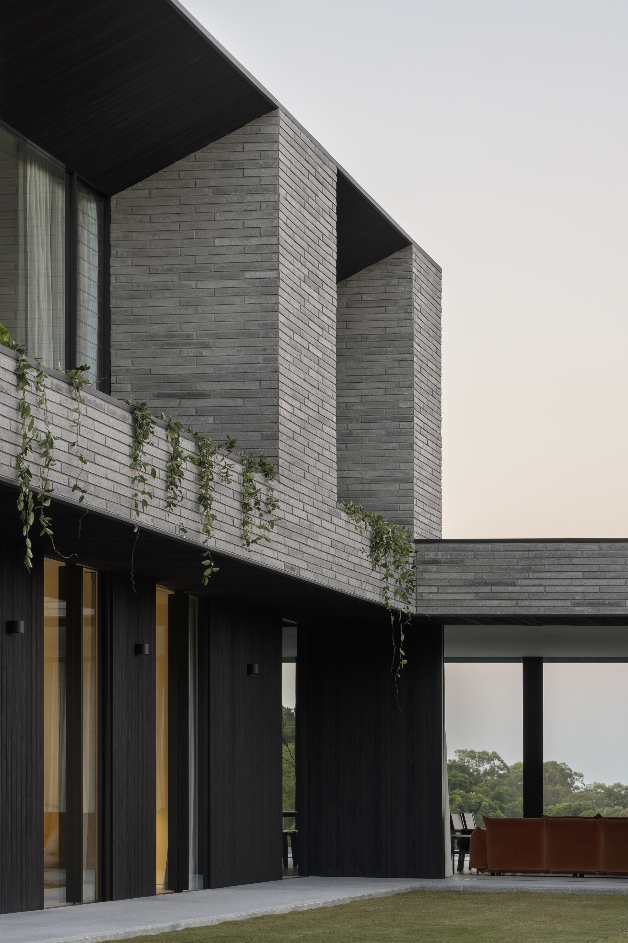
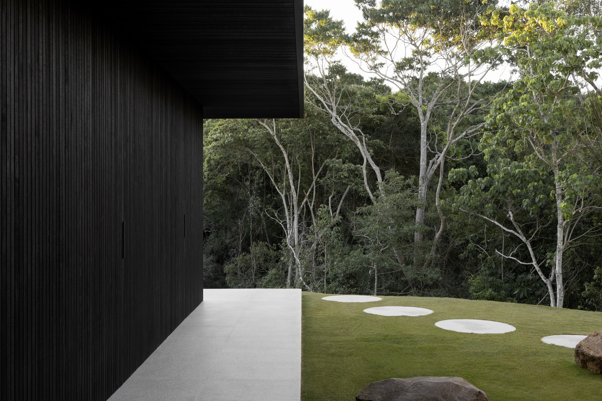

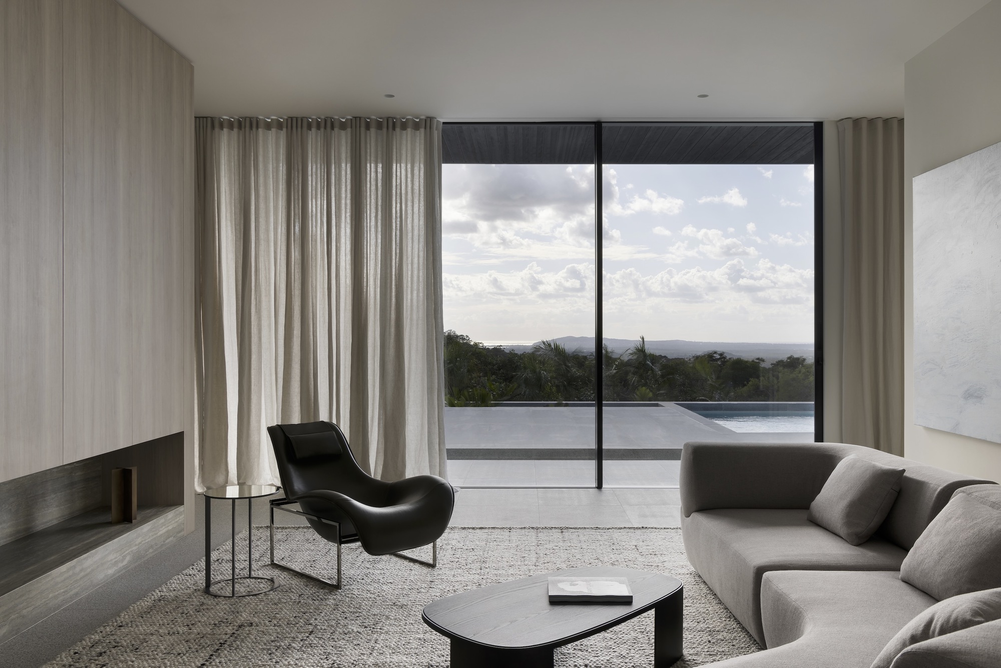
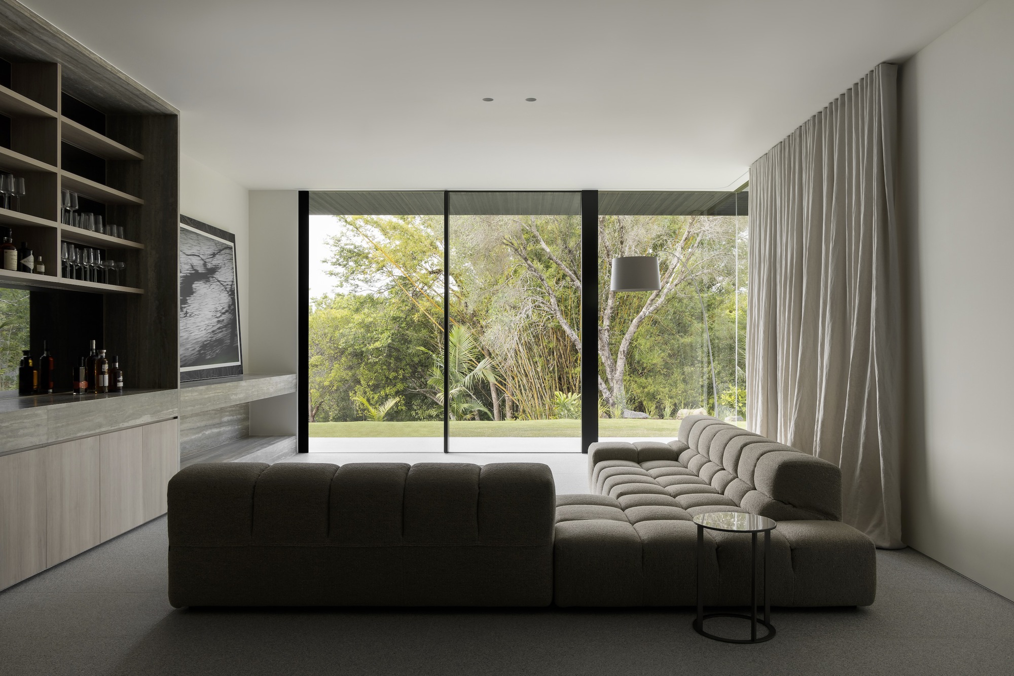
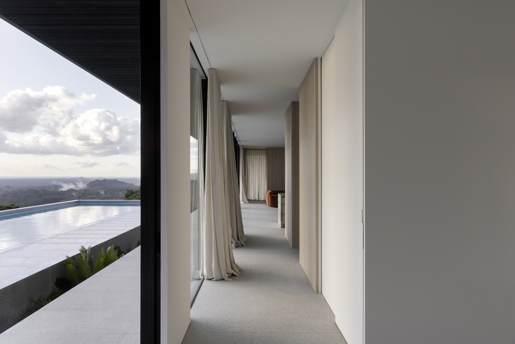
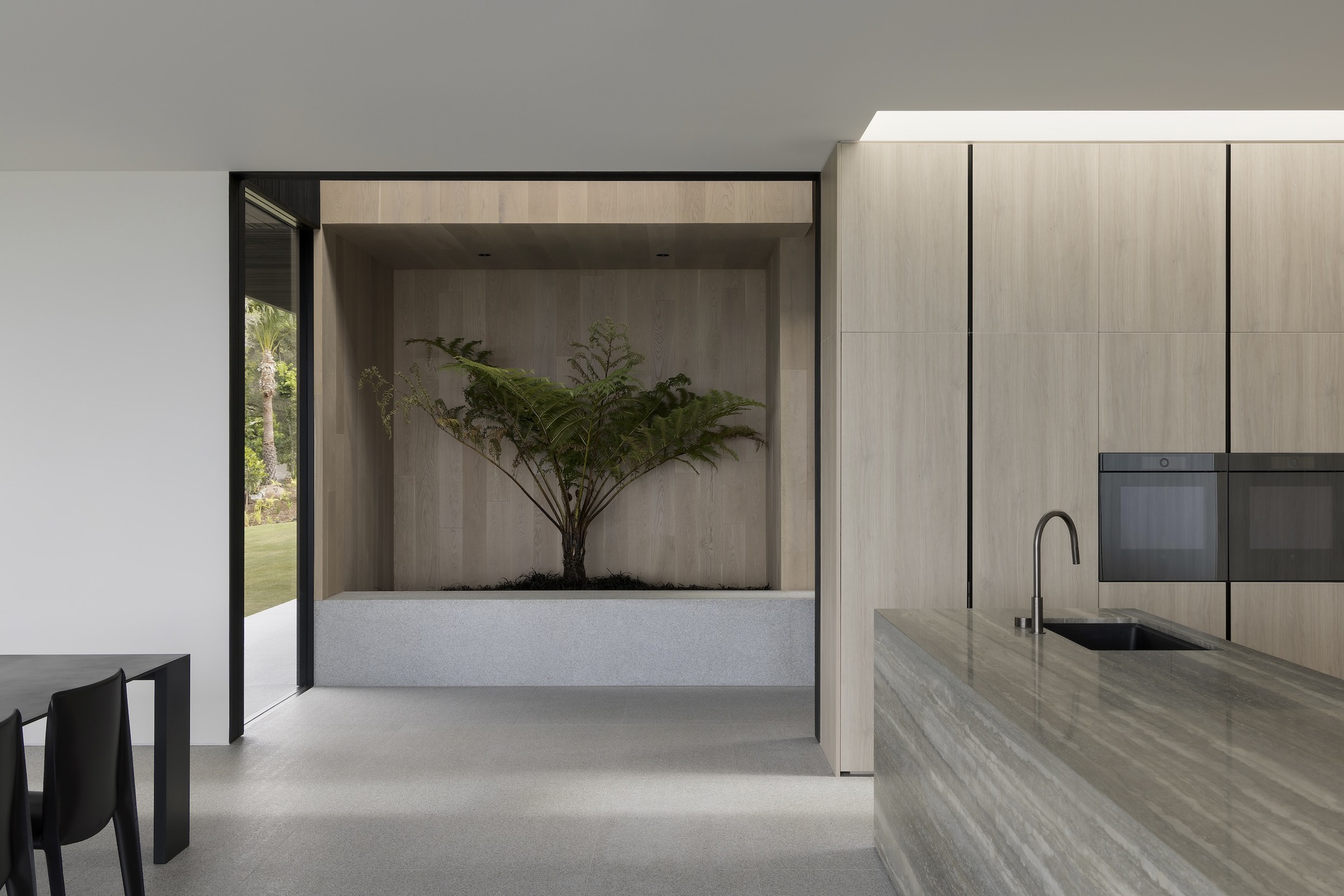
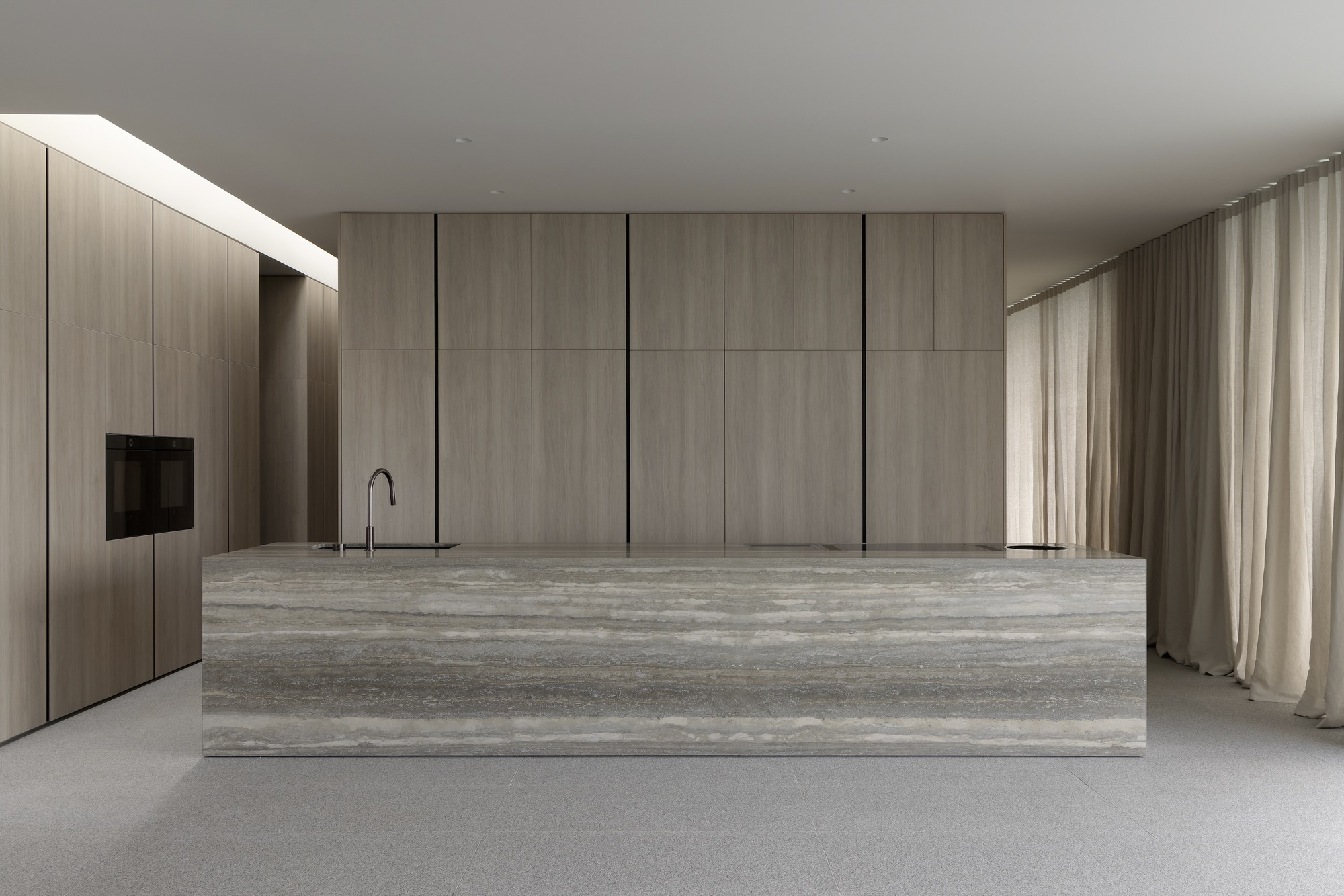
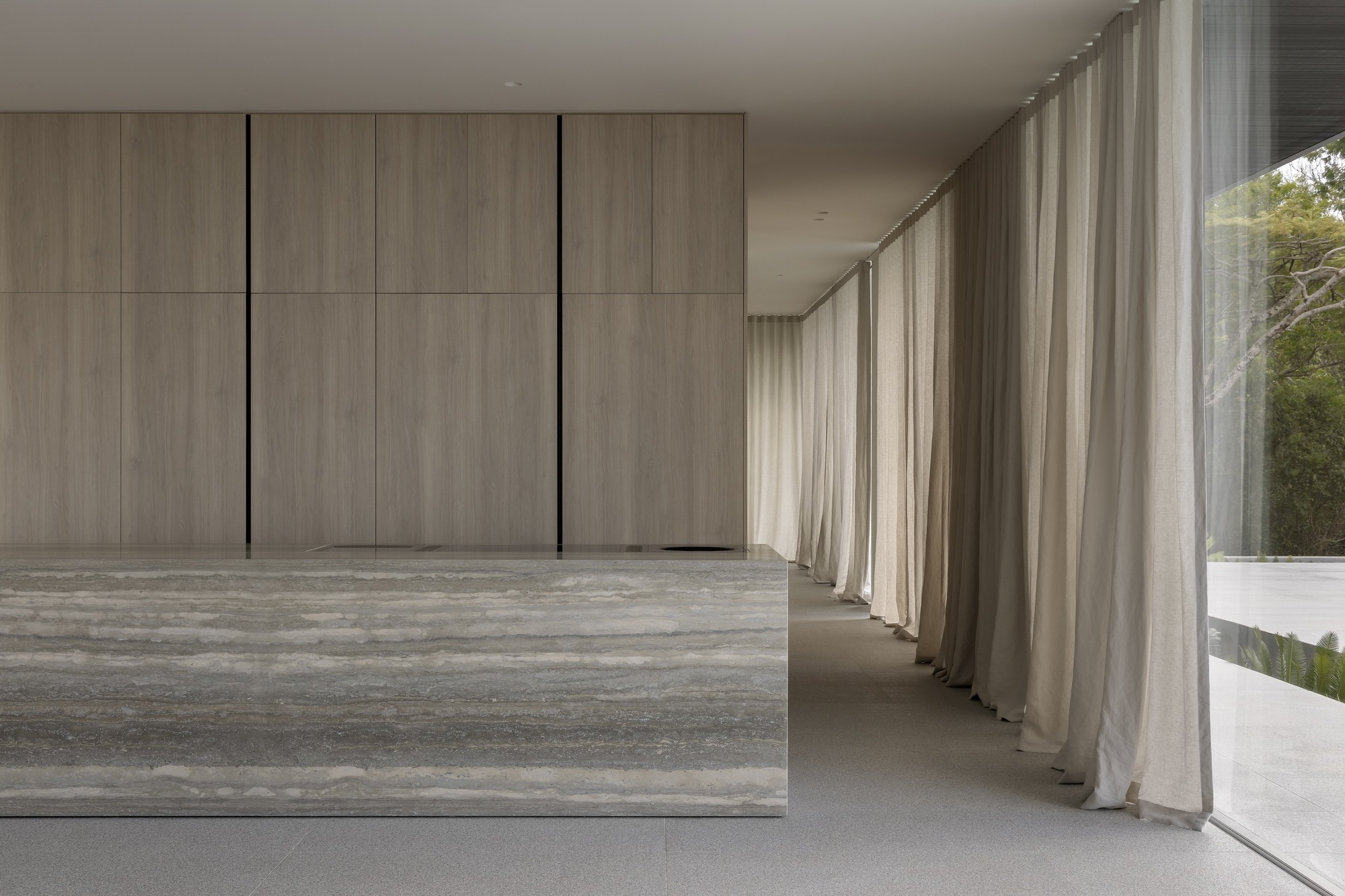
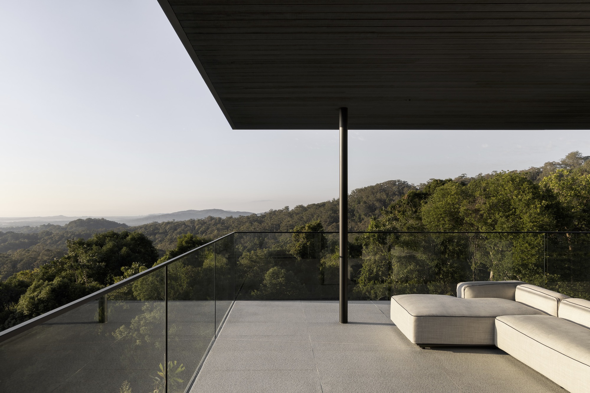

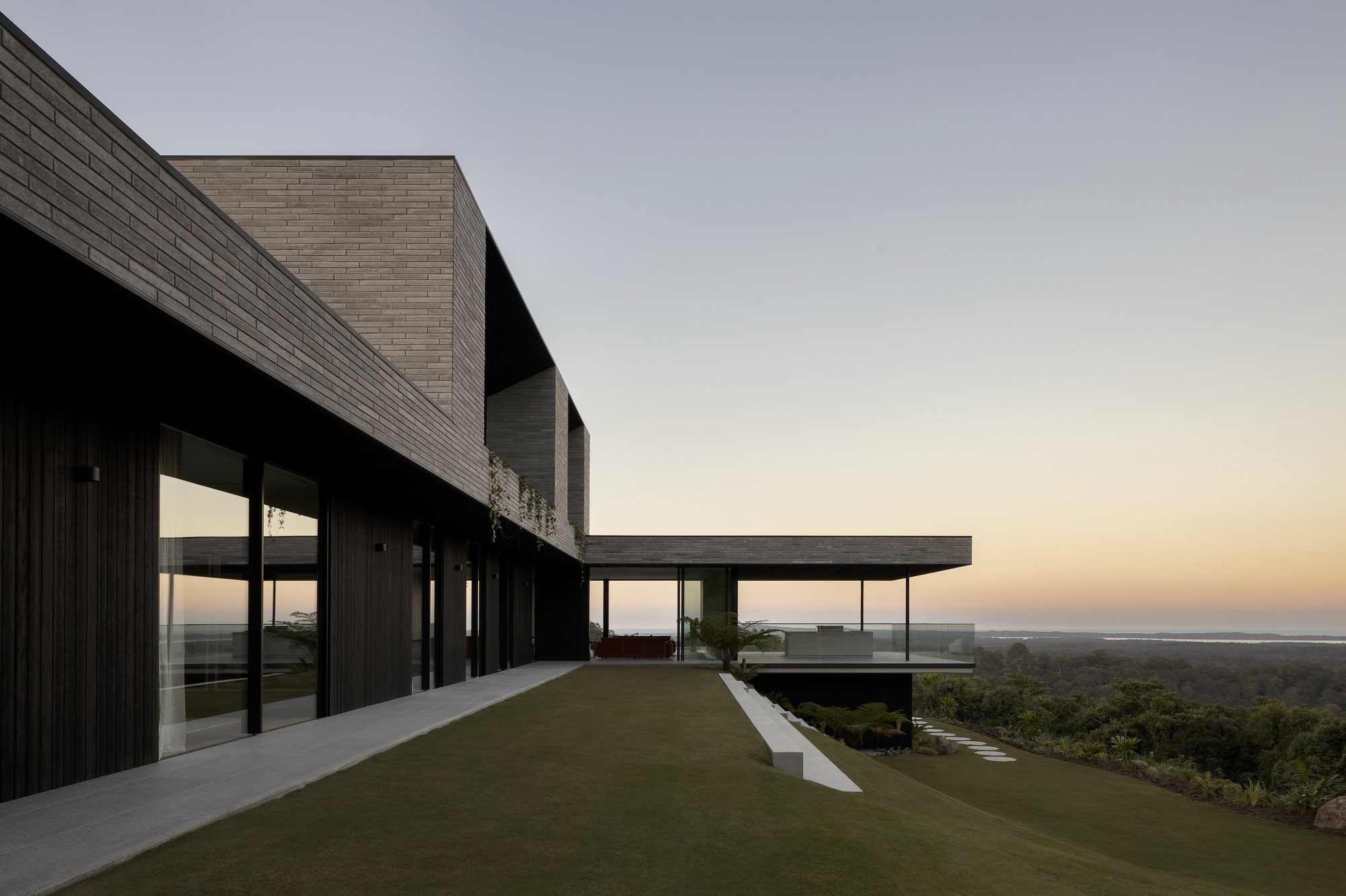
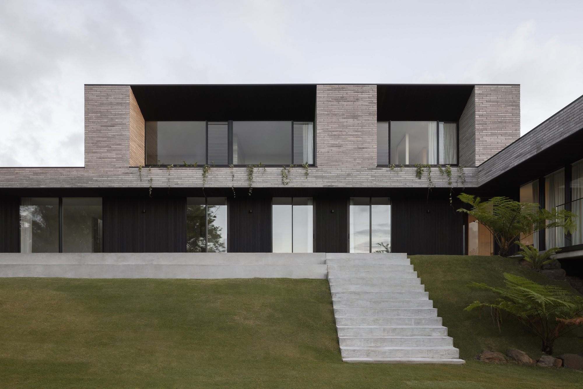
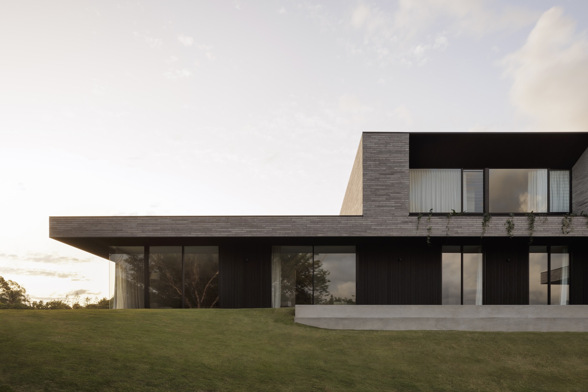
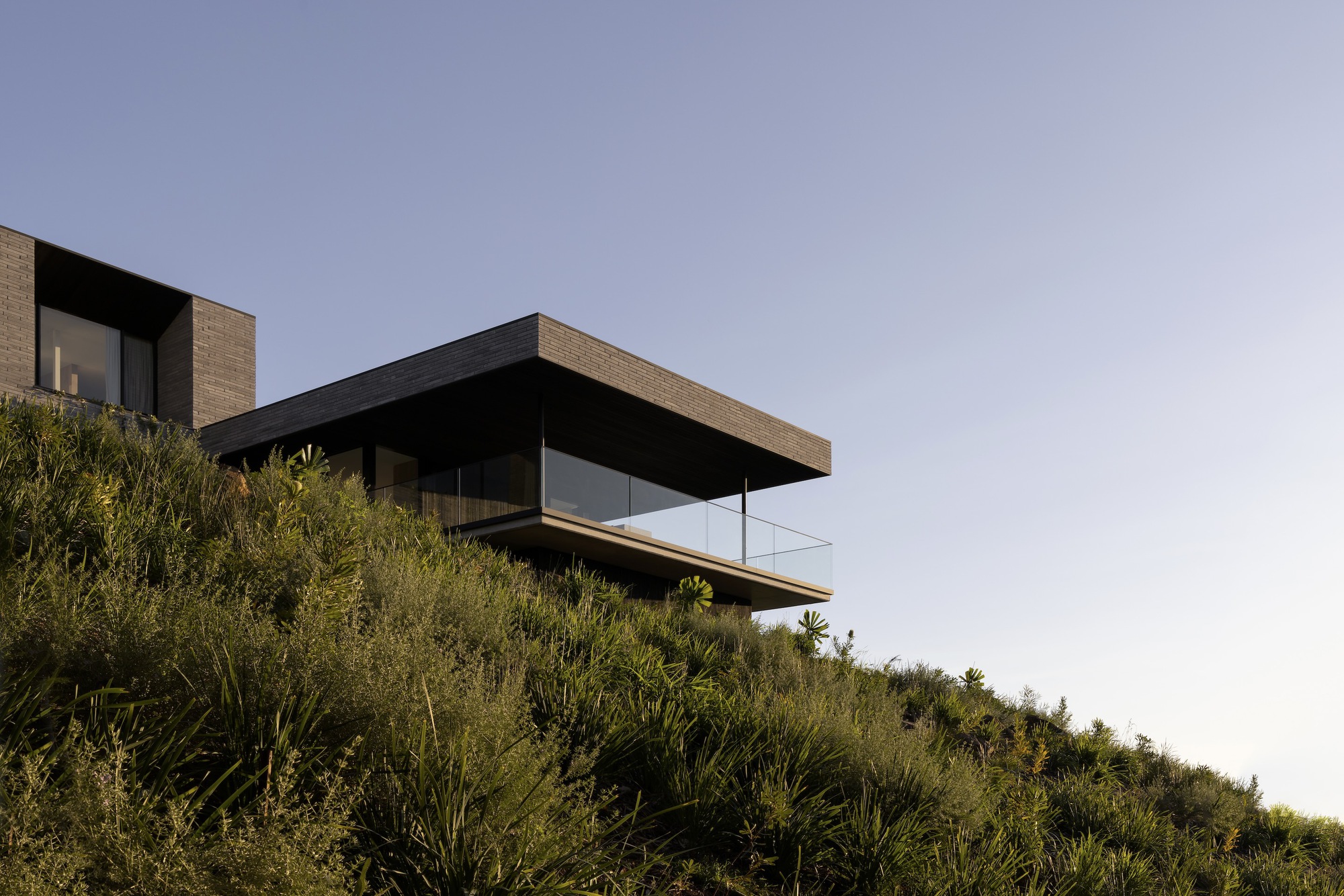
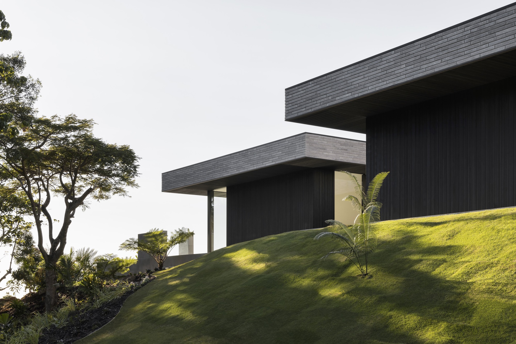
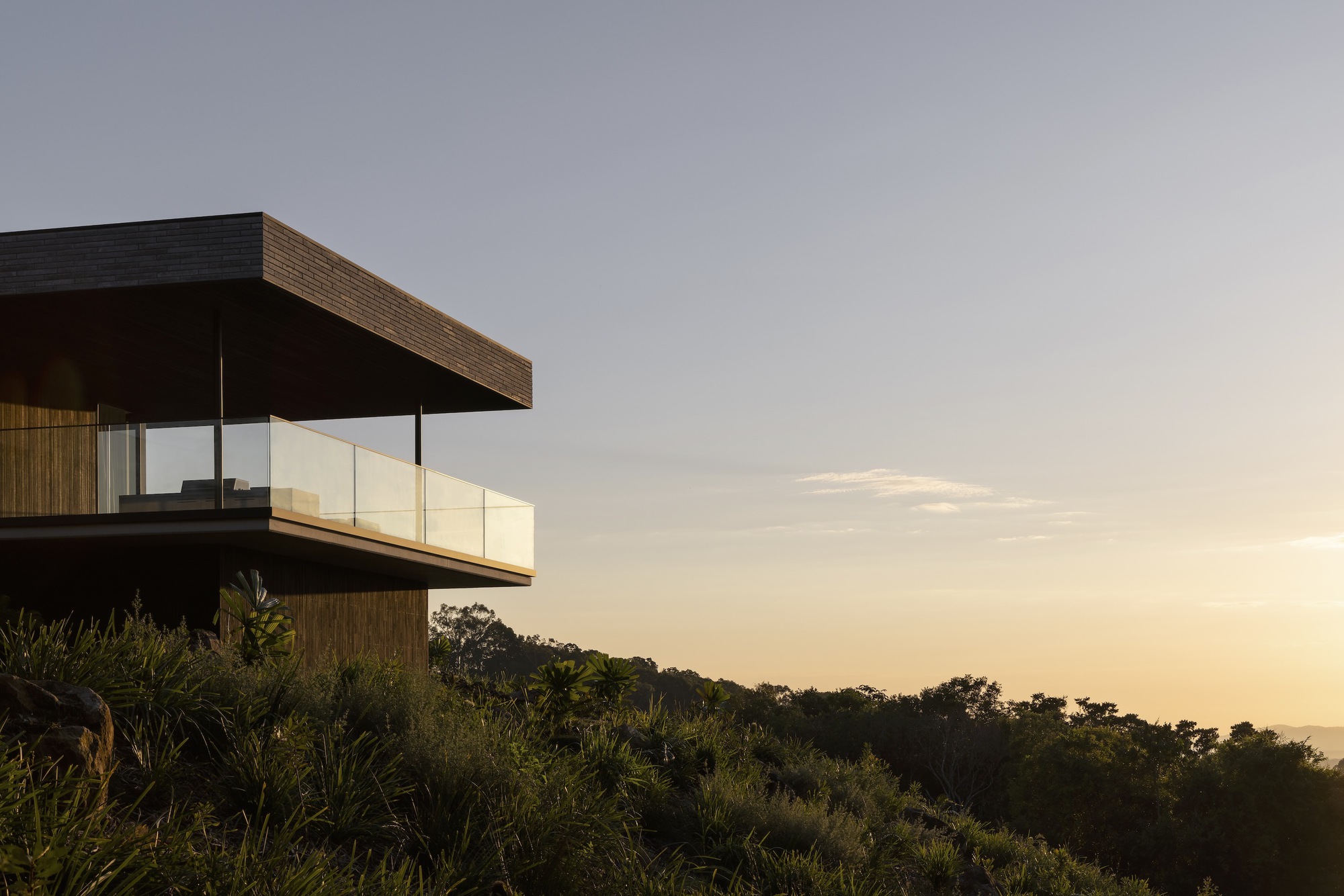
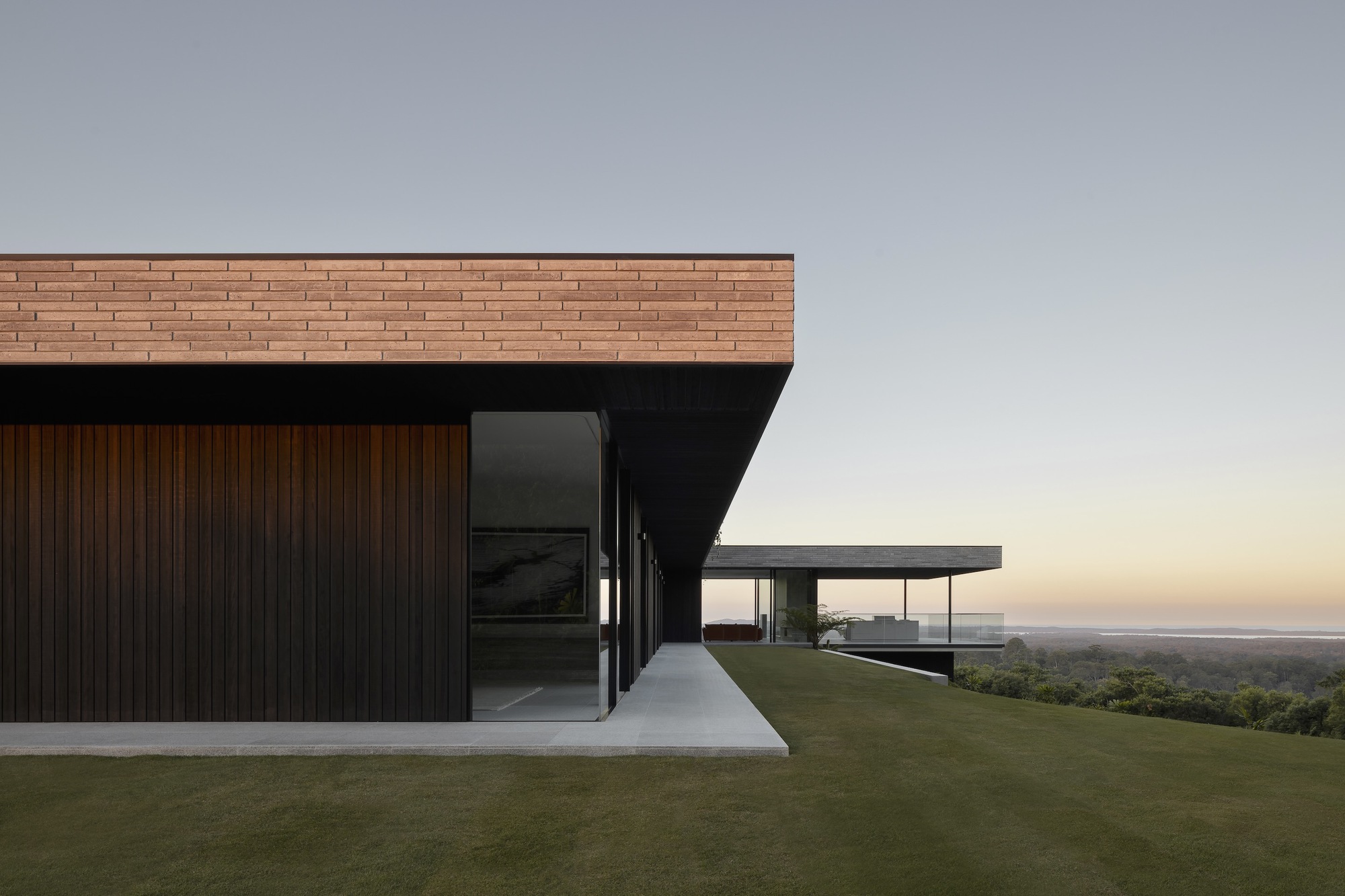
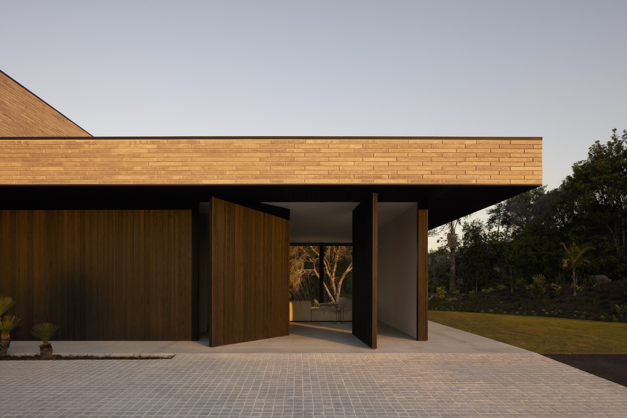
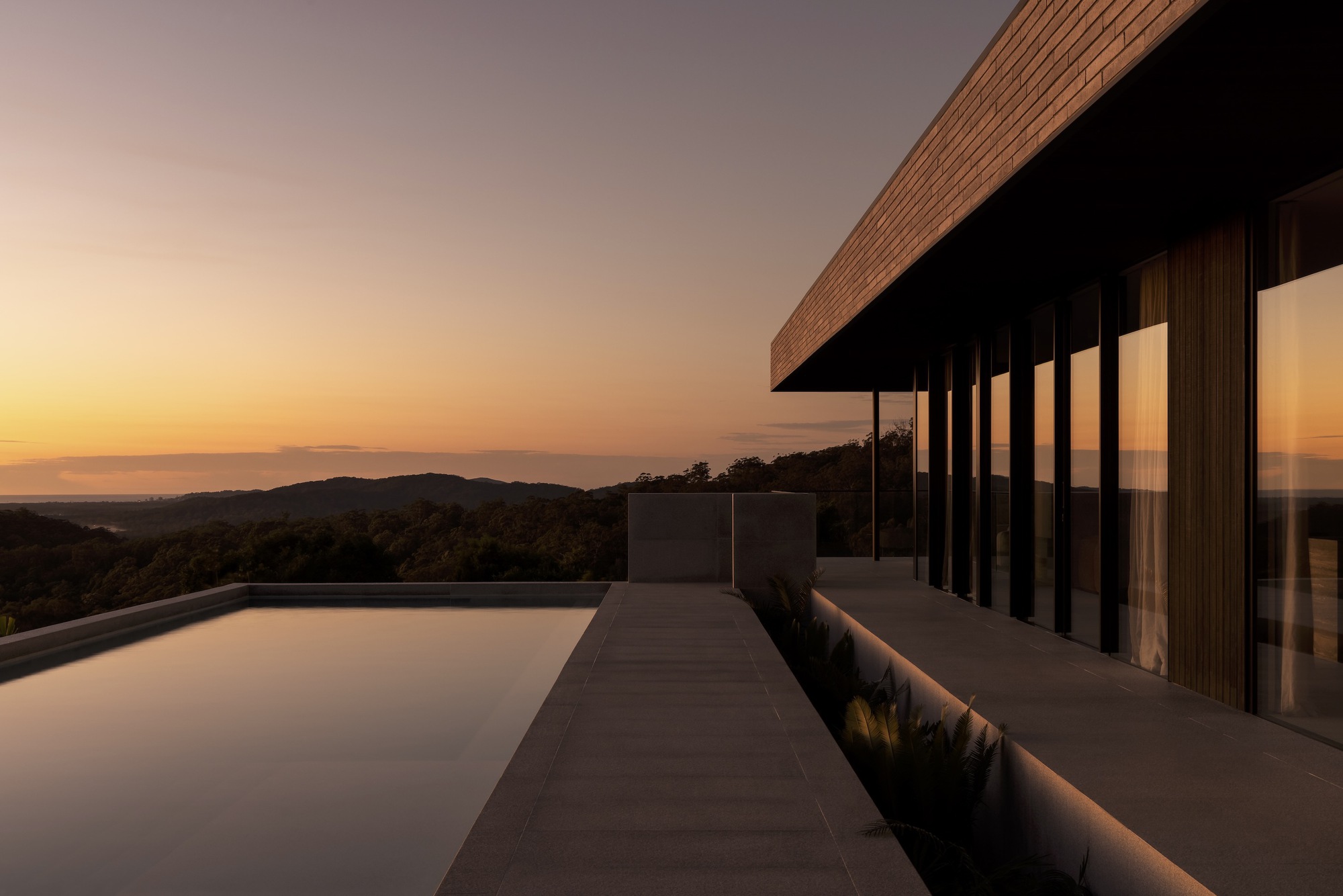
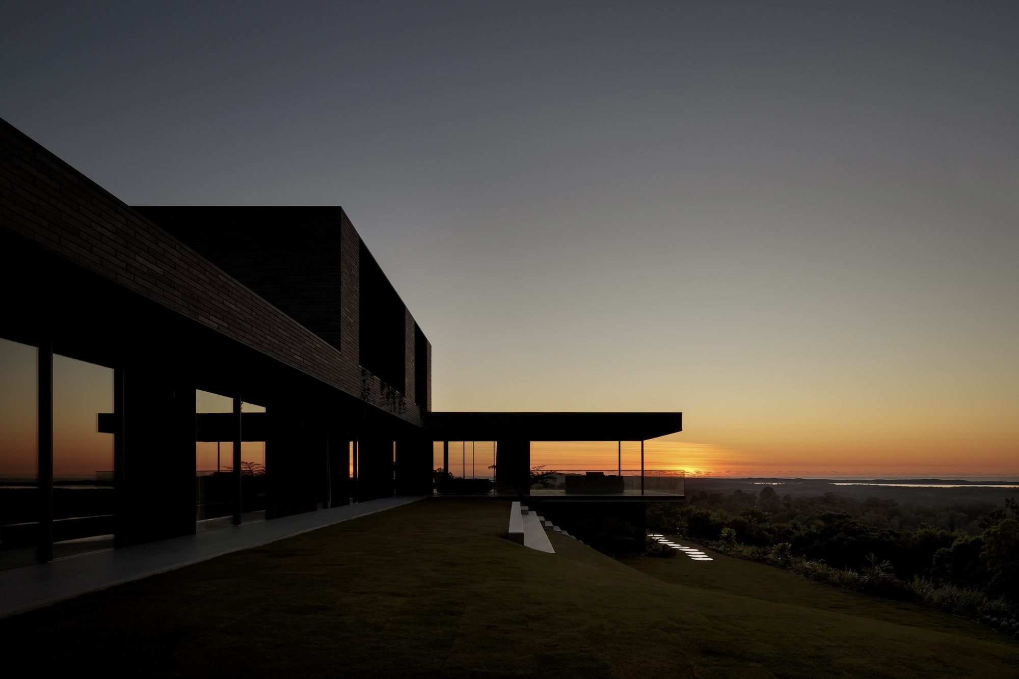
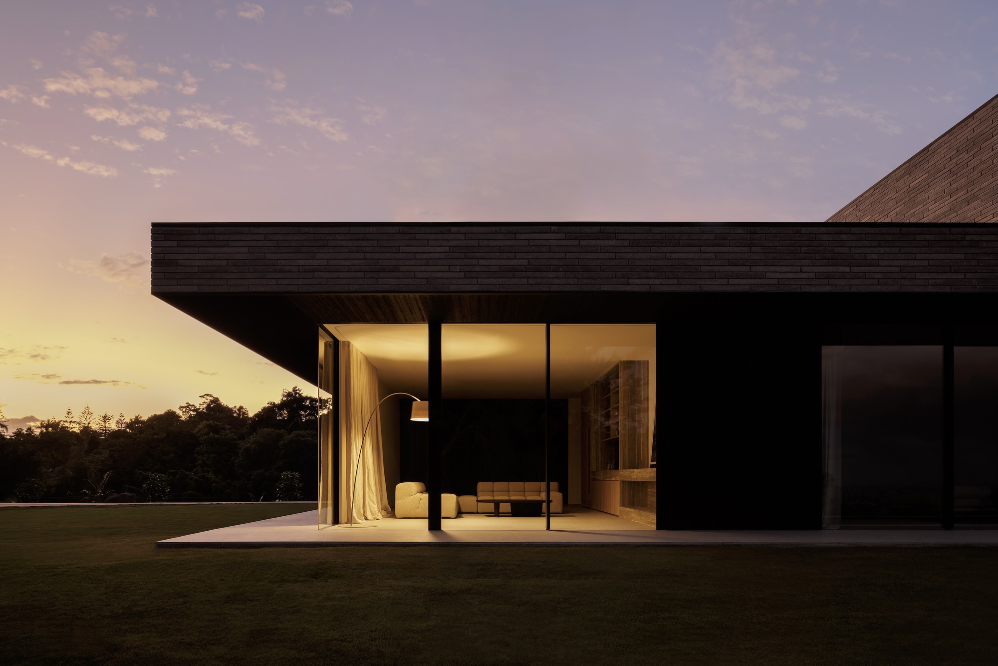
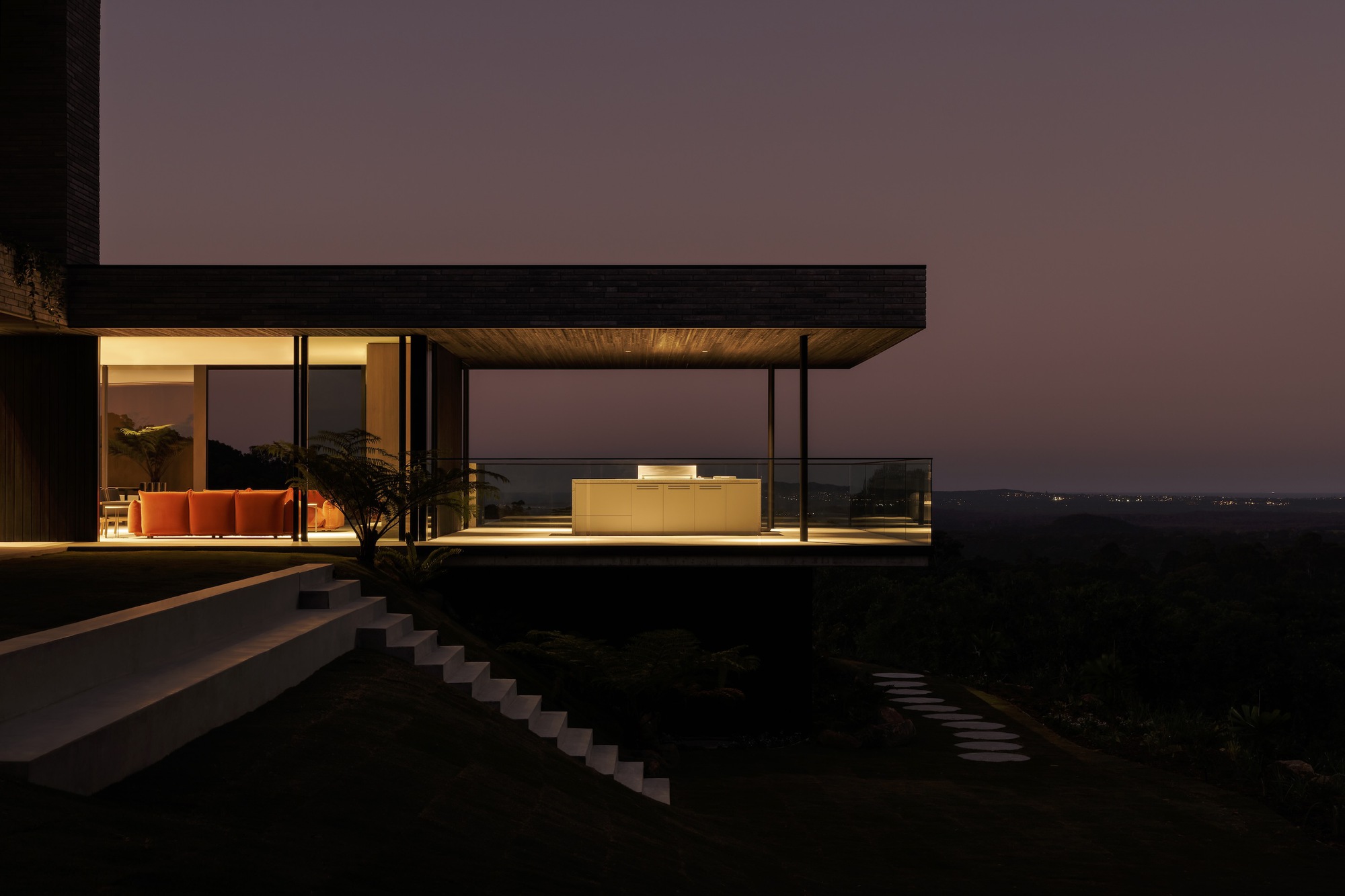
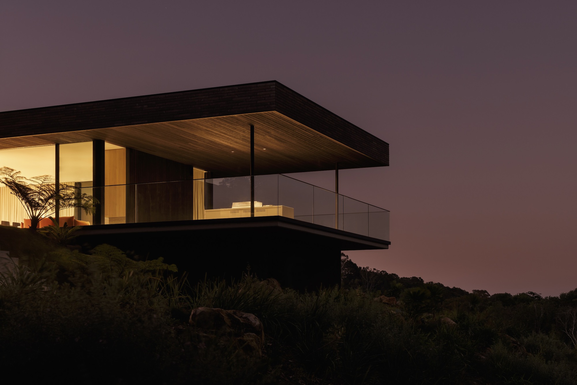
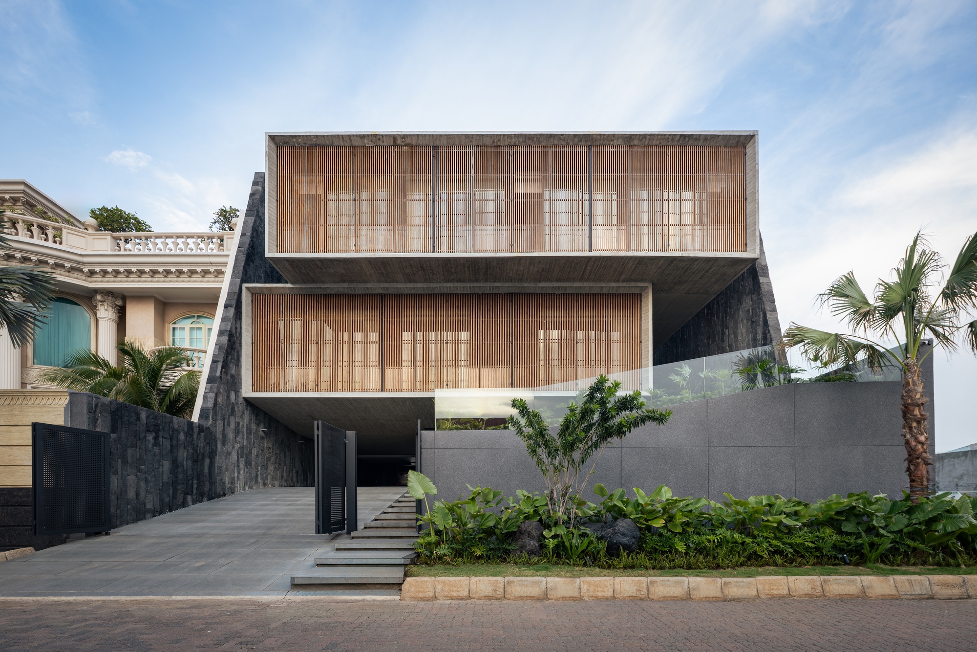
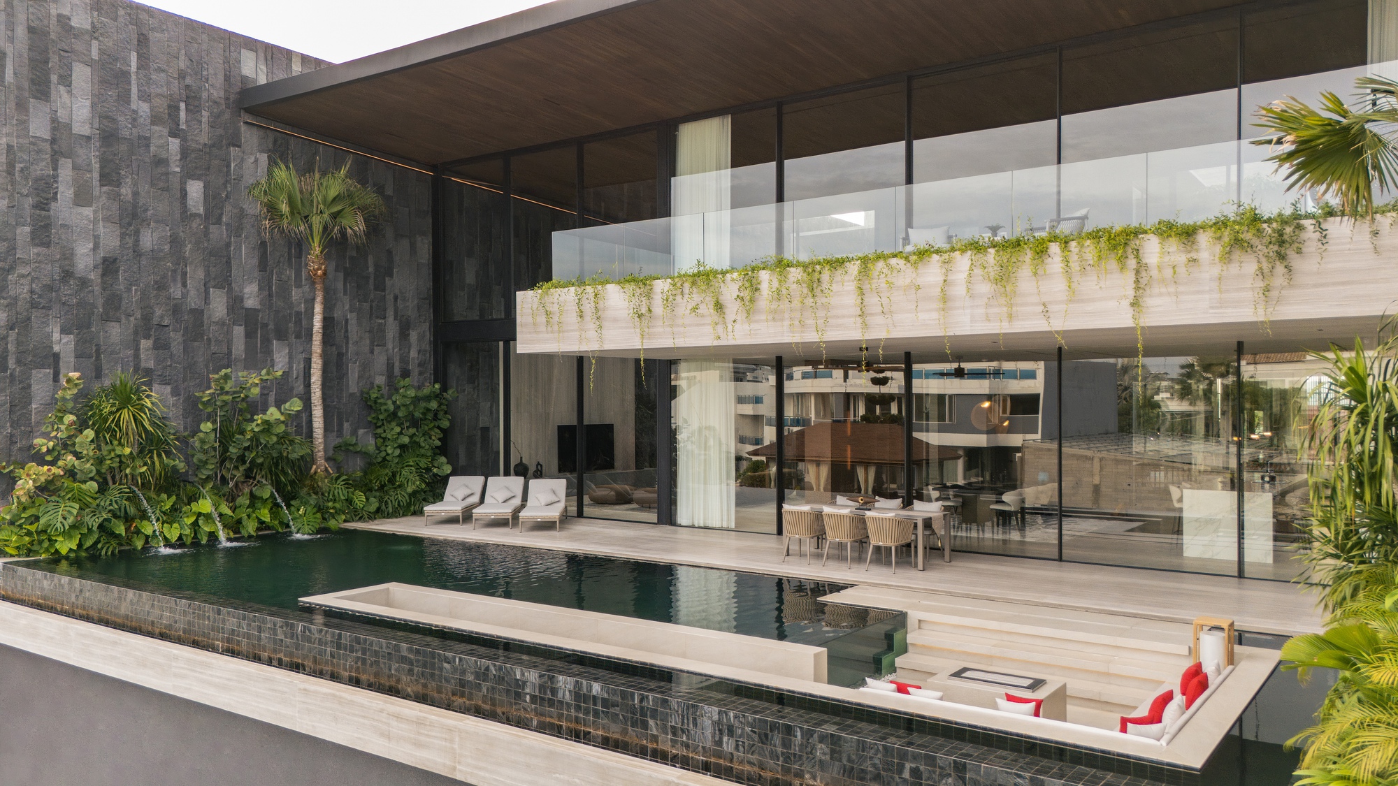
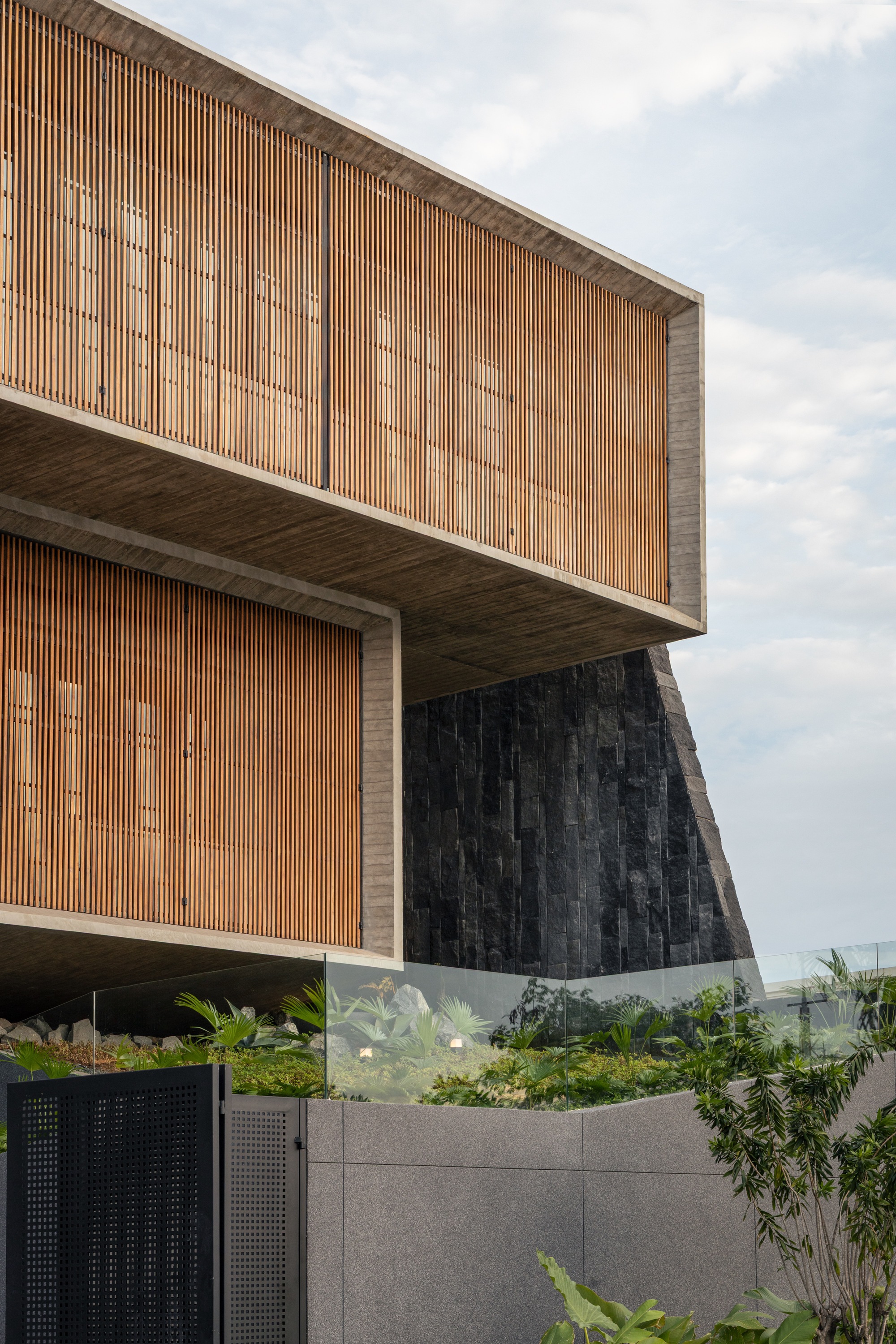
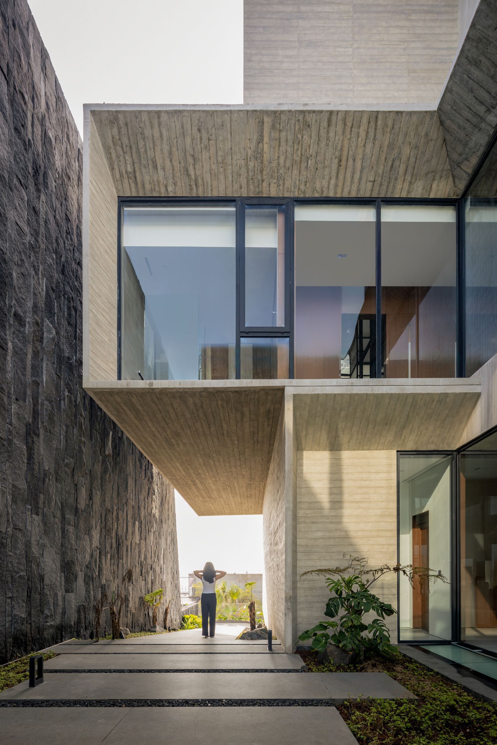
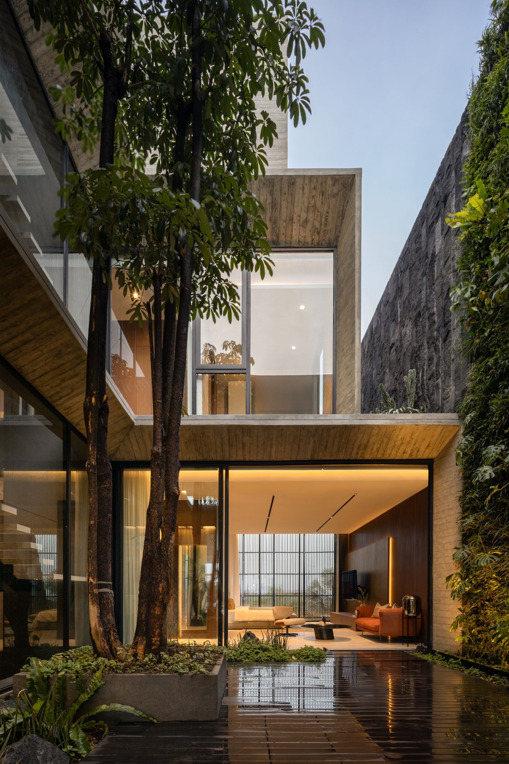
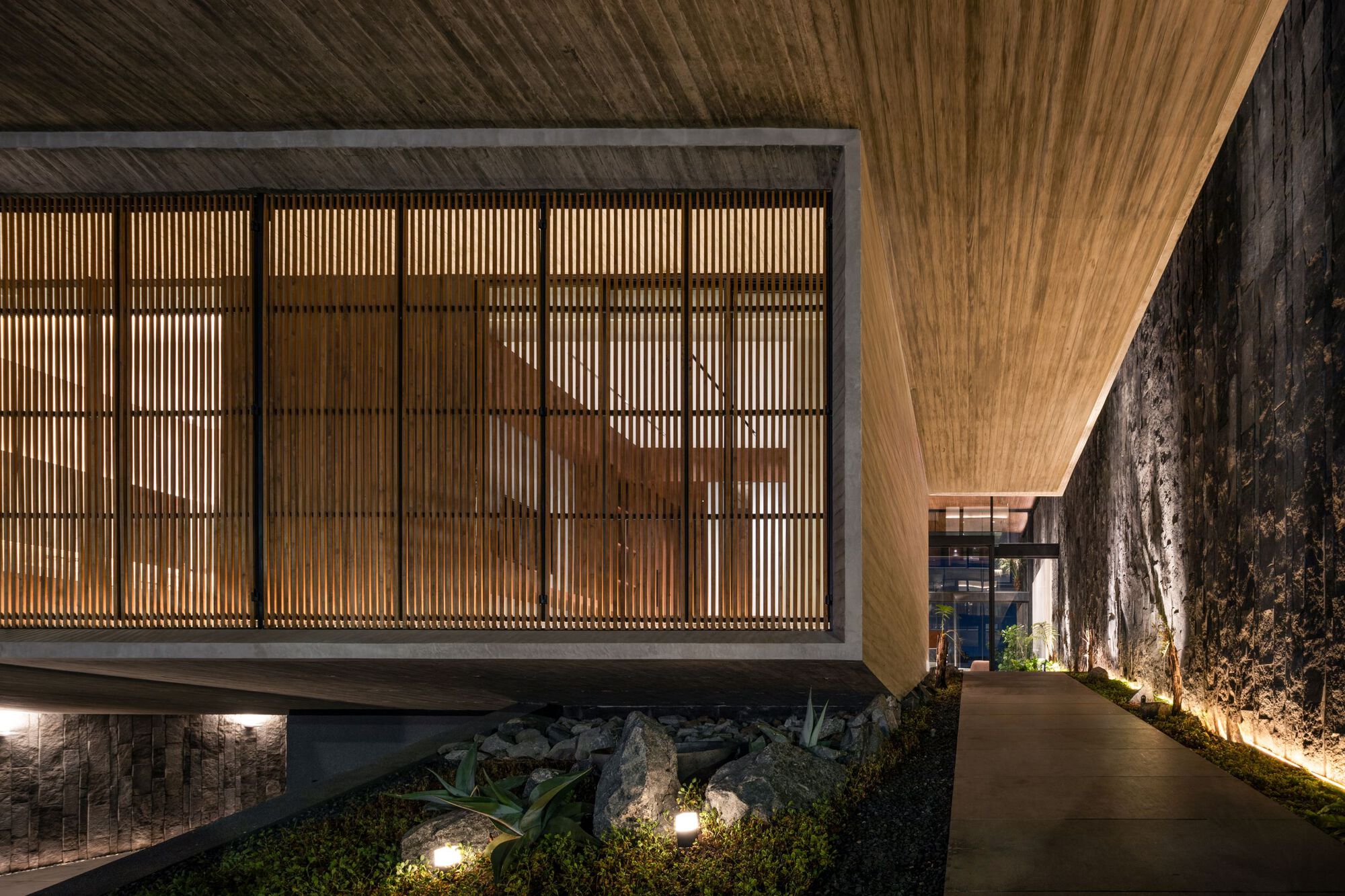
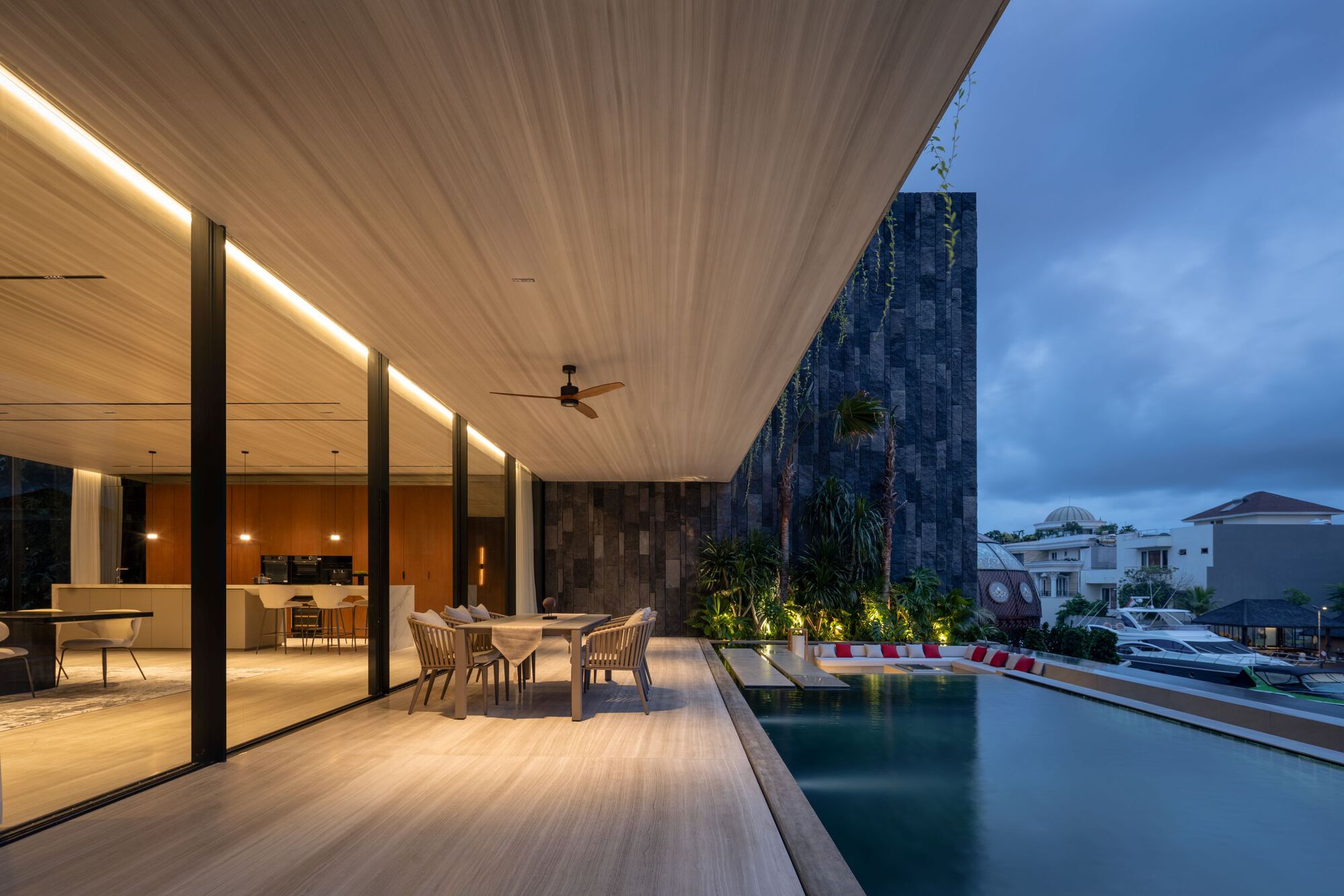
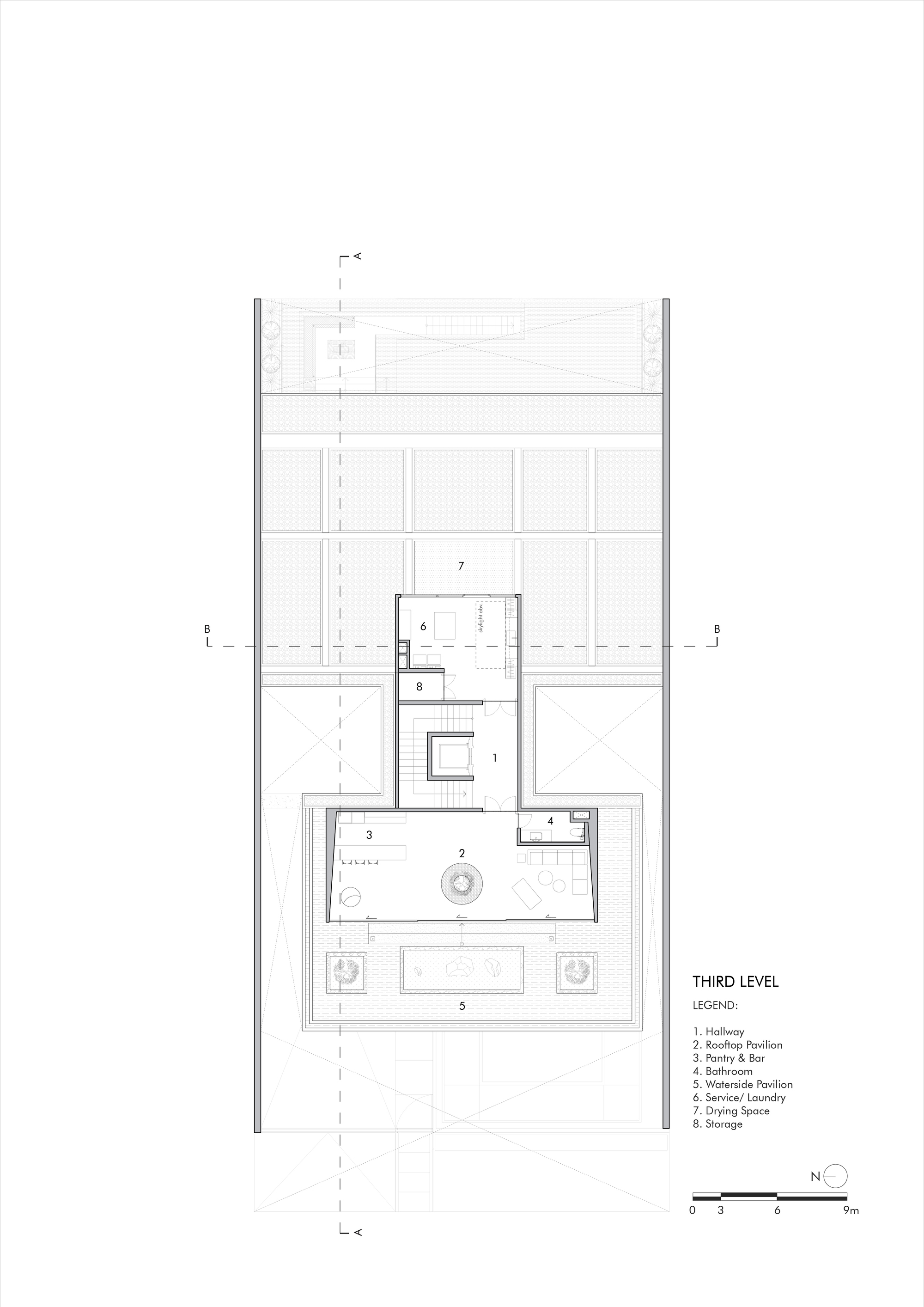
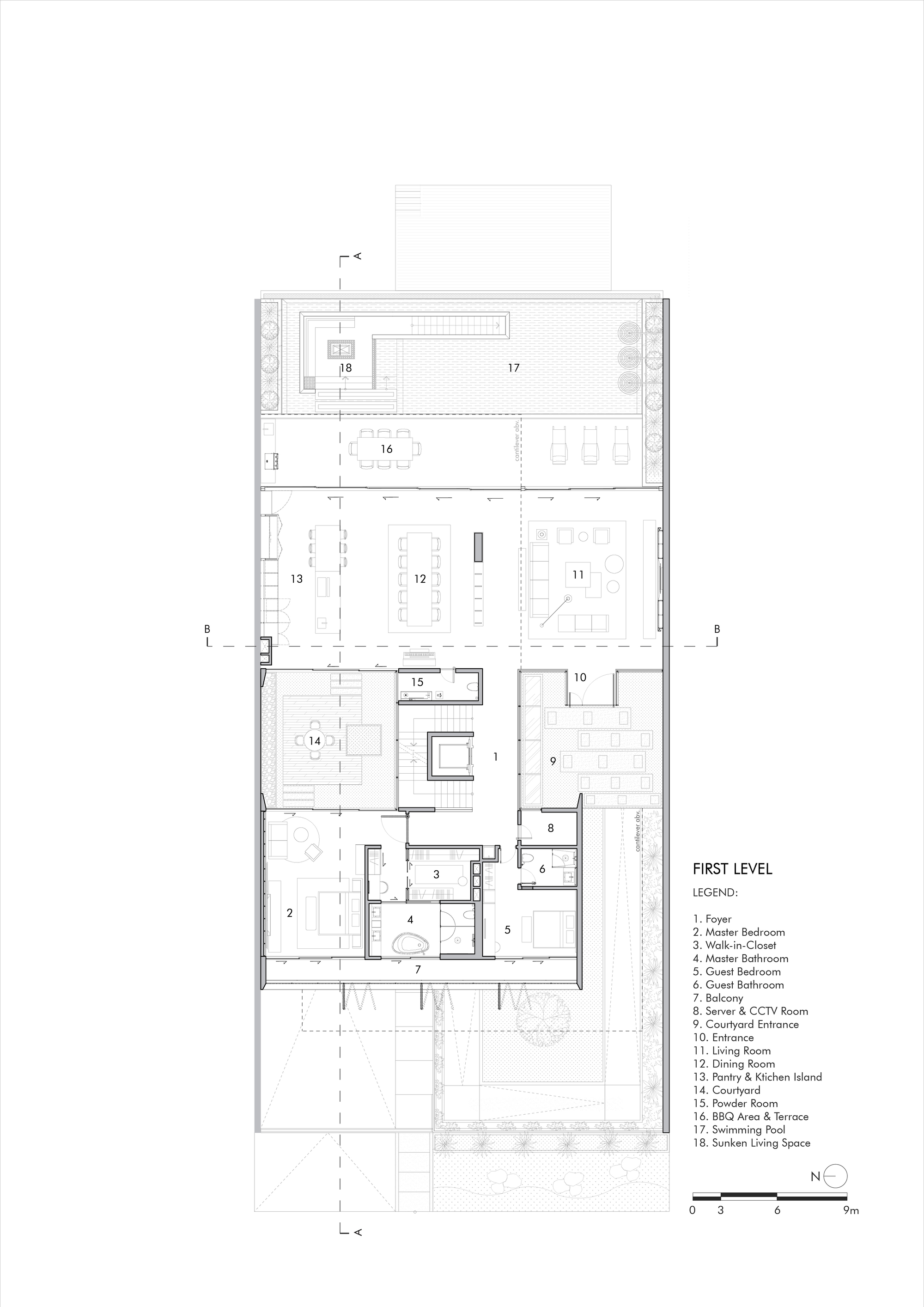
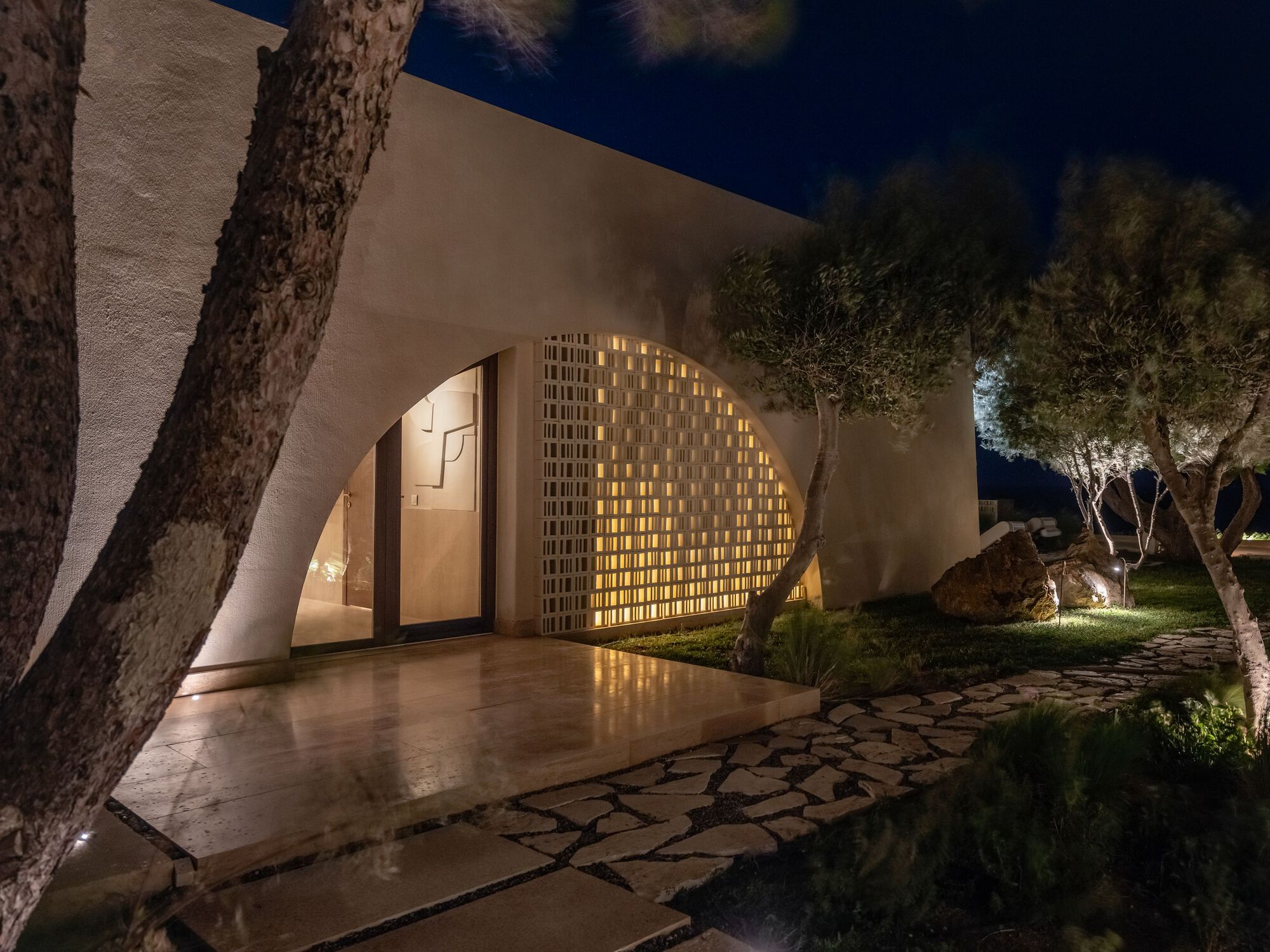
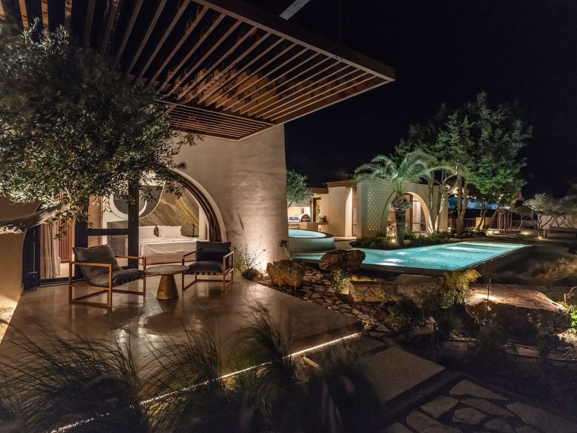
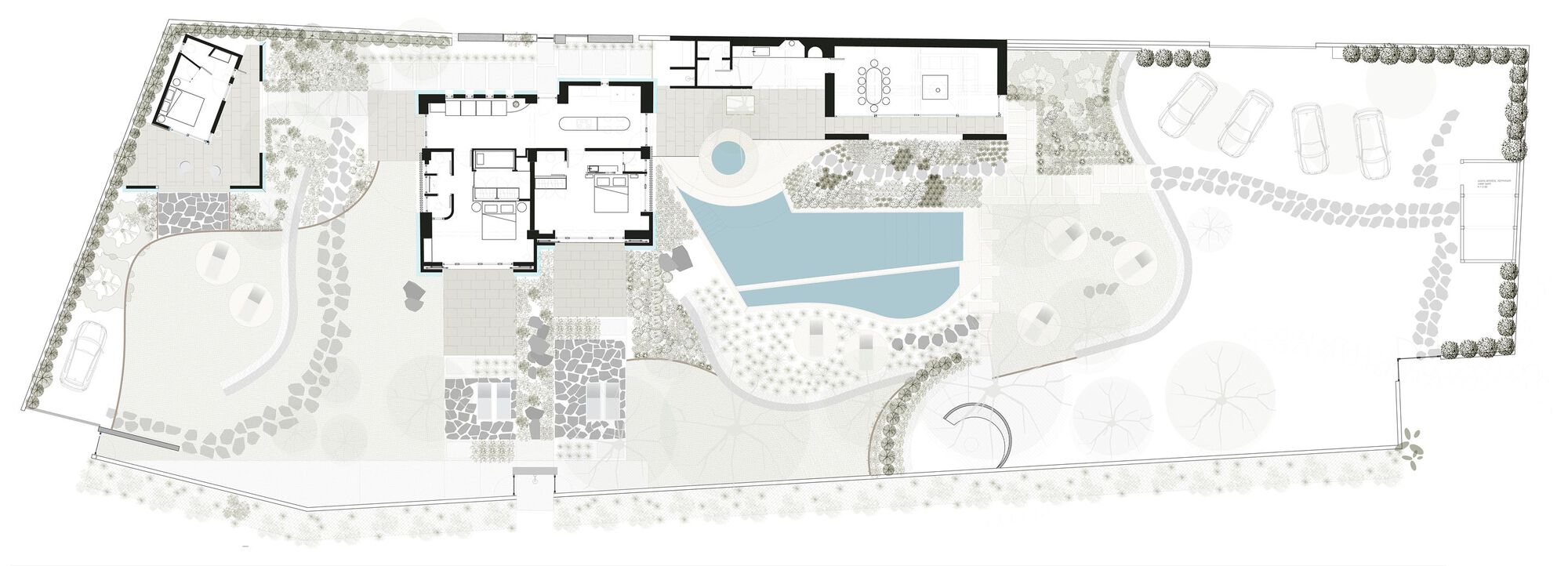
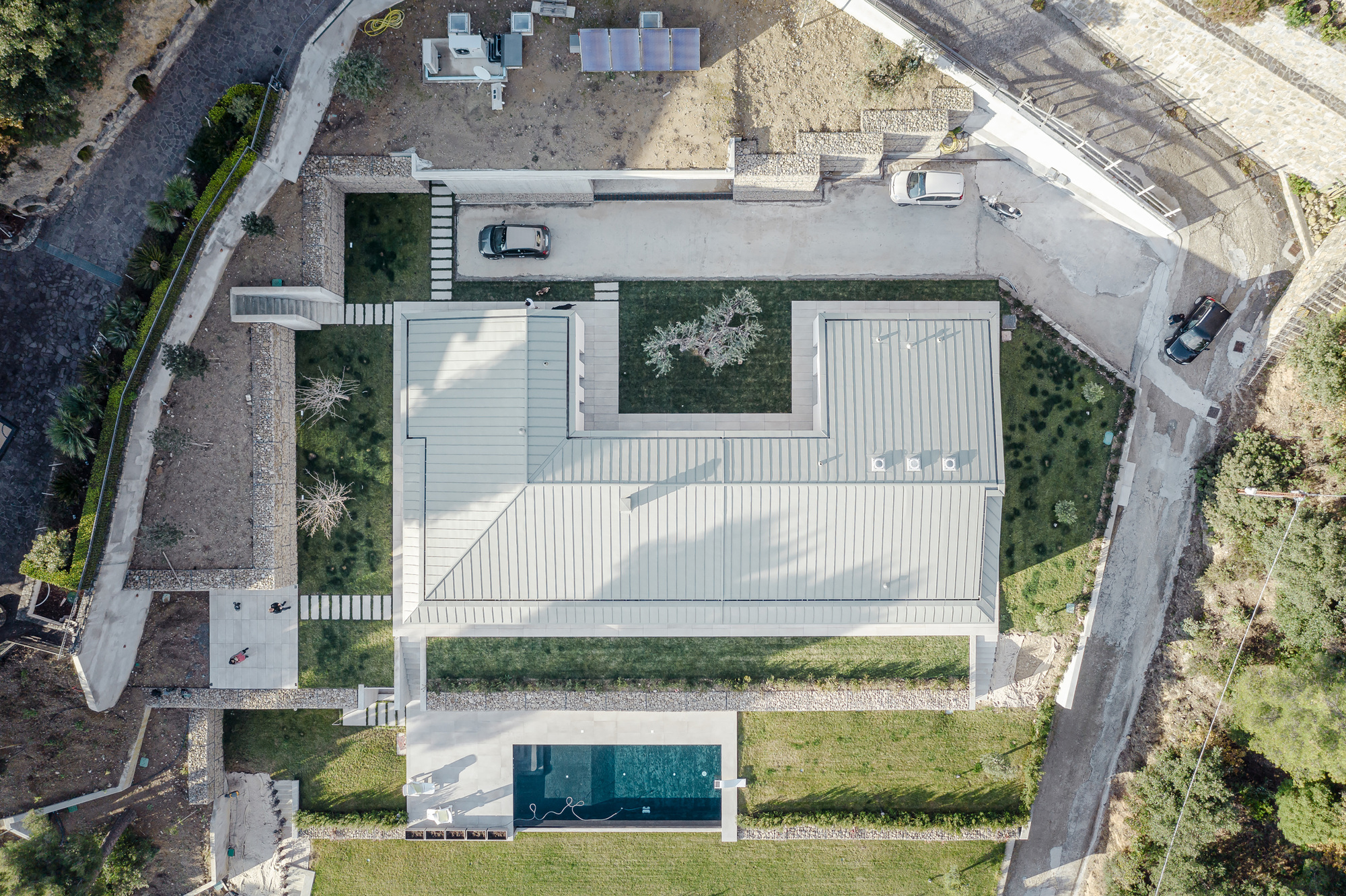
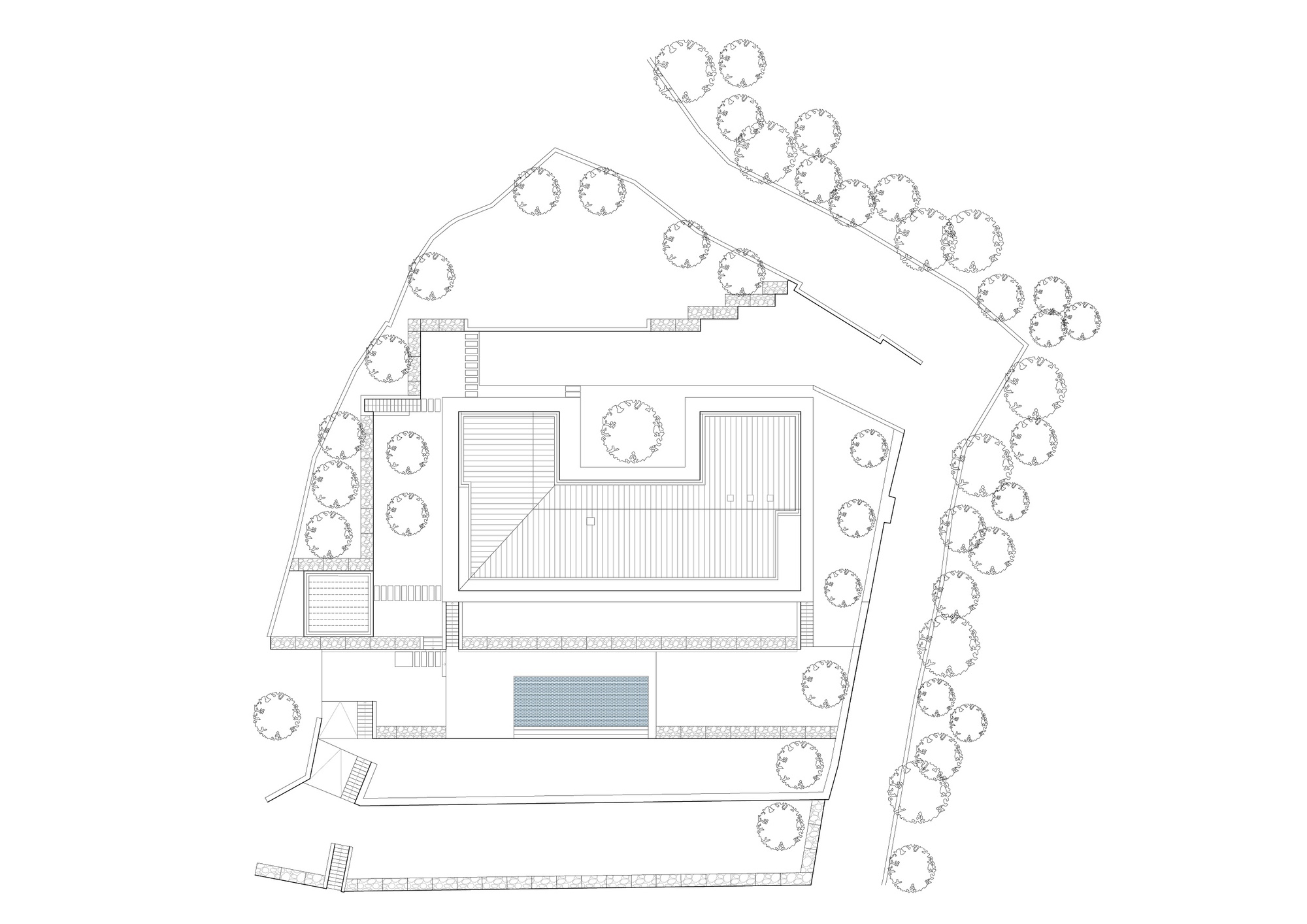
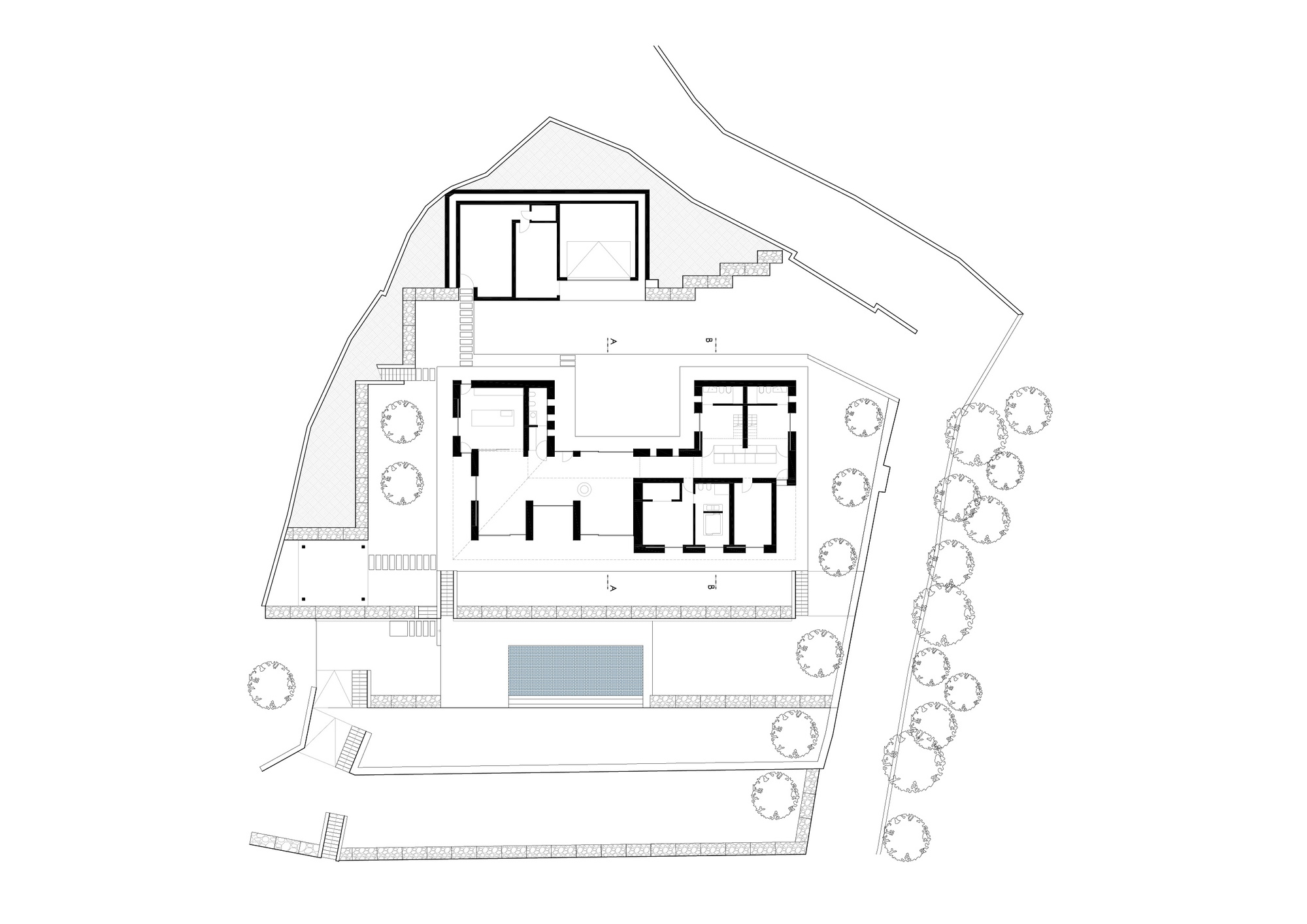
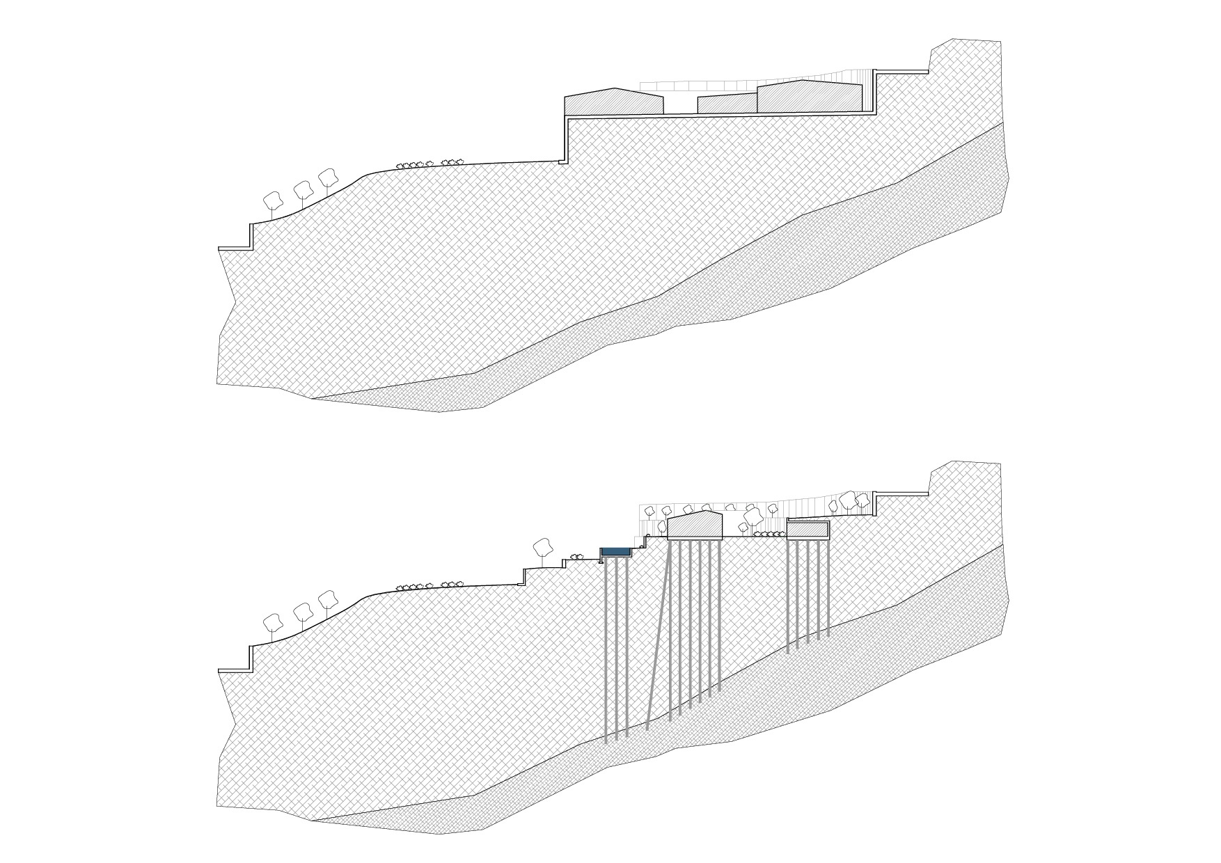
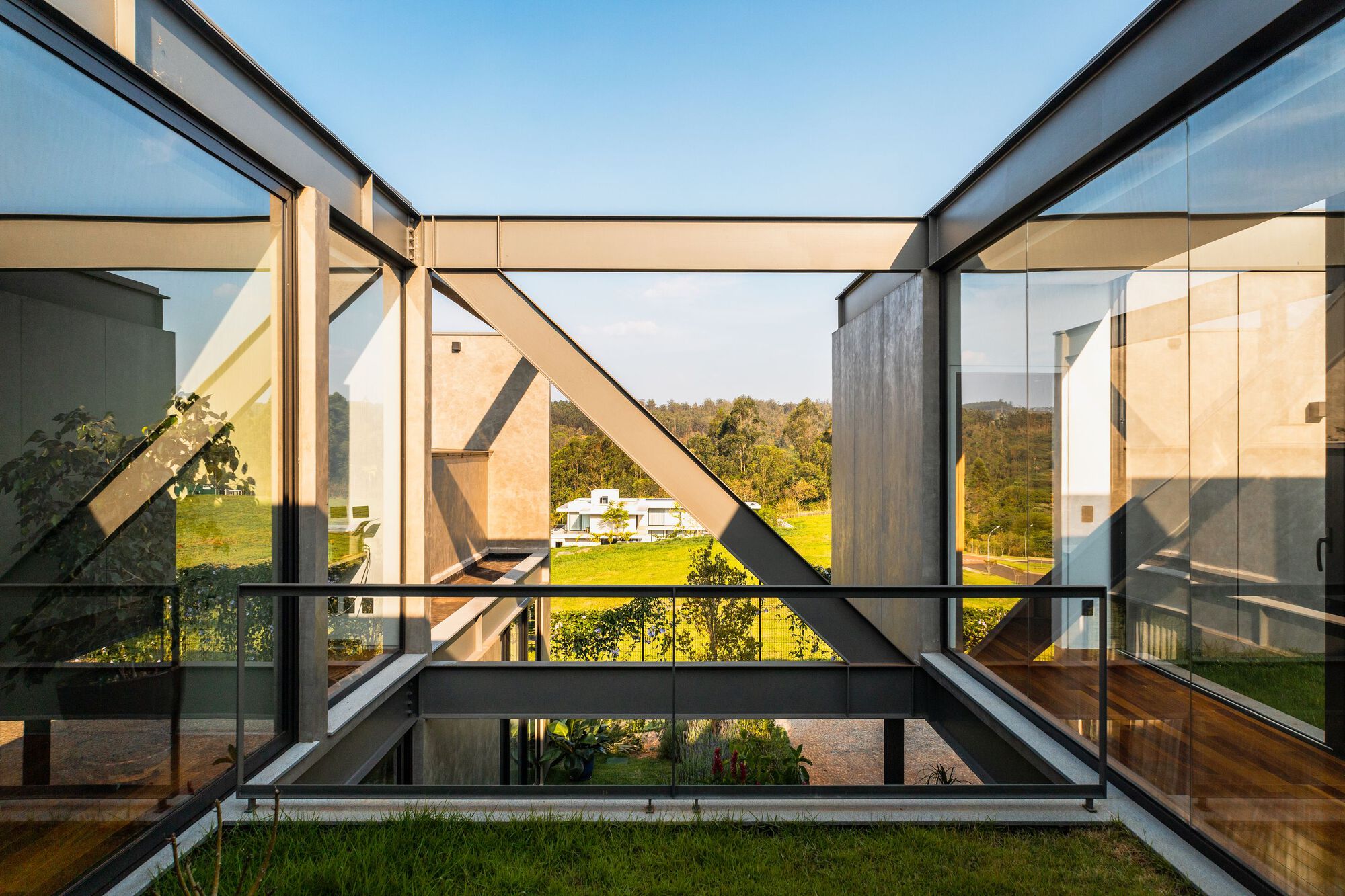
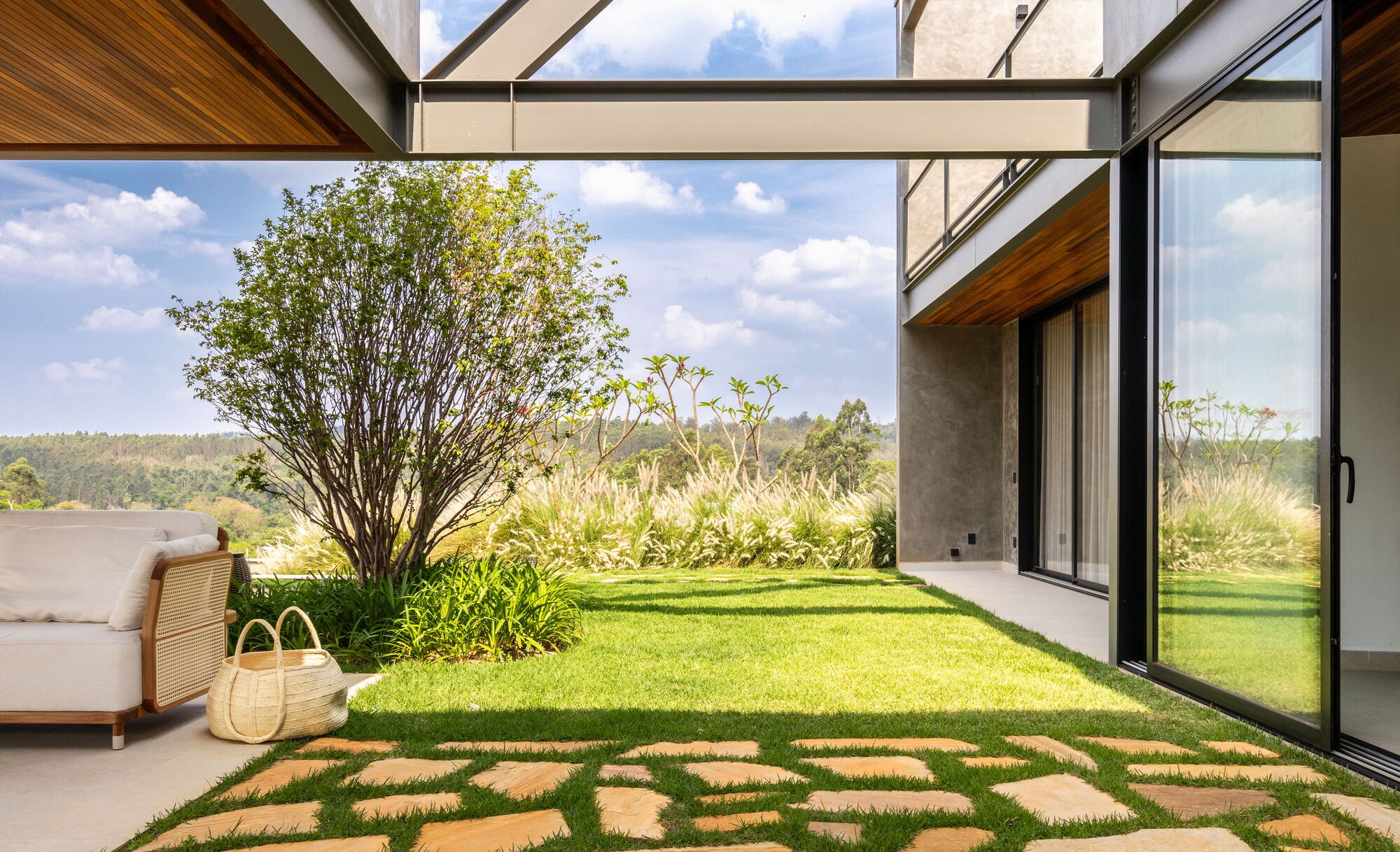
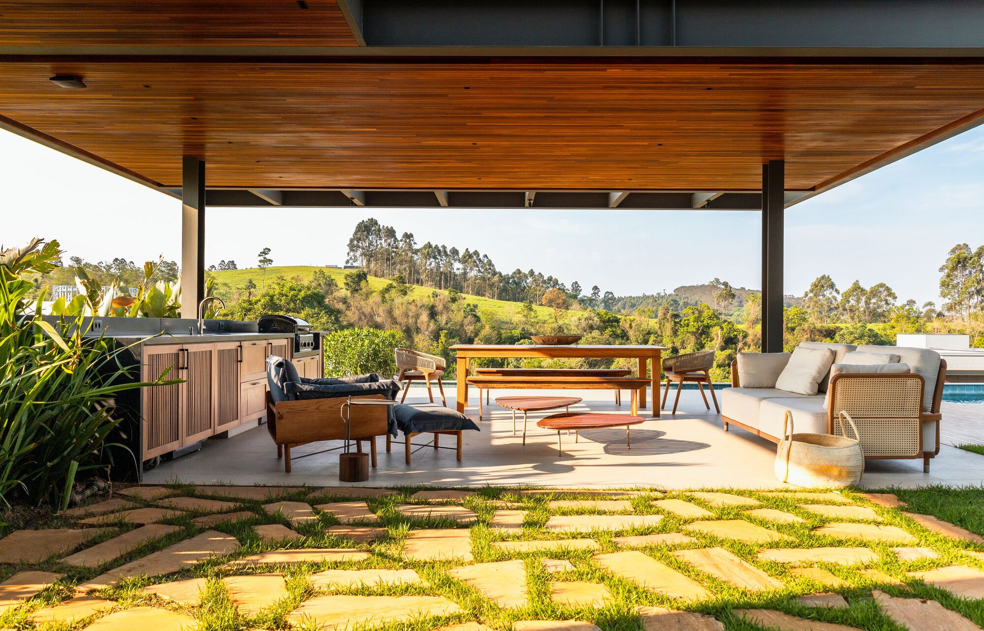
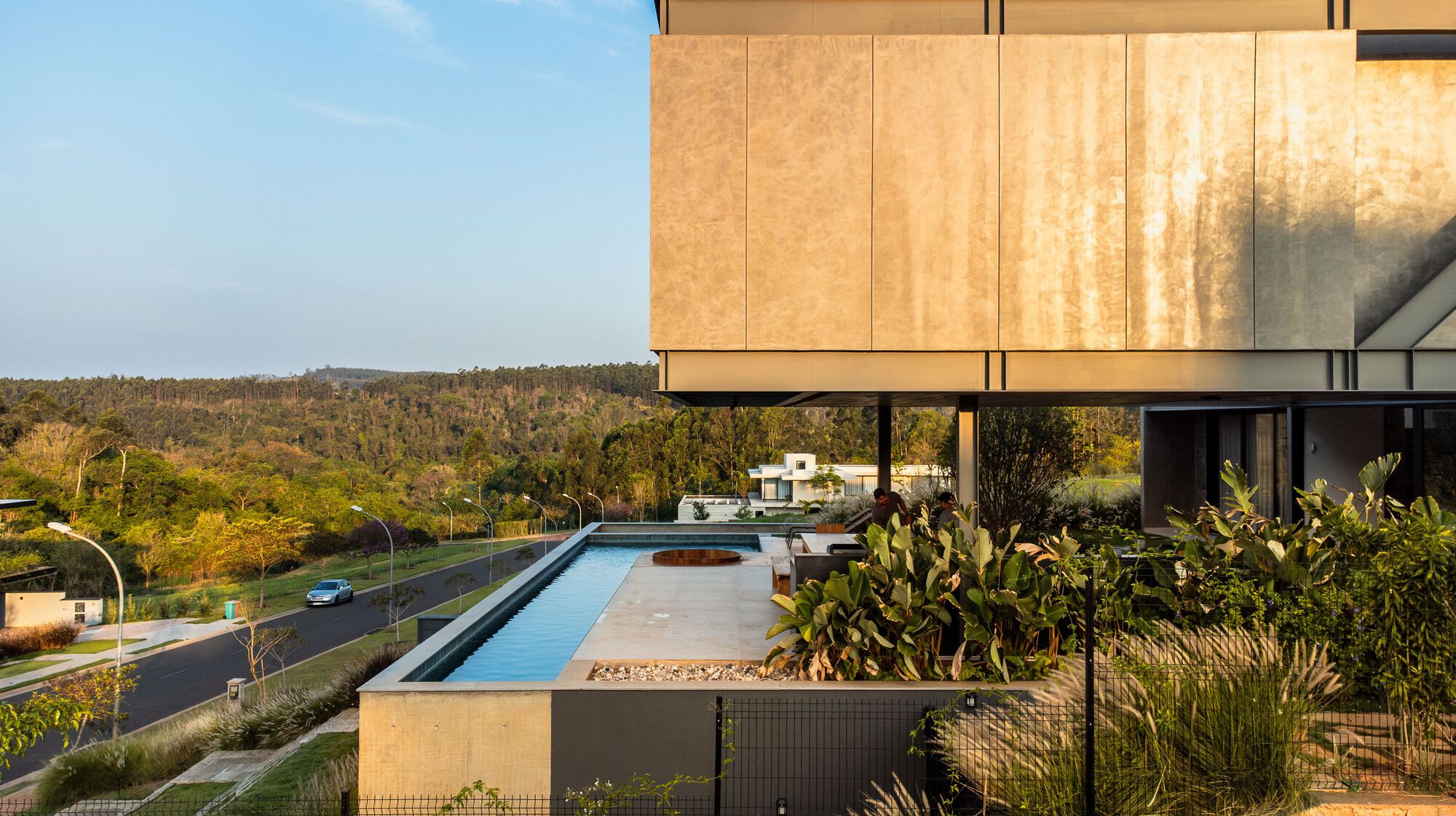
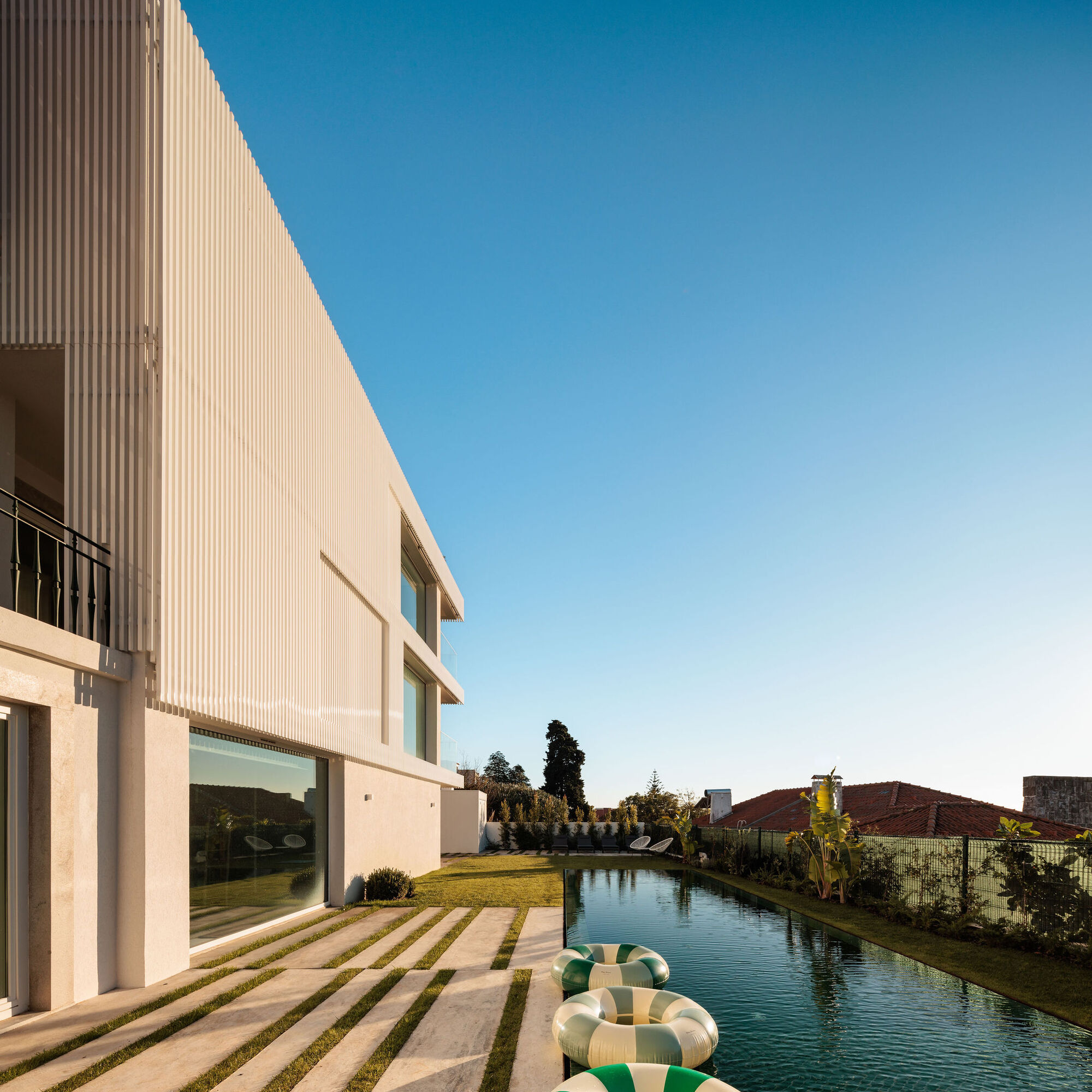
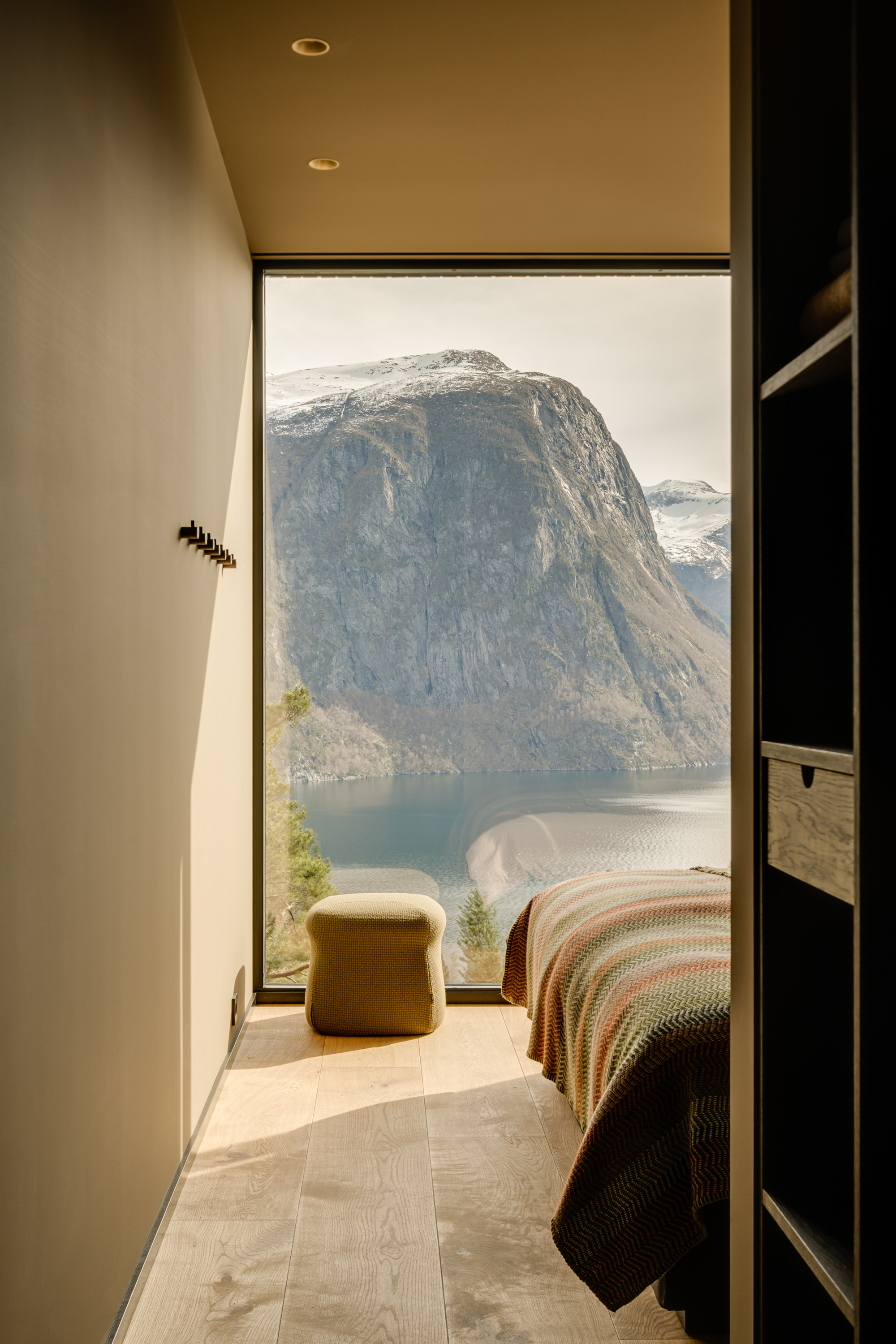
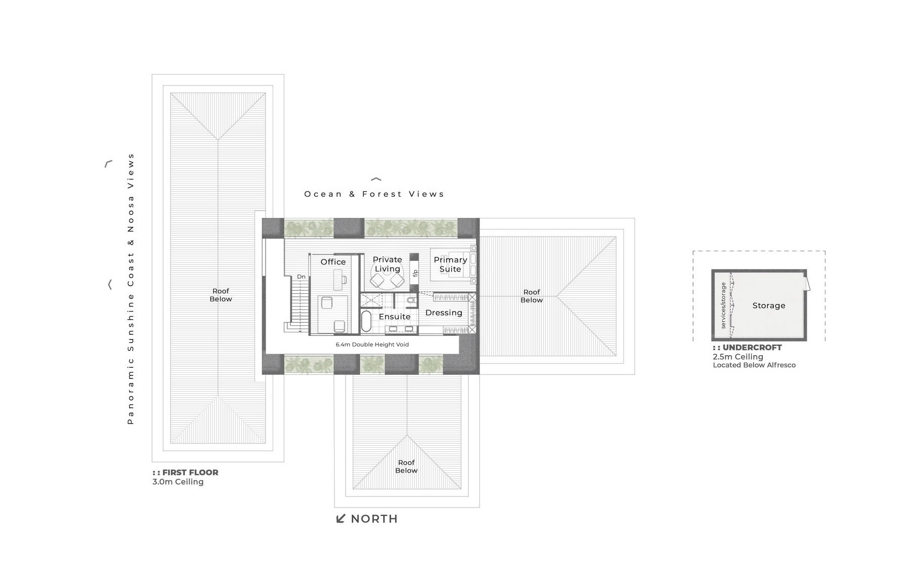 Perched on the crest of the ridgeline of what could be Noosa Hinterland’s most breathtaking location lies Whipbird. Brutalist in style yet simple in its T-shaped pavilion form, Whipbird is a home that adopts a deeply poetic response to the environment, cultivating a close, meaningful relationship between its inhabitants and the unique and natural surroundings.
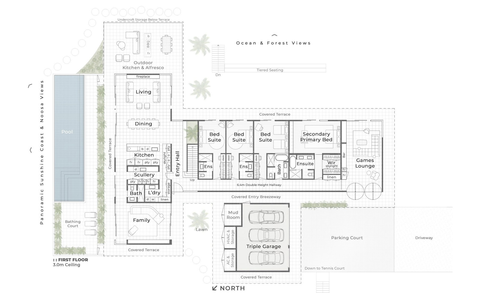
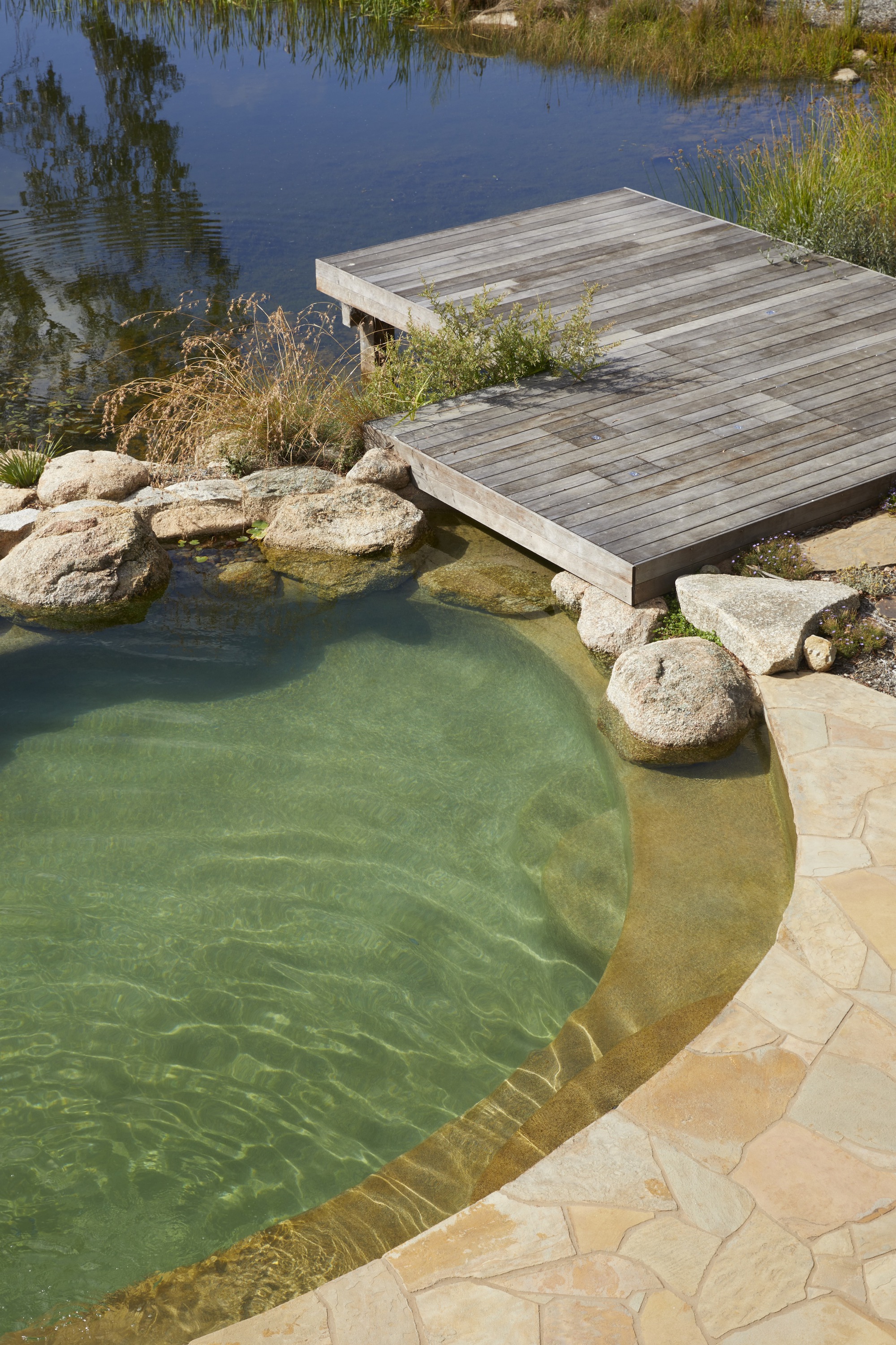
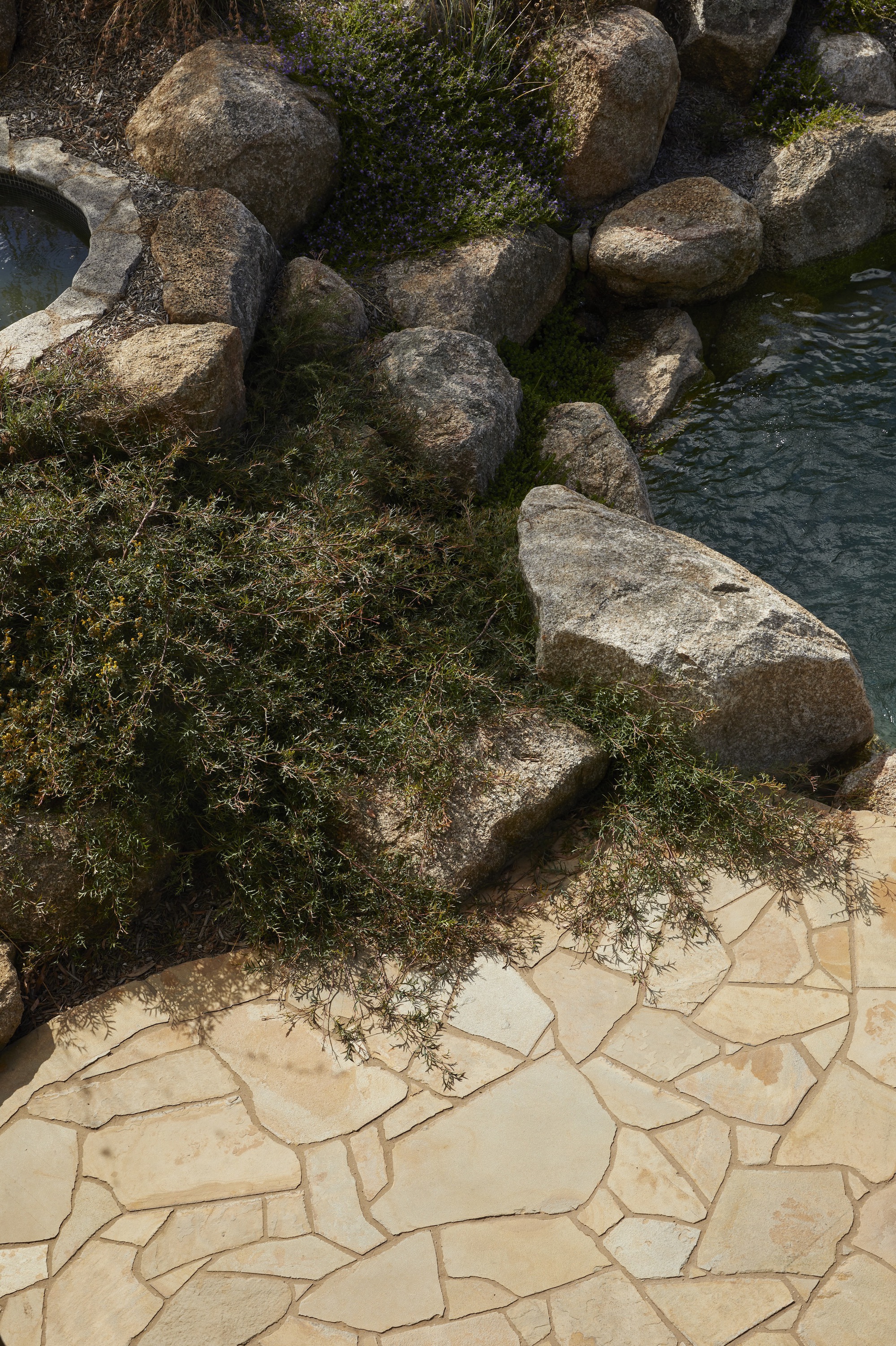
Nestled in the heart of Doonan, in what is possibly the Sunshine Coast’s best-kept secret, Whipbird takes full advantage of the panoramic hinterland and coastal views whilst generating an environment of contemplation and relaxation. The five-bedroom home is broken down into two distinct wings and split across two levels, with landscaped terraces leading out to facilities including a 20m Naked Mineral pool, a Supergrasse tennis court built into the natural fall of the land, a bathing court, 3-car garage, 6-car court and cascading courtyard gardens adding layers and depth to the outlook. A total of 16,735 native trees, plants, and groundcovers were planted into the property surrounds, enforcing the home's architecture while preserving and enhancing the site’s natural character and connection to the environment.
Sharing a unique passion and respect for quality materials and finishes, Zerni enlisted the help of a formidable team of designers, suppliers, and collaborators to bring Whipbird to life. This team includes Architect of the 2022 HIA Australian Home of the Year Winner, Jen Negline from Minnow Studio, global interior stylists Space Furniture, Landscape Architects The Conlon Group, Swiss-made V-ZUG appliances, Italy's premier Travertine producers, Artedomus, handcrafted stone producers Granite Works, timber specialists Made by Storey, Natural Brick Company and many more.
Upon visiting the site for the first time, developer Jayden Zernich from Zerni was enamored by the location’s natural beauty, tranquility, and stunning outlook over the Noosa hinterland and coastline. “The air felt clear, the whipbirds were humming, every sense was stimulated in the most calming, uncontrived way. The vision became clear: to create a secluded and private reprieve from the open surrounds of the hinterland, where nature’s beauty is accentuated, and luxurious living is epitomized. I am confident that Whipbird presents a new level of craftsmanship yet to be seen on the Sunshine Coast,” said Zernich.
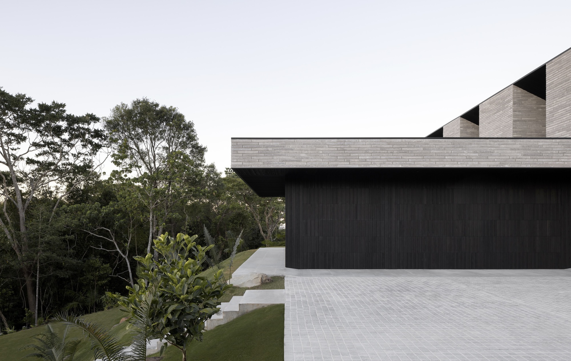
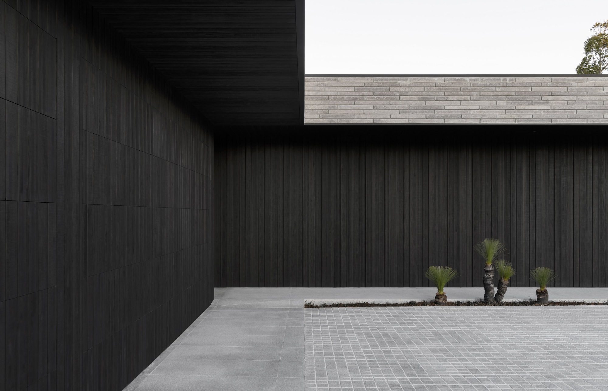
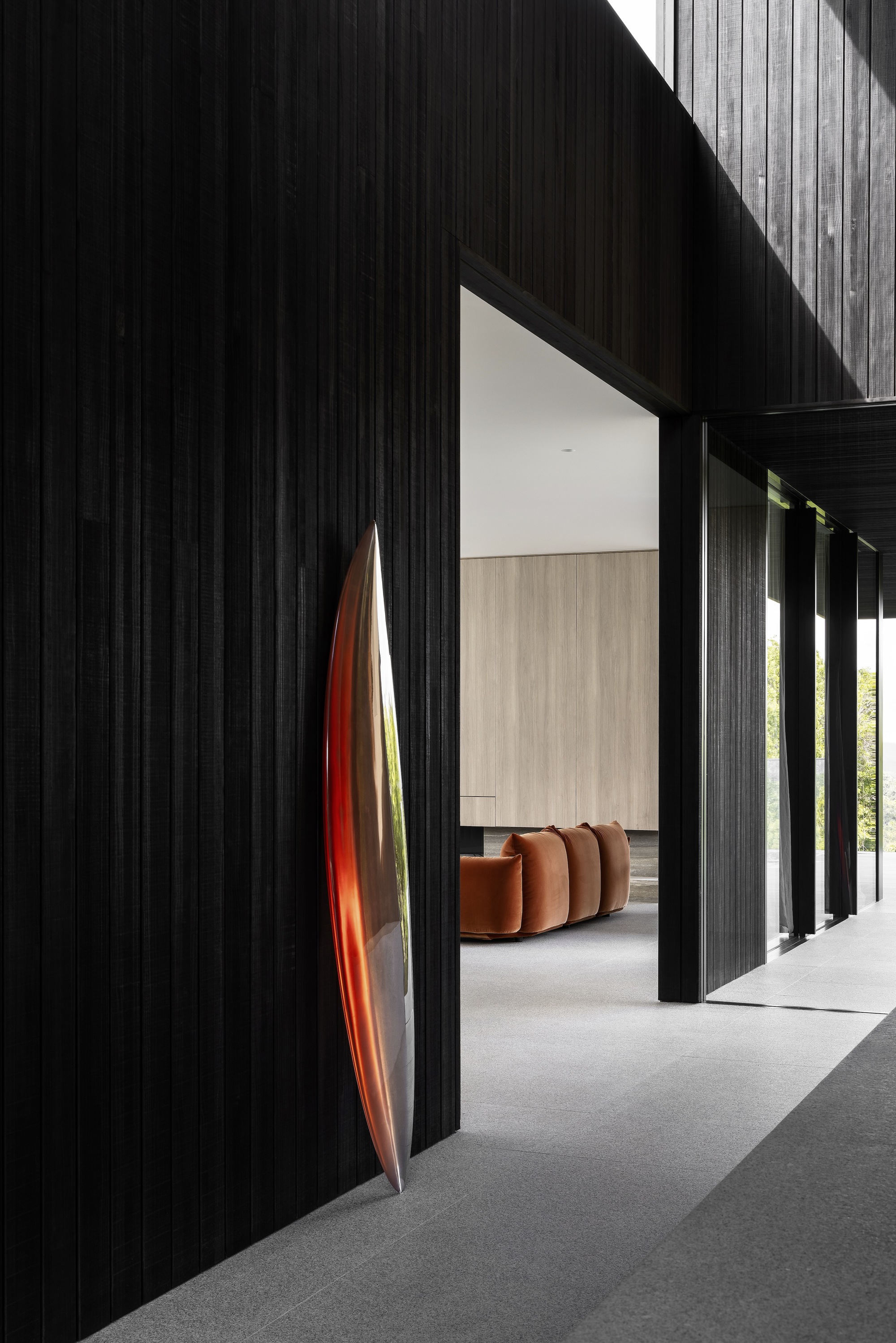
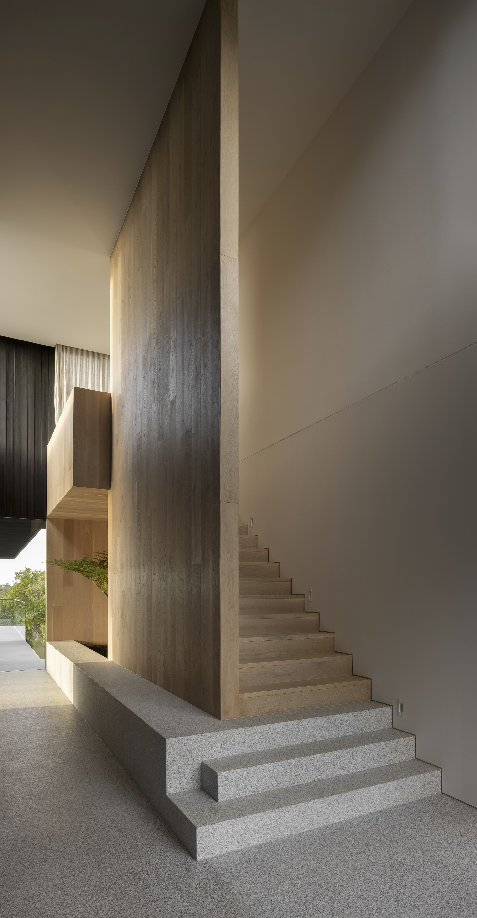
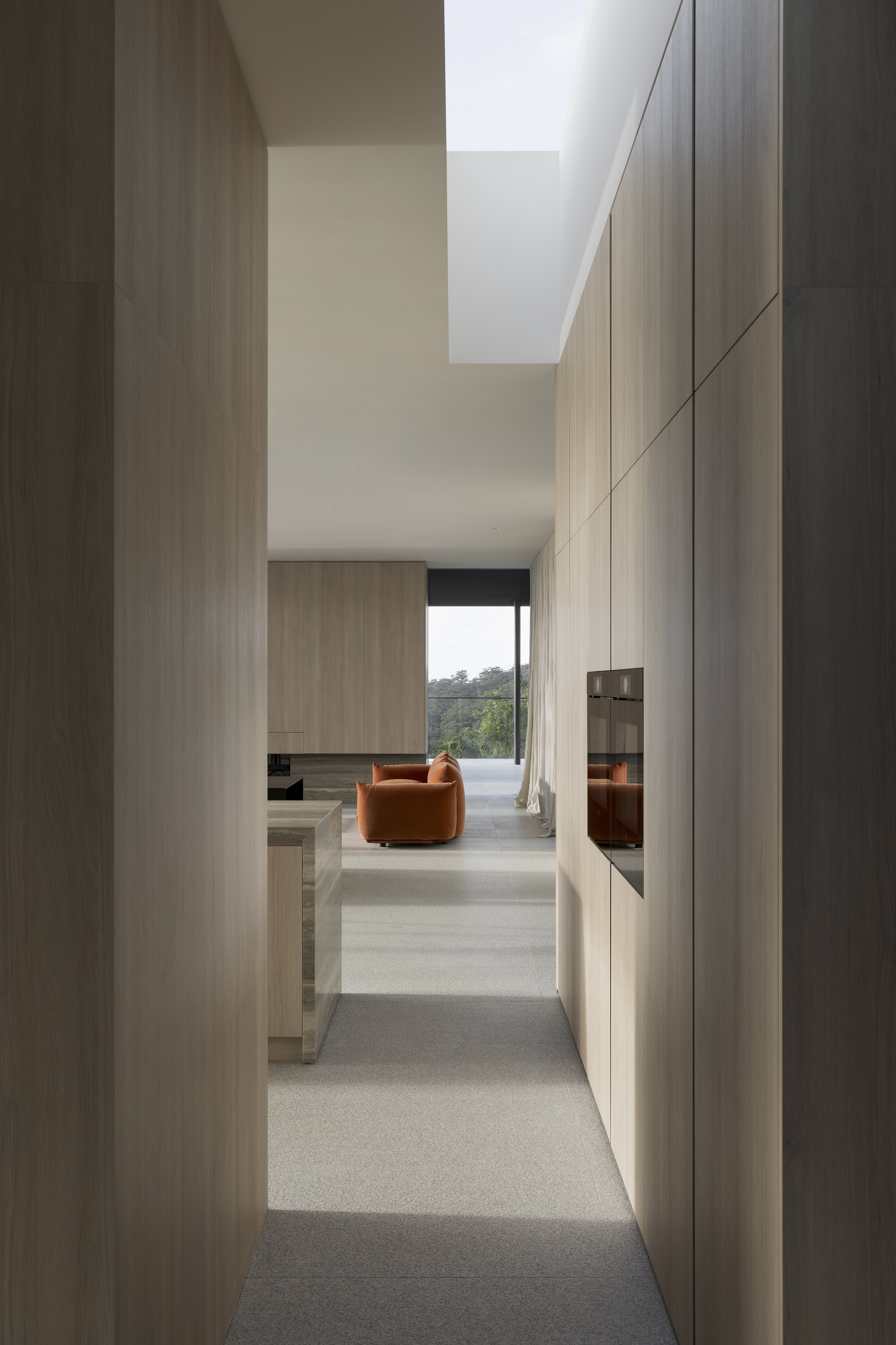
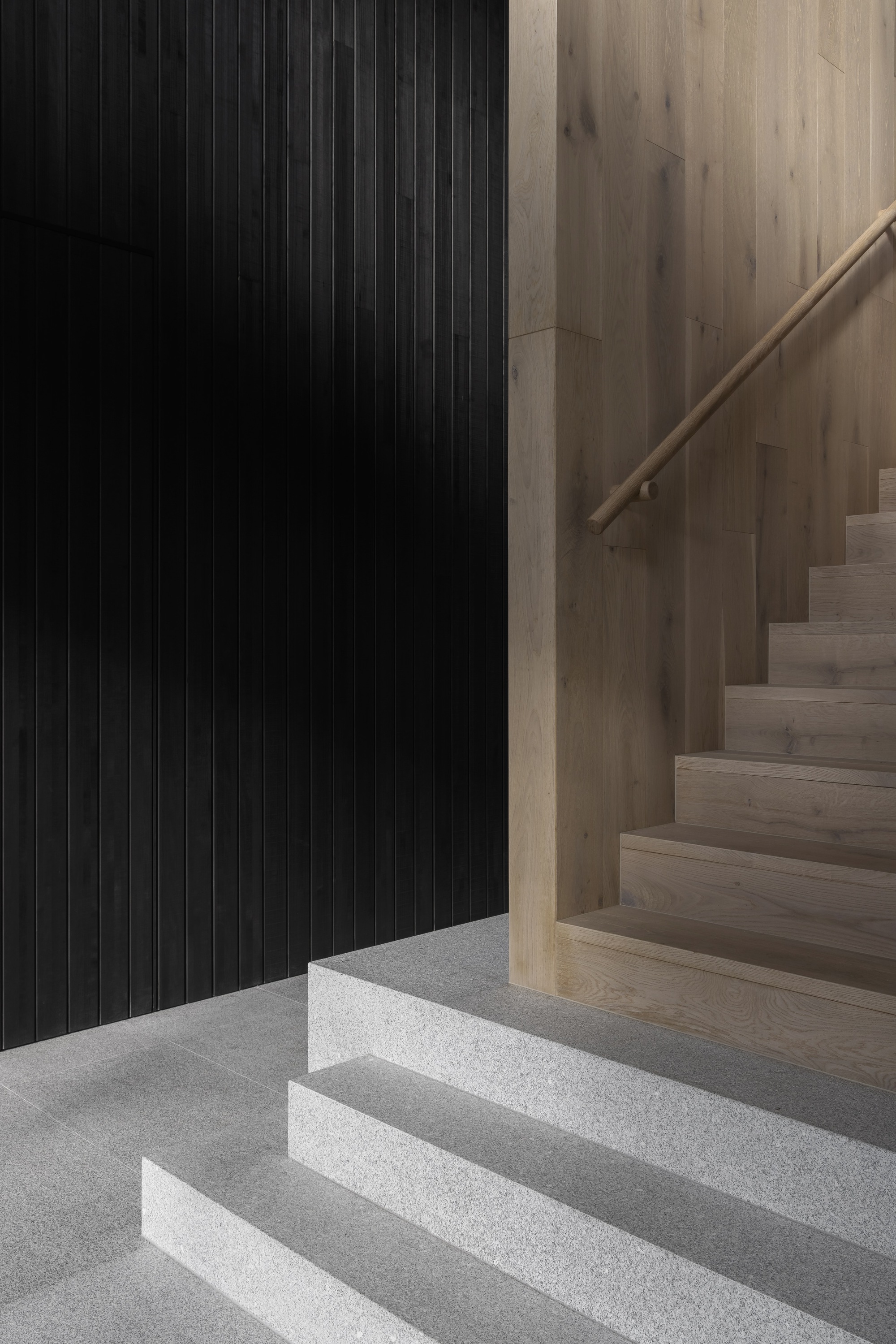
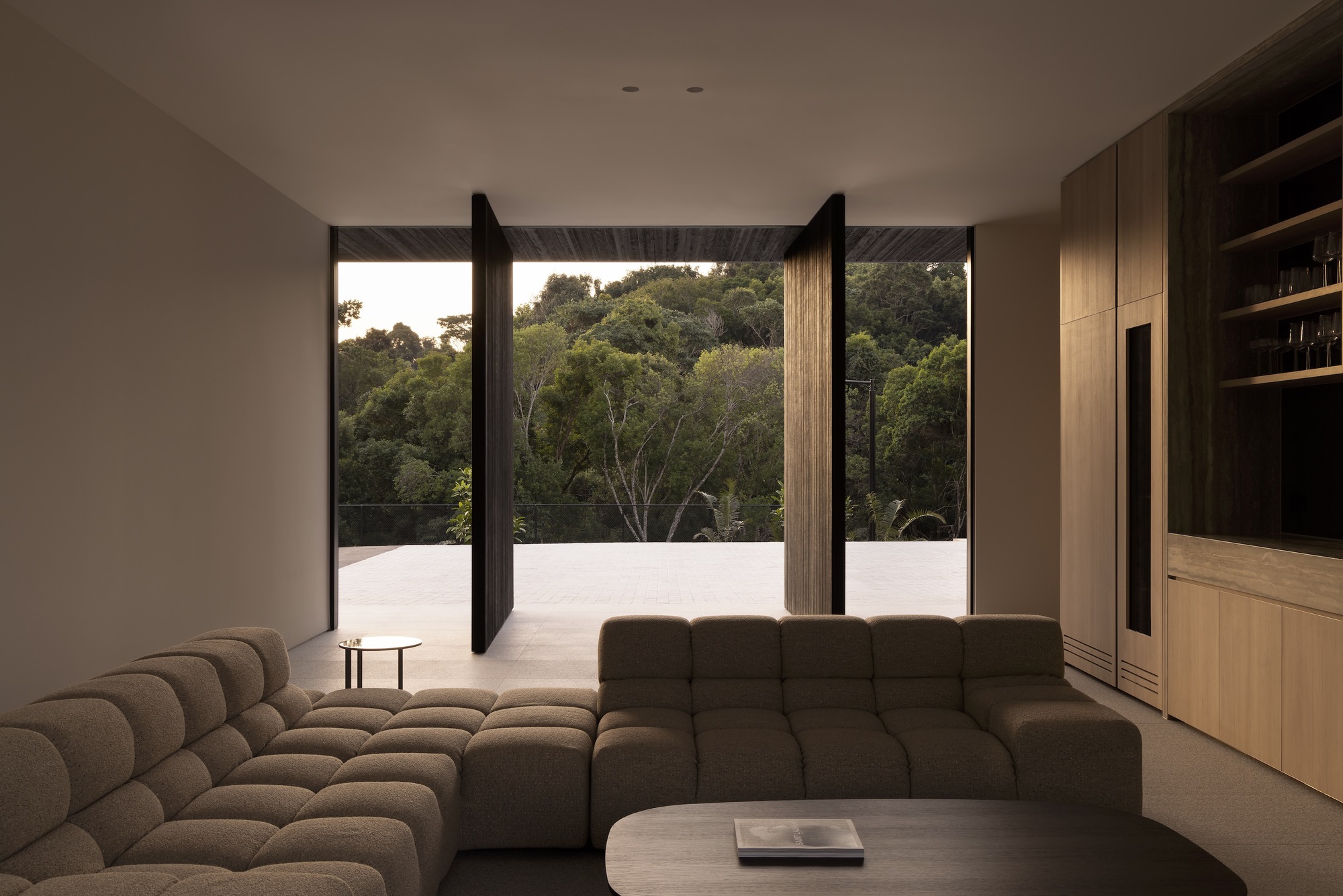
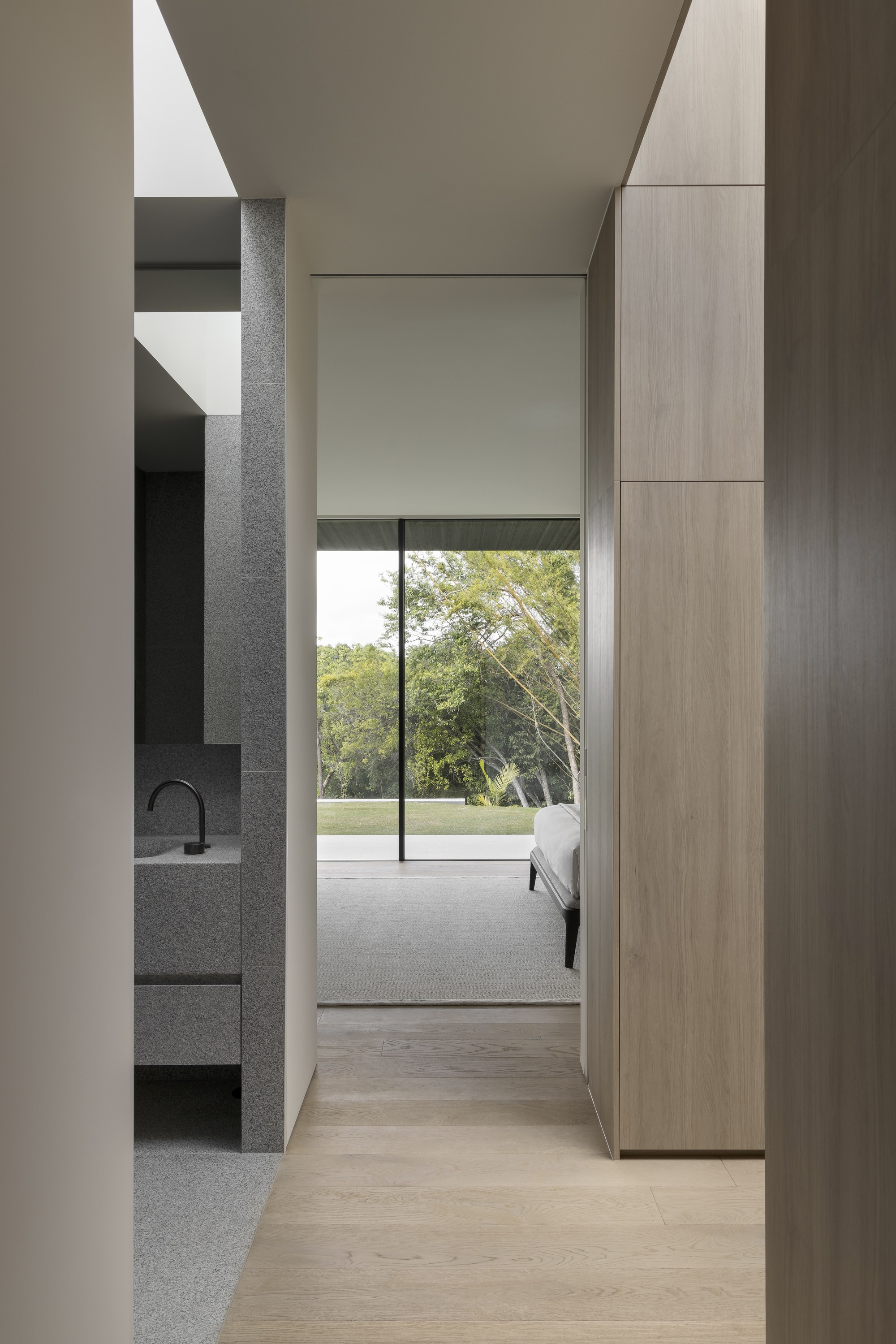
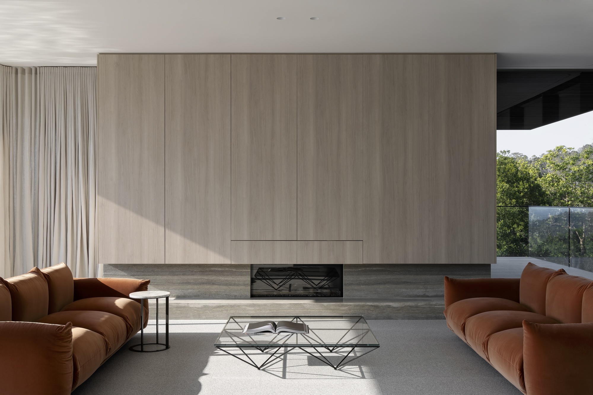
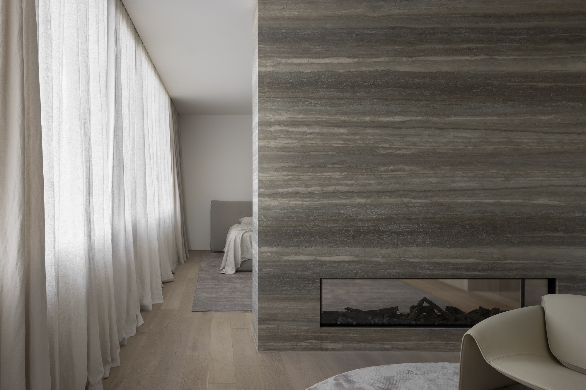
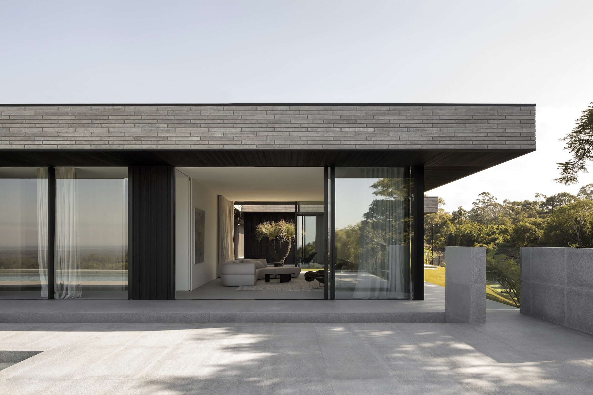
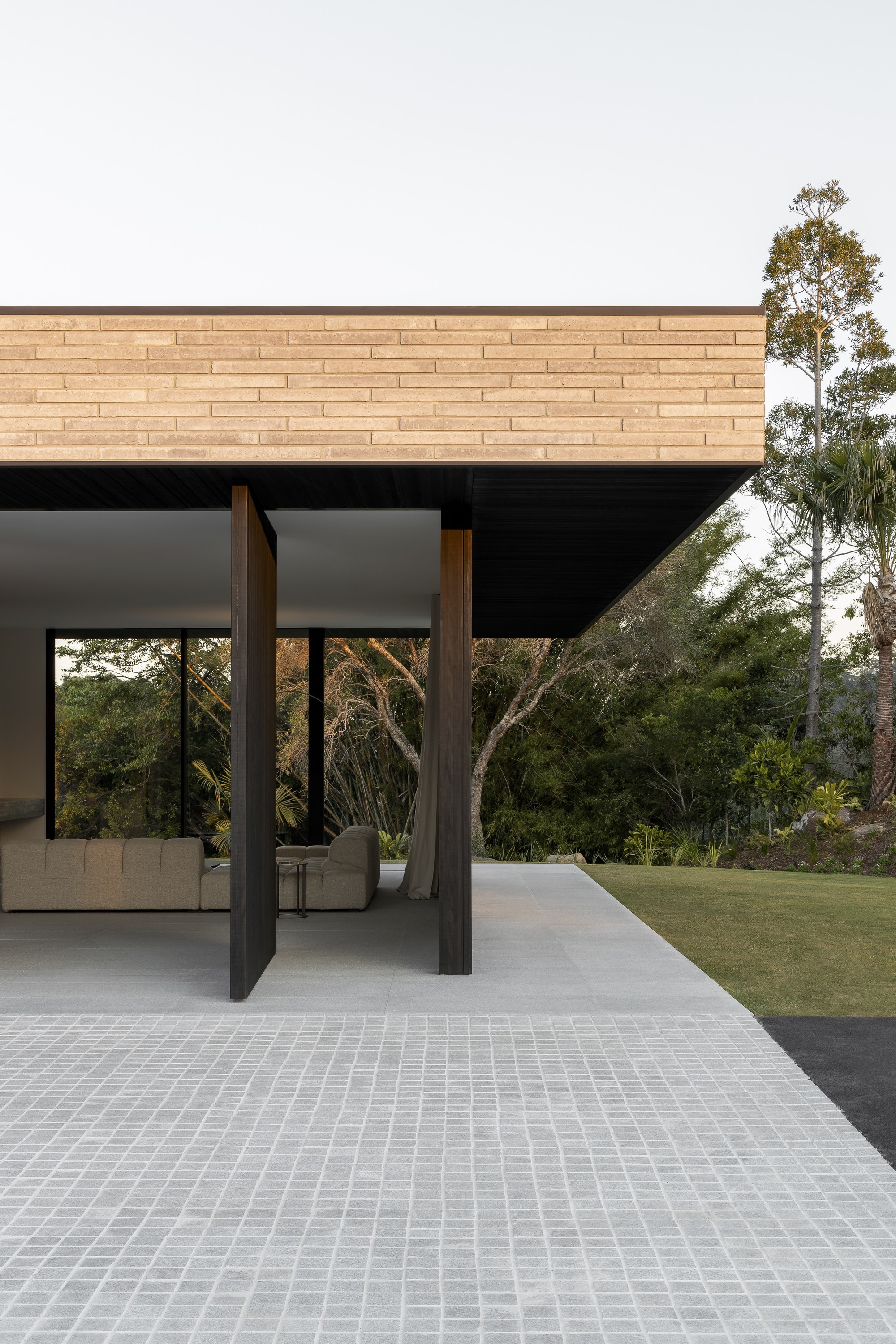
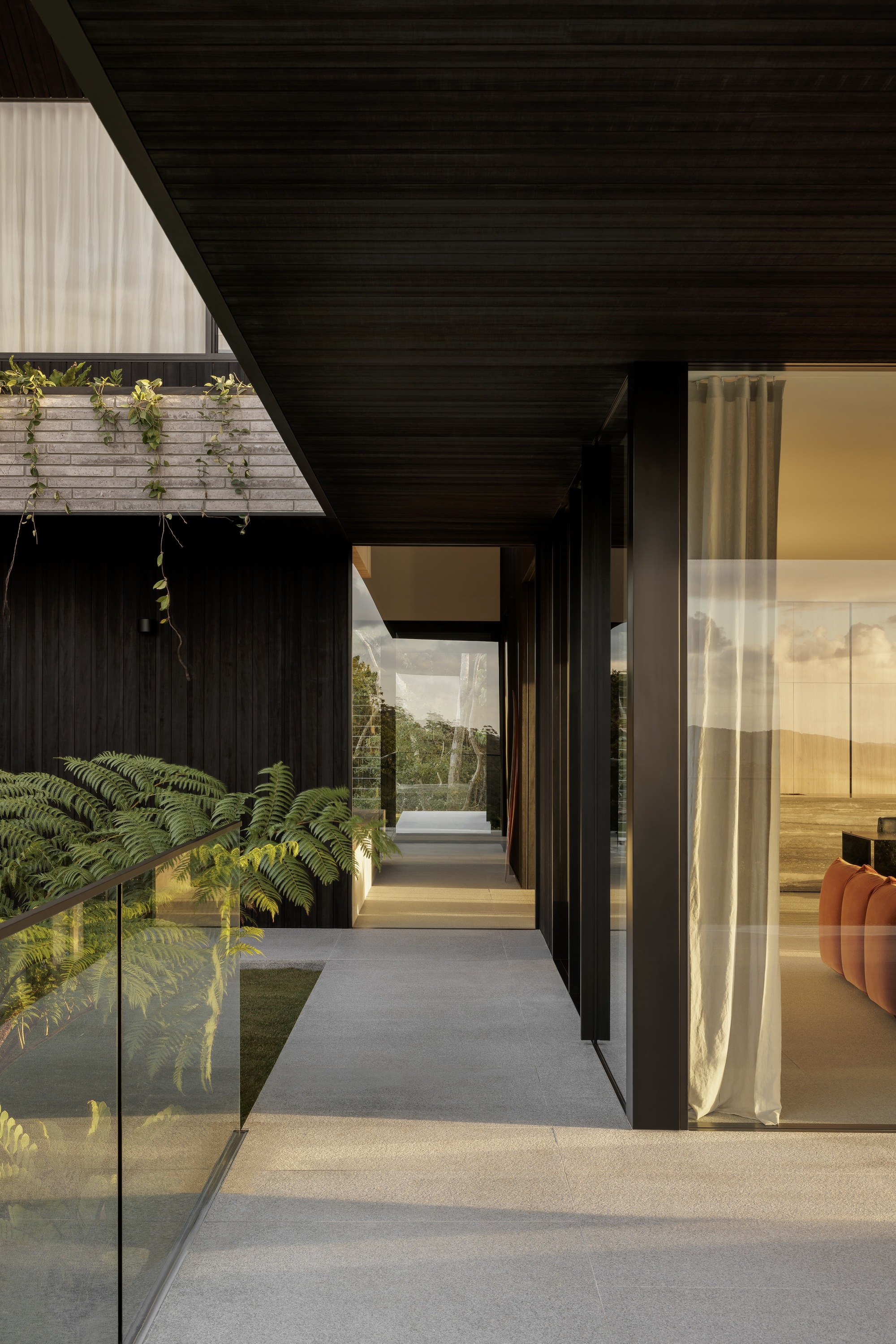
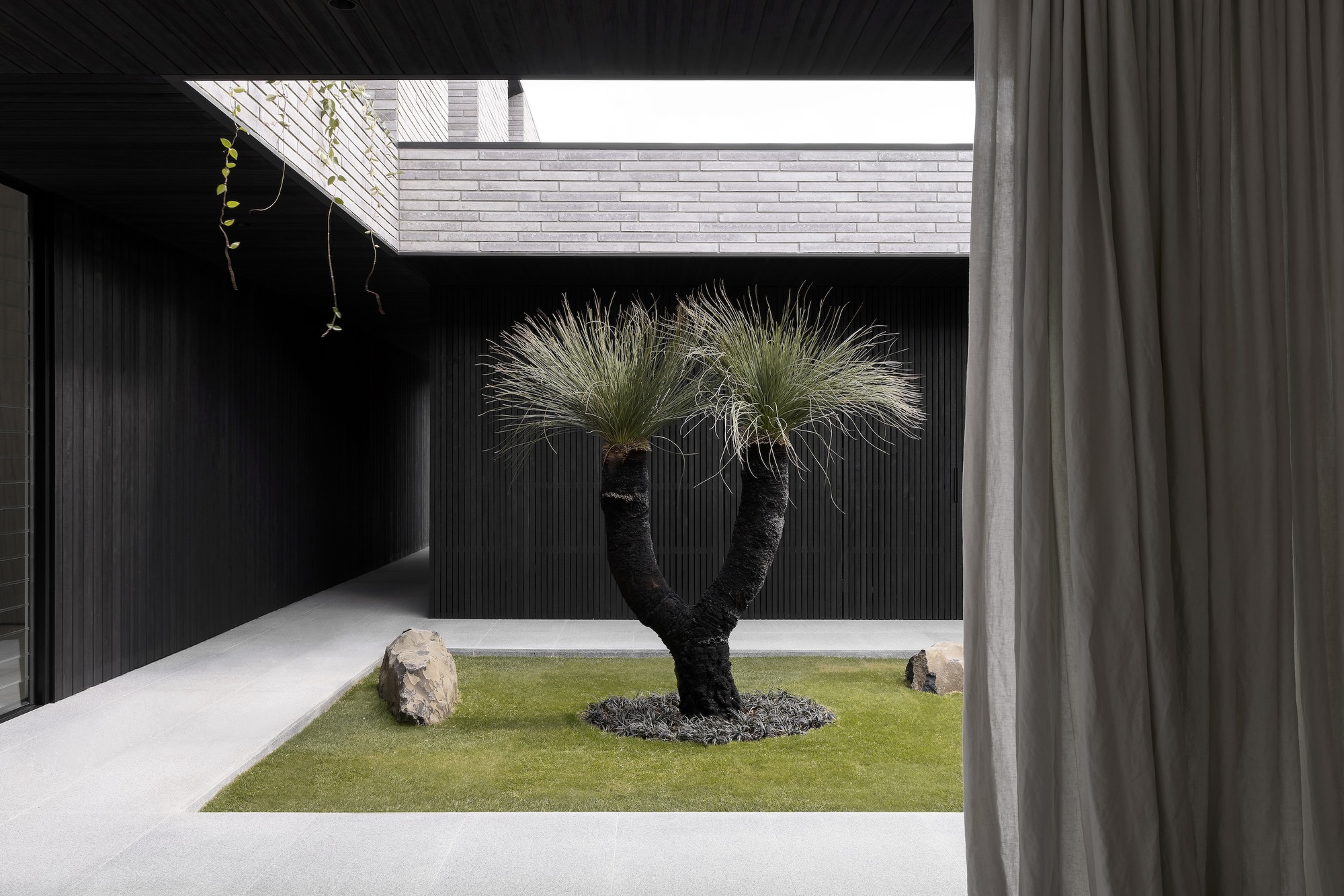
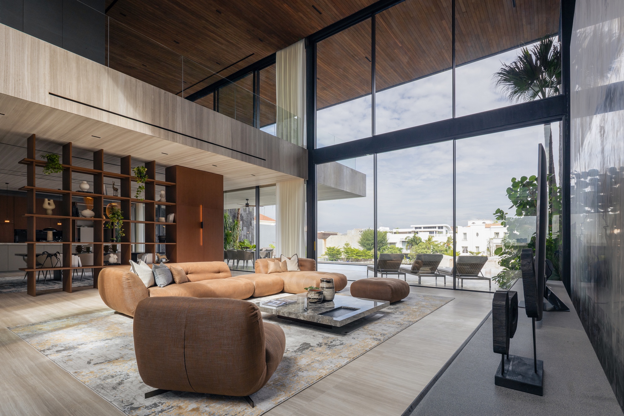
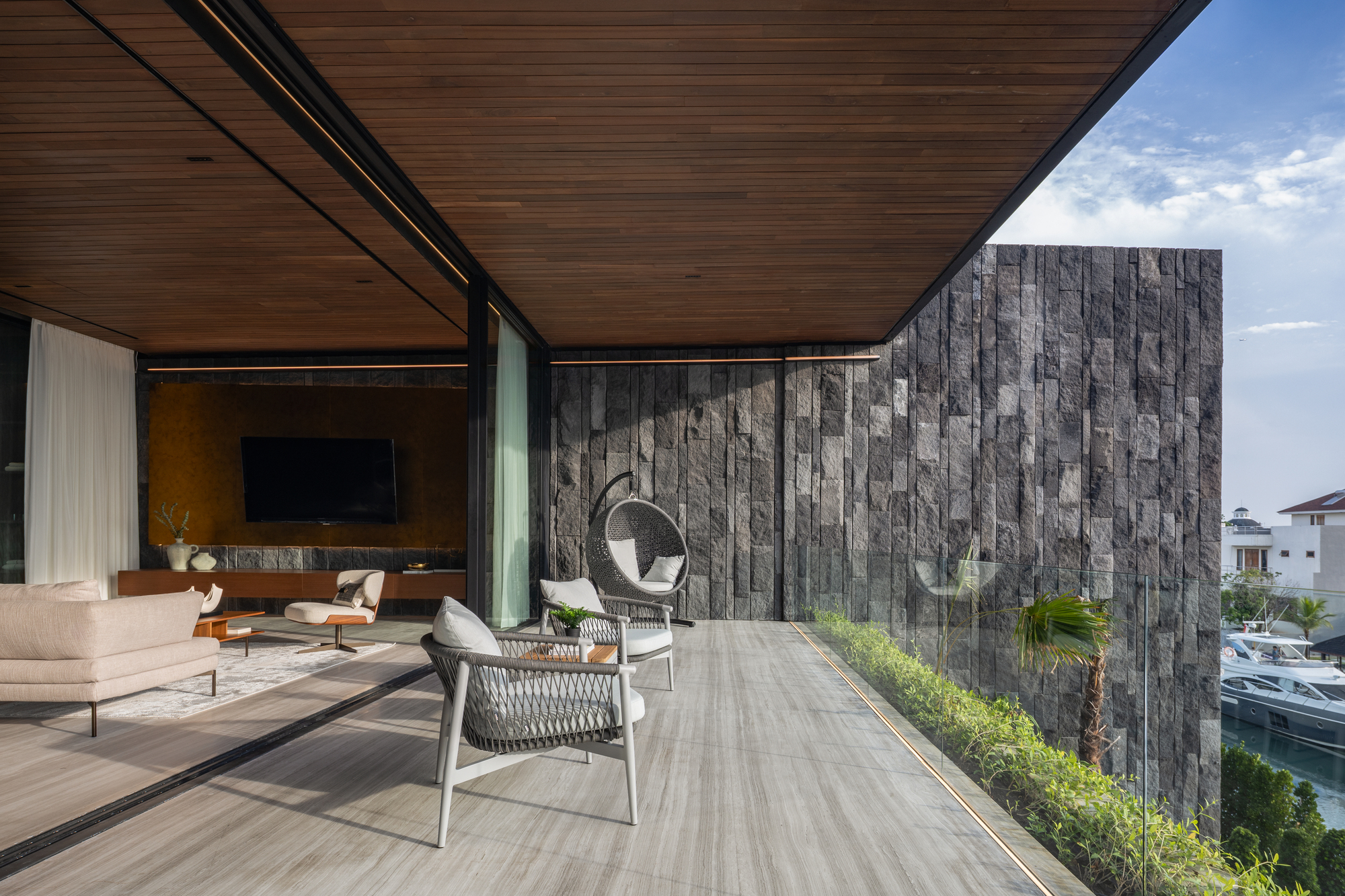
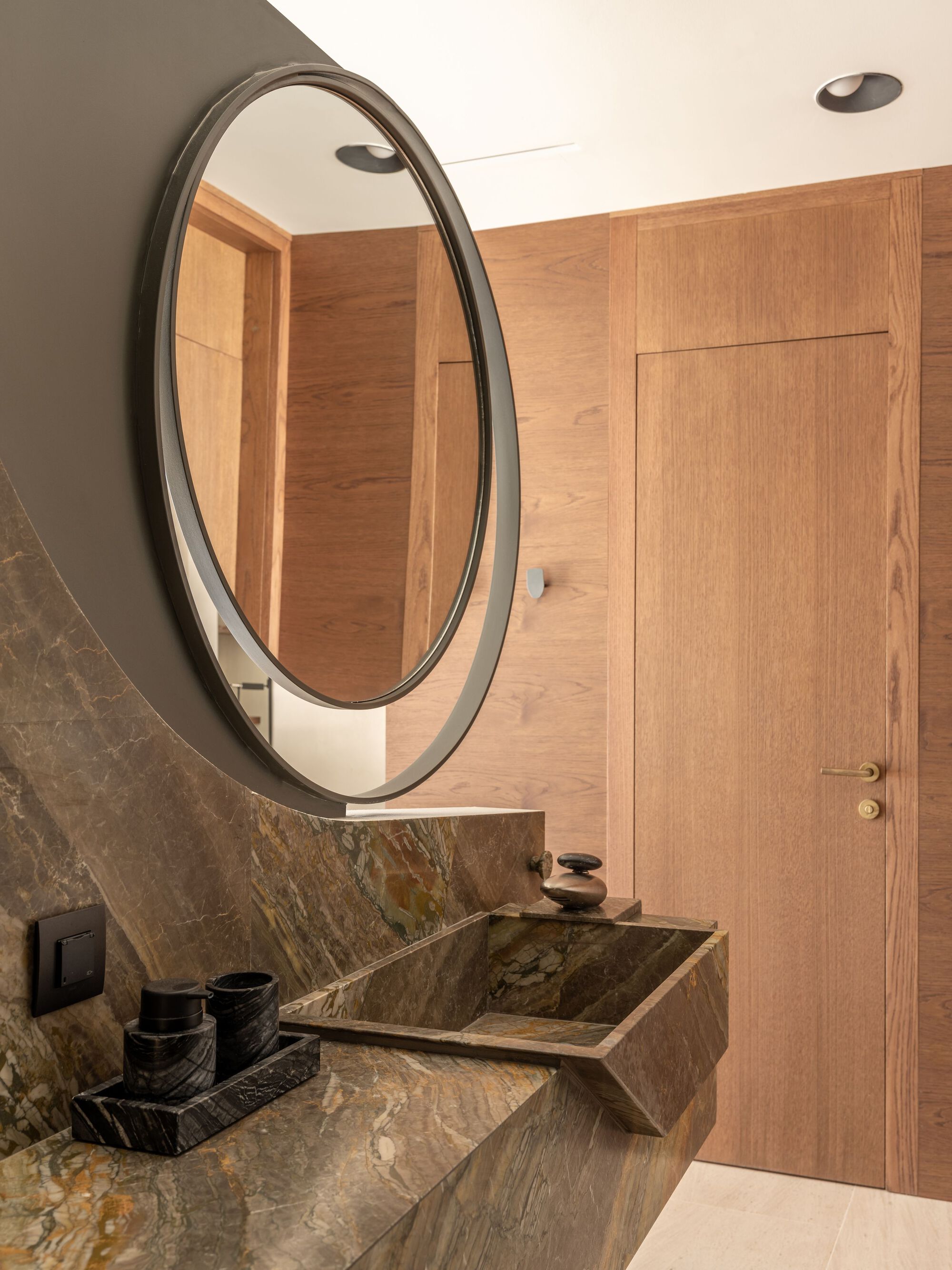
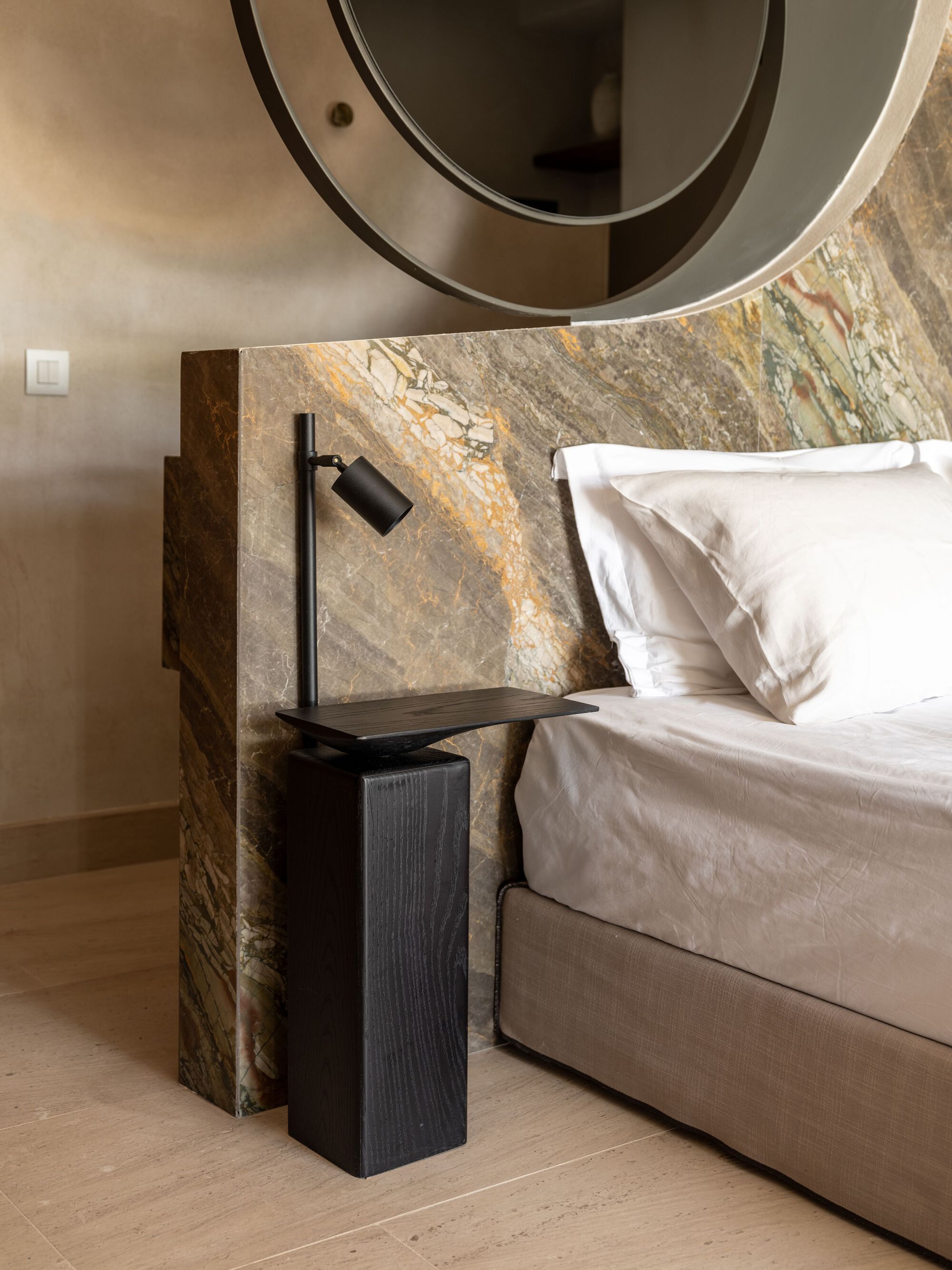
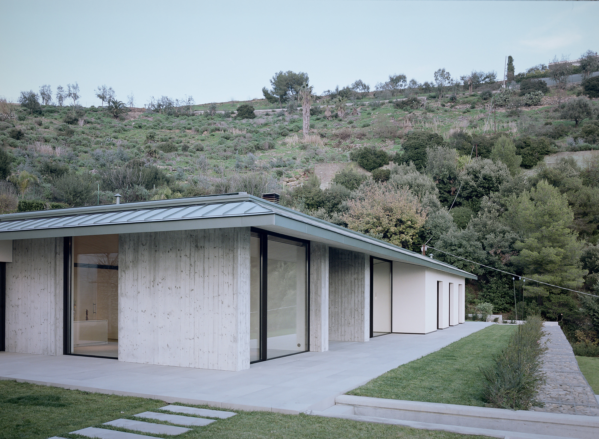
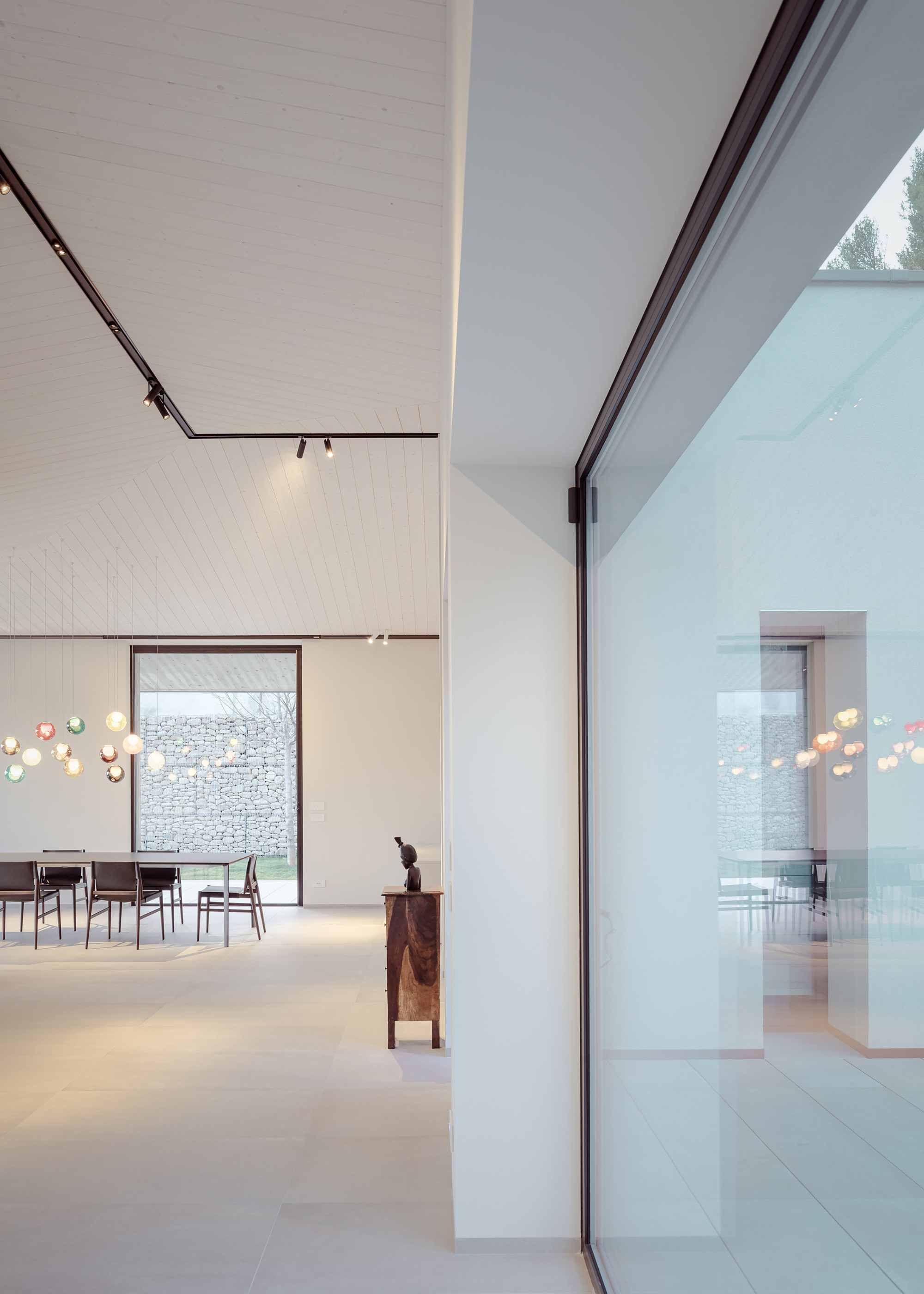
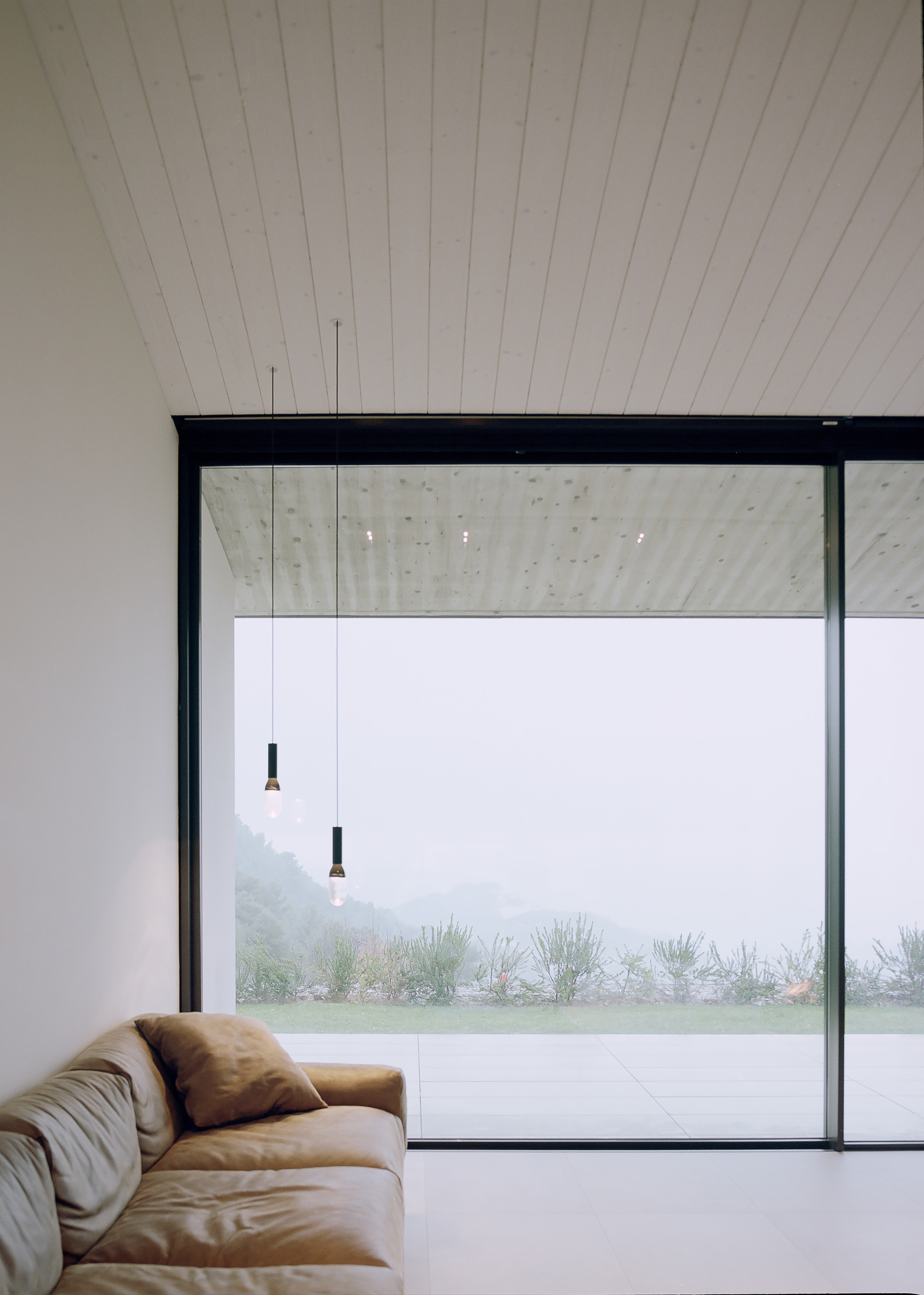
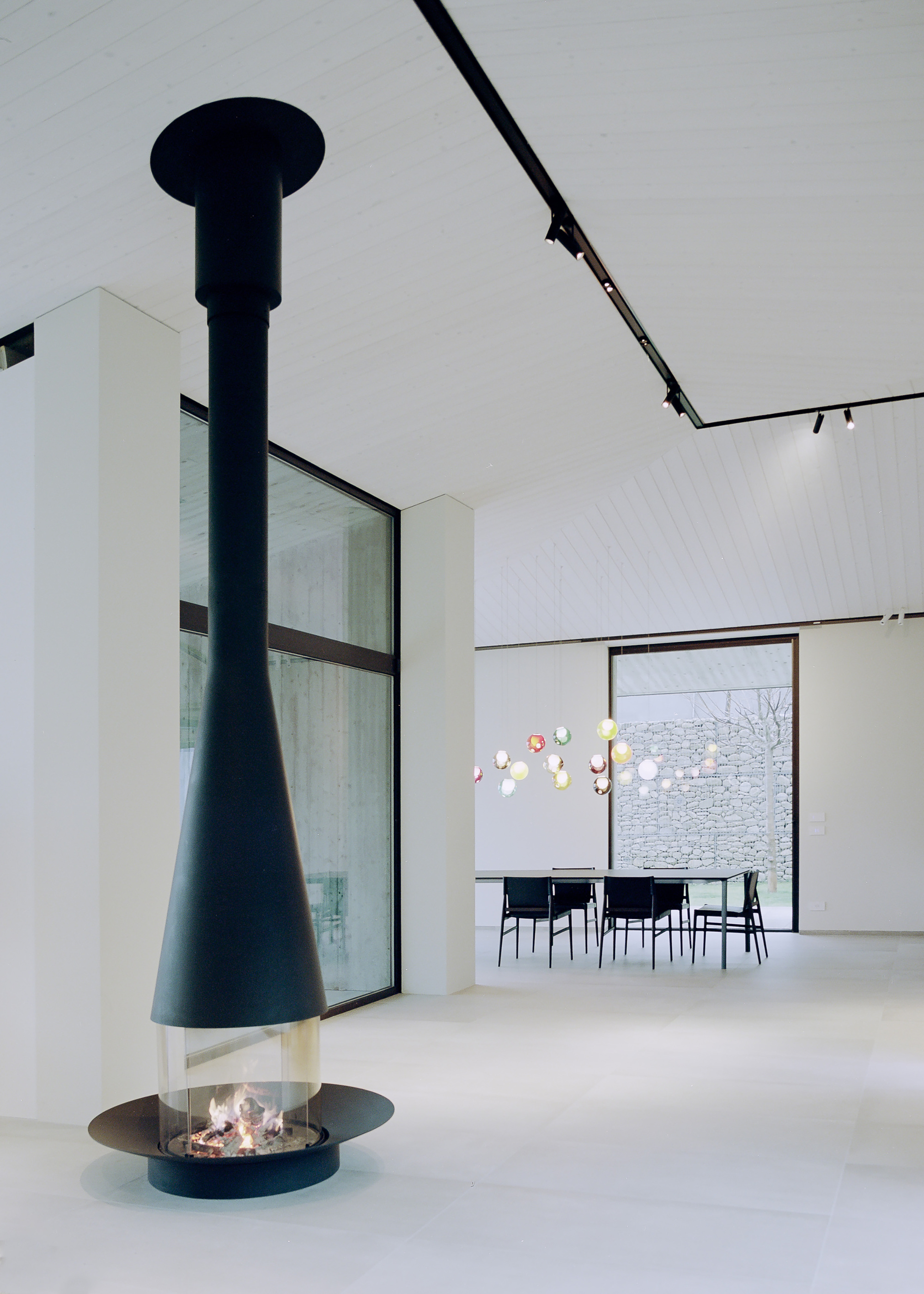
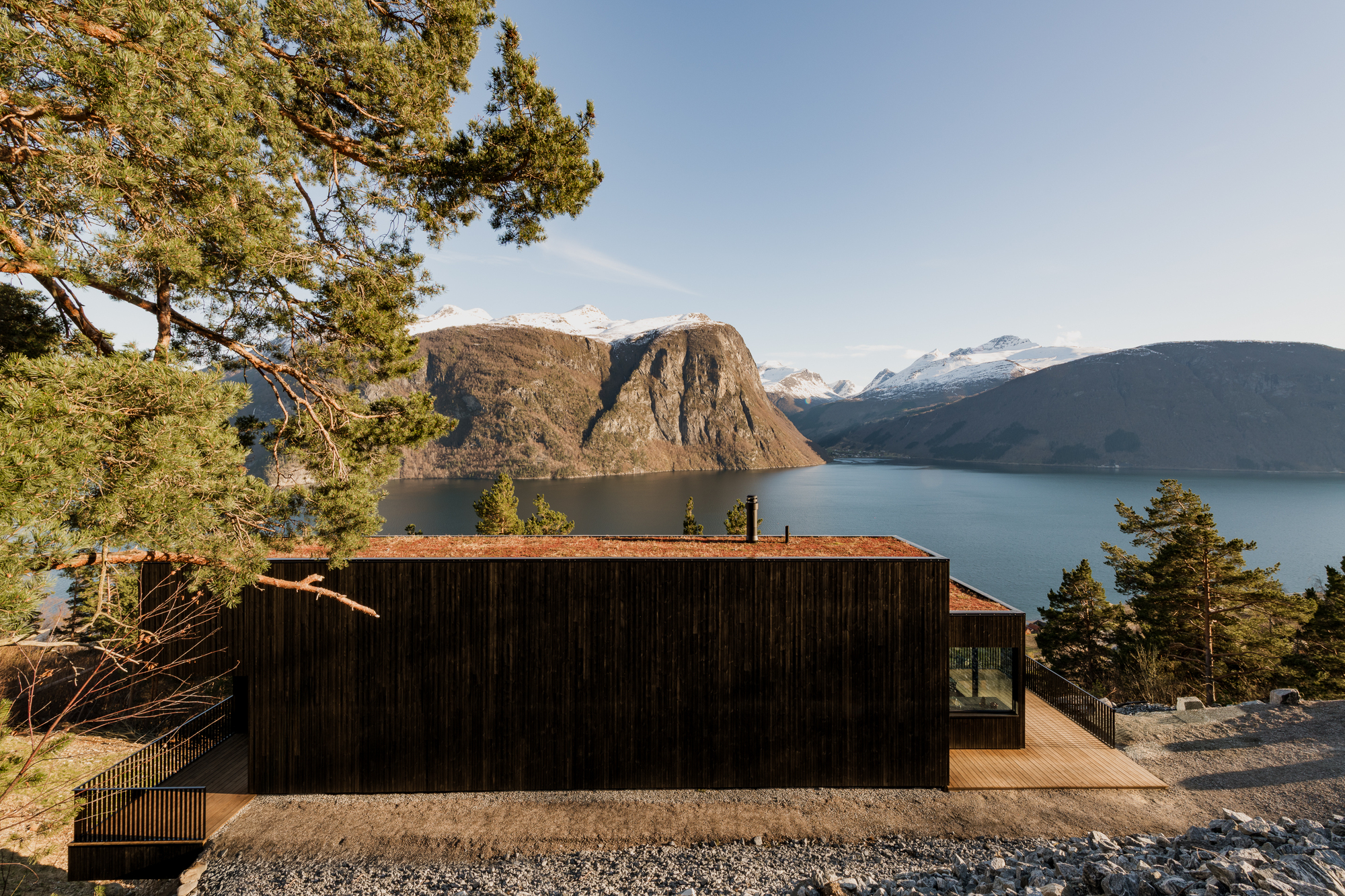
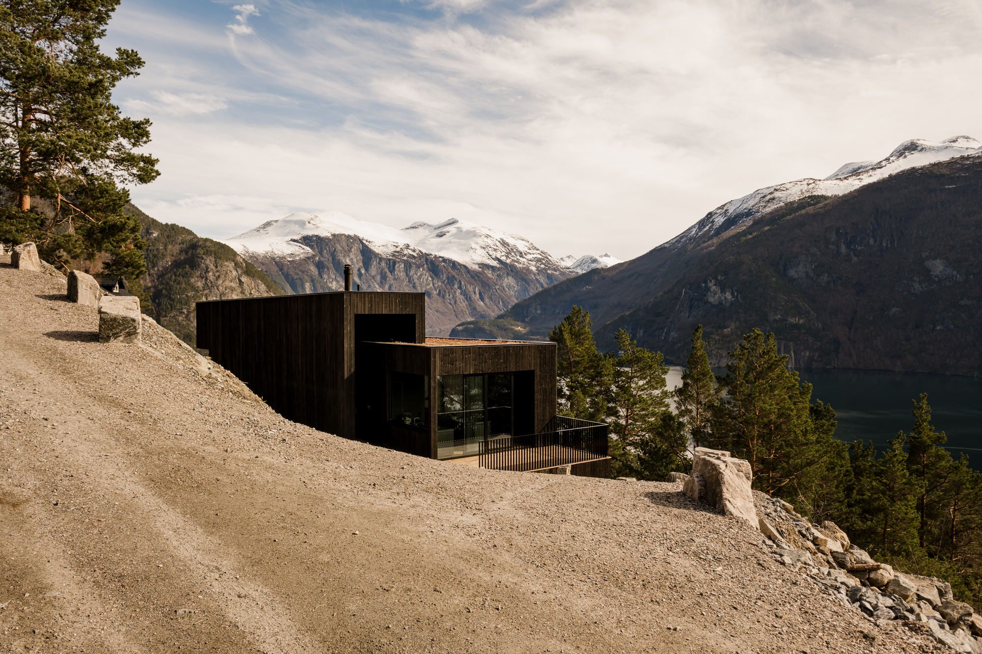
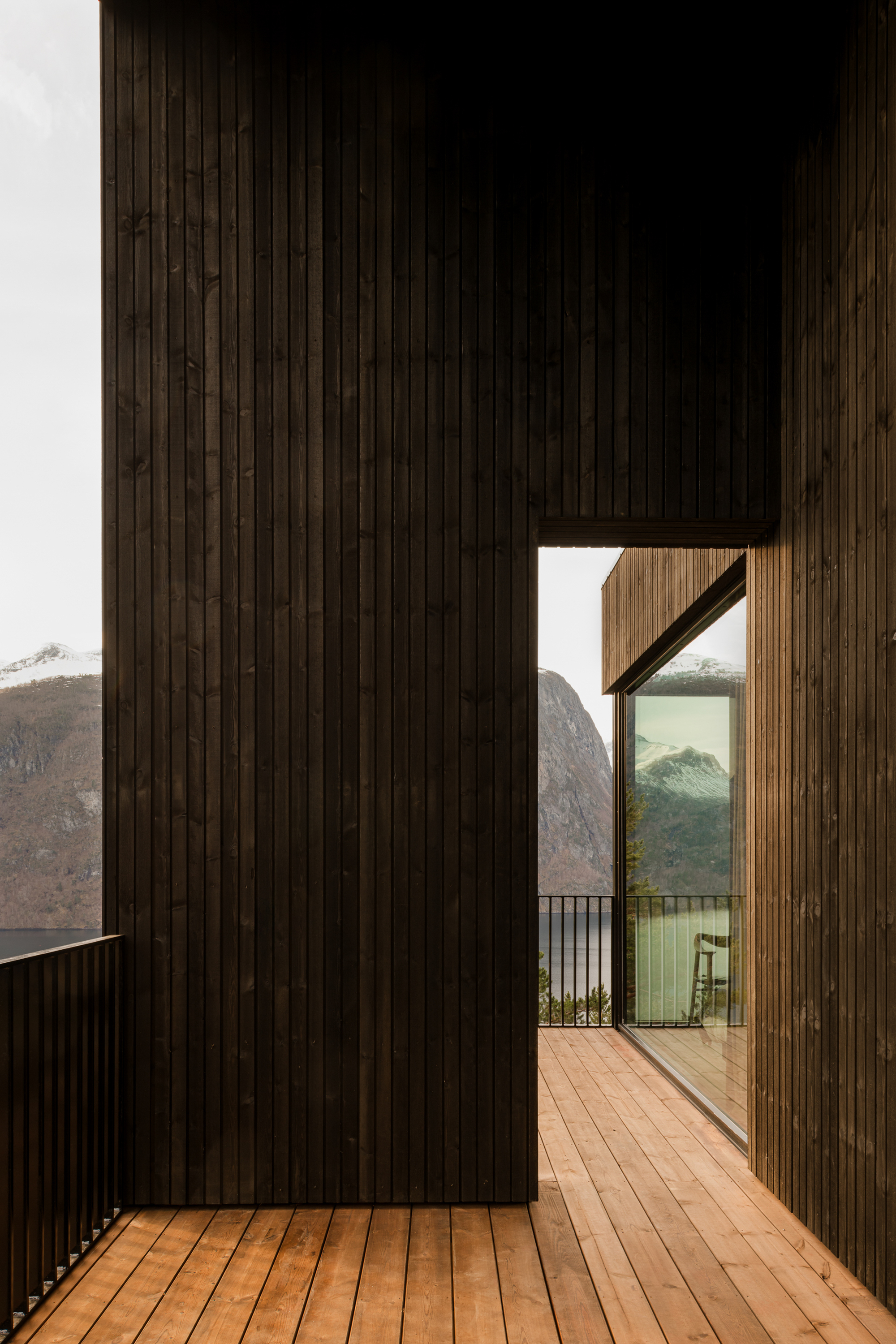
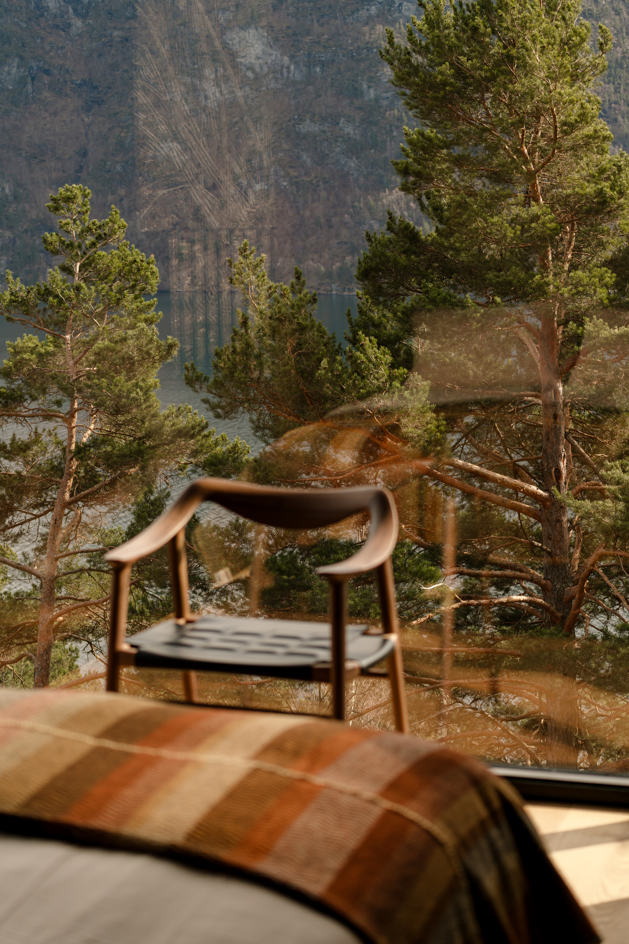
The house has a strong tectonic character thanks to the materials' expressiveness. The entire ground floor of the house is wrapped in black shiplap cladding by Abodo wood, blending into tonal grey handmade Roman Lutyens bricks by Natural Brick Company, light grey granite, and large black-framed windows, which encase the picturesque view.
The palate of the home is raw, robust, and hardwearing, emphasizing the tactile experience of the materials with respect to texture, pattern, color, and geometry. The materials were chosen to integrate the house with the landscape, with the dark walls disappearing into the background of the forest and the light walls above receding against the sky. Ocean Blue Travertine, originating from a single quarry in Italy and sourced by Artedomus, features heavily throughout the kitchen and living areas. A whopping total of 87.9 tonnes of ‘Rustic’ granite was supplied by Granite Works, presenting in the form of free-standing hand-carved baths, vanities, tiles, pavers, cobblestones, and pool coping. The floors and walls are adorned in European French Oak flooring by timber specialists, Made by Storey, and the kitchen and scullery boast state-of-the-art Swiss-made appliances from VZUG, including the CookTop Wok, CookTop Teppanyaki, and multiple wine cooling fridges.
Perched on the crest of the ridgeline of what could be Noosa Hinterland’s most breathtaking location lies Whipbird. Brutalist in style yet simple in its T-shaped pavilion form, Whipbird is a home that adopts a deeply poetic response to the environment, cultivating a close, meaningful relationship between its inhabitants and the unique and natural surroundings.
Nestled in the heart of Doonan, in what is possibly the Sunshine Coast’s best-kept secret, Whipbird takes full advantage of the panoramic hinterland and coastal views whilst generating an environment of contemplation and relaxation. The five-bedroom home is broken down into two distinct wings and split across two levels, with landscaped terraces leading out to facilities including a 20m Naked Mineral pool, a Supergrasse tennis court built into the natural fall of the land, a bathing court, 3-car garage, 6-car court and cascading courtyard gardens adding layers and depth to the outlook. A total of 16,735 native trees, plants, and groundcovers were planted into the property surrounds, enforcing the home's architecture while preserving and enhancing the site’s natural character and connection to the environment.
Sharing a unique passion and respect for quality materials and finishes, Zerni enlisted the help of a formidable team of designers, suppliers, and collaborators to bring Whipbird to life. This team includes Architect of the 2022 HIA Australian Home of the Year Winner, Jen Negline from Minnow Studio, global interior stylists Space Furniture, Landscape Architects The Conlon Group, Swiss-made V-ZUG appliances, Italy's premier Travertine producers, Artedomus, handcrafted stone producers Granite Works, timber specialists Made by Storey, Natural Brick Company and many more.
Upon visiting the site for the first time, developer Jayden Zernich from Zerni was enamored by the location’s natural beauty, tranquility, and stunning outlook over the Noosa hinterland and coastline. “The air felt clear, the whipbirds were humming, every sense was stimulated in the most calming, uncontrived way. The vision became clear: to create a secluded and private reprieve from the open surrounds of the hinterland, where nature’s beauty is accentuated, and luxurious living is epitomized. I am confident that Whipbird presents a new level of craftsmanship yet to be seen on the Sunshine Coast,” said Zernich.
The house has a strong tectonic character thanks to the materials' expressiveness. The entire ground floor of the house is wrapped in black shiplap cladding by Abodo wood, blending into tonal grey handmade Roman Lutyens bricks by Natural Brick Company, light grey granite, and large black-framed windows, which encase the picturesque view.
The palate of the home is raw, robust, and hardwearing, emphasizing the tactile experience of the materials with respect to texture, pattern, color, and geometry. The materials were chosen to integrate the house with the landscape, with the dark walls disappearing into the background of the forest and the light walls above receding against the sky. Ocean Blue Travertine, originating from a single quarry in Italy and sourced by Artedomus, features heavily throughout the kitchen and living areas. A whopping total of 87.9 tonnes of ‘Rustic’ granite was supplied by Granite Works, presenting in the form of free-standing hand-carved baths, vanities, tiles, pavers, cobblestones, and pool coping. The floors and walls are adorned in European French Oak flooring by timber specialists, Made by Storey, and the kitchen and scullery boast state-of-the-art Swiss-made appliances from VZUG, including the CookTop Wok, CookTop Teppanyaki, and multiple wine cooling fridges.
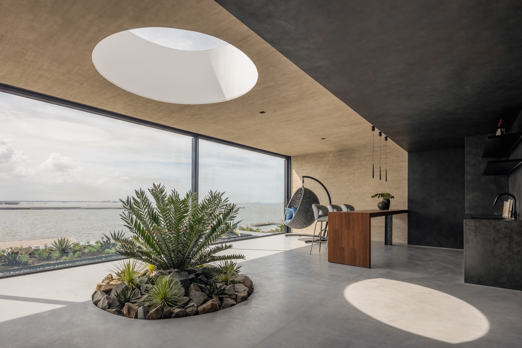


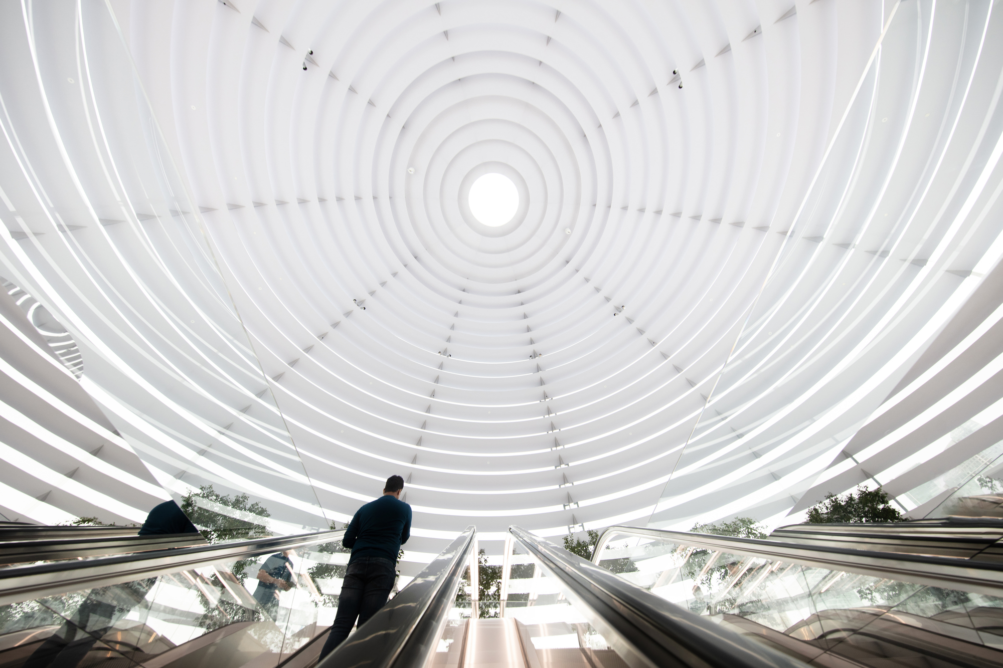


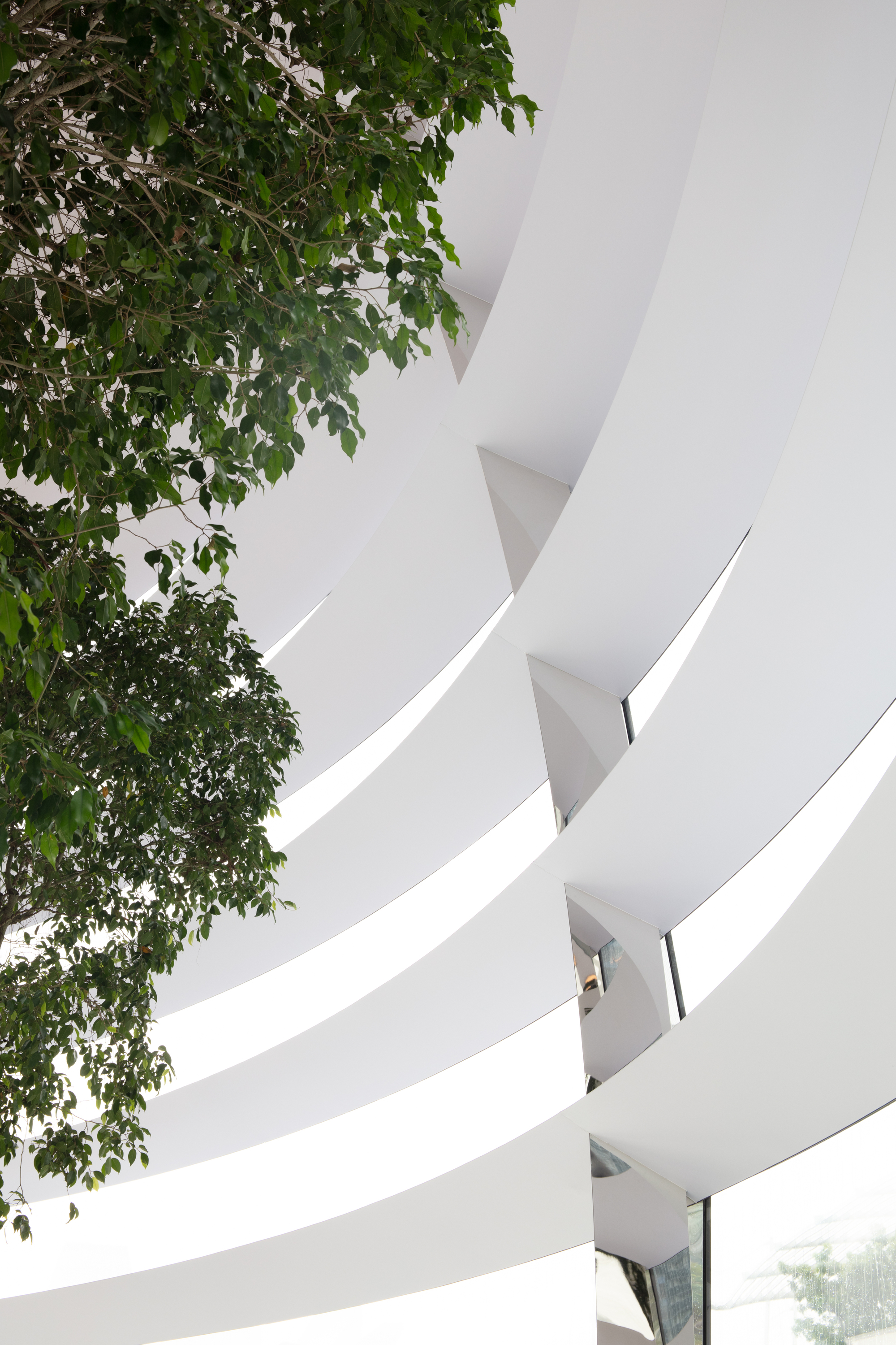


 Apple Marina Bay Sands creates a new distinctive presence on Singapore Bay. The 30-metre-diameter structure is a fully glazed dome with a black glass base, complementing the sister pavilions through its scale and materiality. The design is the result of a close collaboration between Apple’s design teams and the integrated engineering and design team at Foster + Partners.
David Summerfield, Foster + Partners said, “Apple Marina Bay Sands is all about the delicate interplay between transparency and shade. The structure dissolves the boundary between the inside and outside, creating a minimal platform that floats gently in the water, looking out over the bay and the spectacular Singapore skyline.”
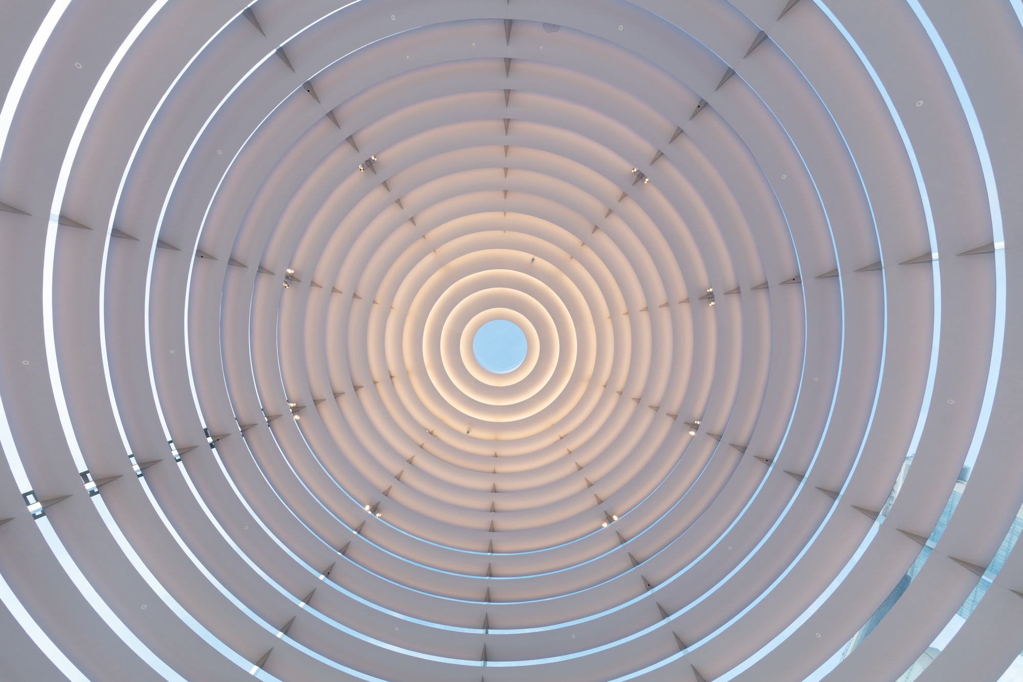
Structurally, the dome acts as a hybrid steel and glass shell, where the grid of steel sections support the weight of the glass and shading, and the curved structural glass panels restrain the steel elements laterally and stiffen the overall form against lateral loads. Integrated solar shading devices keep the interior cool. Each of the 114 panels of glass is carefully selected to meet glazing indices as prescribed by BCA Green Mark, Singapore’s own sustainability rating system.
Each of the multifunctional concentric light sunshade rings reduce in size as they progress towards the top of the building, providing acoustic absorption for the store. More importantly, they diffuse and reflect daylight to the baffle above, creating a magical effect and dematerialising the structure. At the top a semi-opaque oculus provides a dramatic shaft of light that travels through the space, reminiscent of the famous Pantheon in Rome.
Stefan Behling, Foster + Partners said, “The dome appears ephemeral. The effect is very calming, and the changing intensity and colour of the light is mesmerising. It is not only a celebration of Apple’s incredible products, but a celebration of light.”
The garden city ideal of Singapore flows from the promenade into the interior spaces, with ten trees placed along the perimeter providing additional shading and soft shadows through the foliage. Set within leather-topped planters, they also provide comfortable places to sit and enjoy the ambiance of the store and the fantastic views of the marina
The store can be entered through The Shoppes at Marina Bay Sands via a beautifully curved stone entrance, flanked by Apple’s signature Avenue display on either side of a 45-metre long and 7.6-metre wide space. This leads directly to a set of dramatic escalators that take visitors on a “kaleidoscopic” journey to the heart of the spectacular domed space. This contrasting transition from the heart of the retail centre to the Apple dome offers the customer a dramatic and exhilarating experience. It culminates with spectacular views across the bay and towards the city. During the day, the dome reflects the colours of the surrounding water and sky, while in the evening the subtle interior lighting provides a warm glow and enhances everyone’s experience of Singapore’s spectacular skyline.
Apple Marina Bay Sands creates a new distinctive presence on Singapore Bay. The 30-metre-diameter structure is a fully glazed dome with a black glass base, complementing the sister pavilions through its scale and materiality. The design is the result of a close collaboration between Apple’s design teams and the integrated engineering and design team at Foster + Partners.
David Summerfield, Foster + Partners said, “Apple Marina Bay Sands is all about the delicate interplay between transparency and shade. The structure dissolves the boundary between the inside and outside, creating a minimal platform that floats gently in the water, looking out over the bay and the spectacular Singapore skyline.”
Structurally, the dome acts as a hybrid steel and glass shell, where the grid of steel sections support the weight of the glass and shading, and the curved structural glass panels restrain the steel elements laterally and stiffen the overall form against lateral loads. Integrated solar shading devices keep the interior cool. Each of the 114 panels of glass is carefully selected to meet glazing indices as prescribed by BCA Green Mark, Singapore’s own sustainability rating system.
Each of the multifunctional concentric light sunshade rings reduce in size as they progress towards the top of the building, providing acoustic absorption for the store. More importantly, they diffuse and reflect daylight to the baffle above, creating a magical effect and dematerialising the structure. At the top a semi-opaque oculus provides a dramatic shaft of light that travels through the space, reminiscent of the famous Pantheon in Rome.
Stefan Behling, Foster + Partners said, “The dome appears ephemeral. The effect is very calming, and the changing intensity and colour of the light is mesmerising. It is not only a celebration of Apple’s incredible products, but a celebration of light.”
The garden city ideal of Singapore flows from the promenade into the interior spaces, with ten trees placed along the perimeter providing additional shading and soft shadows through the foliage. Set within leather-topped planters, they also provide comfortable places to sit and enjoy the ambiance of the store and the fantastic views of the marina
The store can be entered through The Shoppes at Marina Bay Sands via a beautifully curved stone entrance, flanked by Apple’s signature Avenue display on either side of a 45-metre long and 7.6-metre wide space. This leads directly to a set of dramatic escalators that take visitors on a “kaleidoscopic” journey to the heart of the spectacular domed space. This contrasting transition from the heart of the retail centre to the Apple dome offers the customer a dramatic and exhilarating experience. It culminates with spectacular views across the bay and towards the city. During the day, the dome reflects the colours of the surrounding water and sky, while in the evening the subtle interior lighting provides a warm glow and enhances everyone’s experience of Singapore’s spectacular skyline.


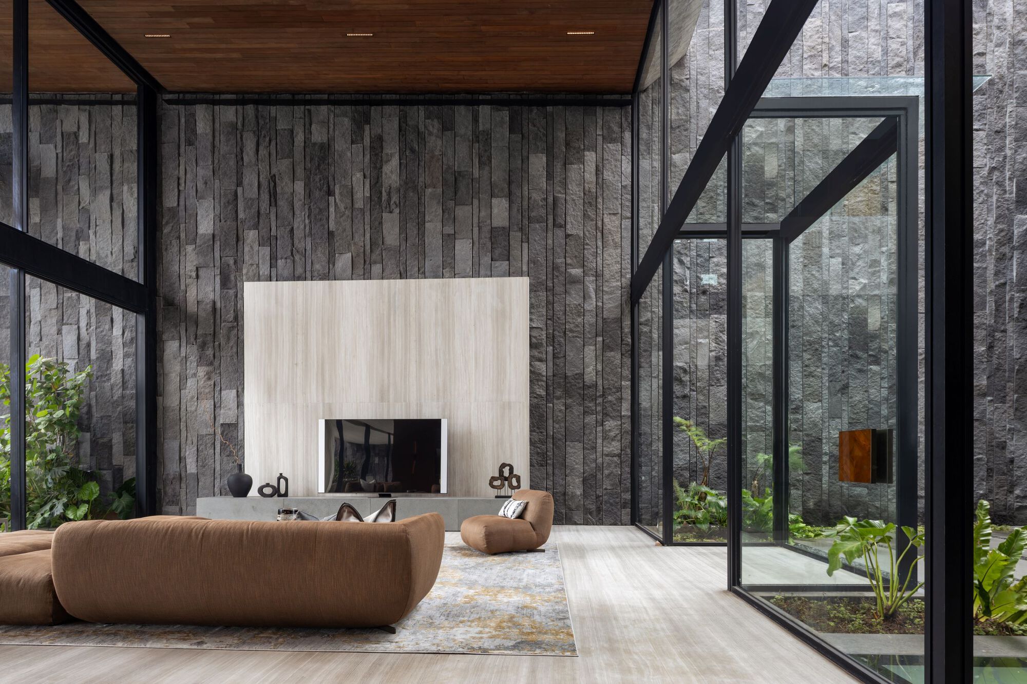
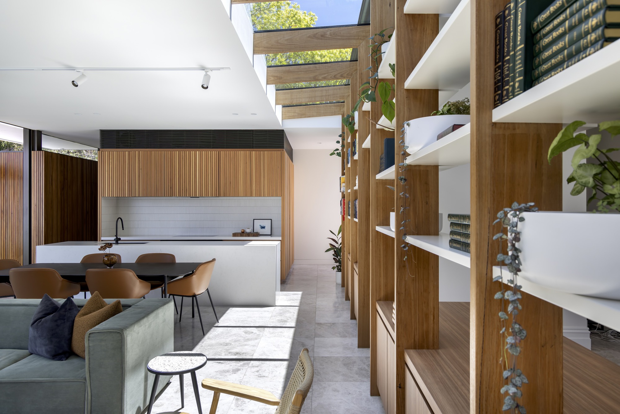
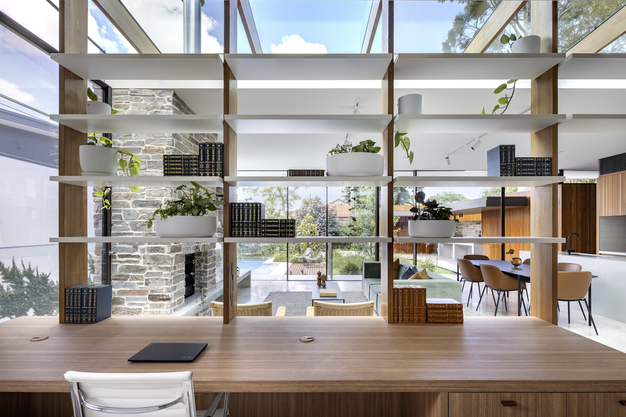
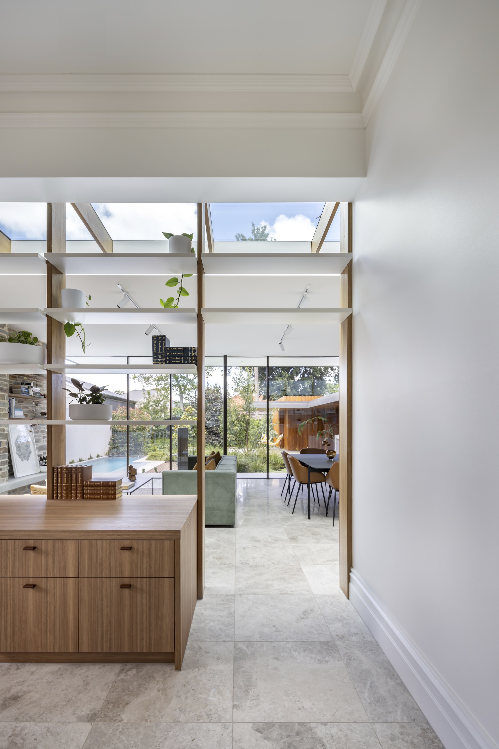
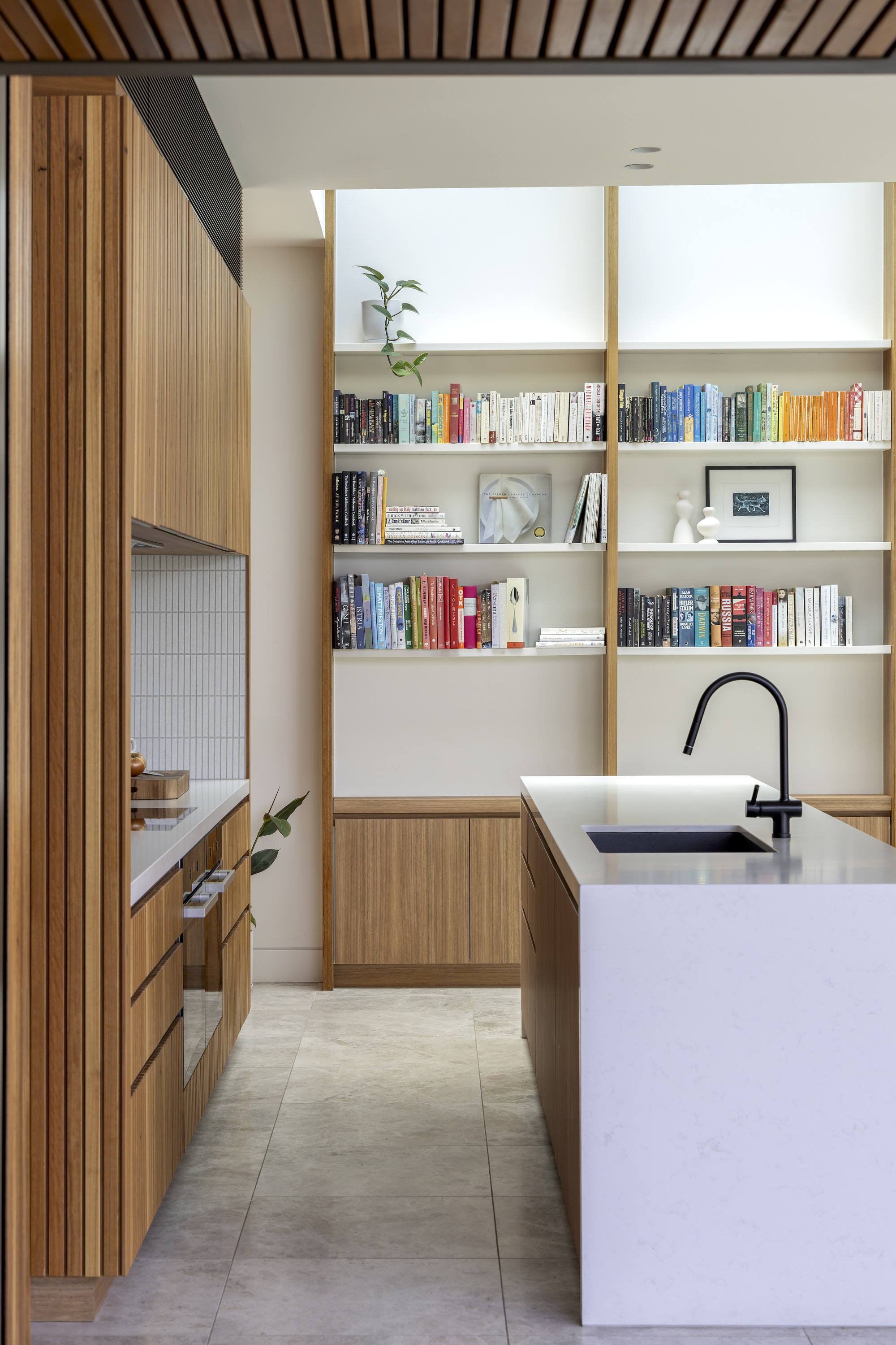
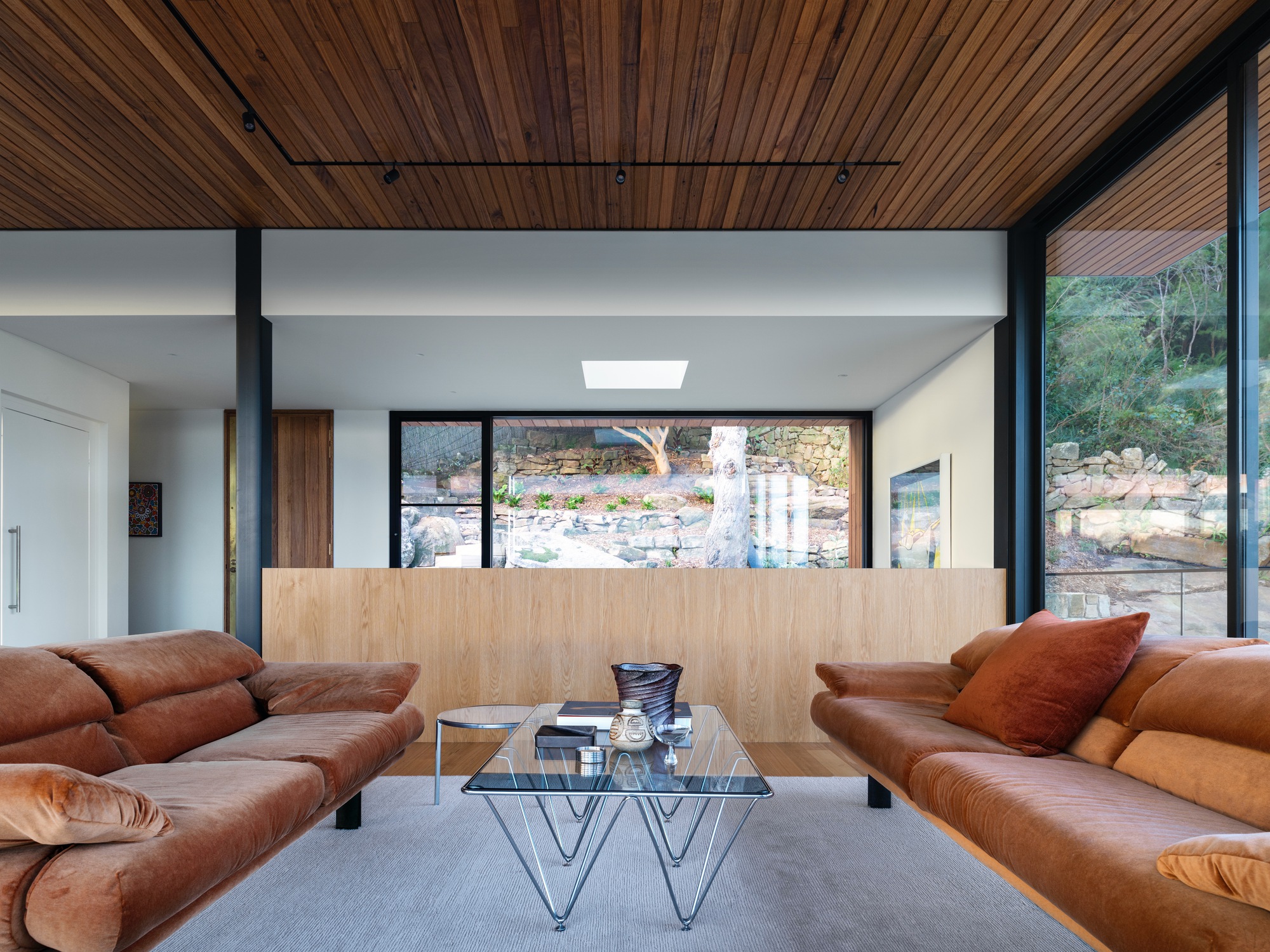
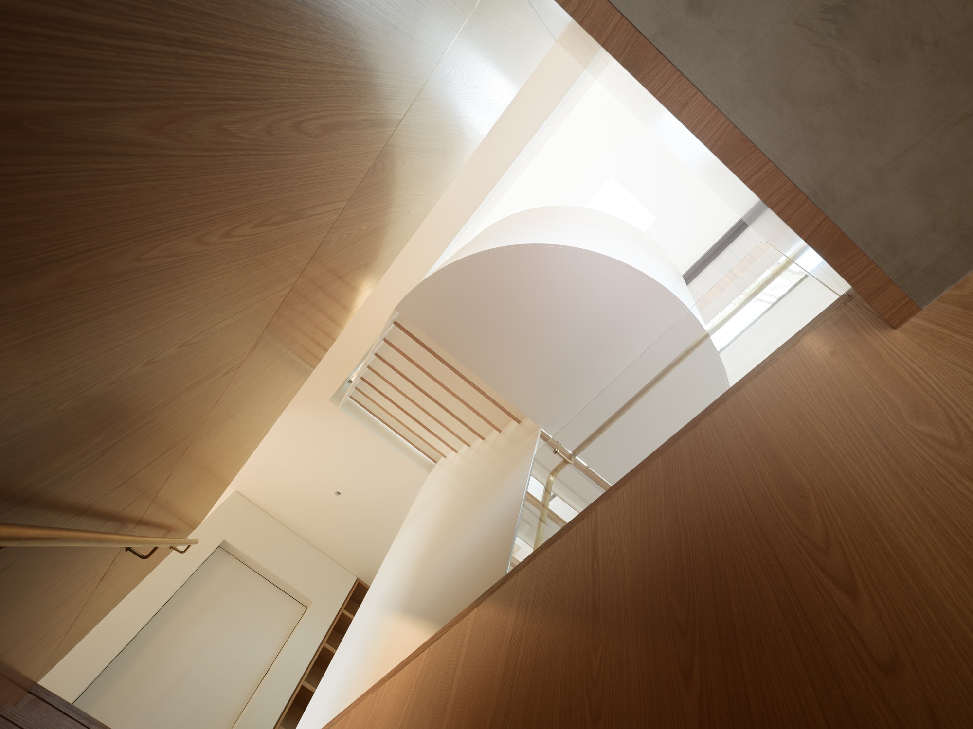
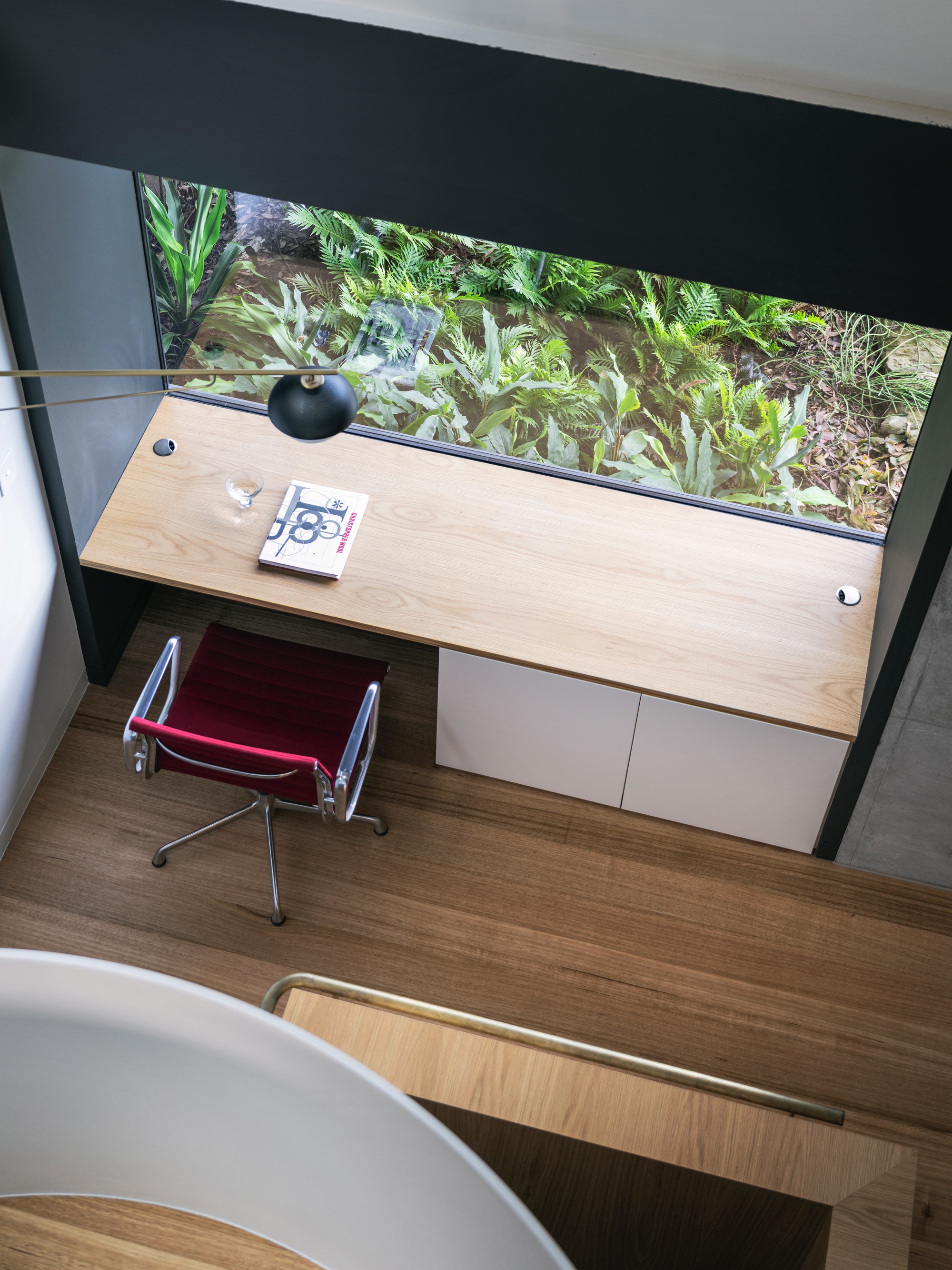
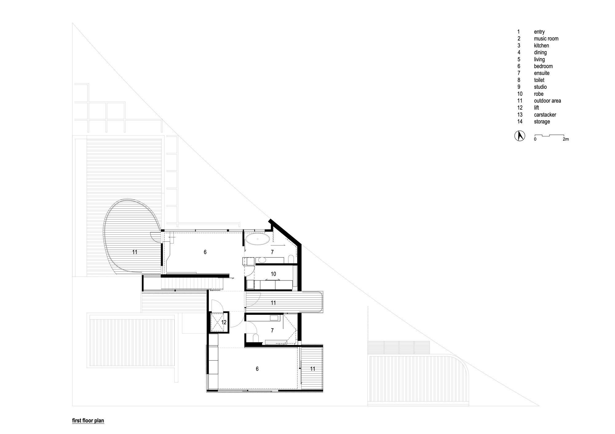 A throw away comment by one half of our clients, a gentleman in his late 70’s and an artist of national if not international standing; that he’d never had a house designed for him, for them, a home... This resonated with us. His excitement and expectation of the possibilities was palpable, as was the gentle understanding that time to experience this home was not open ended. It reinforced the precious opportunity a client gifts their architect.
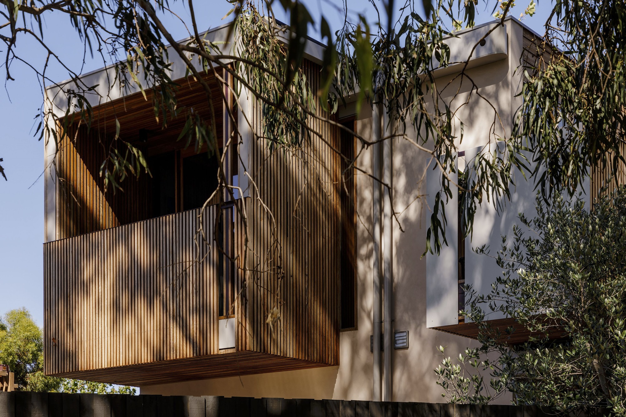
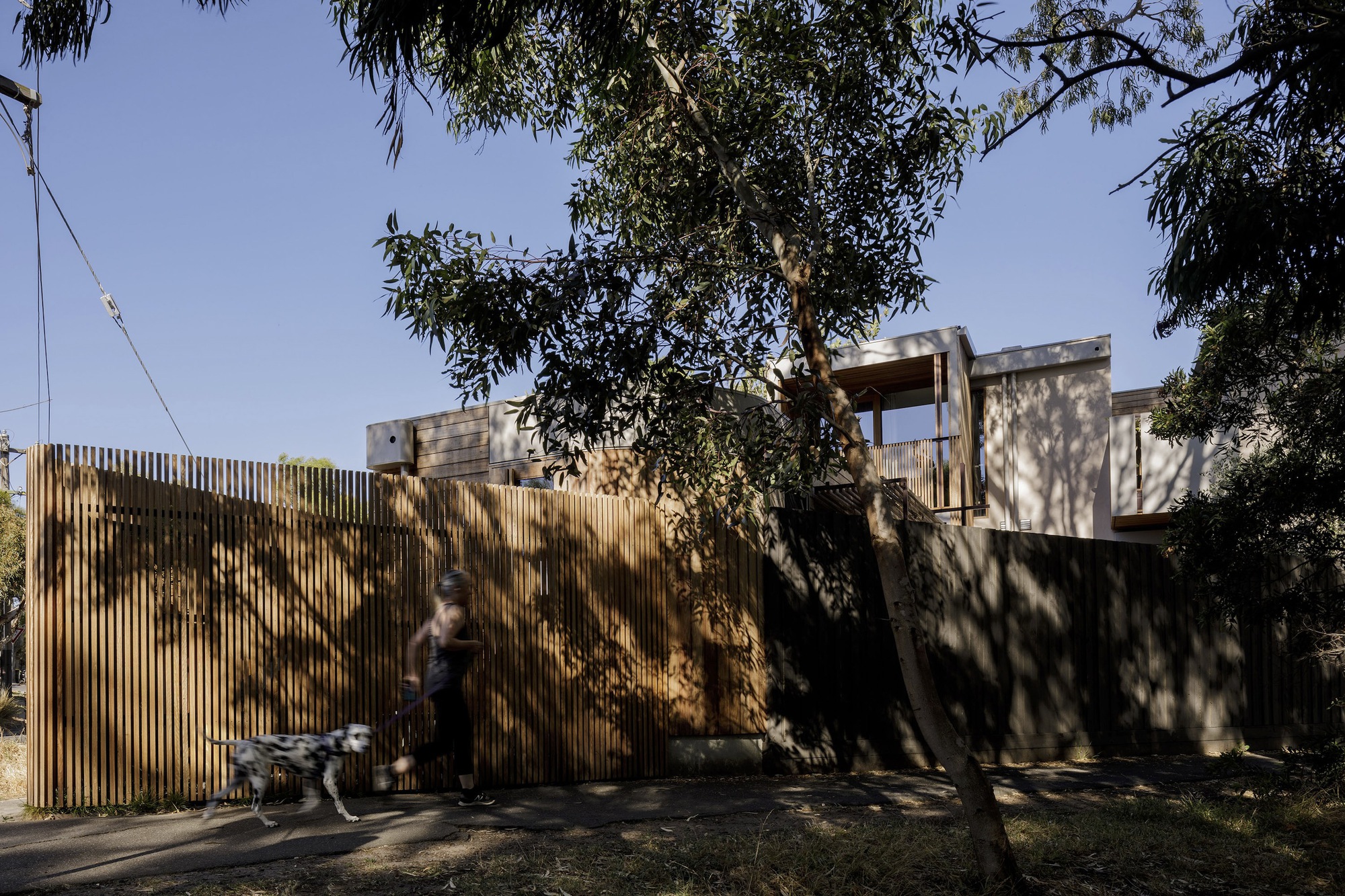
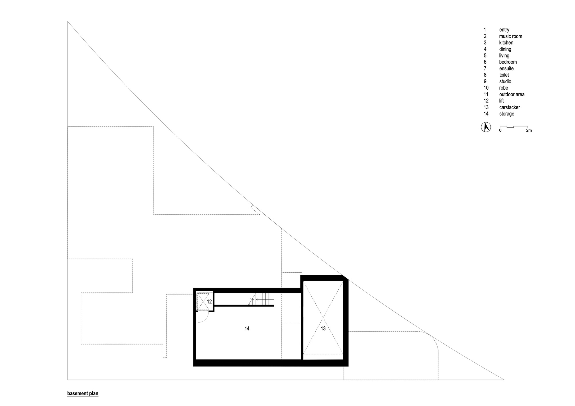
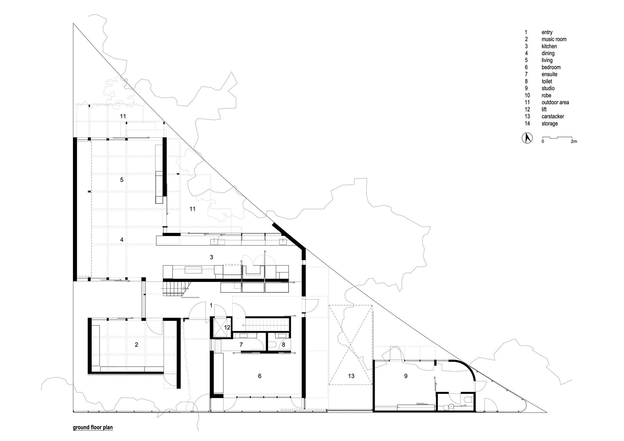
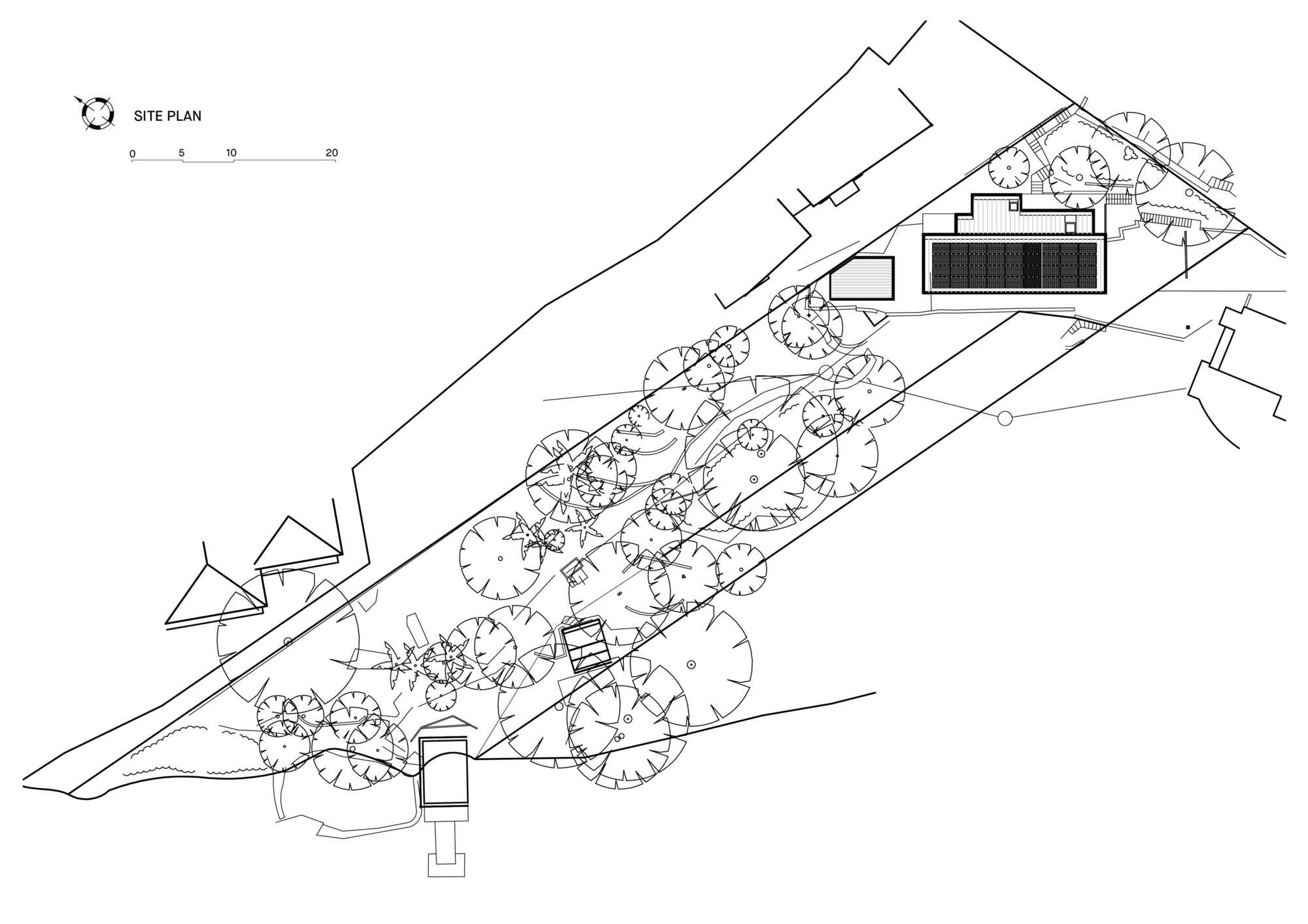
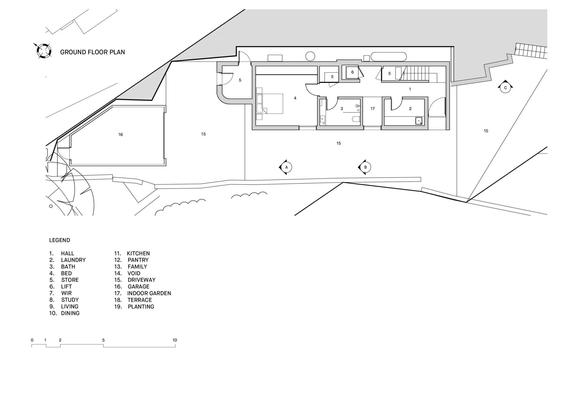
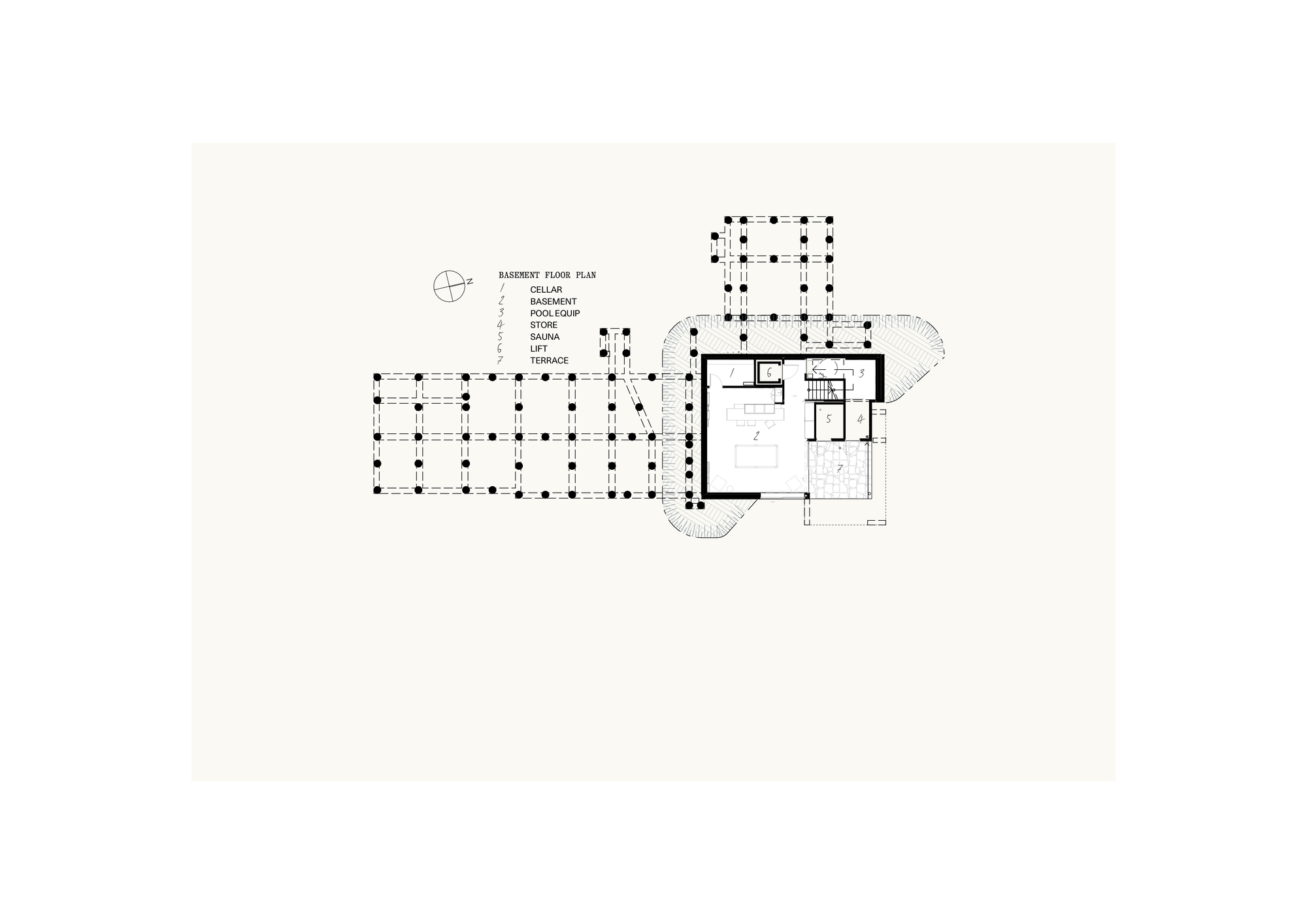
Another inciteful ‘thought out loud’ moment was that the building should be designed such that it could be embraced by the neighborhood. Our explicit role then was to gift the community a beautiful building. Given a triangular site bounded on two sides by pedestrian traffic, this makes for pleasing a lot of people. Then we have a not insubstantial brief for a not insubstantial home including basement, lift, car stacker and separate studio.
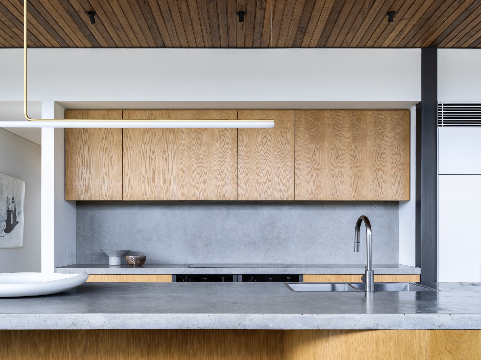
This brings us to the very disparate personal tastes of our clients. One likes high volumes, one likes intimate spaces, one is a minimalist, the other a collector of things… natural, textured, patinaed, a love of objects with history, the scratches and bruises of past use. Both wanting an abundance of natural light, while loving the play of shadow, wanting the inside to seamlessly shift to the outside while remaining private to the teams of passerbys.
To display their trophies of a life well lived, the books, the art, the furniture, the collections, the objects, the records, the dog, the visiting family, the pots, the pans, the l can’t throw this away objects, the heirlooms, the trophy trophies...all needing a space, a home. All this on an awkward block… with height restrictions and a flood level for good measure. Backing onto a park filled with substantial gums and rowdy galahs.
Knowing that the site and program expectations were not the greatest of bedfellows, we chose our consultants carefully. A builder who's not afraid of detail, materiality, or tight sites and an engineer who would work closely with us. We discussed the landscaping from the very outset of the project. We measured and cataloged the entire list of the client’s objects…
As is usual, the plan works hard to resolve the constraints inherited. To provide privacy from the passing parade, while presenting a generous, homely aesthetic on all sides. To create vistas from room to room over fledgling landscaped spaces, while the built form responds directly to place, and the materiality which quietly mimics the colour and textures of parkland to its northern flank is carried through internally.
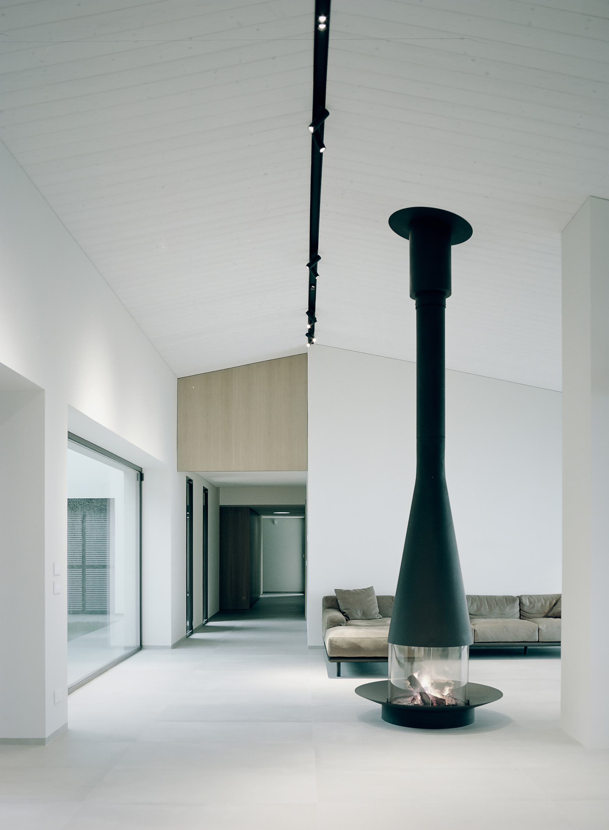
The tall / small thing…. well, we played with height throughout, using coffered ceilings to the primary living spaces to mediate the expectations of both clients where, from the corner of the room one registers the bottom of the coffers, giving a cozy, intimate feel. And then when moving through the room the height of the ceiling becomes apparent… problem solved - job done.
A throw away comment by one half of our clients, a gentleman in his late 70’s and an artist of national if not international standing; that he’d never had a house designed for him, for them, a home... This resonated with us. His excitement and expectation of the possibilities was palpable, as was the gentle understanding that time to experience this home was not open ended. It reinforced the precious opportunity a client gifts their architect.
Another inciteful ‘thought out loud’ moment was that the building should be designed such that it could be embraced by the neighborhood. Our explicit role then was to gift the community a beautiful building. Given a triangular site bounded on two sides by pedestrian traffic, this makes for pleasing a lot of people. Then we have a not insubstantial brief for a not insubstantial home including basement, lift, car stacker and separate studio.
This brings us to the very disparate personal tastes of our clients. One likes high volumes, one likes intimate spaces, one is a minimalist, the other a collector of things… natural, textured, patinaed, a love of objects with history, the scratches and bruises of past use. Both wanting an abundance of natural light, while loving the play of shadow, wanting the inside to seamlessly shift to the outside while remaining private to the teams of passerbys.
To display their trophies of a life well lived, the books, the art, the furniture, the collections, the objects, the records, the dog, the visiting family, the pots, the pans, the l can’t throw this away objects, the heirlooms, the trophy trophies...all needing a space, a home. All this on an awkward block… with height restrictions and a flood level for good measure. Backing onto a park filled with substantial gums and rowdy galahs.
Knowing that the site and program expectations were not the greatest of bedfellows, we chose our consultants carefully. A builder who's not afraid of detail, materiality, or tight sites and an engineer who would work closely with us. We discussed the landscaping from the very outset of the project. We measured and cataloged the entire list of the client’s objects…
As is usual, the plan works hard to resolve the constraints inherited. To provide privacy from the passing parade, while presenting a generous, homely aesthetic on all sides. To create vistas from room to room over fledgling landscaped spaces, while the built form responds directly to place, and the materiality which quietly mimics the colour and textures of parkland to its northern flank is carried through internally.
The tall / small thing…. well, we played with height throughout, using coffered ceilings to the primary living spaces to mediate the expectations of both clients where, from the corner of the room one registers the bottom of the coffers, giving a cozy, intimate feel. And then when moving through the room the height of the ceiling becomes apparent… problem solved - job done.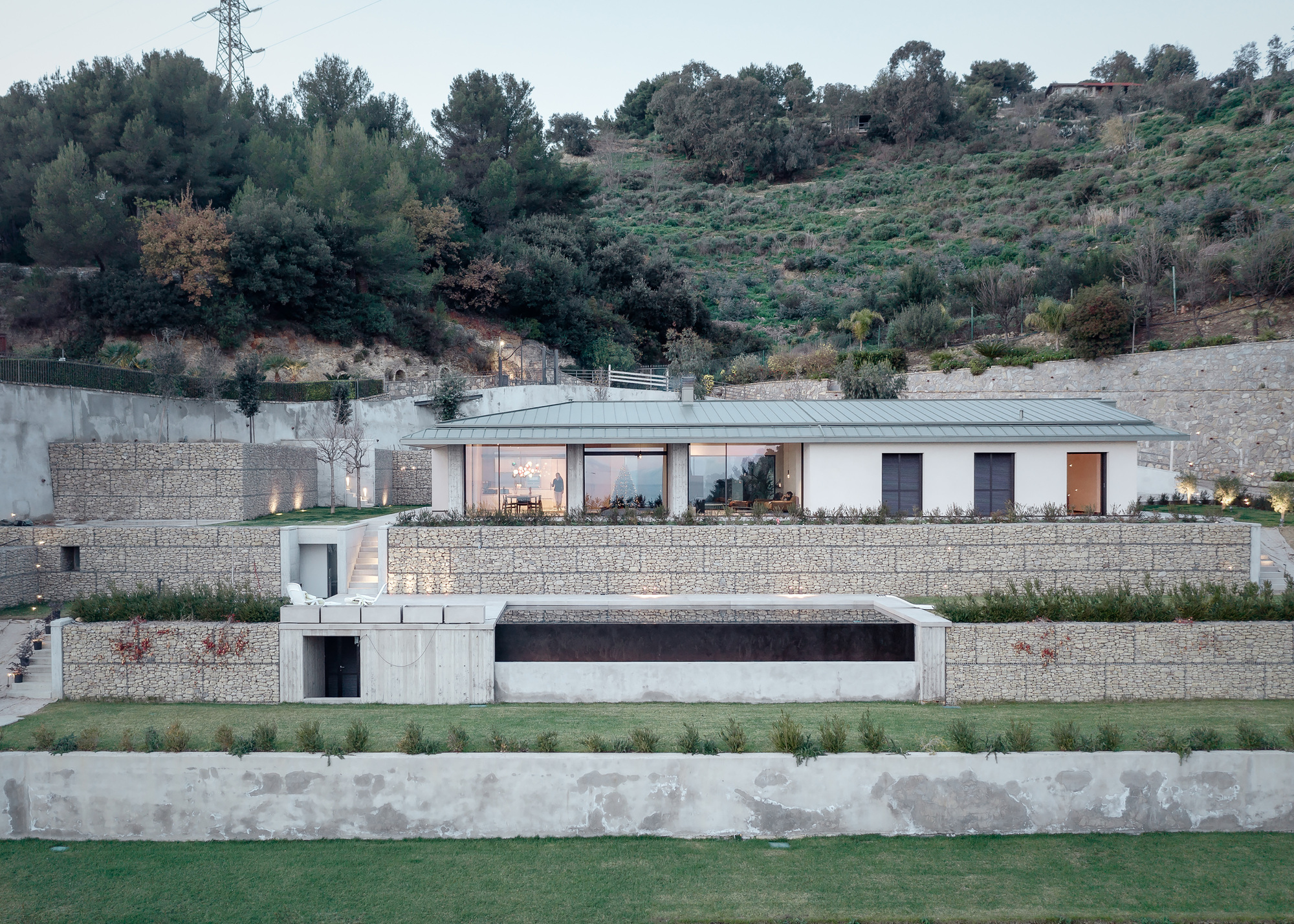
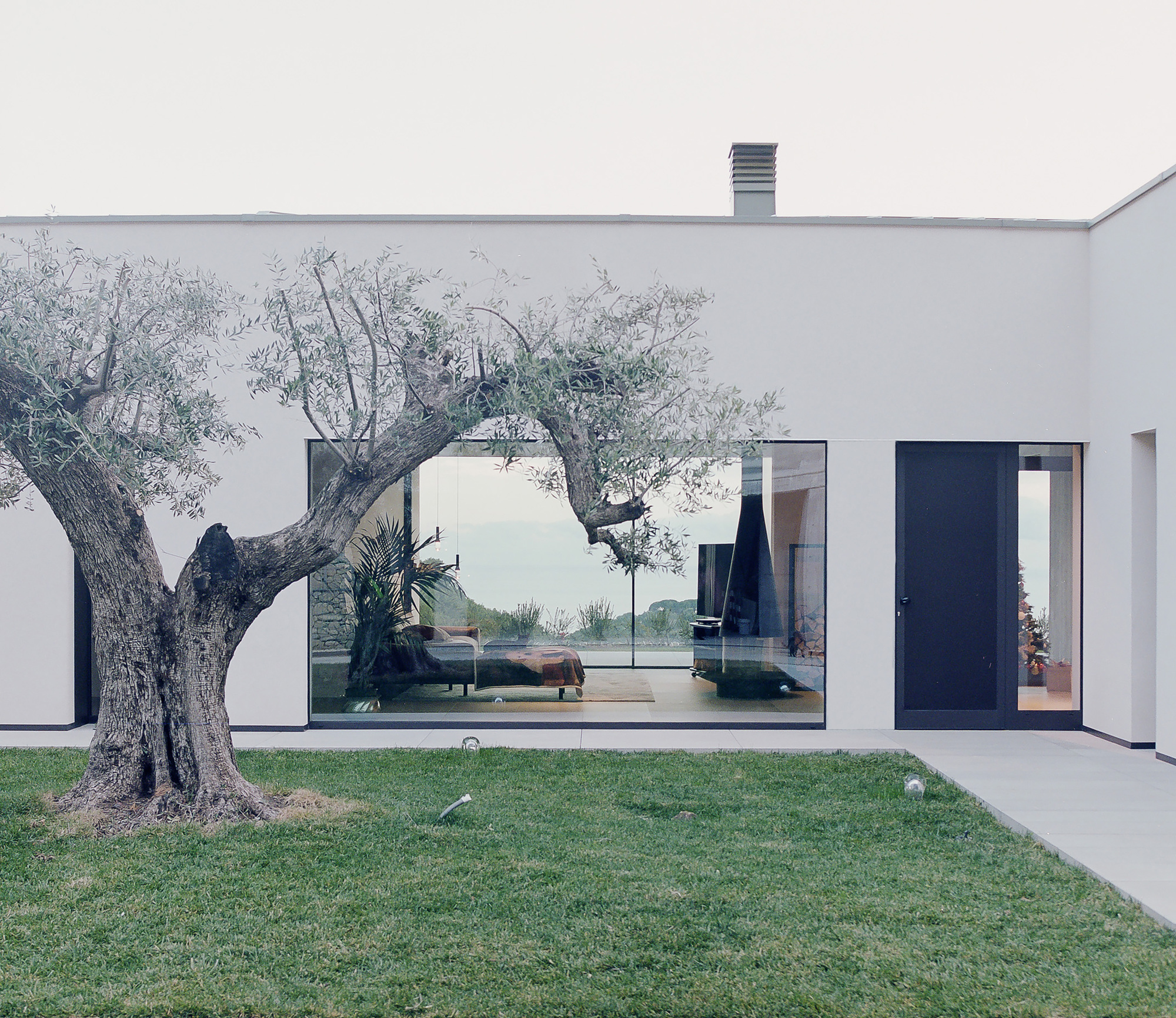
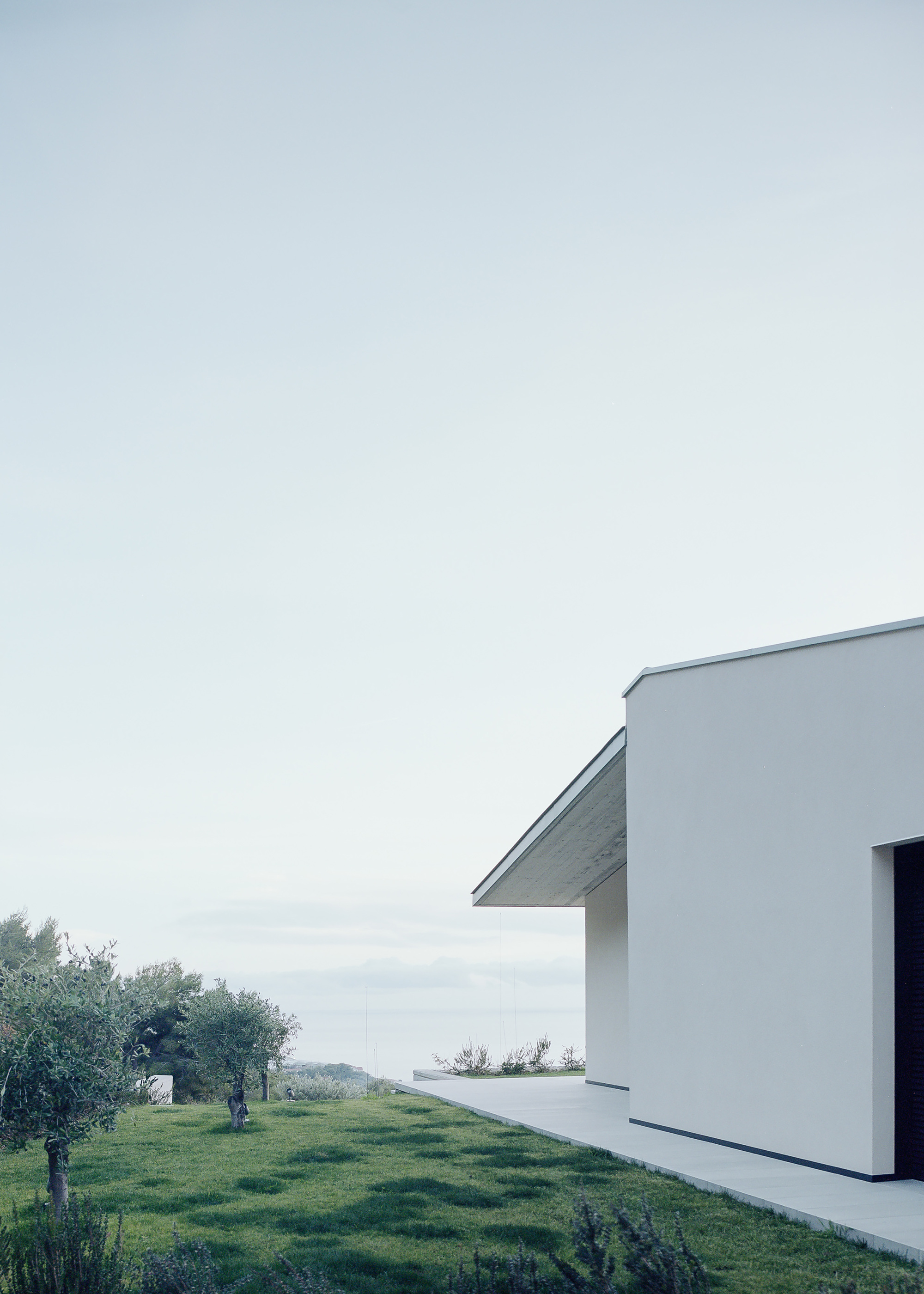


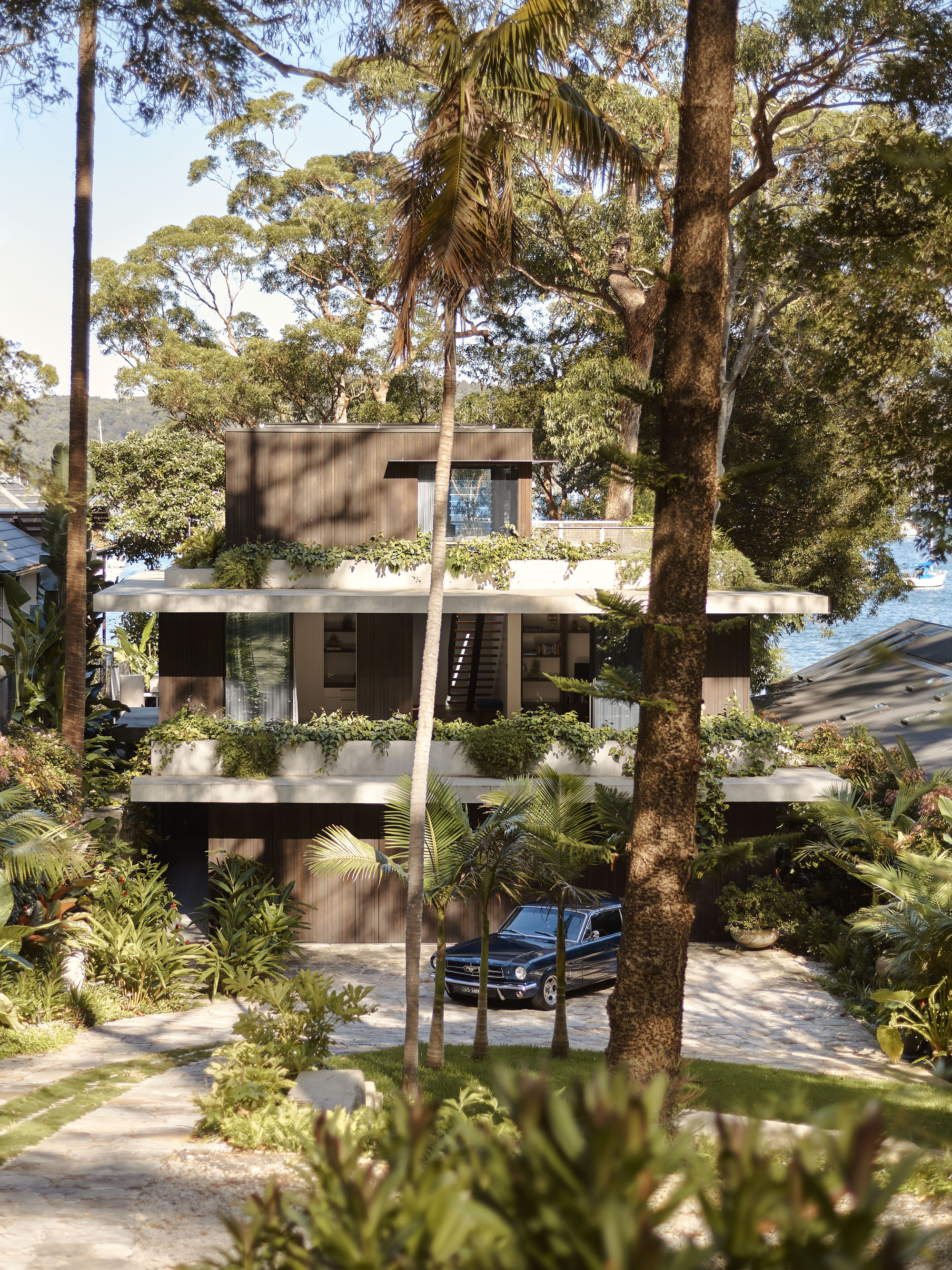
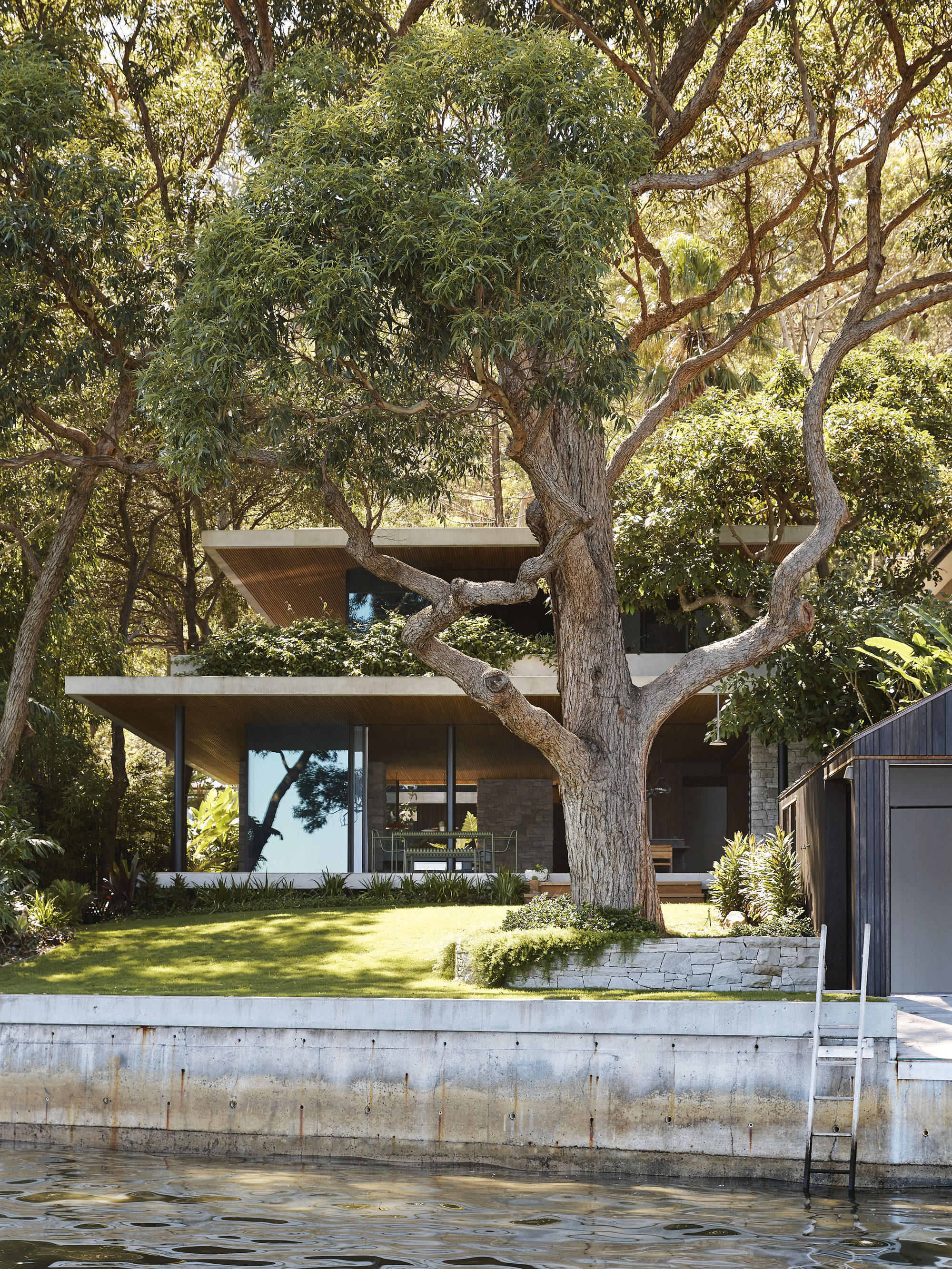
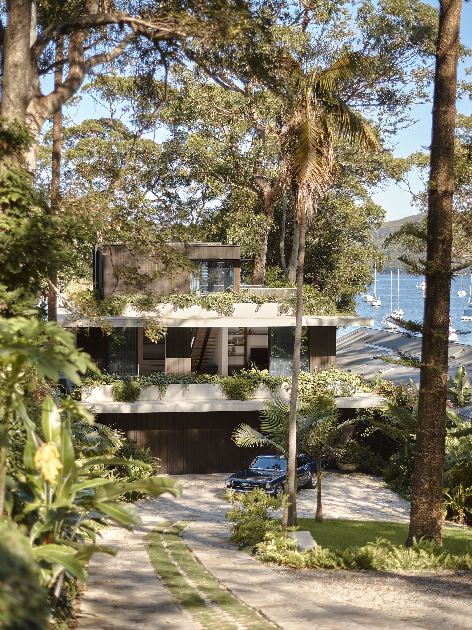

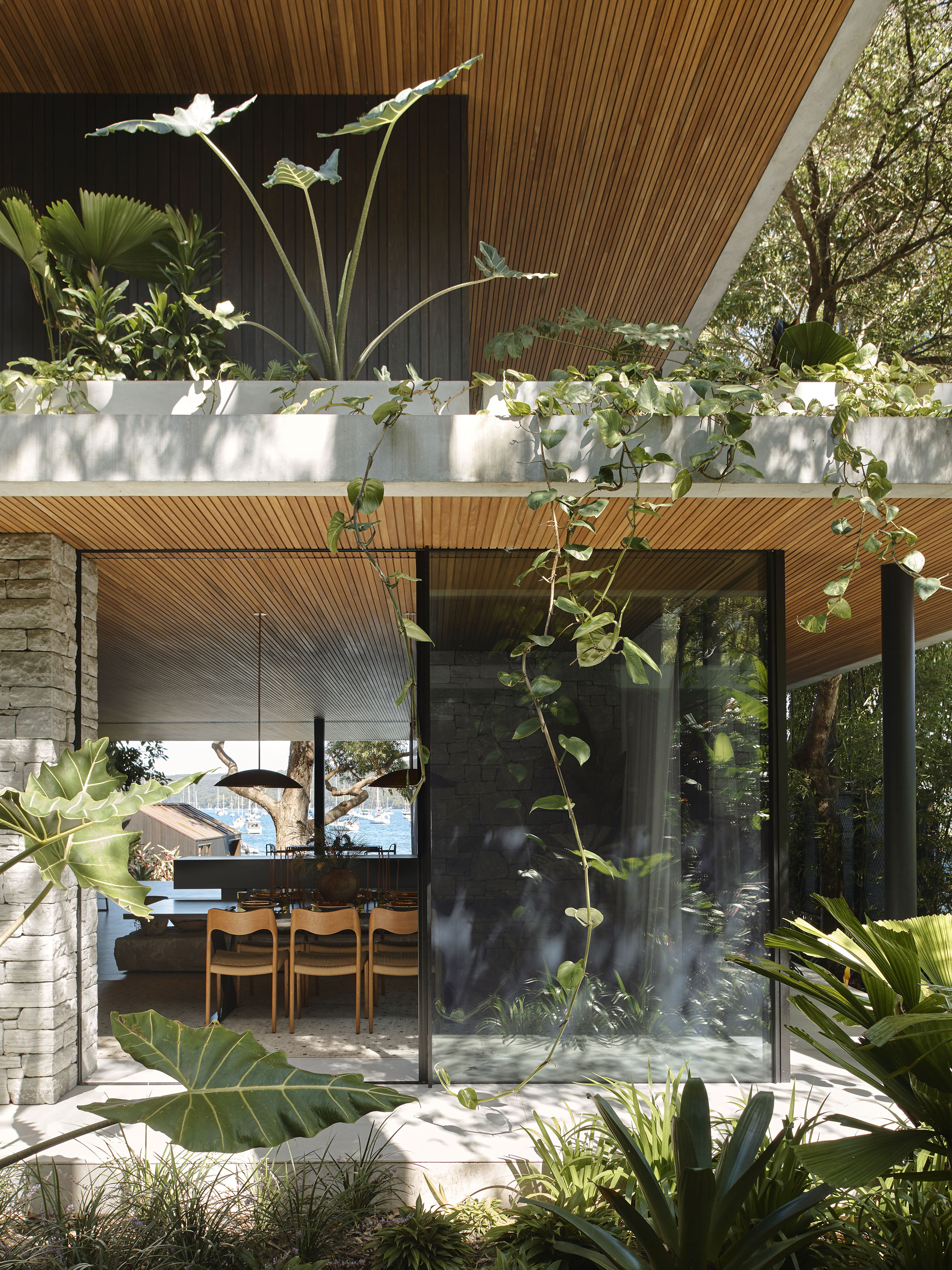
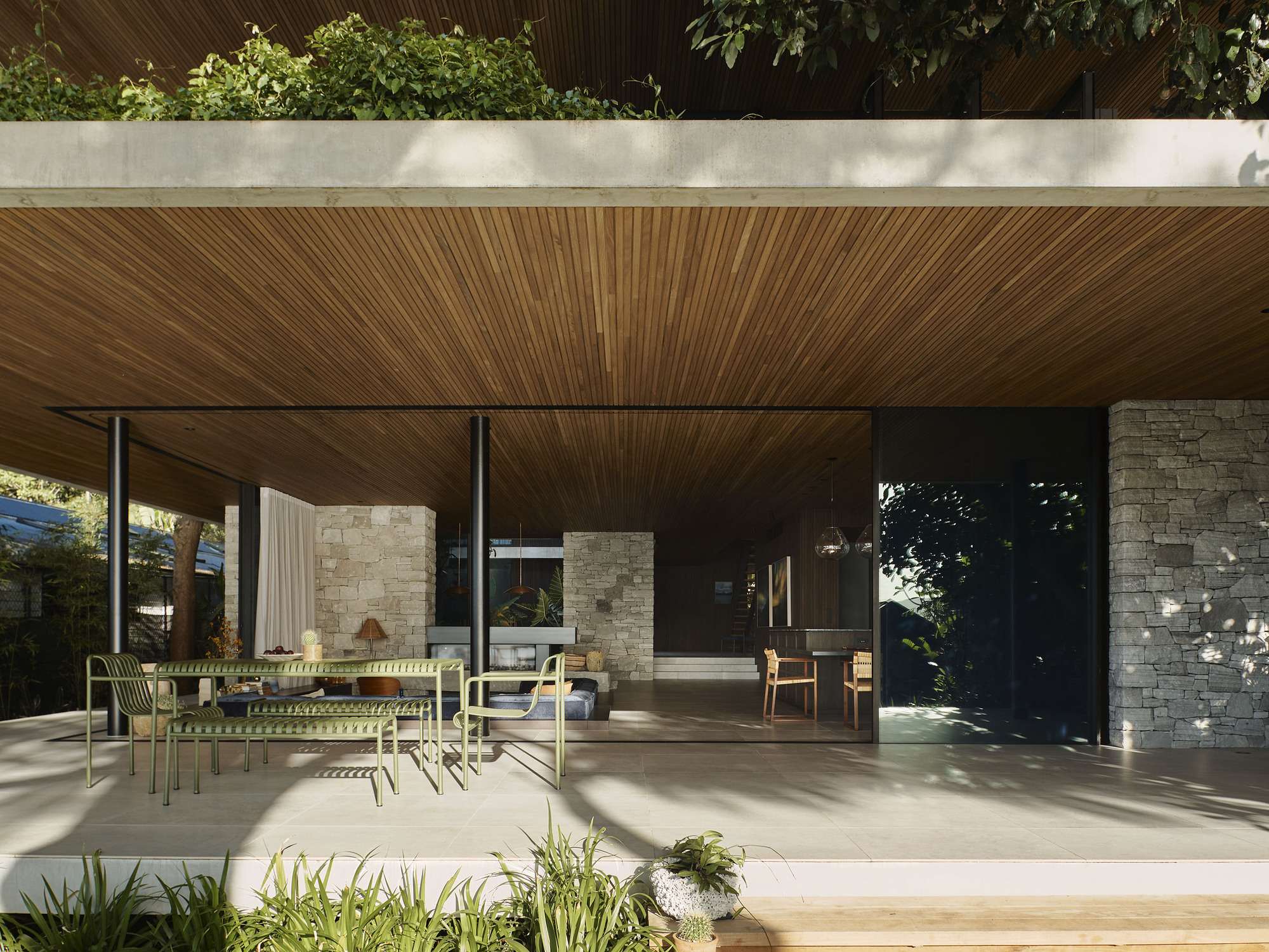
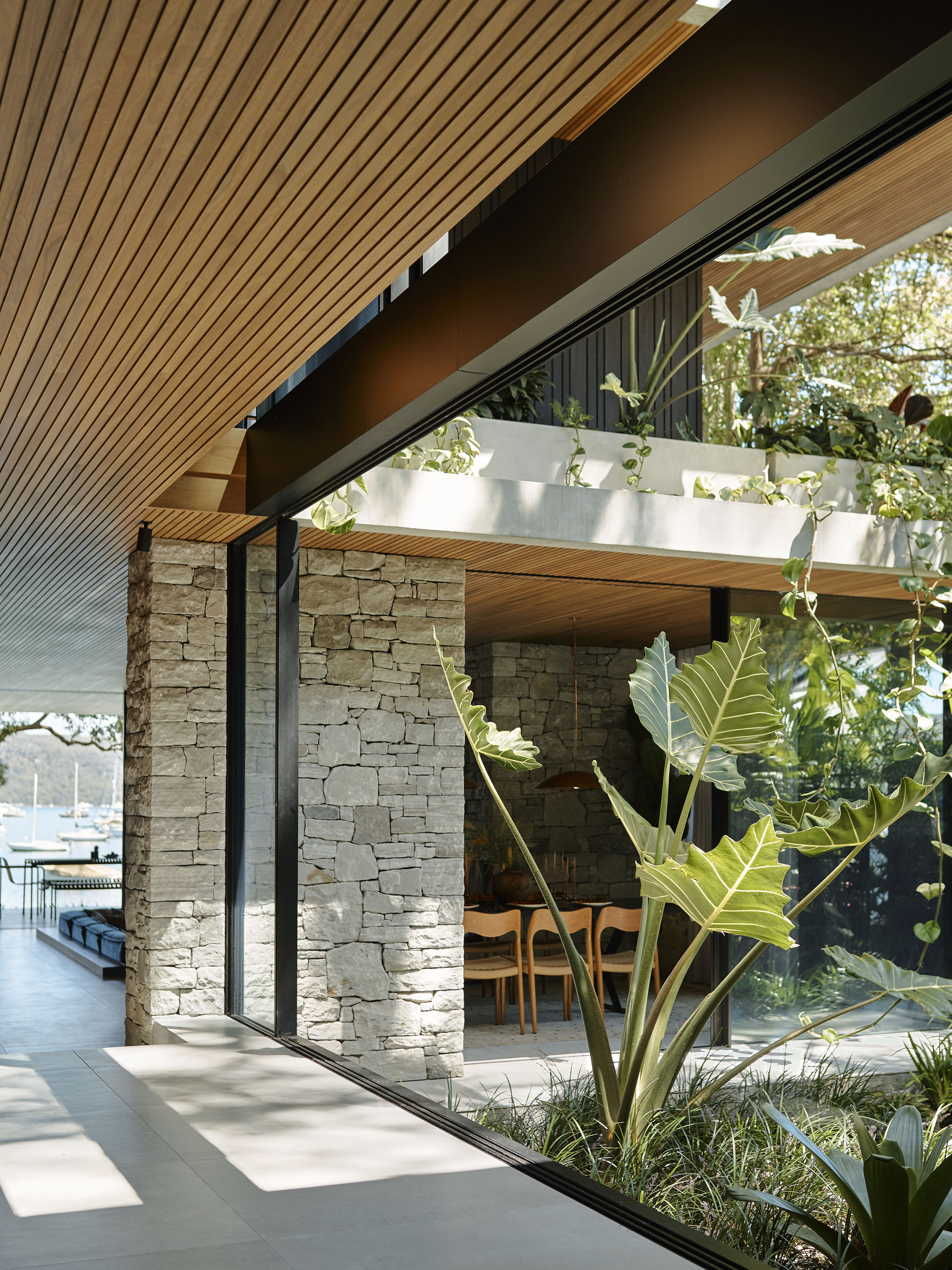
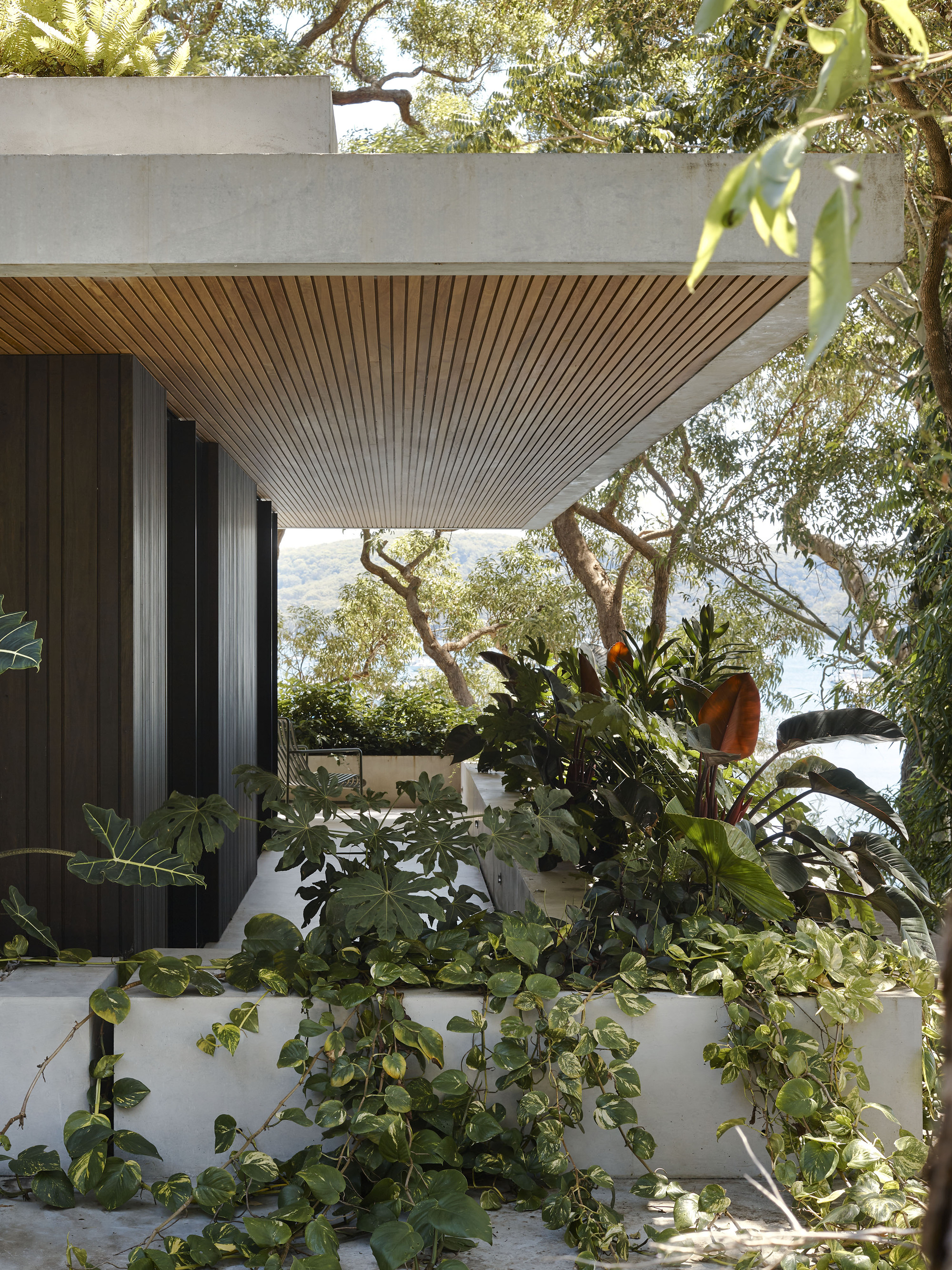
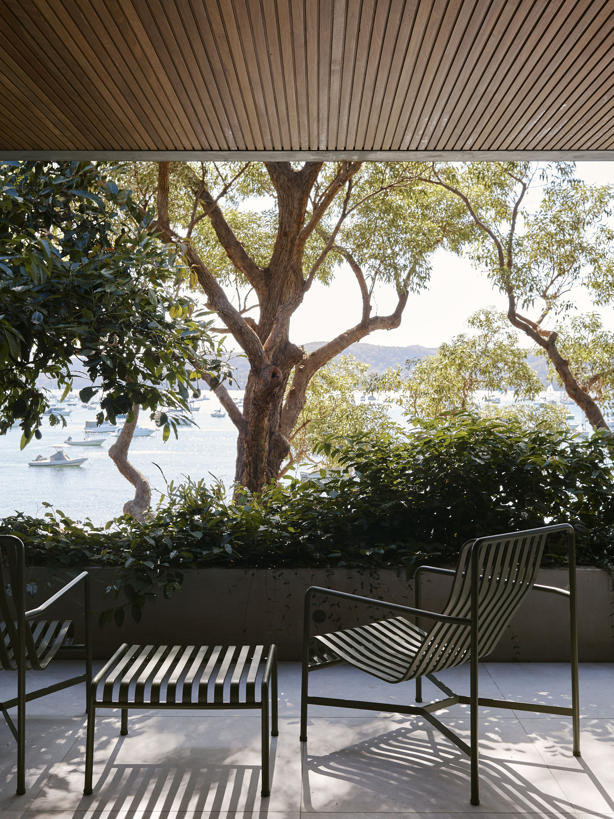
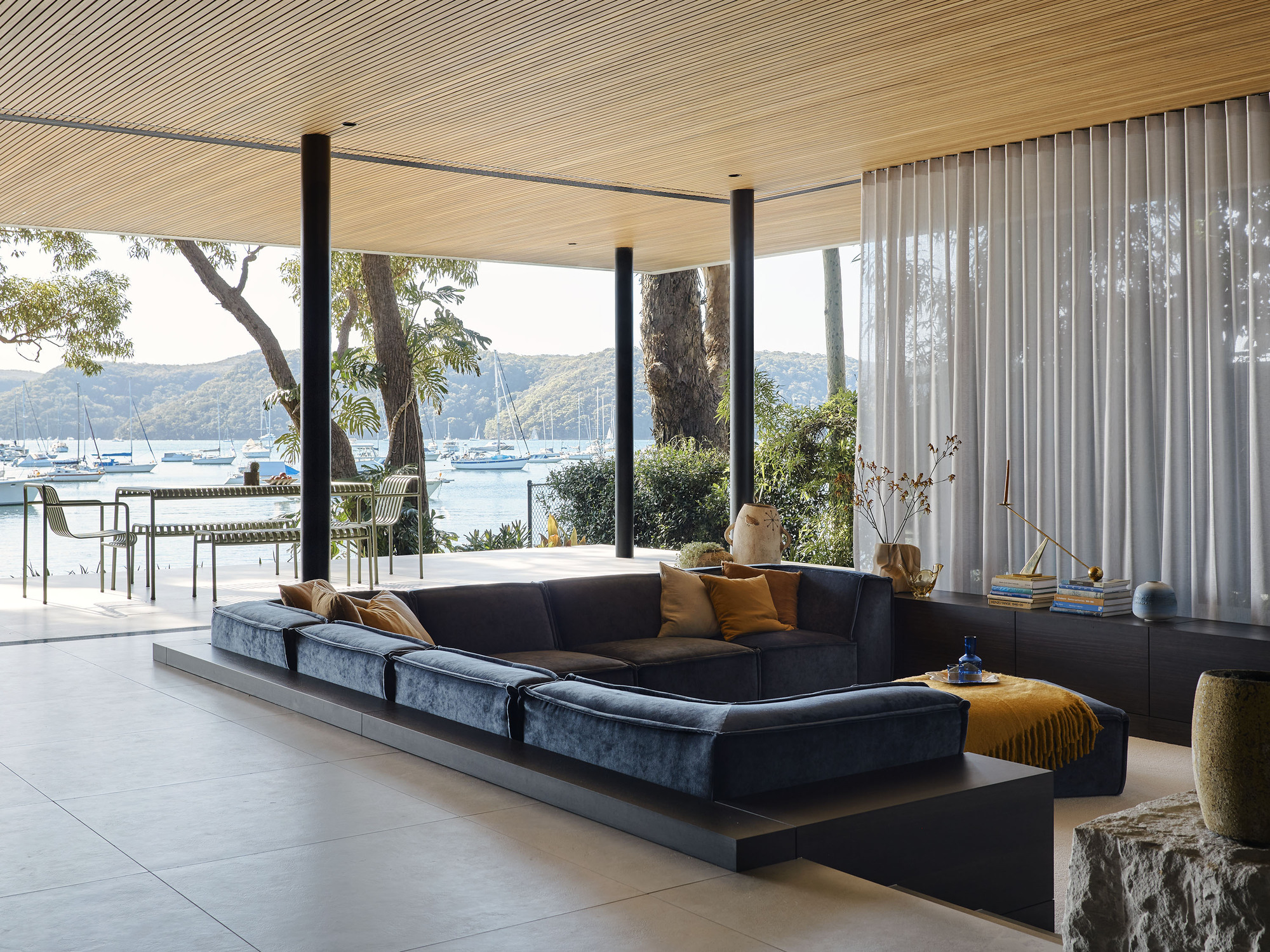
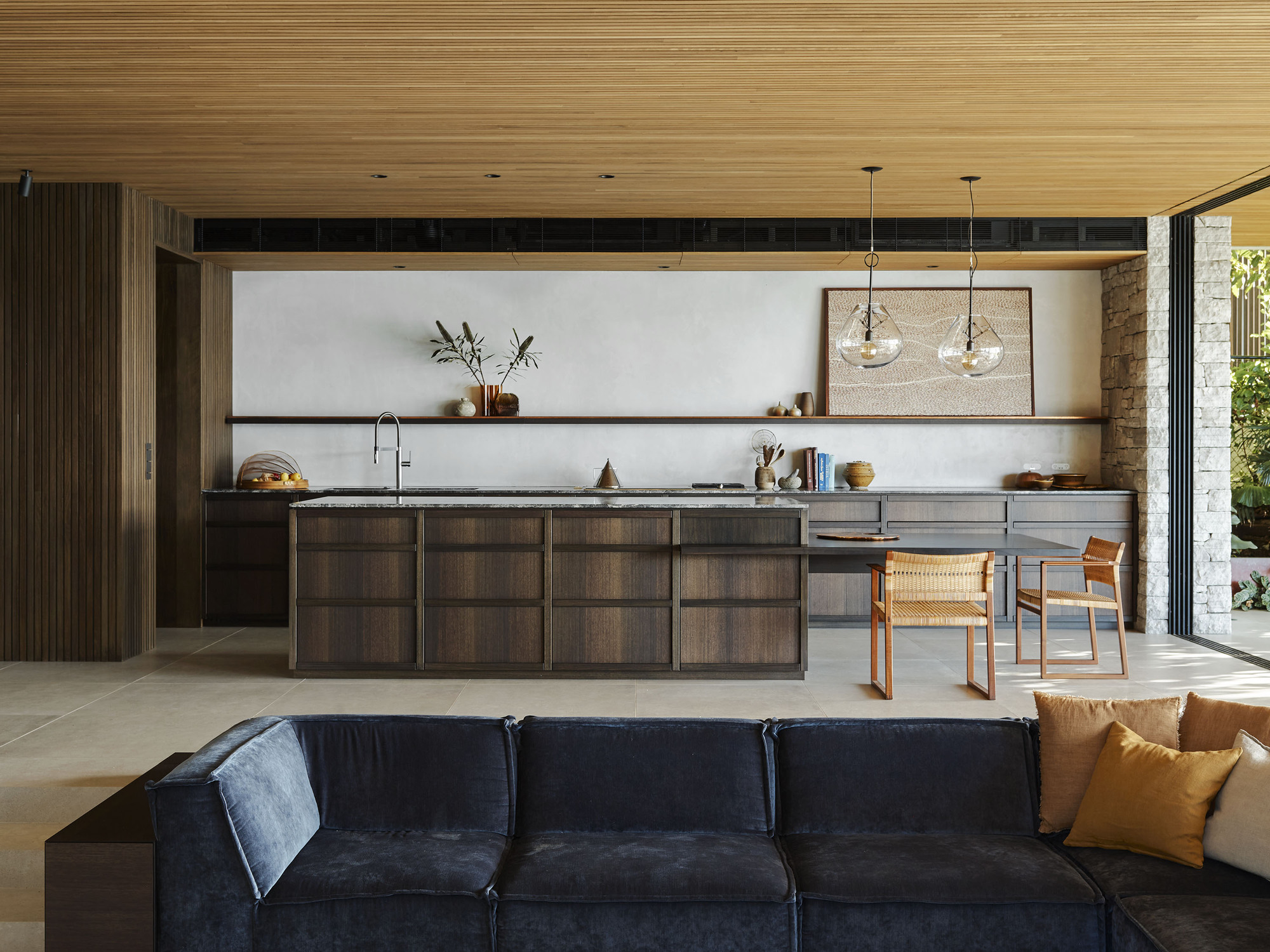


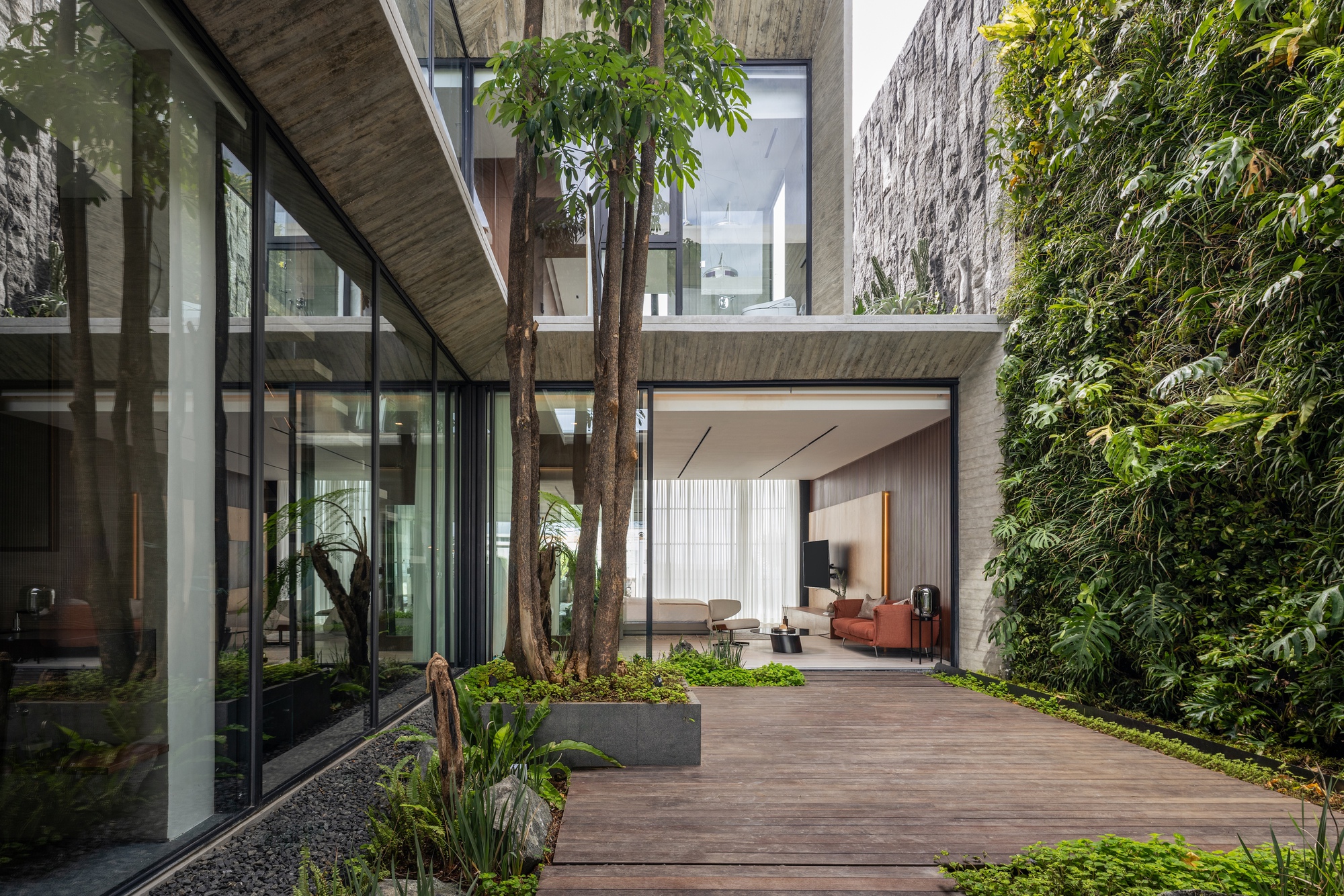
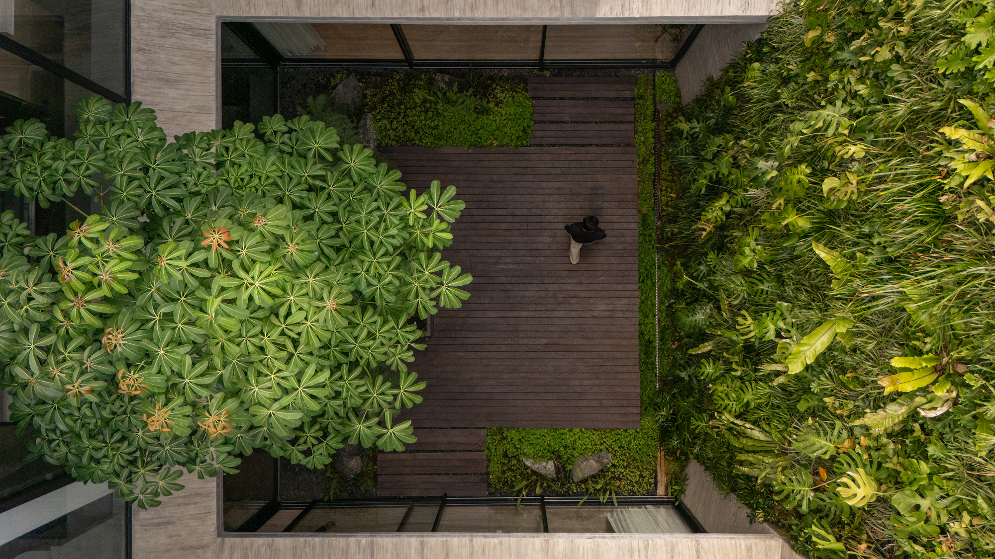
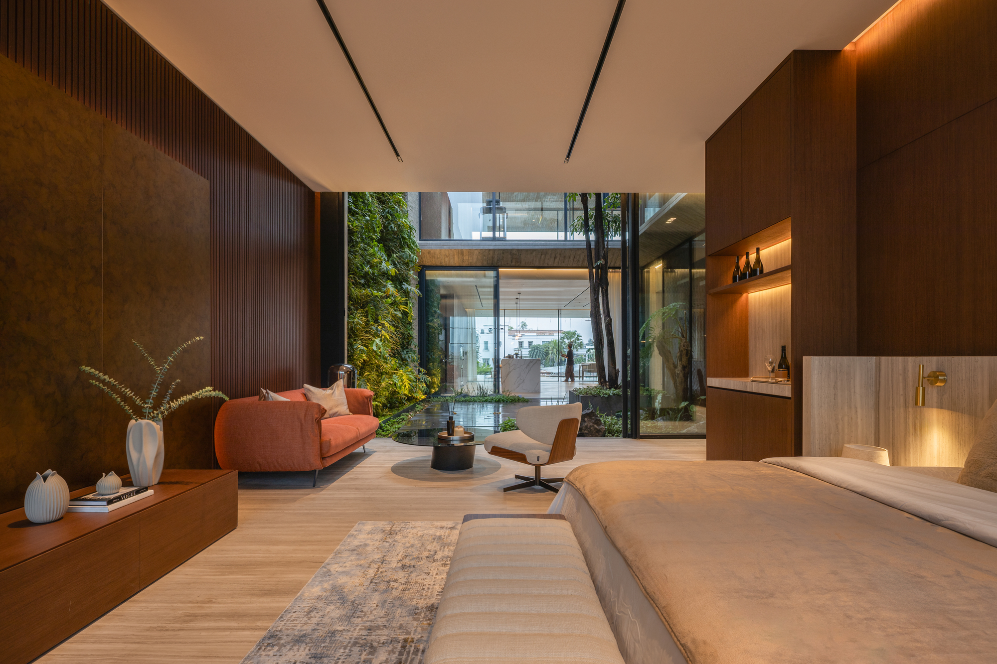
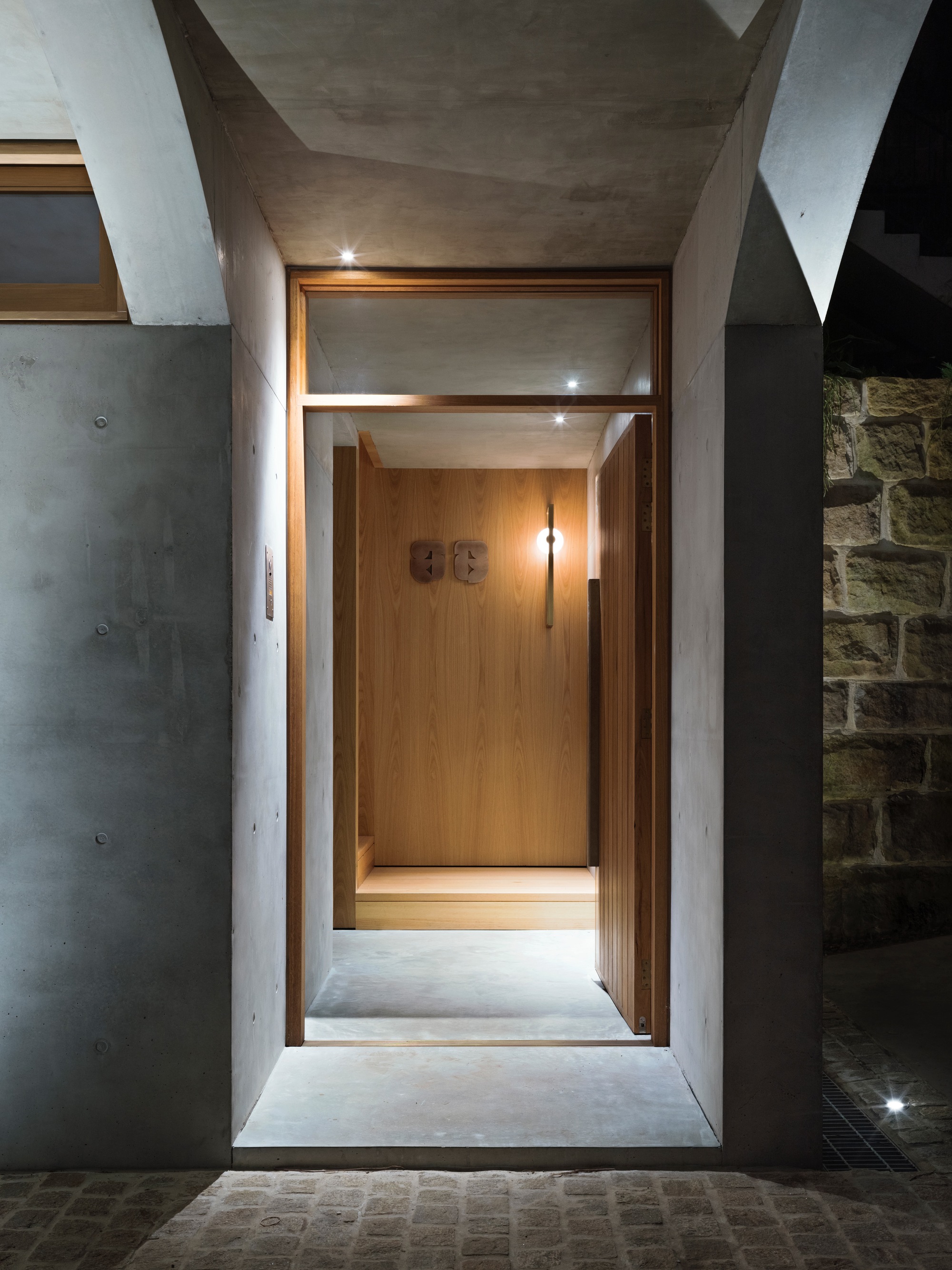
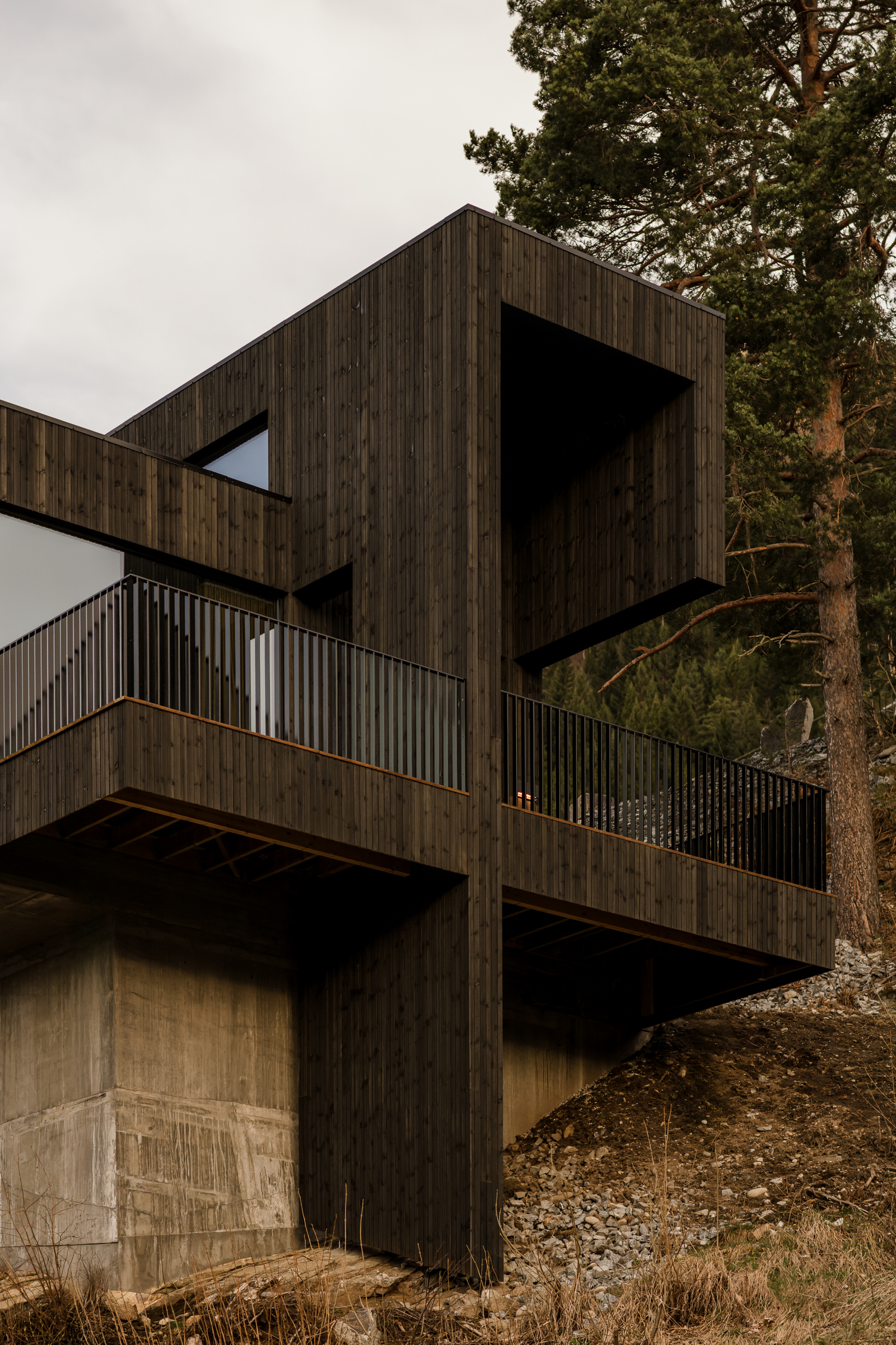
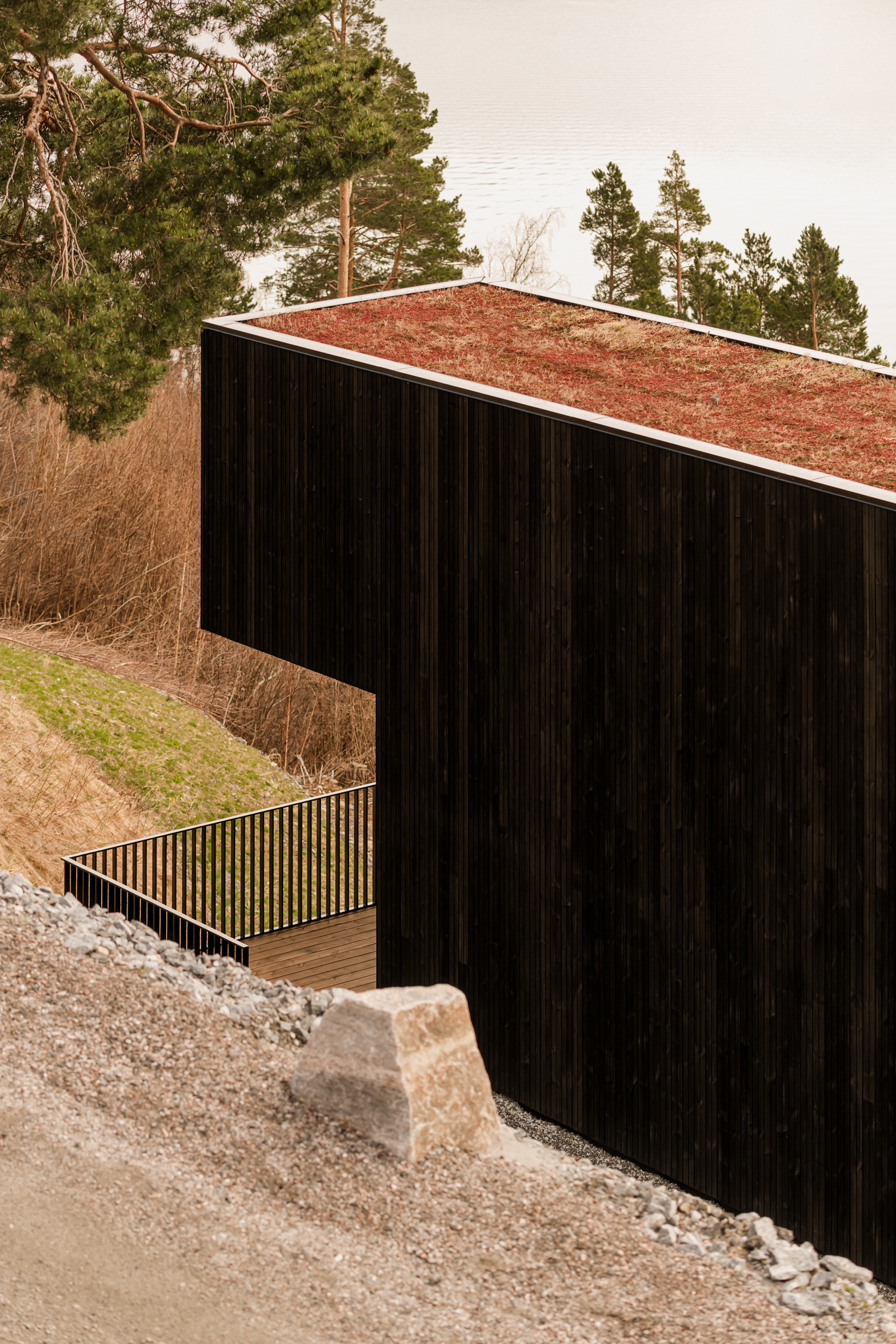
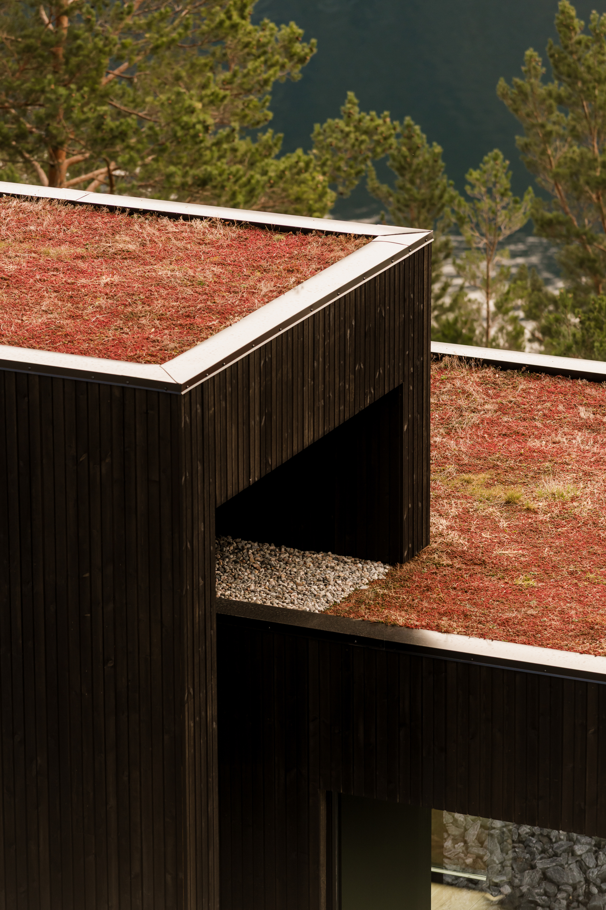
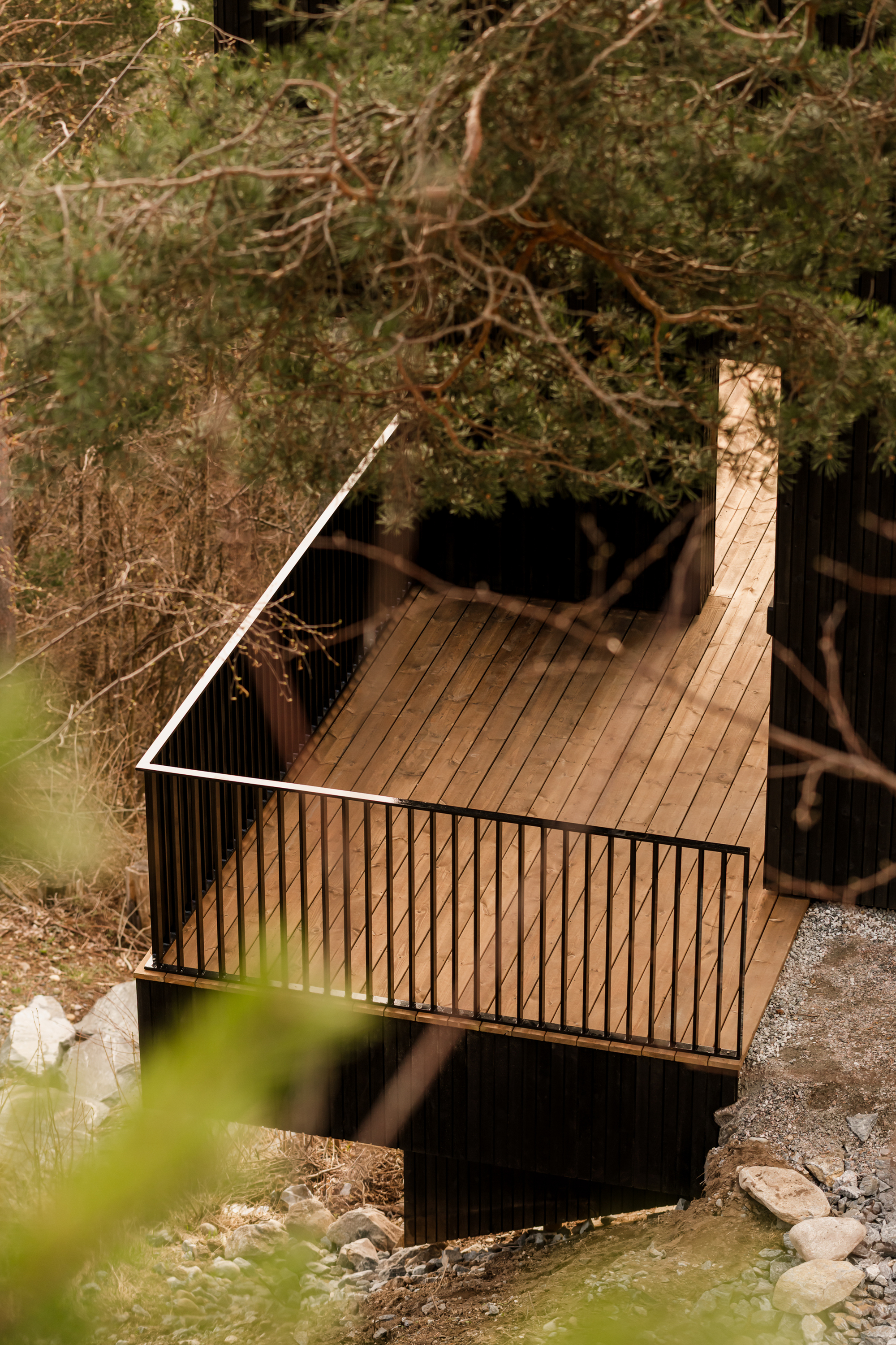
 On the leafy shoreline of Clareville Beach, this new residential dwelling recedes behind a green canopy cascading from the rooftop down and growing up from below, blurring the lines between outside and in. Hints of Brazilian Modernism are seen in the concrete form with deep drawn-out eaves, voids, and openness.
The underlying principal of M House was to create a restful and private family home that receded into the landscape using immersive planting from the rooftop cascading down, visible from every room, and planting from the ground up. Encouraging nature to envelop the structure, blurring lines between outside and in, allows the home to disappear behind the greenery, providing privacy and tranquillity.
The feeling of being outside yet still being sheltered by a formative structure was key – this is where we played with the idea of hard and soft. Hard is represented in the Brazilian modernist design with concrete, stone, and tallowwood. The result is a solid structure with large eaves, creating a safe receding shelter.
Light, voids, landscape, and glass exemplify the softness. The soft makes the strong shelter one with the trees, plants, and water surrounding the home.
On the leafy shoreline of Clareville Beach, this new residential dwelling recedes behind a green canopy cascading from the rooftop down and growing up from below, blurring the lines between outside and in. Hints of Brazilian Modernism are seen in the concrete form with deep drawn-out eaves, voids, and openness.
The underlying principal of M House was to create a restful and private family home that receded into the landscape using immersive planting from the rooftop cascading down, visible from every room, and planting from the ground up. Encouraging nature to envelop the structure, blurring lines between outside and in, allows the home to disappear behind the greenery, providing privacy and tranquillity.
The feeling of being outside yet still being sheltered by a formative structure was key – this is where we played with the idea of hard and soft. Hard is represented in the Brazilian modernist design with concrete, stone, and tallowwood. The result is a solid structure with large eaves, creating a safe receding shelter.
Light, voids, landscape, and glass exemplify the softness. The soft makes the strong shelter one with the trees, plants, and water surrounding the home.


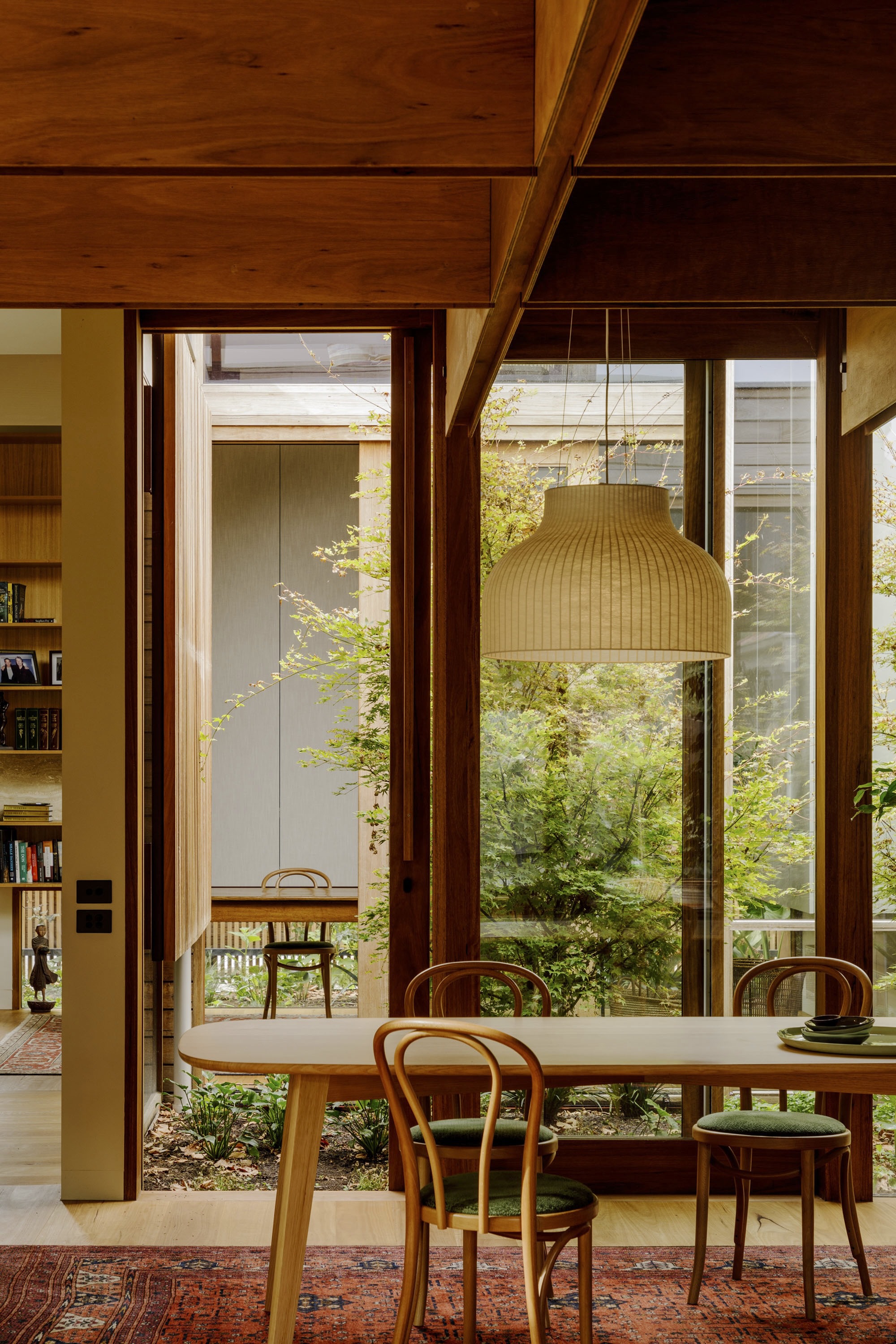
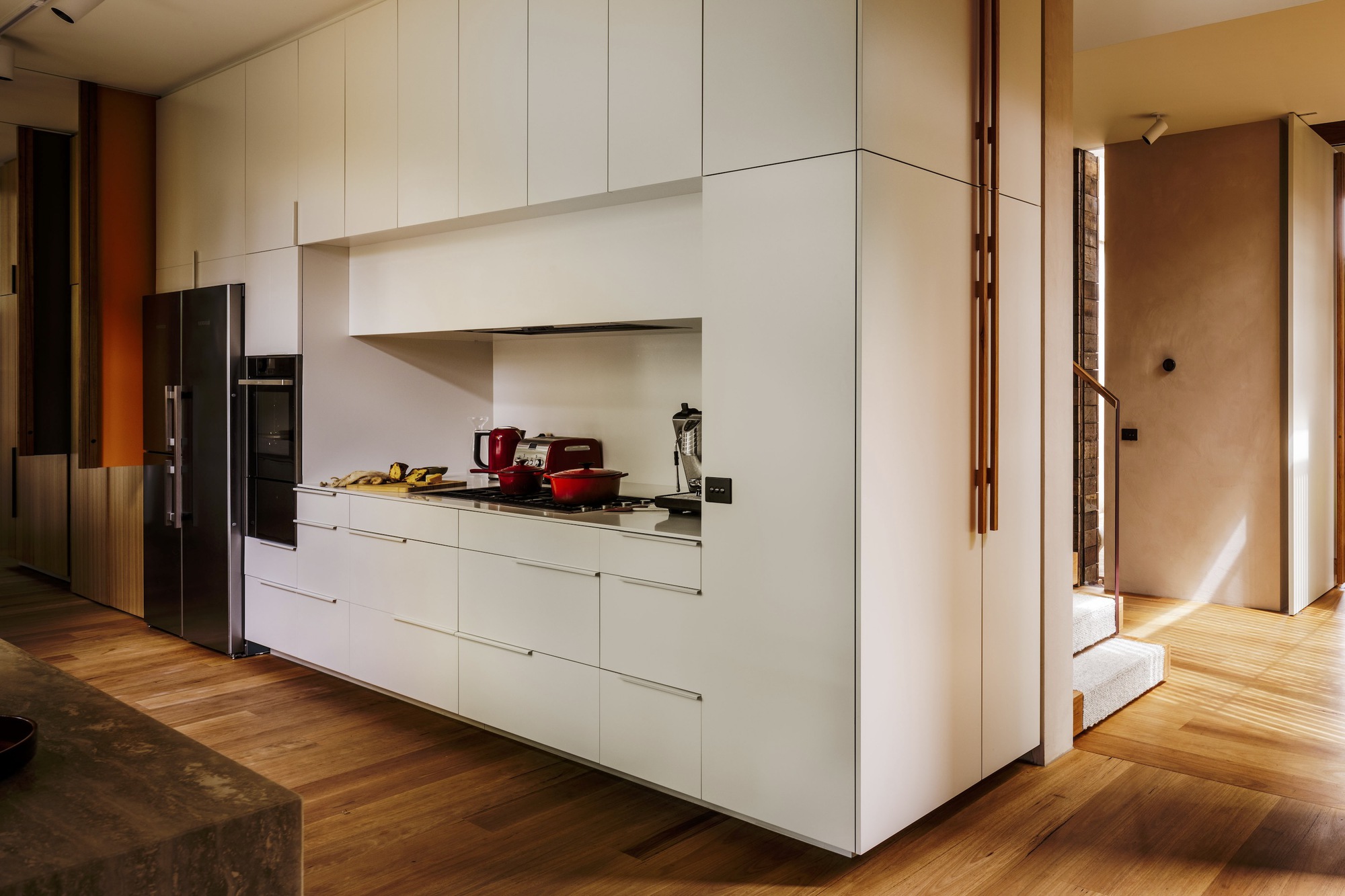
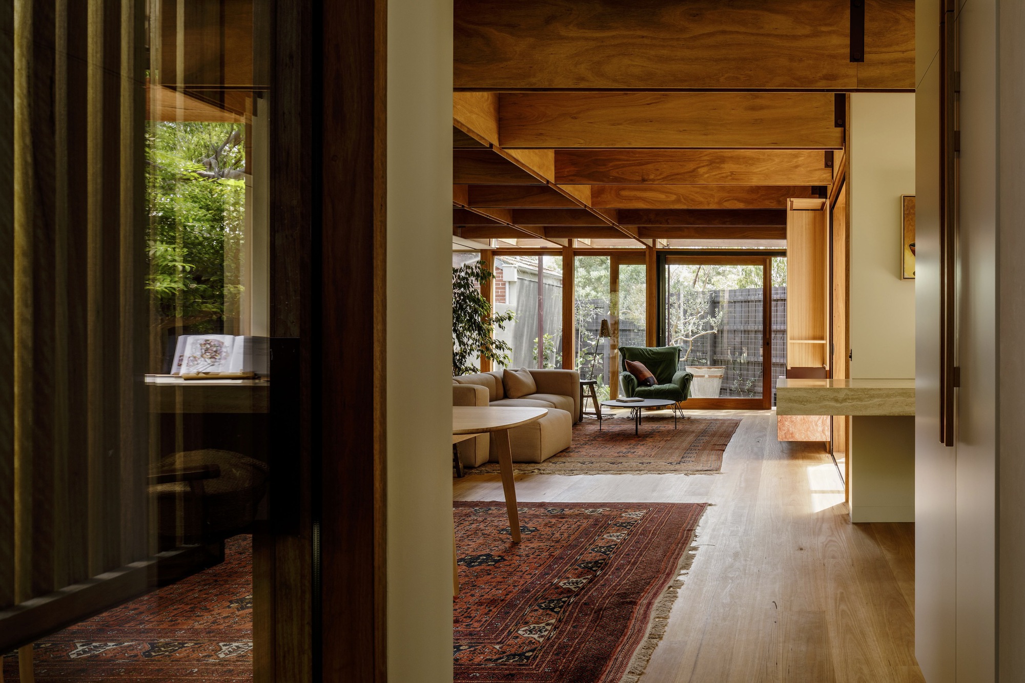
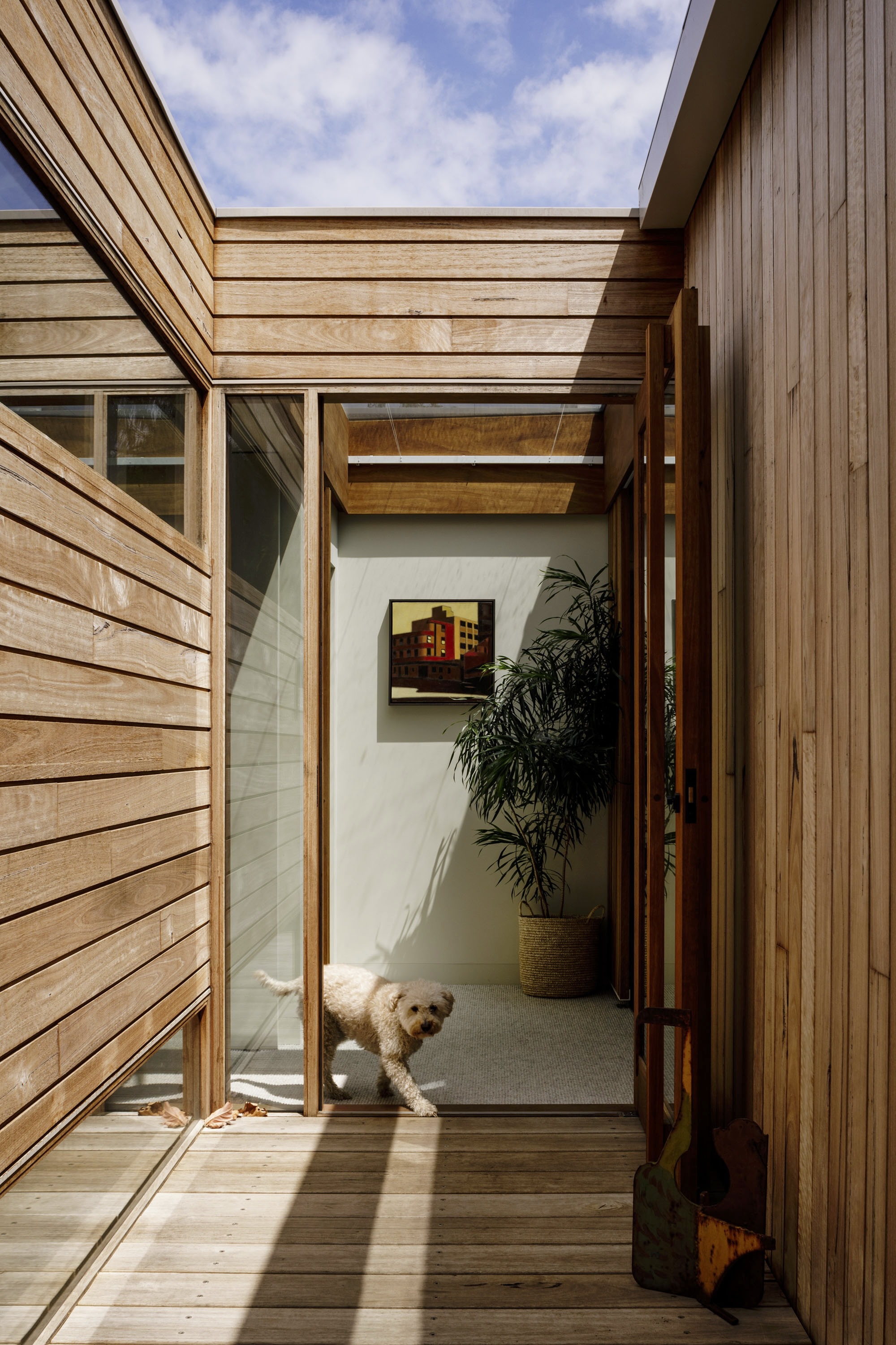
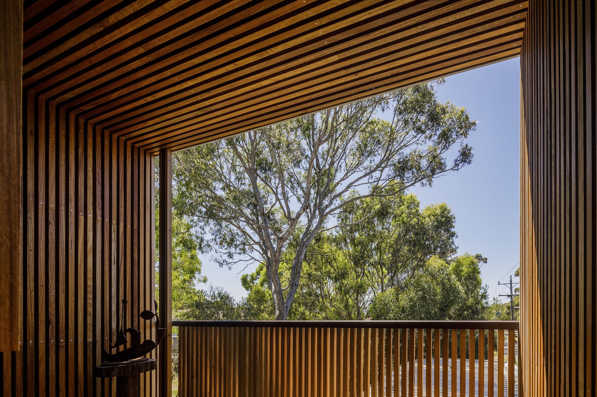
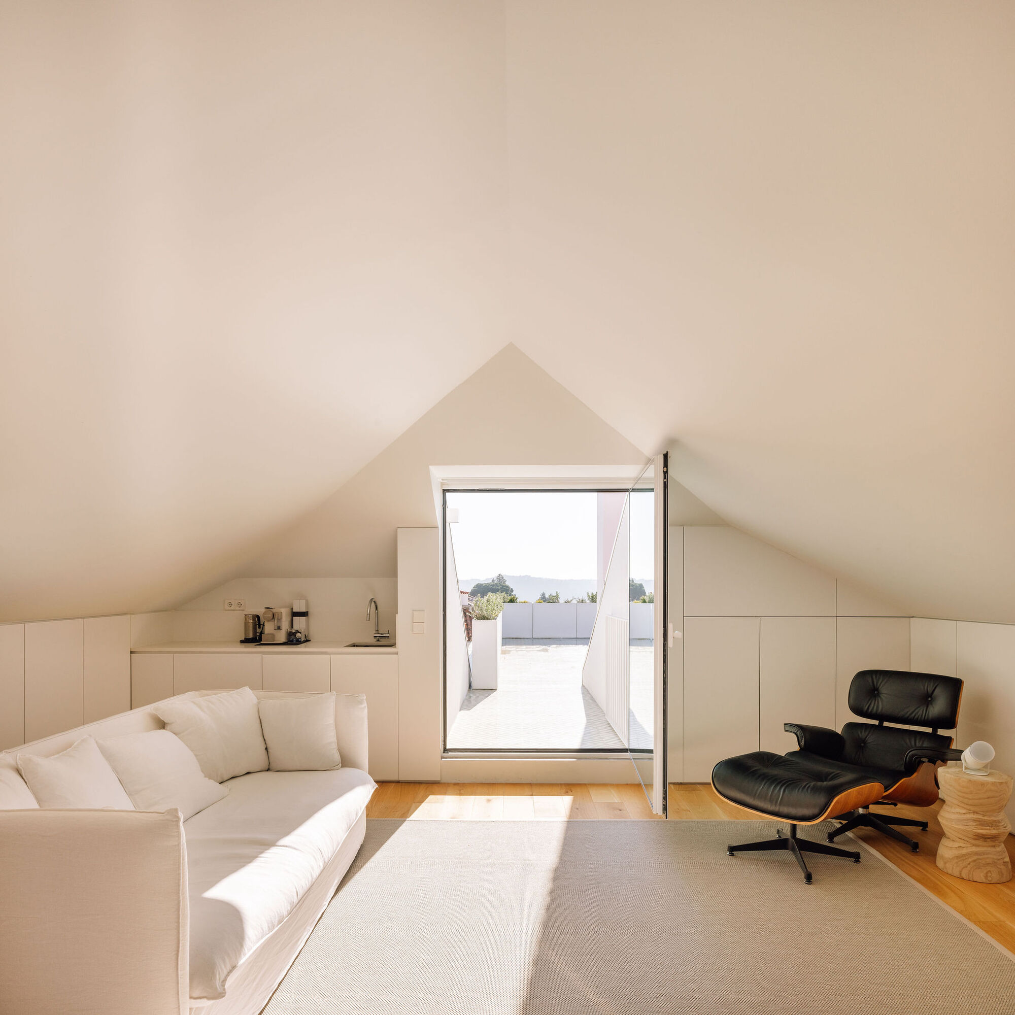
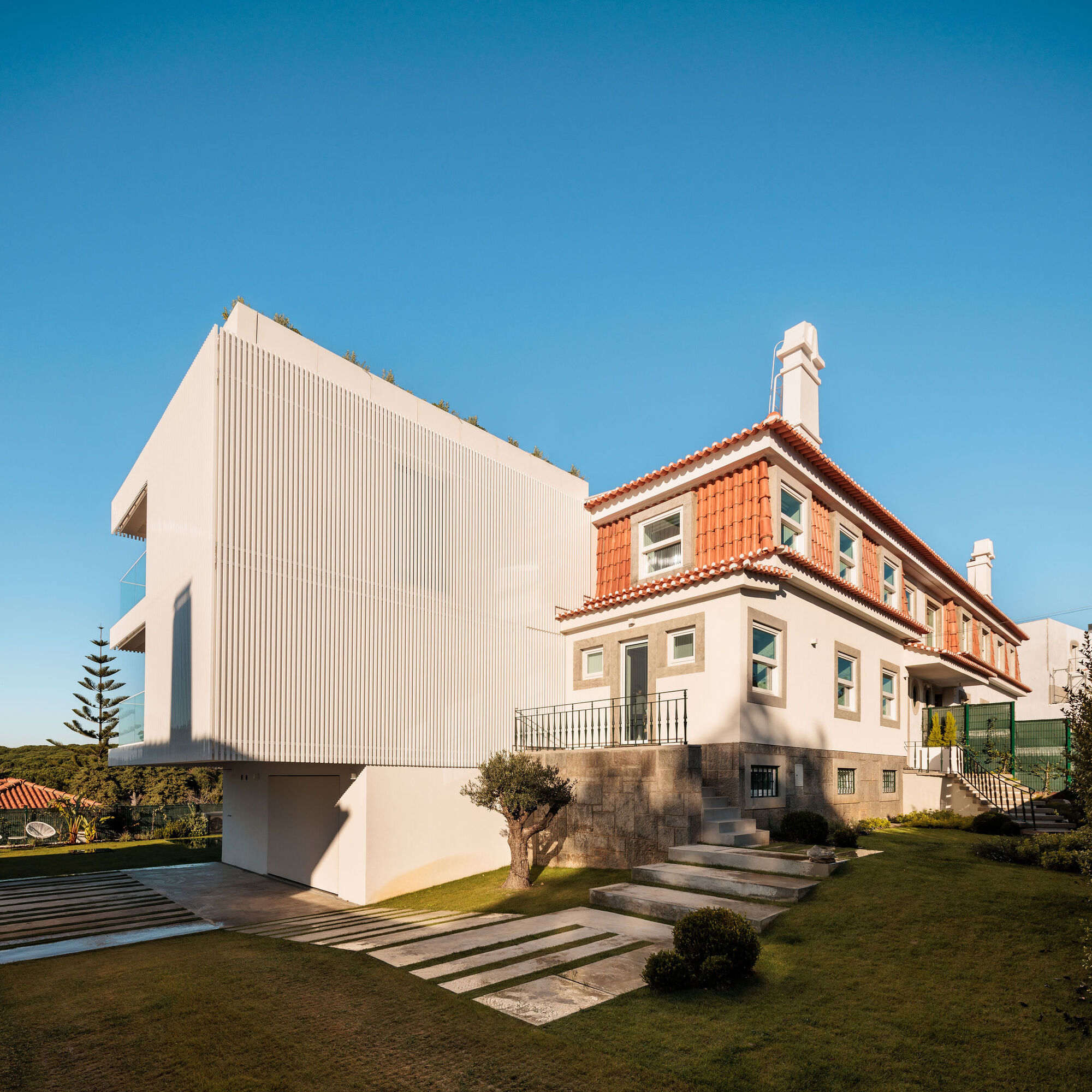
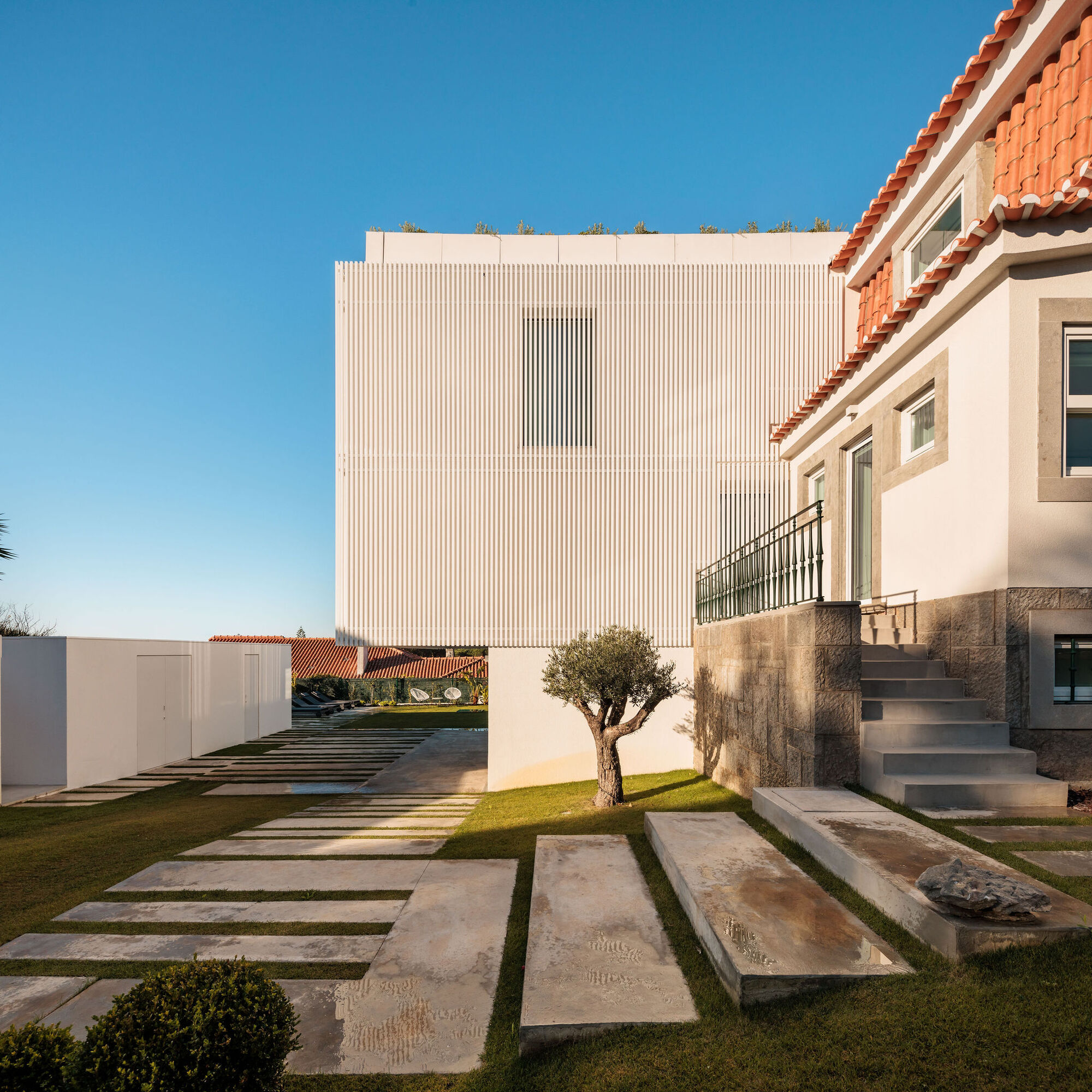
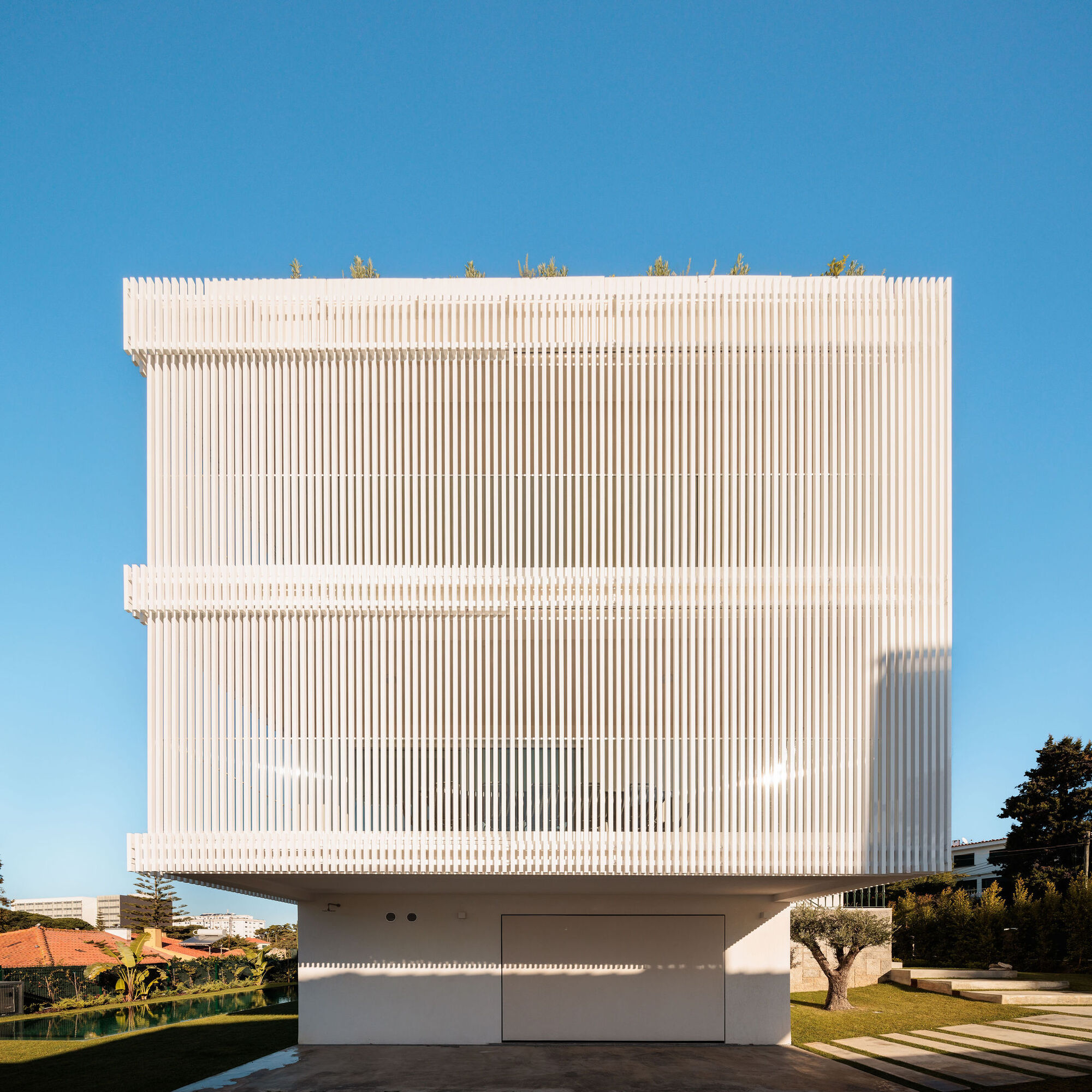
 The project involved alterations + additions to a derelict semi-attached double-storey Victorian terrace in Fitzroy. The finished residence was to provide relaxed, robust, and generous accommodation for a family of two adults and a teenager and to enable a number of future living and/or working scenarios.
On-site Laneway: As one of Fitzroy’s myriad of privately created ad-hoc laneways from the suburb’s formative years, a narrow strip of land became a catalyst for organizing and separating the “served” and “servant” functions of the house and also the character of the resultant spaces and forms.
Two street frontages: This provided an opportunity for two different but related visible contemporary additions to the neighborhood, each tailored to the relevant street pedestrian. The separate and related buildings enabled by the dual frontages were exploited to provide living and working flexibility for the family.
Charlemont Terrace: The existing portion of the house fronting George Street in Fitzroy is one of five attached double-storey Victorian terraces, which together comprise Charlemont Terrace. An intention to amplify the urban presence of Charlemont Terrace guided the formal and spatial character of the contemporary addition fronting this street.
Existing house: The remaining rooms within the existing portion of the main house were considered as “internal” in comparison to the spaces of the new addition. This influenced the material and lighting selections, and the character of the thresholds between the existing and new parts of the house also highlighted this difference. This interaction between the existing and contemporary components of the house also encouraged a more warm, verdant, playful, and relaxed interior life than suggested by the relatively reserved urban presentations of the new additions.
Adaptability: Although residential architecture necessarily involves a high degree of architect-designed customization to achieve meaningful spaces, underlying the project is a sense that the enjoyment and durability of these spaces would benefit from a degree of ongoing customization by the inhabitants. There was a desire to provide adaptability to the changing needs of the inhabitants and/or the evolving circumstances of the surrounding context of this relatively tight inner suburban site.
Through the creation of clear and logical spaces with relatively generous proportions and adaptable openings and the use of moveable/demountable/adaptable furniture and other elements, this project allows for ongoing personalization, operation, and adaptability to changing circumstances. In addition to the designed adaptability of the overall home and the partial reuse of the existing house, the project employs several environmental measures to add to its sustainability. These include user-operated shading and deciduous planting to large new east and west glazing and solar-generated power to cover daytime use of the rear building.
The project involved alterations + additions to a derelict semi-attached double-storey Victorian terrace in Fitzroy. The finished residence was to provide relaxed, robust, and generous accommodation for a family of two adults and a teenager and to enable a number of future living and/or working scenarios.
On-site Laneway: As one of Fitzroy’s myriad of privately created ad-hoc laneways from the suburb’s formative years, a narrow strip of land became a catalyst for organizing and separating the “served” and “servant” functions of the house and also the character of the resultant spaces and forms.
Two street frontages: This provided an opportunity for two different but related visible contemporary additions to the neighborhood, each tailored to the relevant street pedestrian. The separate and related buildings enabled by the dual frontages were exploited to provide living and working flexibility for the family.
Charlemont Terrace: The existing portion of the house fronting George Street in Fitzroy is one of five attached double-storey Victorian terraces, which together comprise Charlemont Terrace. An intention to amplify the urban presence of Charlemont Terrace guided the formal and spatial character of the contemporary addition fronting this street.
Existing house: The remaining rooms within the existing portion of the main house were considered as “internal” in comparison to the spaces of the new addition. This influenced the material and lighting selections, and the character of the thresholds between the existing and new parts of the house also highlighted this difference. This interaction between the existing and contemporary components of the house also encouraged a more warm, verdant, playful, and relaxed interior life than suggested by the relatively reserved urban presentations of the new additions.
Adaptability: Although residential architecture necessarily involves a high degree of architect-designed customization to achieve meaningful spaces, underlying the project is a sense that the enjoyment and durability of these spaces would benefit from a degree of ongoing customization by the inhabitants. There was a desire to provide adaptability to the changing needs of the inhabitants and/or the evolving circumstances of the surrounding context of this relatively tight inner suburban site.
Through the creation of clear and logical spaces with relatively generous proportions and adaptable openings and the use of moveable/demountable/adaptable furniture and other elements, this project allows for ongoing personalization, operation, and adaptability to changing circumstances. In addition to the designed adaptability of the overall home and the partial reuse of the existing house, the project employs several environmental measures to add to its sustainability. These include user-operated shading and deciduous planting to large new east and west glazing and solar-generated power to cover daytime use of the rear building.


 A richly detailed extension and renovation, Pear Tree House demonstrates a seamless transition between old and new, where a structured floating box, adjoined by a sunken garden and rectangular pool, elevates traditional charm to modern sophistication.
The client’s wishes were to ensure that a modern extension remained sympathetic to the character of the original 1890 sandstone cottage, which sat on a 627 sqm block. Boutique architecture and construction firm Glasshouse Projects refigured the older back part of the home, creating more areas for private retreats as well as communal spaces for entertaining and socializing.
A 300 sqm extension, as well as renovation to the older part of the home, resulted in a new master bedroom with an ensuite, dining, kitchen, butler's pantry, laundry, powder room, guest bathroom, study, pool, and outdoor living area.
Clever design in the use of the rear access, the garage can be recessed via sliding timber panels and used for greater outdoor entertaining space. The addition of a side entry, complete with parking space, affords greater practicality for unloading shopping, with direct access to the kitchen and living.
A richly detailed extension and renovation, Pear Tree House demonstrates a seamless transition between old and new, where a structured floating box, adjoined by a sunken garden and rectangular pool, elevates traditional charm to modern sophistication.
The client’s wishes were to ensure that a modern extension remained sympathetic to the character of the original 1890 sandstone cottage, which sat on a 627 sqm block. Boutique architecture and construction firm Glasshouse Projects refigured the older back part of the home, creating more areas for private retreats as well as communal spaces for entertaining and socializing.
A 300 sqm extension, as well as renovation to the older part of the home, resulted in a new master bedroom with an ensuite, dining, kitchen, butler's pantry, laundry, powder room, guest bathroom, study, pool, and outdoor living area.
Clever design in the use of the rear access, the garage can be recessed via sliding timber panels and used for greater outdoor entertaining space. The addition of a side entry, complete with parking space, affords greater practicality for unloading shopping, with direct access to the kitchen and living.


 Corbel House
#architecture
Architects: Nick Bell Architects
Area: 1696 m²
Year: 2024
Photographs: Justin Alexander
Country: Australia
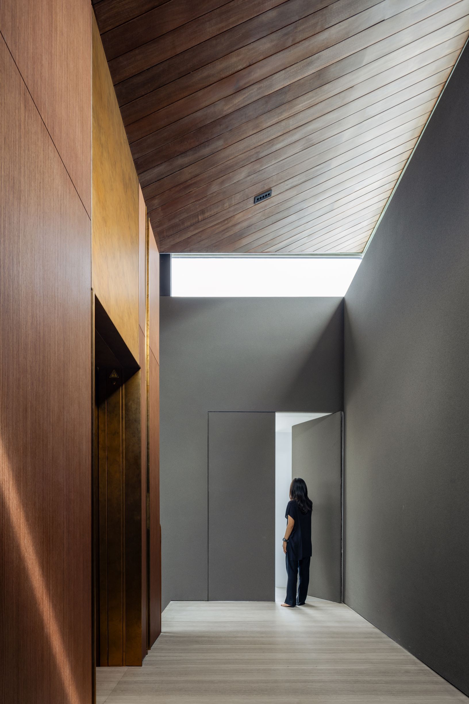
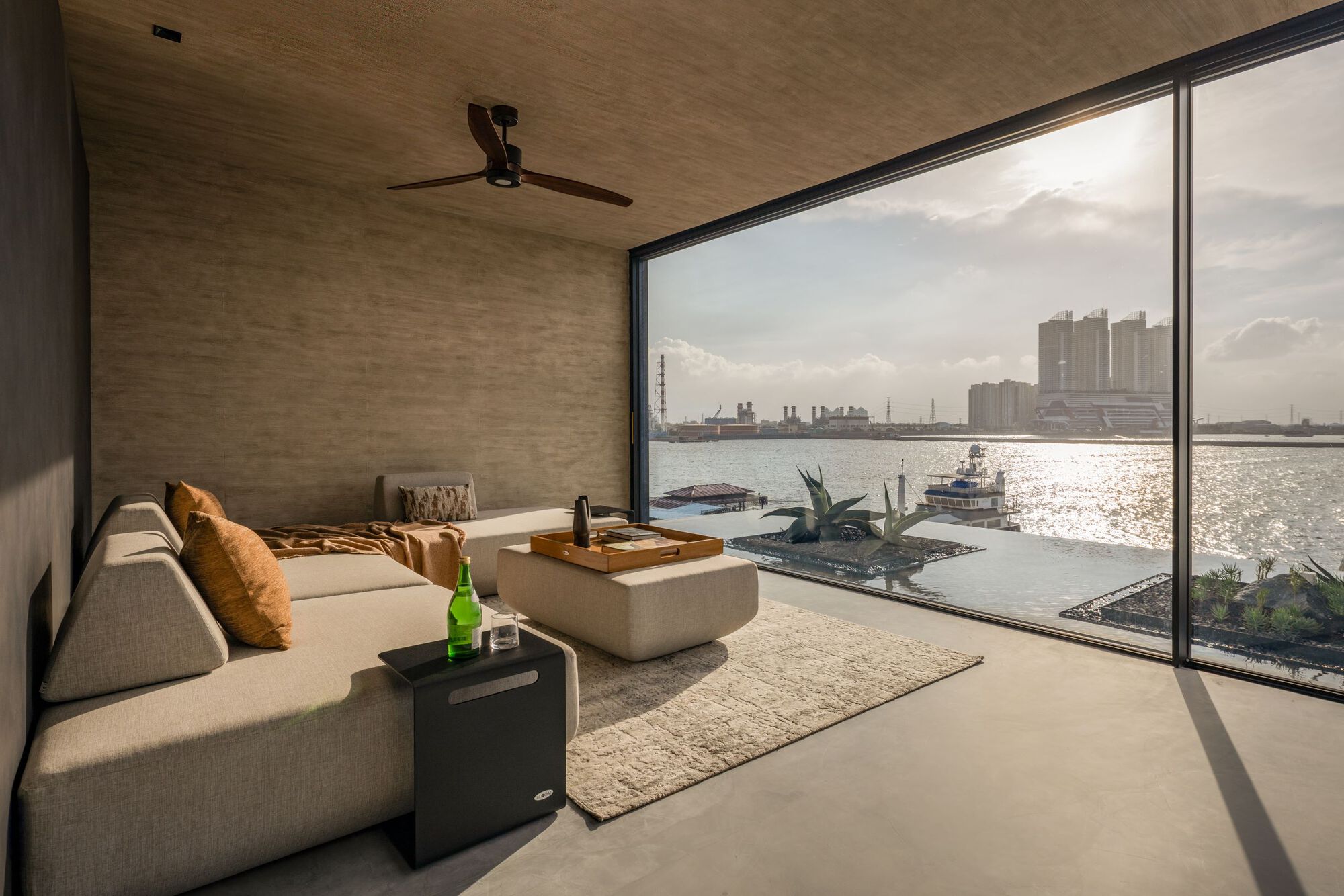
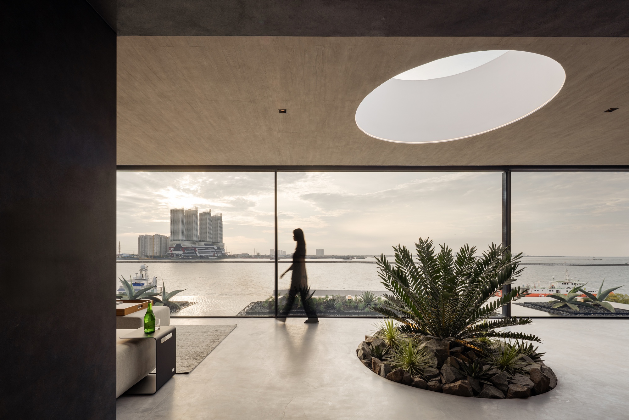
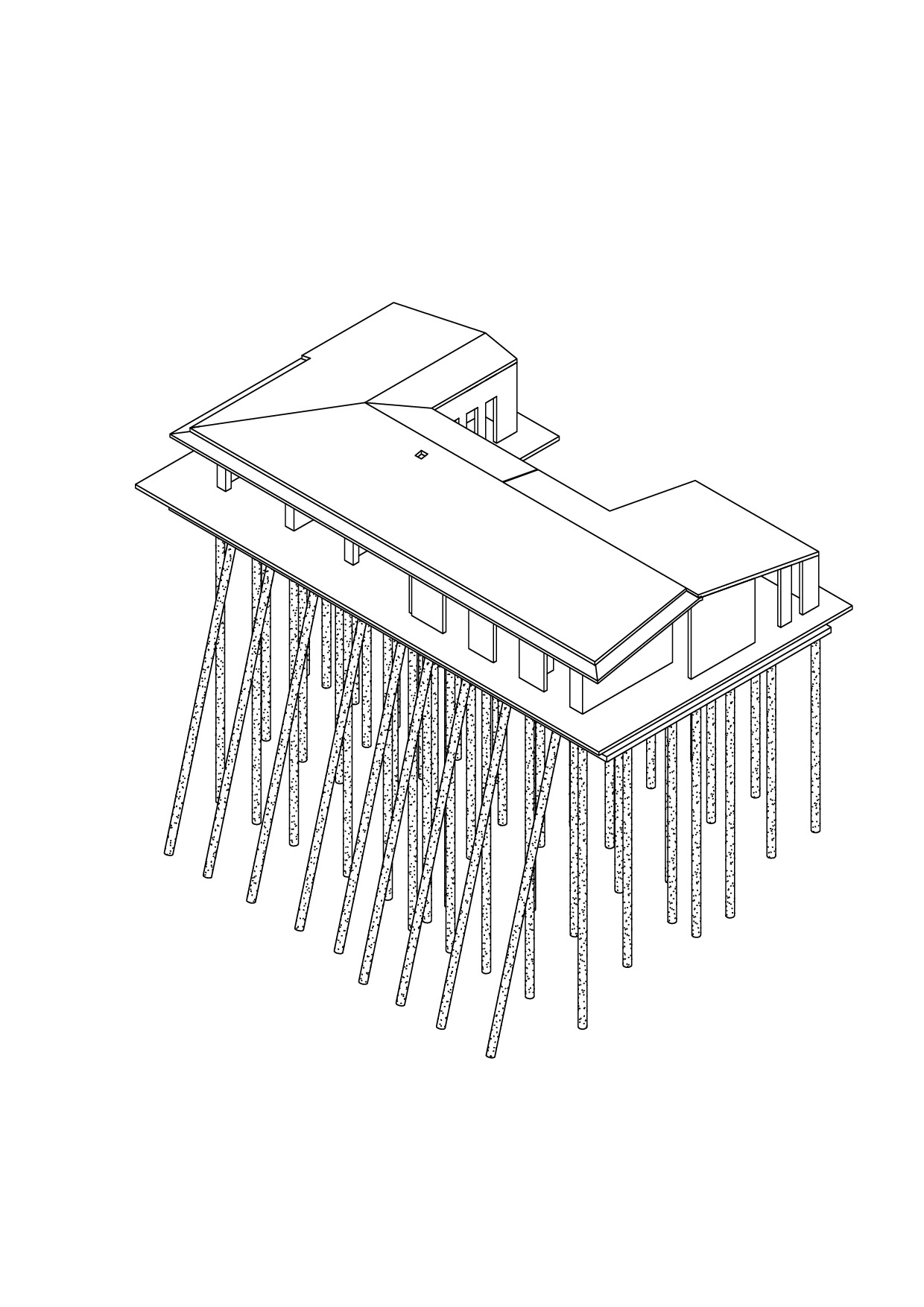
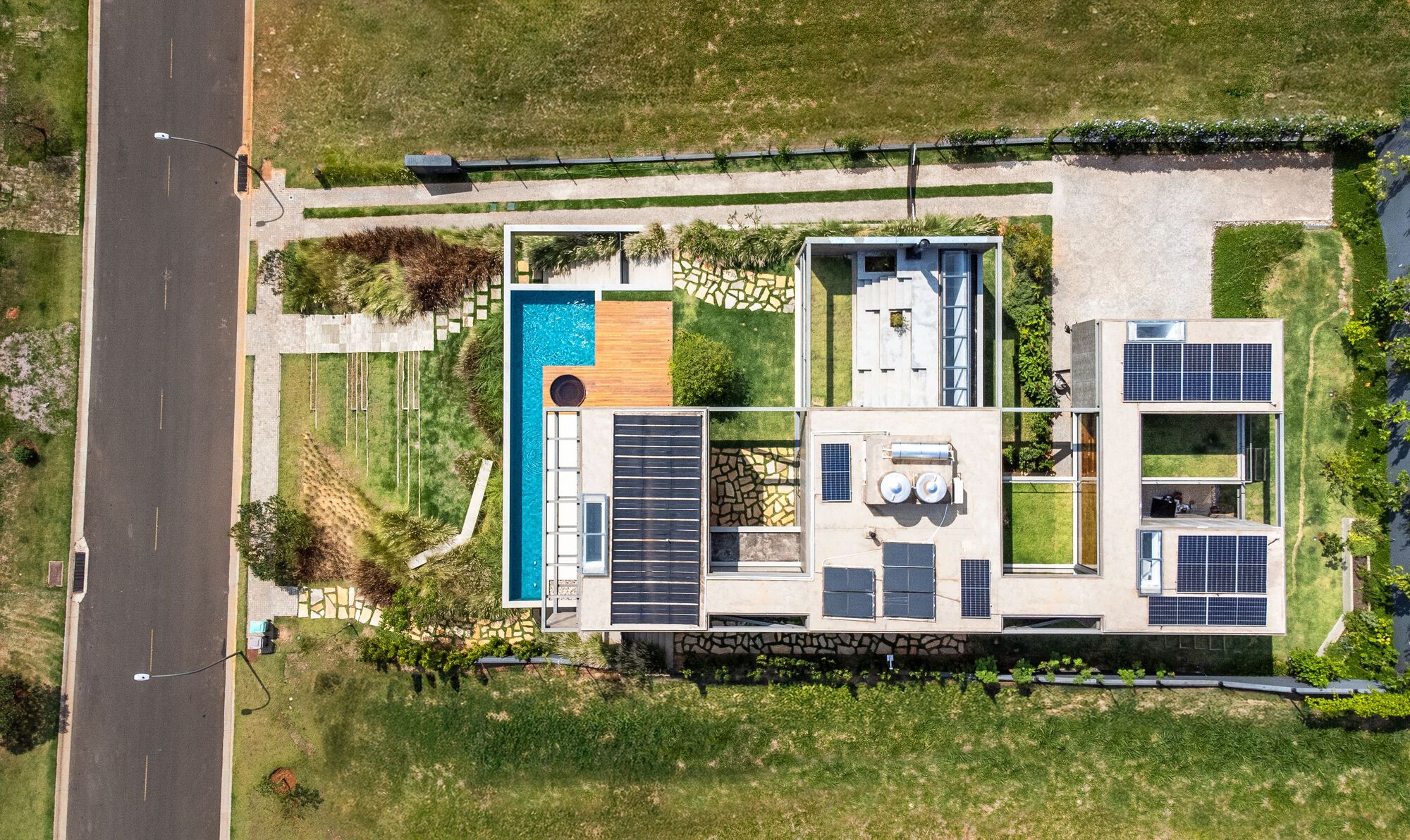
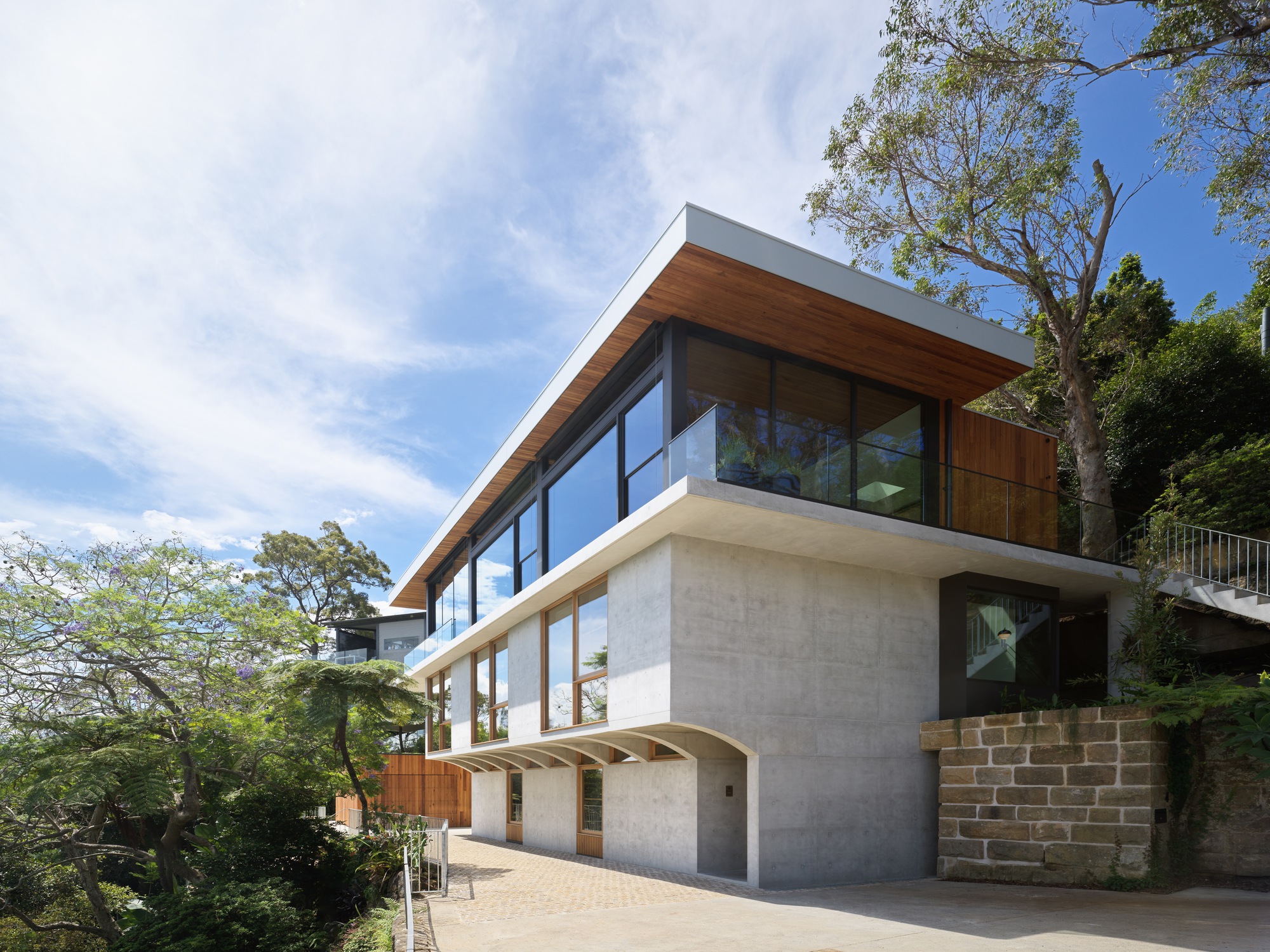
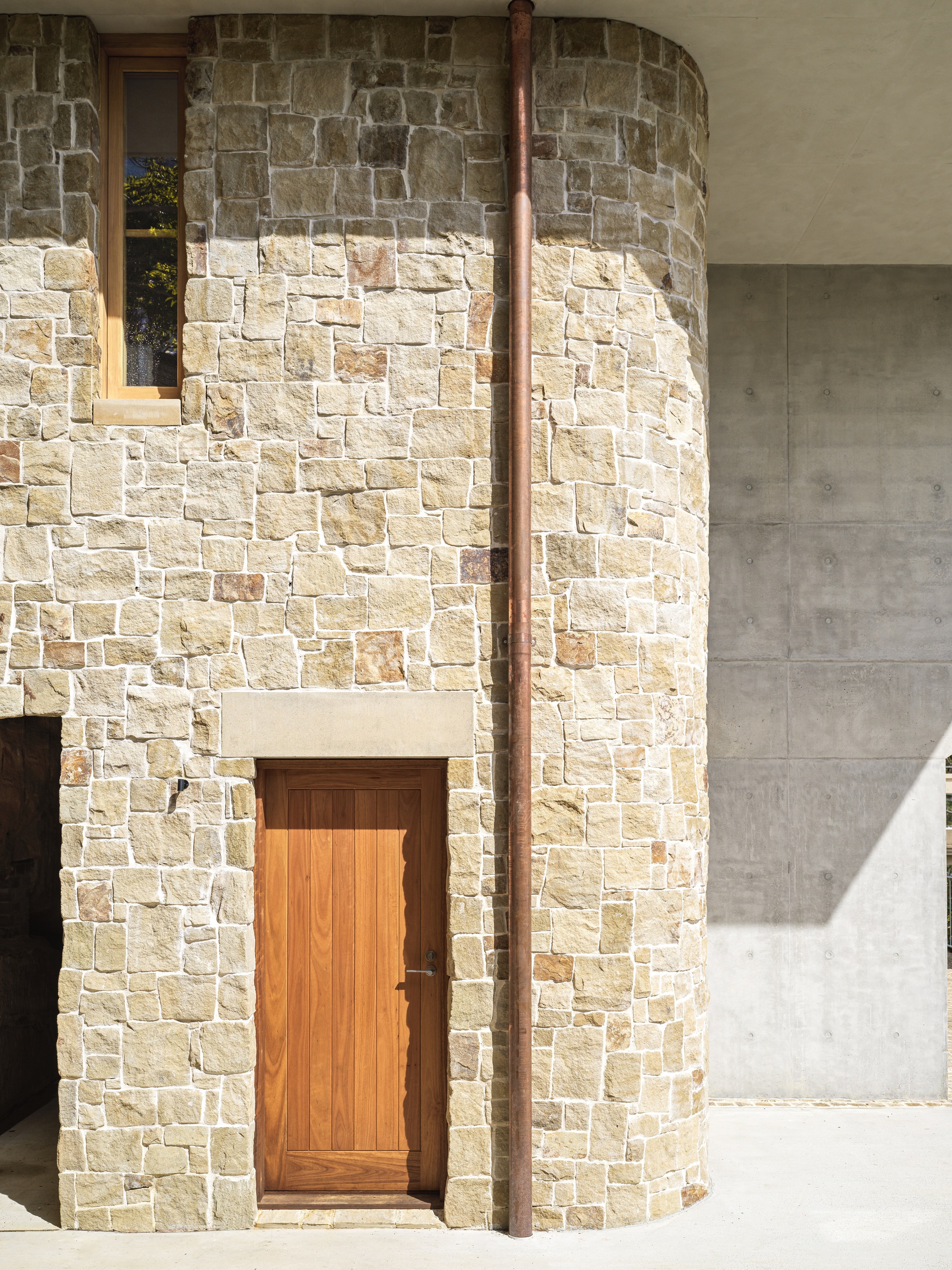
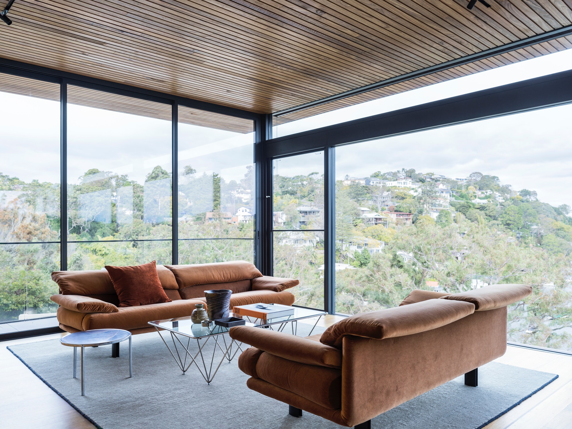
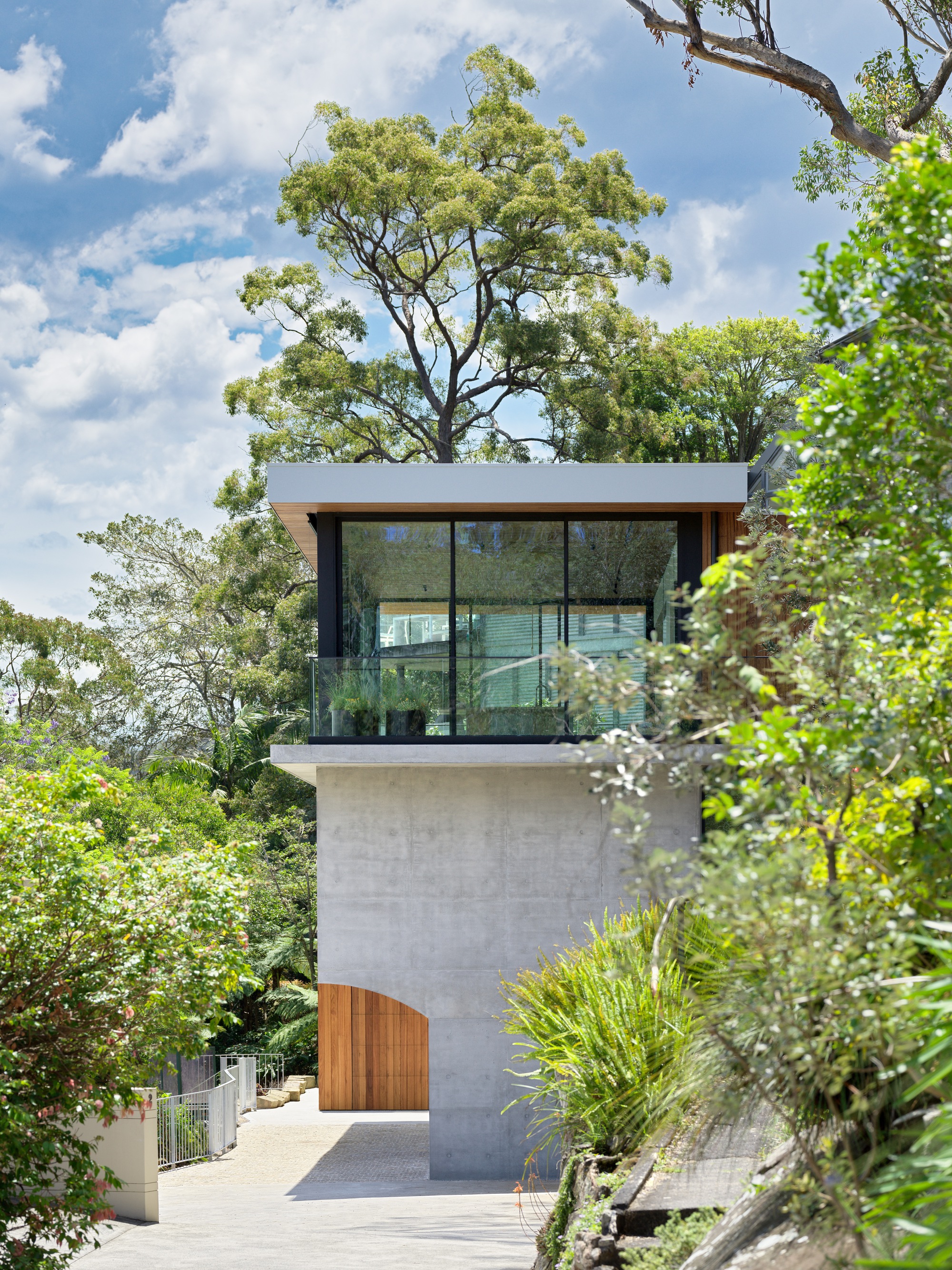
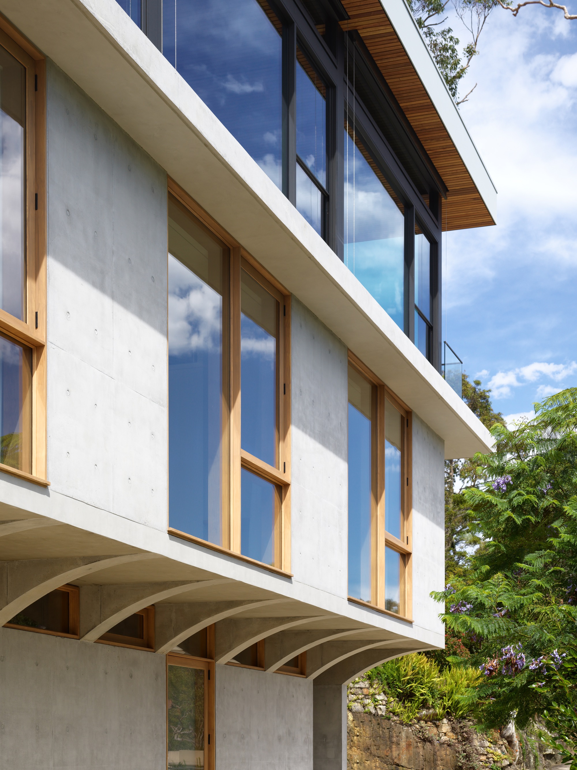
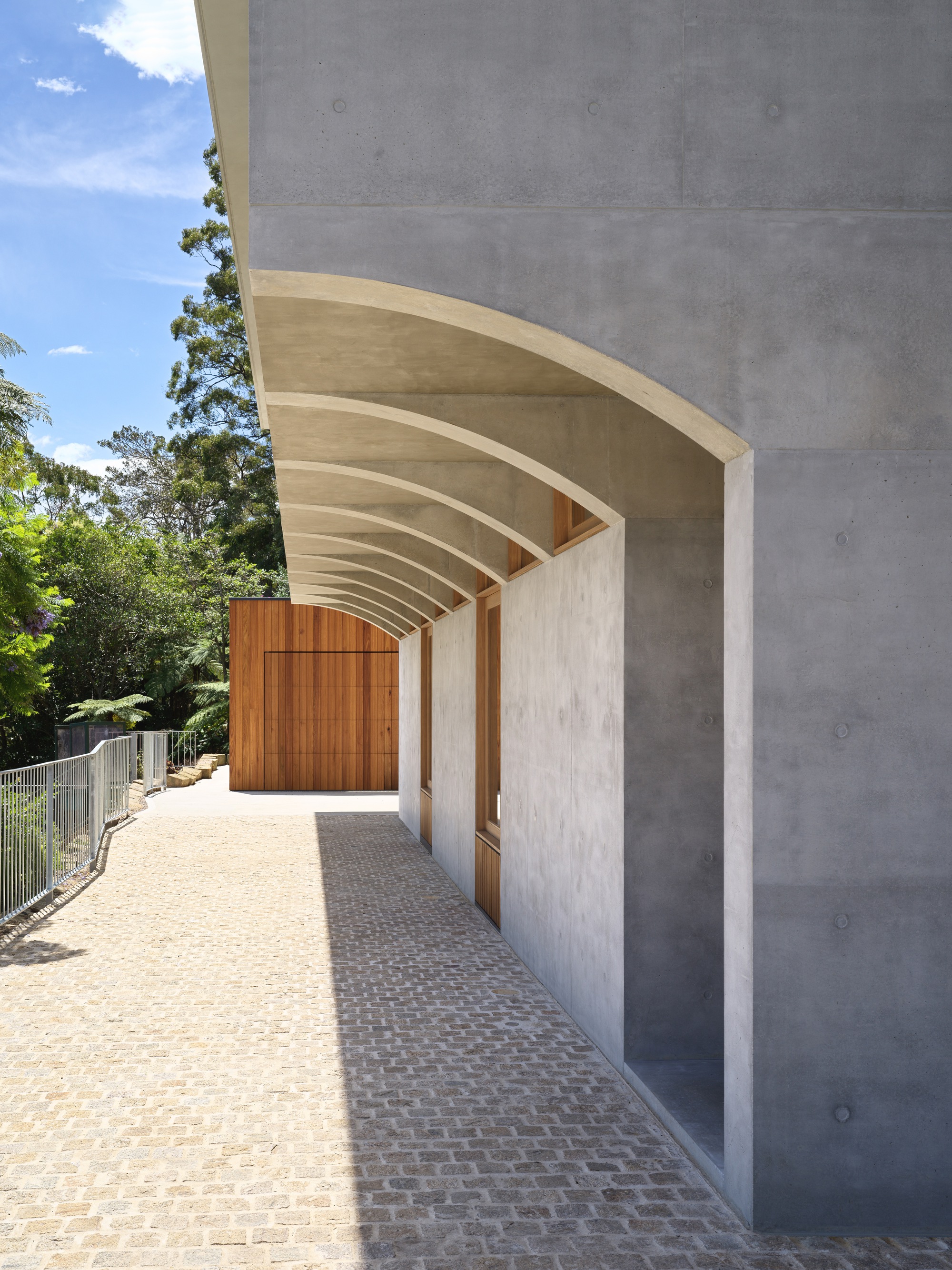
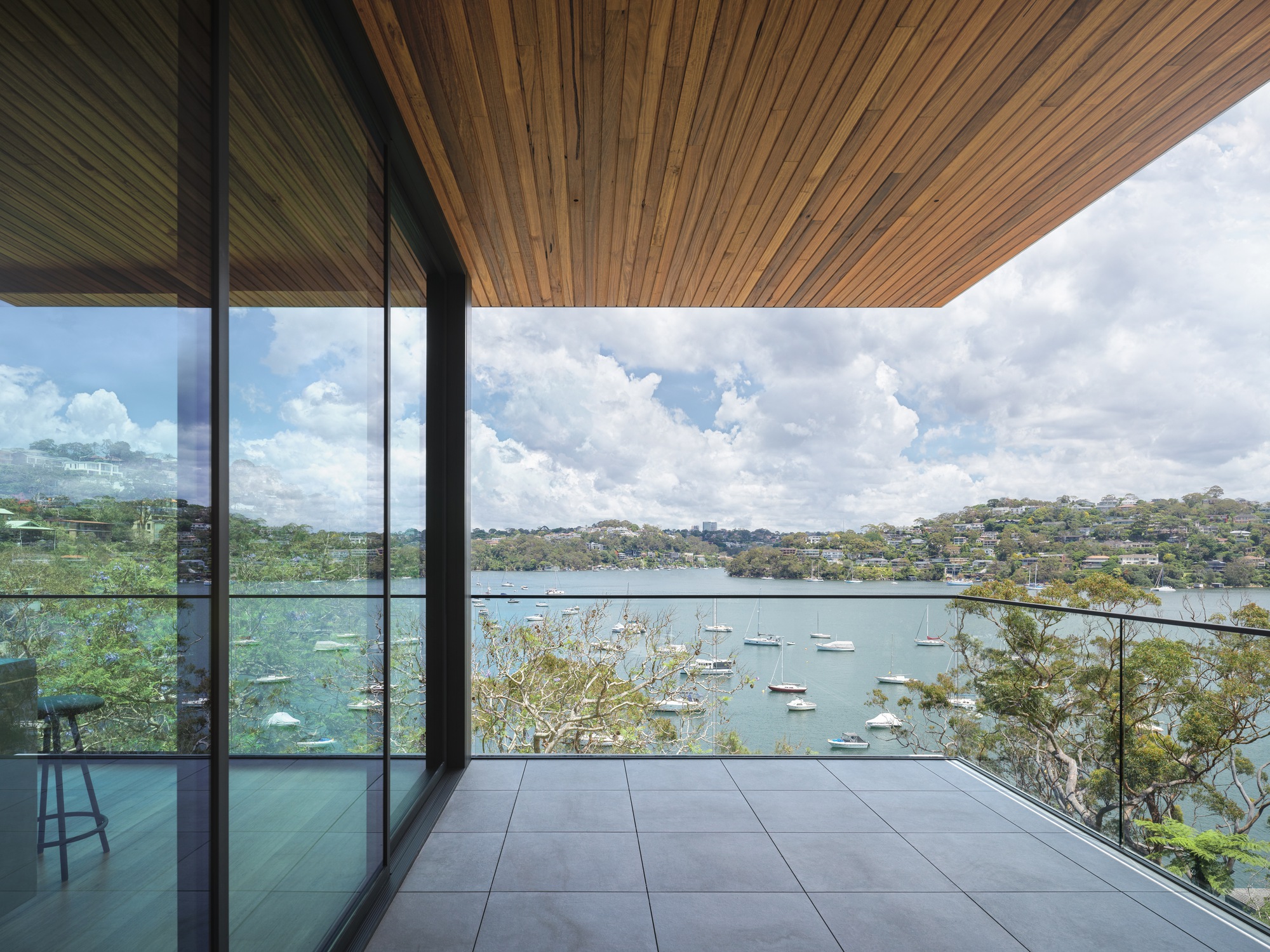
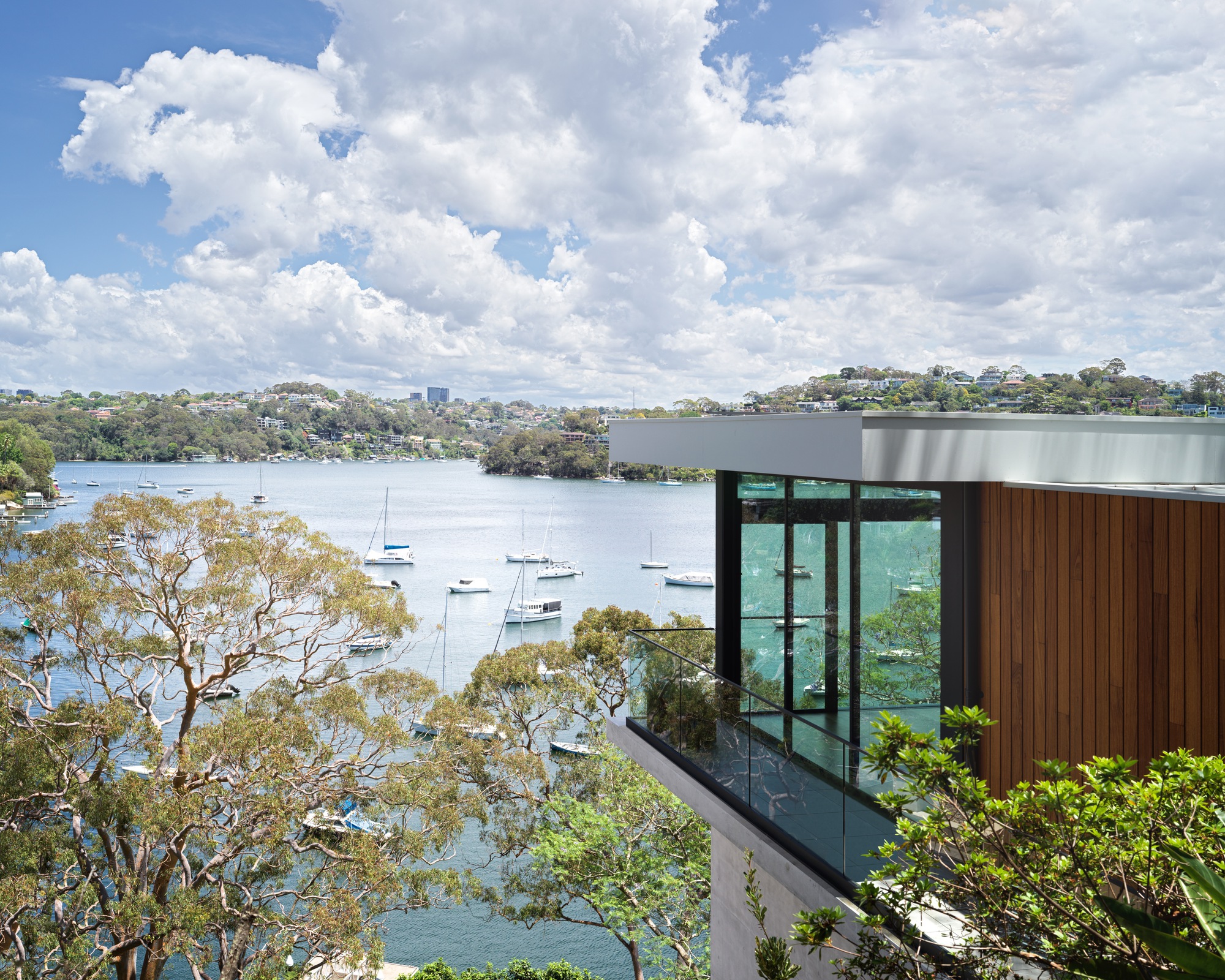
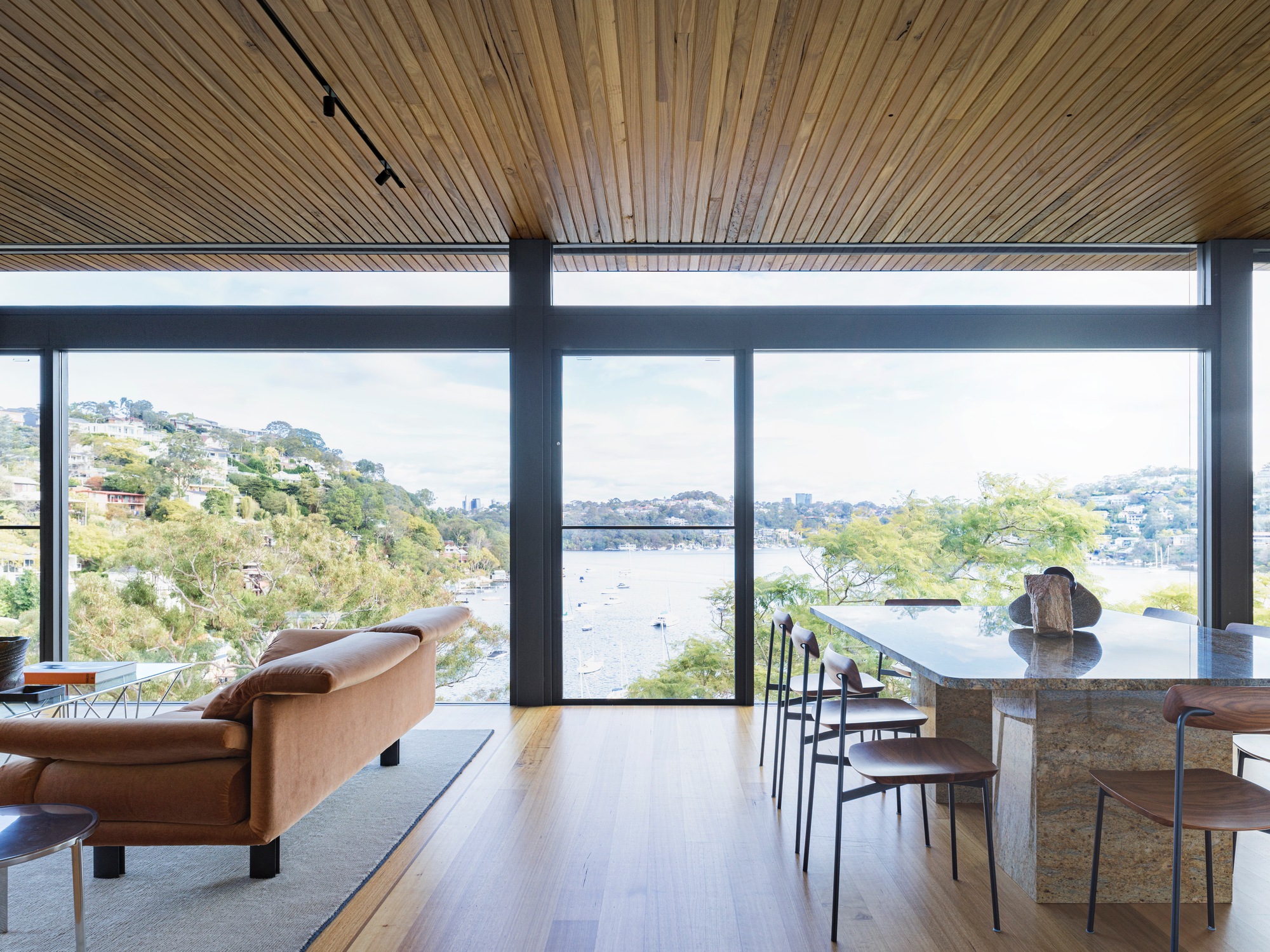
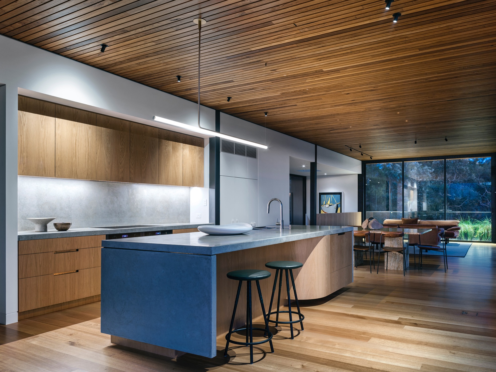
A striking residential project has emerged on a challenging waterfront site, seamlessly blending medieval architectural principles with contemporary design. Dubbed "Corbel House," by designers Nick Bell Architects, this innovative family home maximizes spatial efficiency while harmonizing with its natural surroundings.
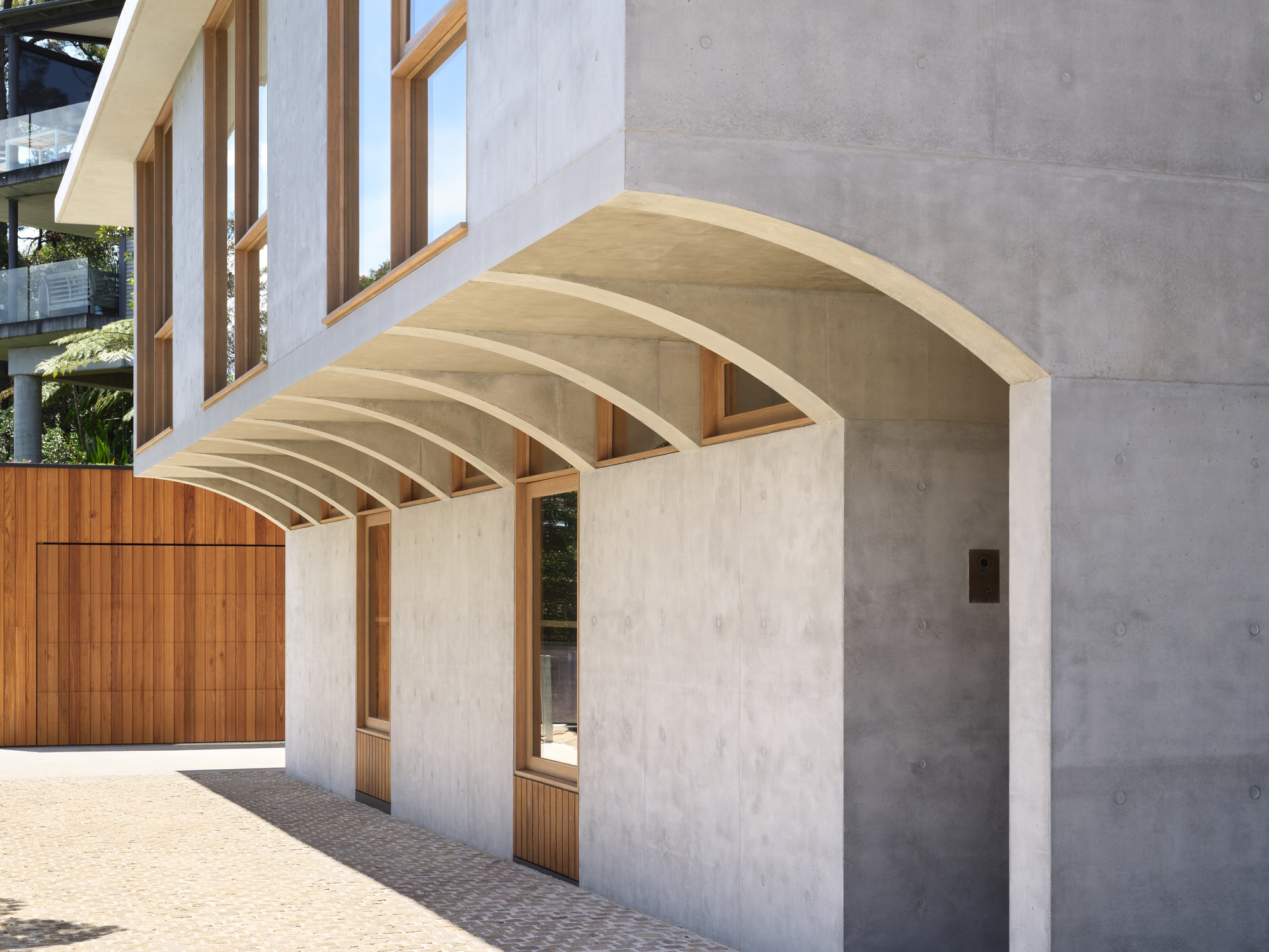
Drawing inspiration from the medieval corbel — a stepped architectural element projecting from walls to support weight — Nick Bell Architects used the age-old principle to meet the challenge of building on a narrow strip of land with a steep slope, difficult access, council height considerations and desire to maintain the ecology of the expansive waterfront site (1696 sqm).
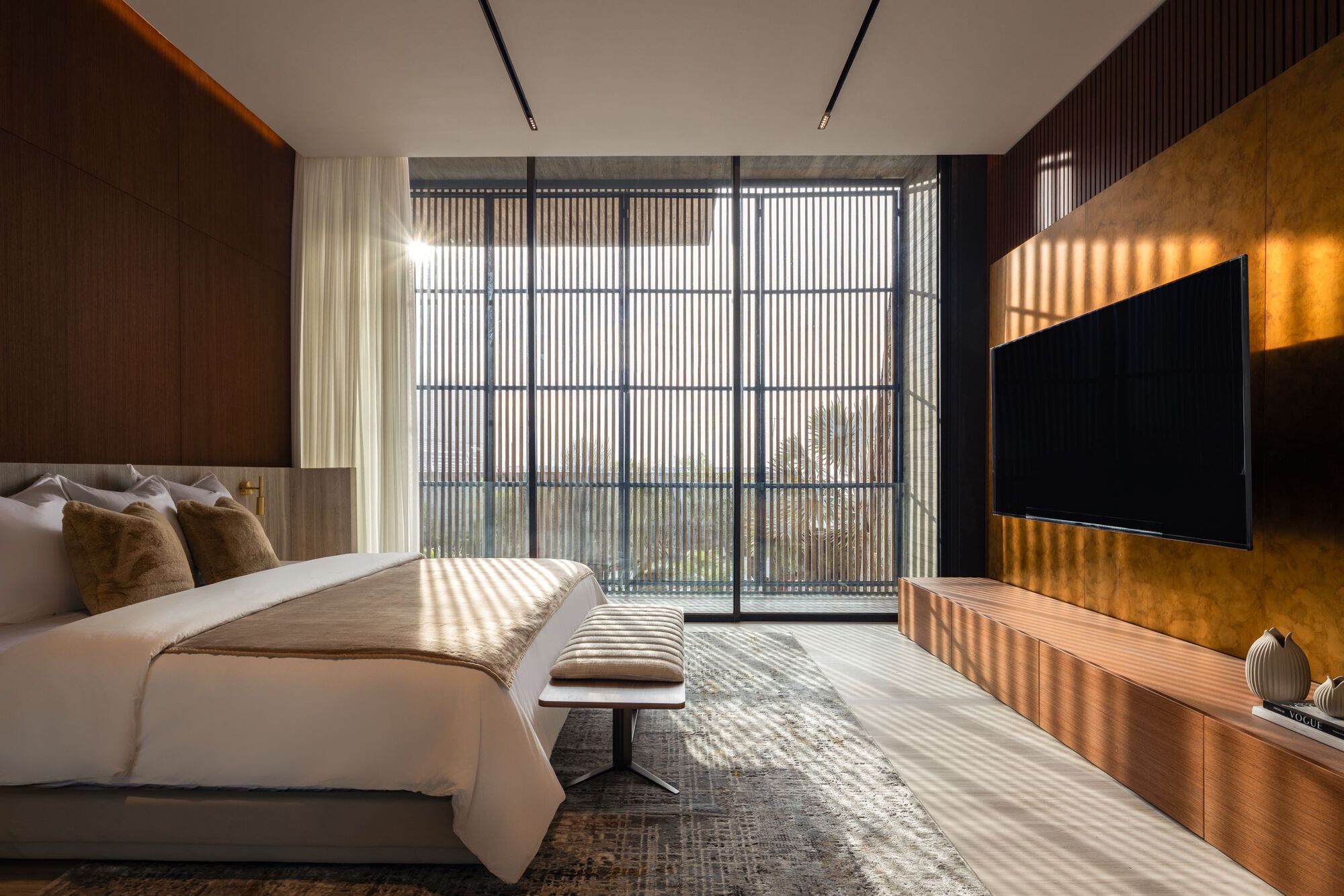
The result is a three-level contemporary home with a 75 sqm footprint that expands to a generous 245 sqm of living space. Utilizing the corbel enabled a minimal footprint, preserving the site's natural beauty and creating a unique living experience for the family of five - a spacious, light-filled home that enjoys expansive views with a feeling of being embedded within the natural environment.
The home's design evolves from a solid concrete base to lighter, more ethereal upper levels, mirroring the ascent from earth to sky. This progression is not merely aesthetic; it's an integral part of the home's character, emphasizing the transition between spaces. Using a mix of materials from concrete, timber and steel, the construction and materials embody a commitment to lasting quality - ensuring structural integrity for generations to come.
"We wanted to create a home that not only solved the site's challenges but also told a story through its architecture," says Nick Bell, lead designer of the project. "Corbel House demonstrates how historical architectural elements can be reimagined to create thoroughly modern, captivating living spaces that are built to last."
Key features of Corbel House include:
* A cantilever design supported by corbels, maximizing usable space on a minimal footprint.
* Bespoke elements including laser-cut formwork for the concrete corbels, custom floating steel staircase, and kitchen bench combining pre-cast concrete and brass.
* Sandstone exteriors, solid sandstone lintels and cobblestone paving that pay homage to the corbel's historical roots.
* A material journey from heavy concrete on the ground floor to lighter materials on upper levels, chosen for both aesthetic appeal and longevity.
* Full electrification with a 36-panel solar system including 36 micro inverters, heat pumps, Enphase batteries and a rainwater tank.
* Panoramic views and bushland vistas from every room.
Corbel House stands as a testament to the timeless strength and relevance of aged-old design principles to solve challenges - looking back to move forward.
Corbel House
#architecture
Architects: Nick Bell Architects
Area: 1696 m²
Year: 2024
Photographs: Justin Alexander
Country: Australia
A striking residential project has emerged on a challenging waterfront site, seamlessly blending medieval architectural principles with contemporary design. Dubbed "Corbel House," by designers Nick Bell Architects, this innovative family home maximizes spatial efficiency while harmonizing with its natural surroundings.
Drawing inspiration from the medieval corbel — a stepped architectural element projecting from walls to support weight — Nick Bell Architects used the age-old principle to meet the challenge of building on a narrow strip of land with a steep slope, difficult access, council height considerations and desire to maintain the ecology of the expansive waterfront site (1696 sqm).
The result is a three-level contemporary home with a 75 sqm footprint that expands to a generous 245 sqm of living space. Utilizing the corbel enabled a minimal footprint, preserving the site's natural beauty and creating a unique living experience for the family of five - a spacious, light-filled home that enjoys expansive views with a feeling of being embedded within the natural environment.
The home's design evolves from a solid concrete base to lighter, more ethereal upper levels, mirroring the ascent from earth to sky. This progression is not merely aesthetic; it's an integral part of the home's character, emphasizing the transition between spaces. Using a mix of materials from concrete, timber and steel, the construction and materials embody a commitment to lasting quality - ensuring structural integrity for generations to come.
"We wanted to create a home that not only solved the site's challenges but also told a story through its architecture," says Nick Bell, lead designer of the project. "Corbel House demonstrates how historical architectural elements can be reimagined to create thoroughly modern, captivating living spaces that are built to last."
Key features of Corbel House include:
* A cantilever design supported by corbels, maximizing usable space on a minimal footprint.
* Bespoke elements including laser-cut formwork for the concrete corbels, custom floating steel staircase, and kitchen bench combining pre-cast concrete and brass.
* Sandstone exteriors, solid sandstone lintels and cobblestone paving that pay homage to the corbel's historical roots.
* A material journey from heavy concrete on the ground floor to lighter materials on upper levels, chosen for both aesthetic appeal and longevity.
* Full electrification with a 36-panel solar system including 36 micro inverters, heat pumps, Enphase batteries and a rainwater tank.
* Panoramic views and bushland vistas from every room.
Corbel House stands as a testament to the timeless strength and relevance of aged-old design principles to solve challenges - looking back to move forward.


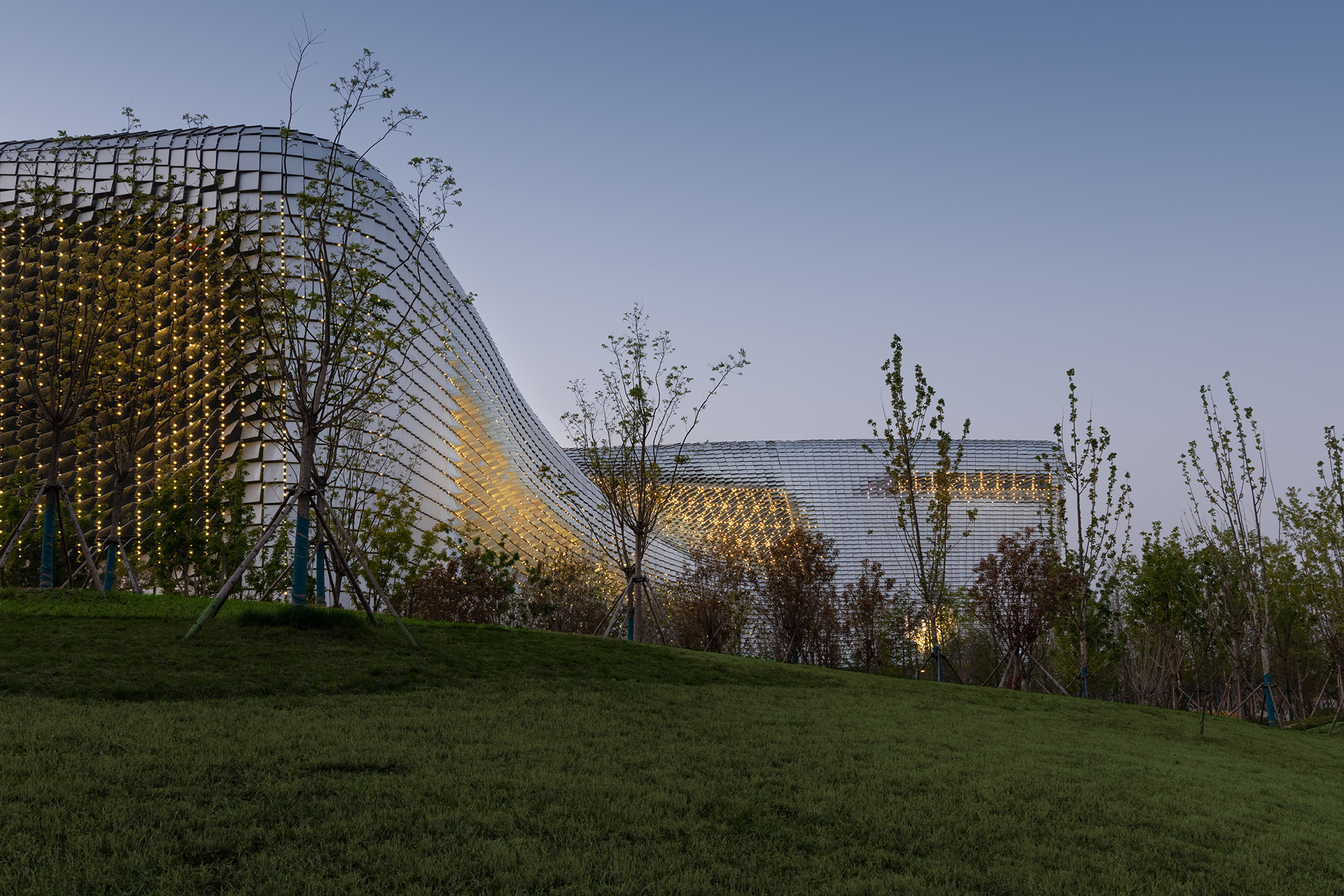
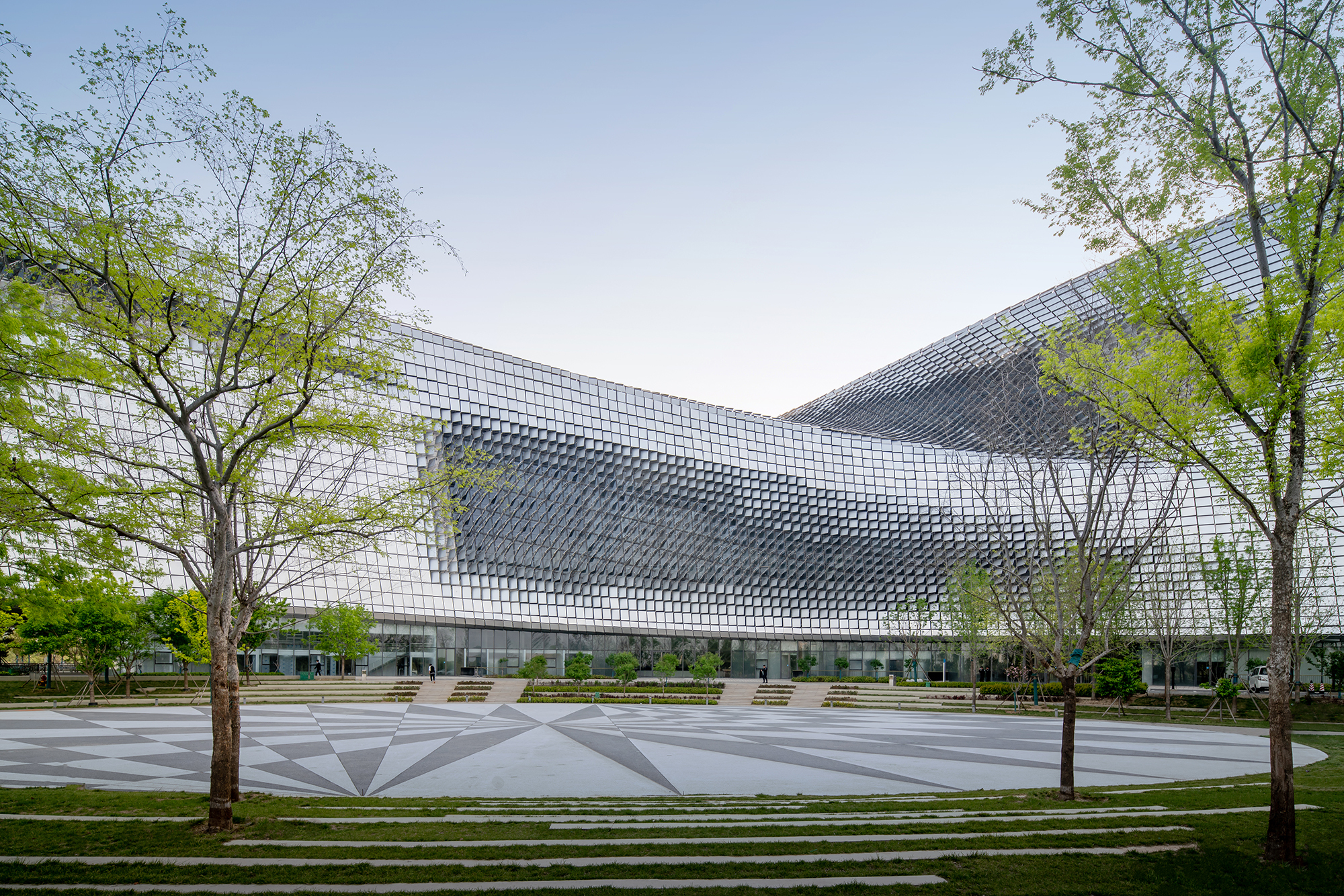
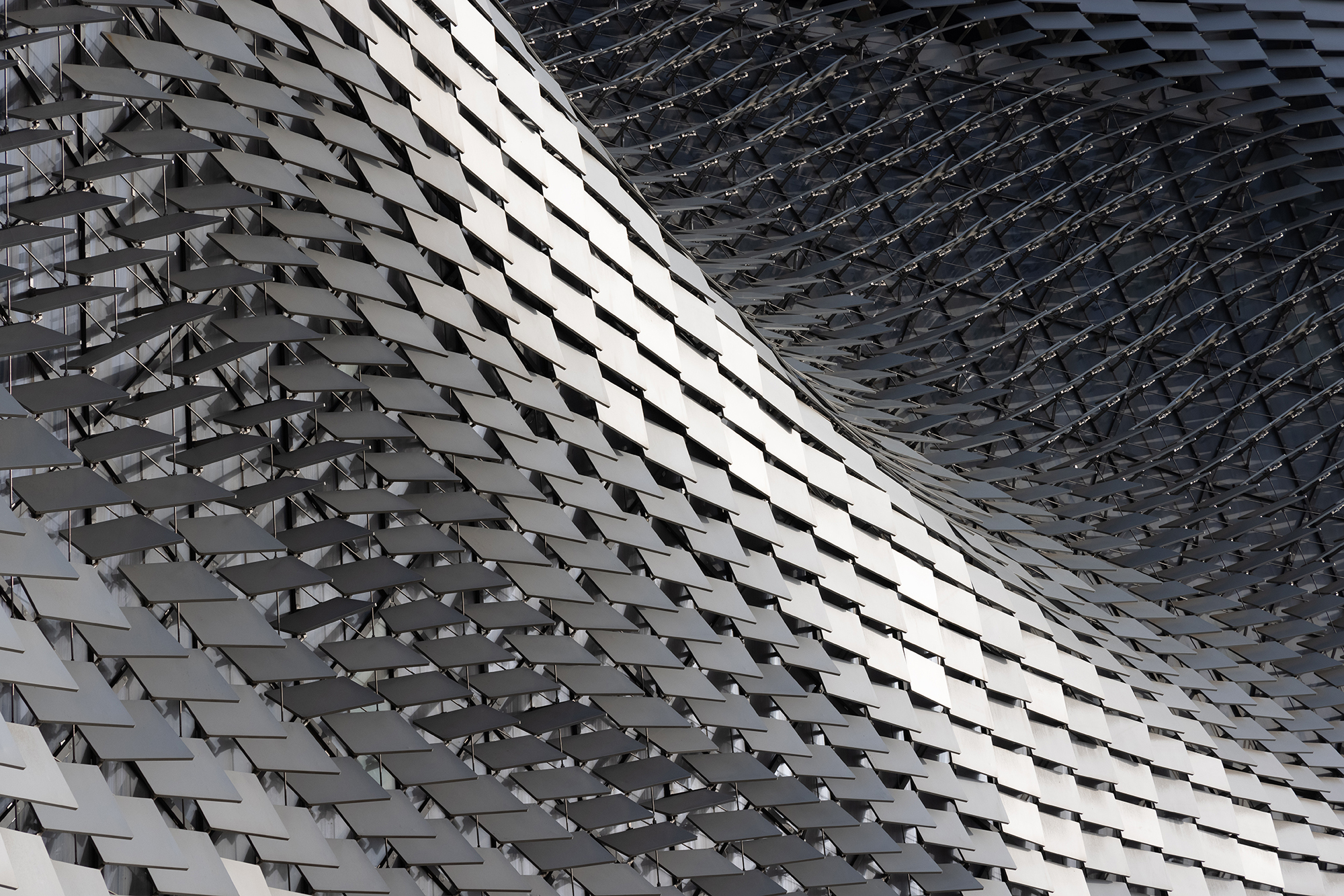
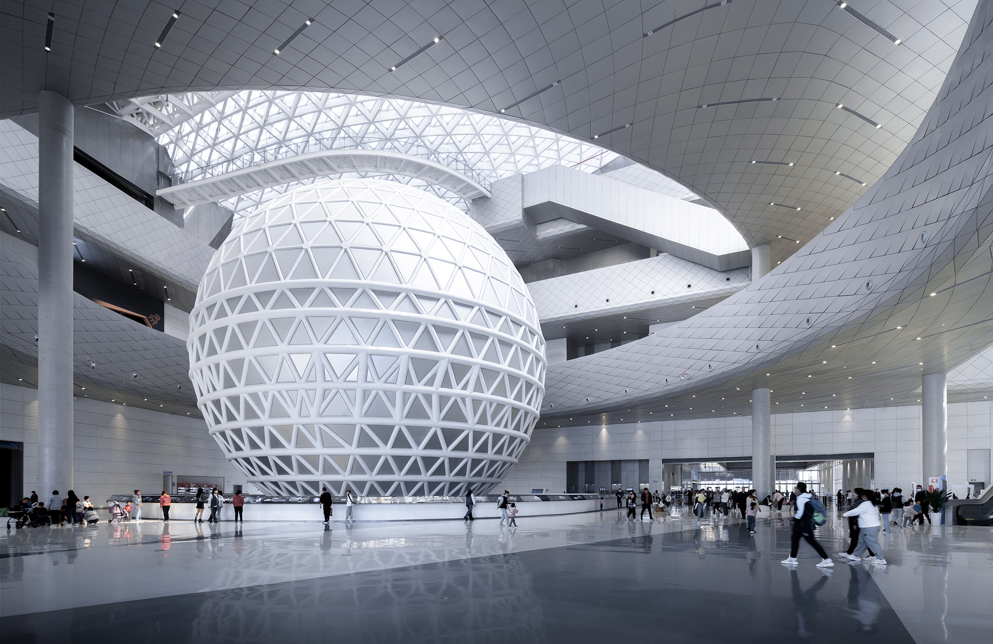
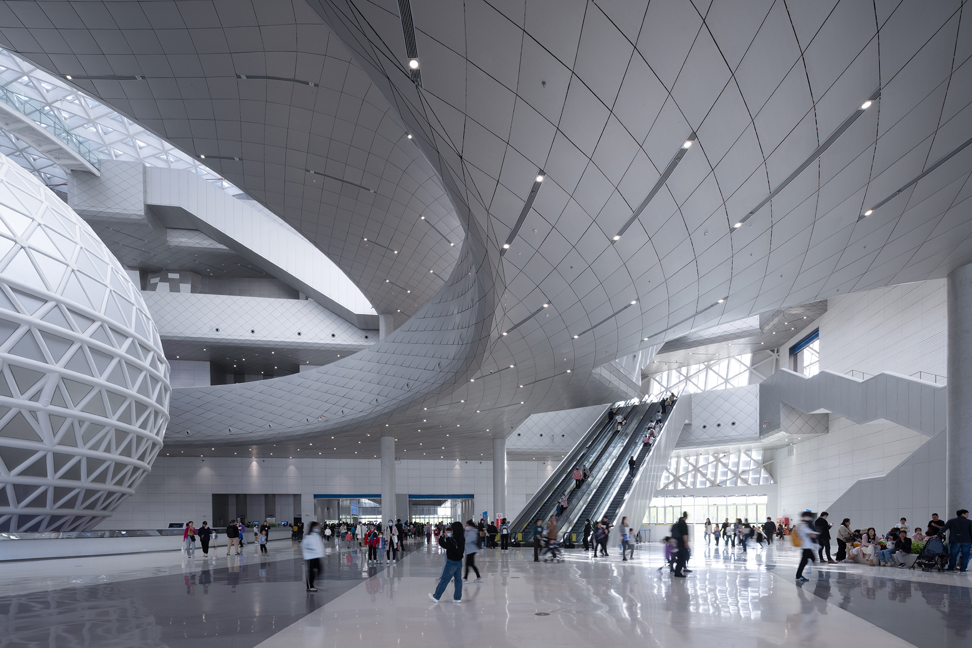
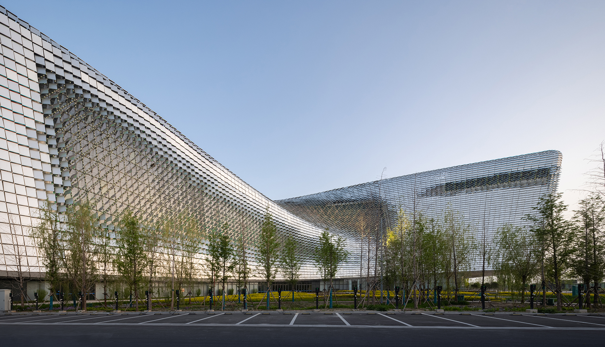
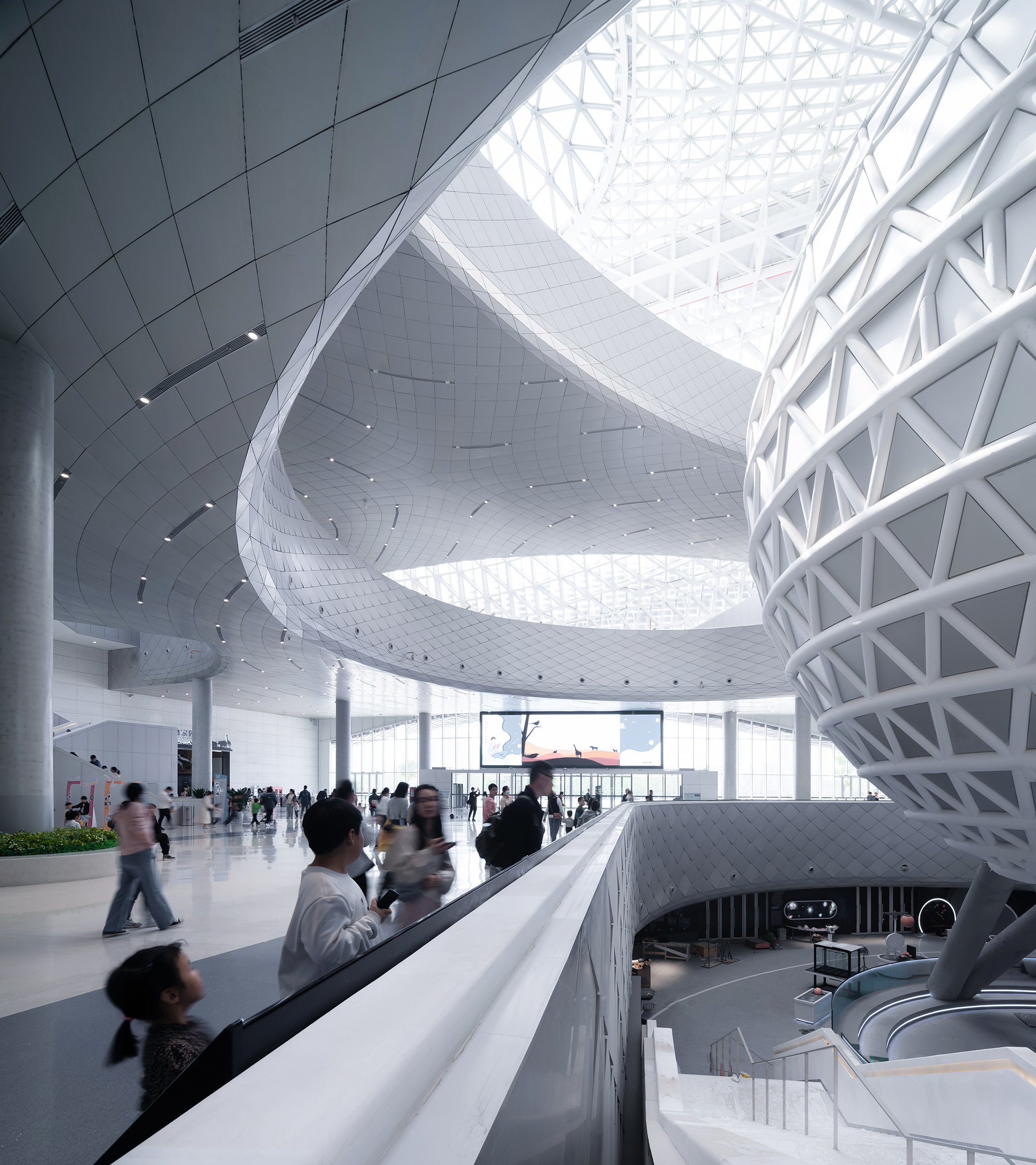
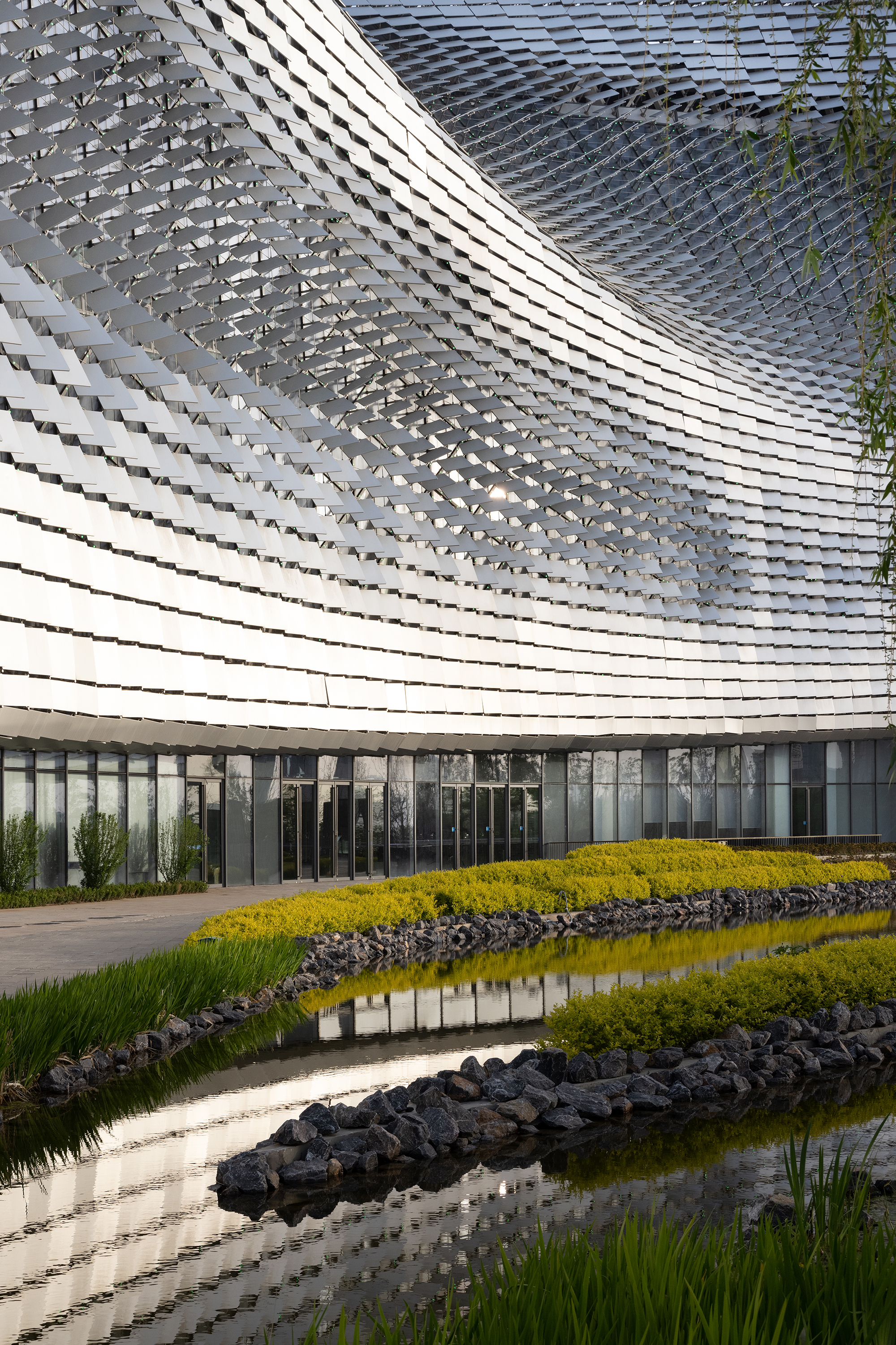
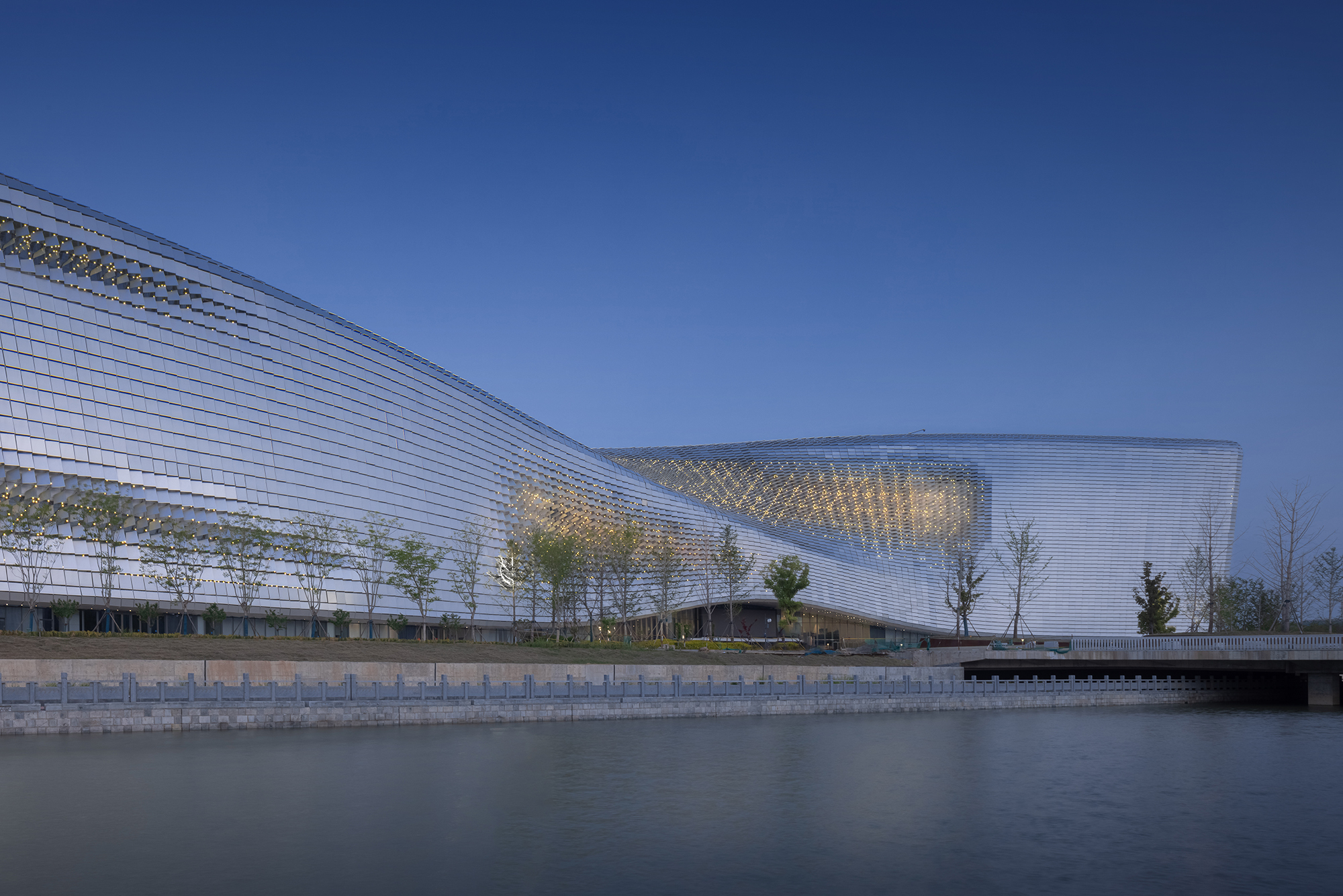
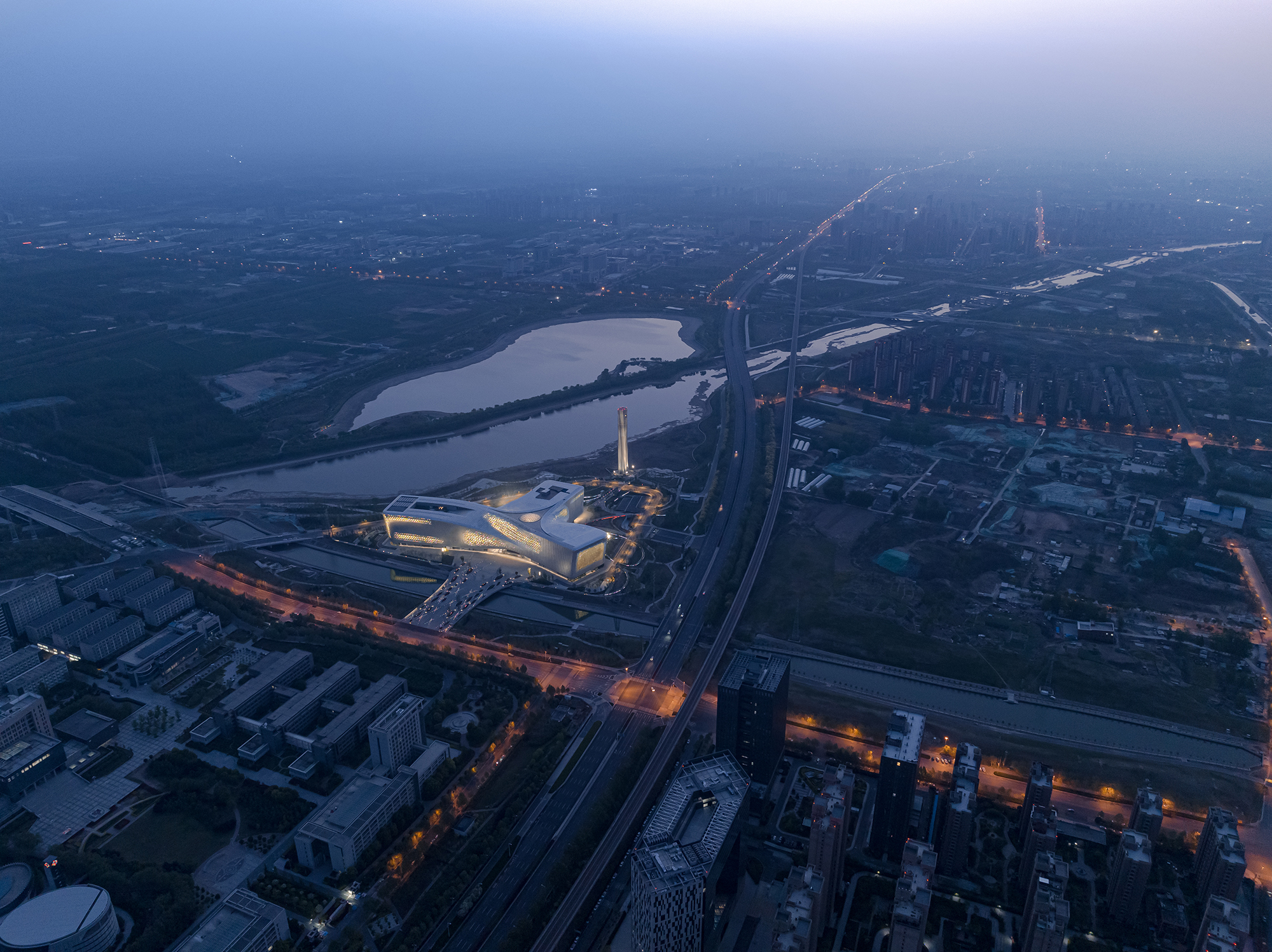
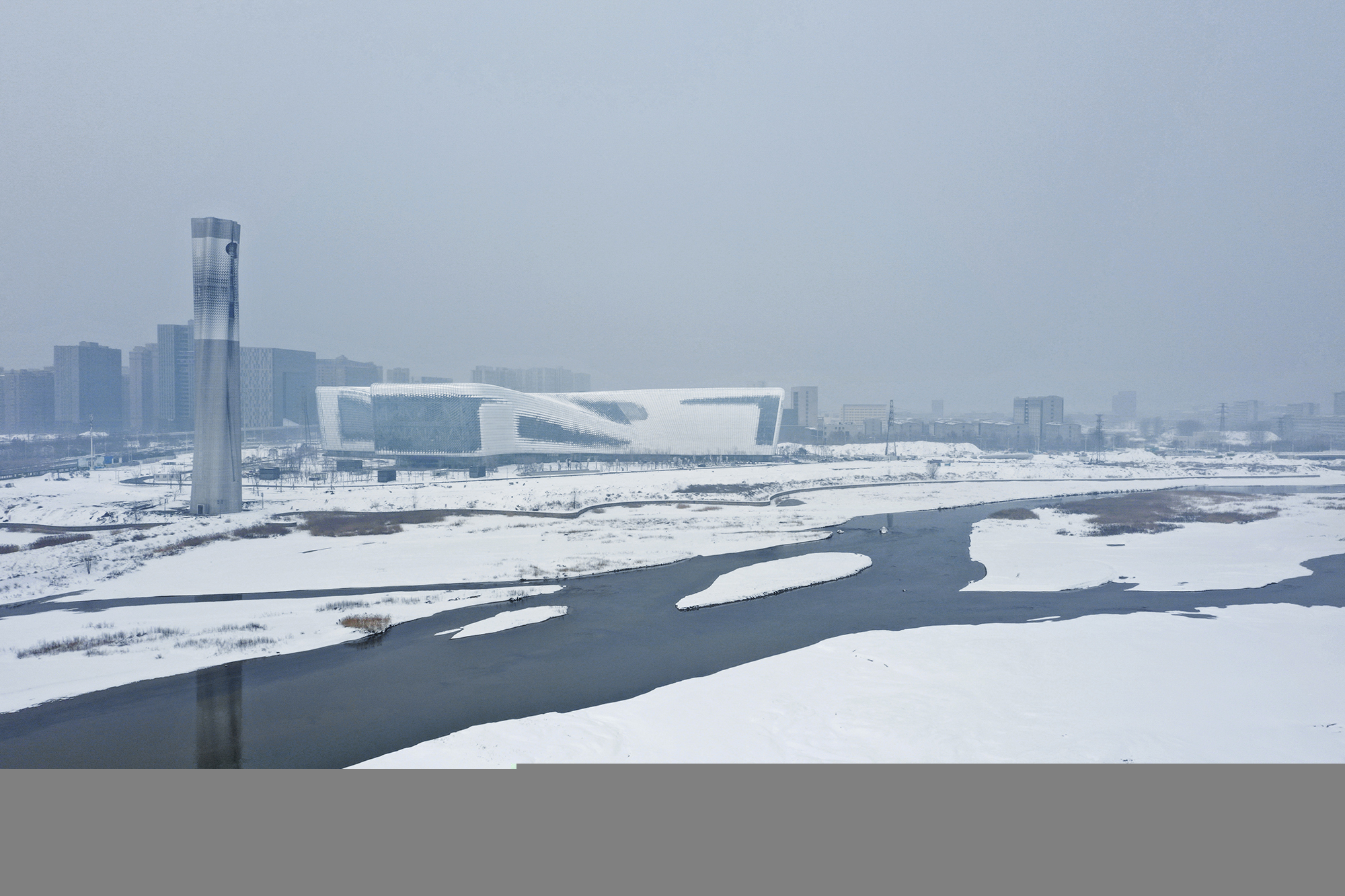
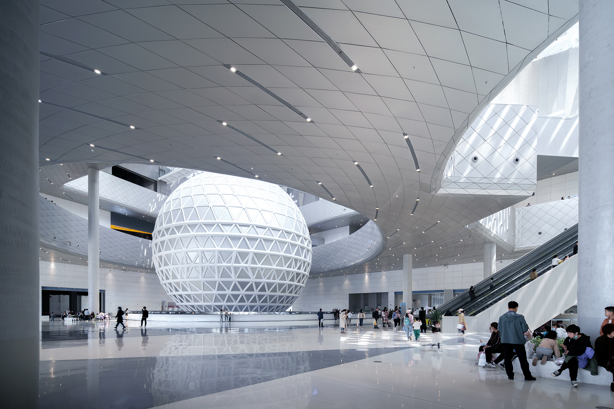
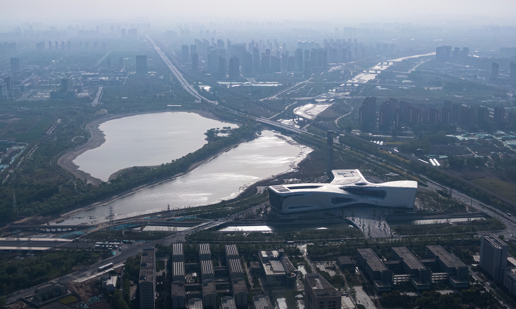
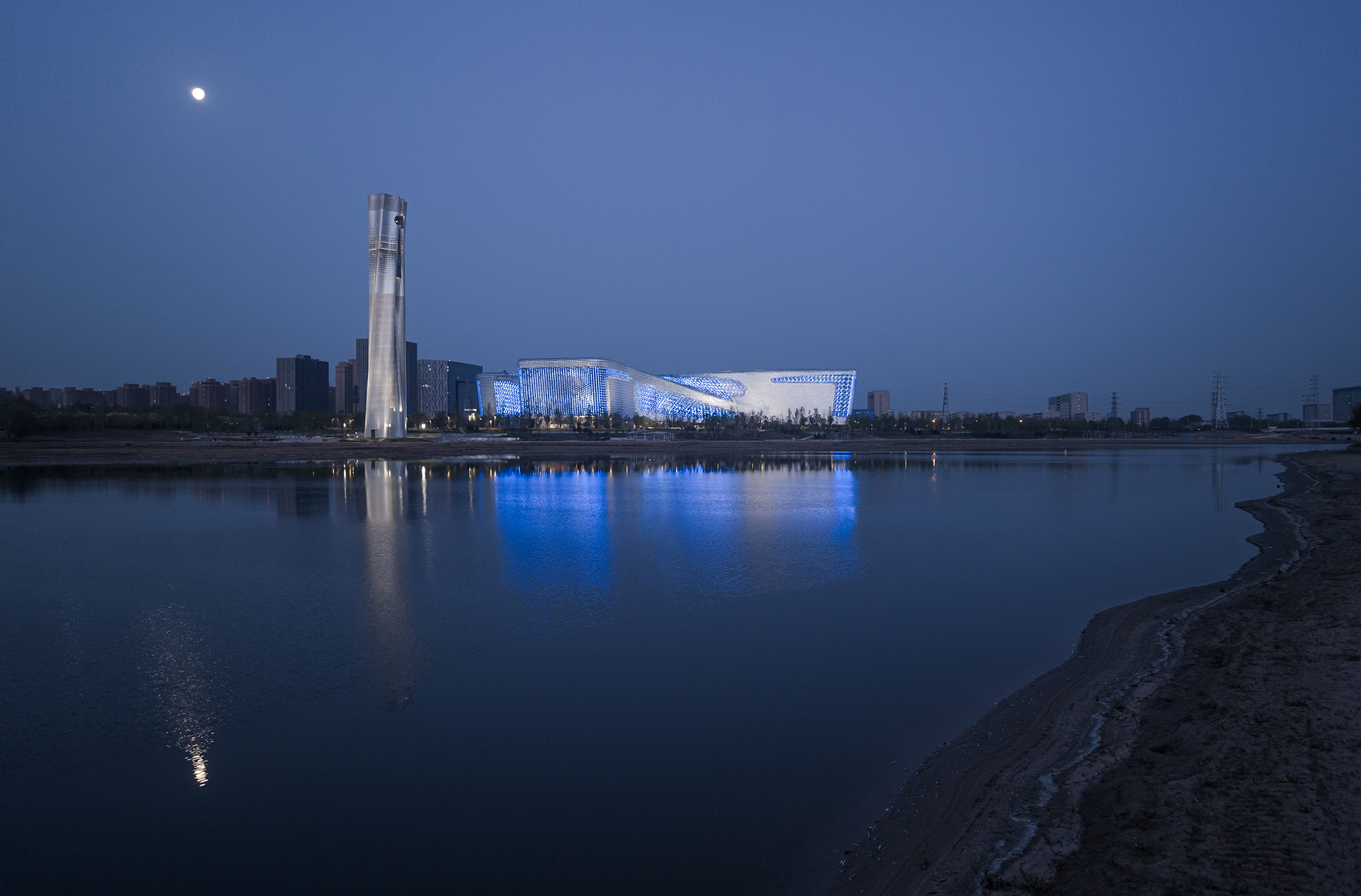
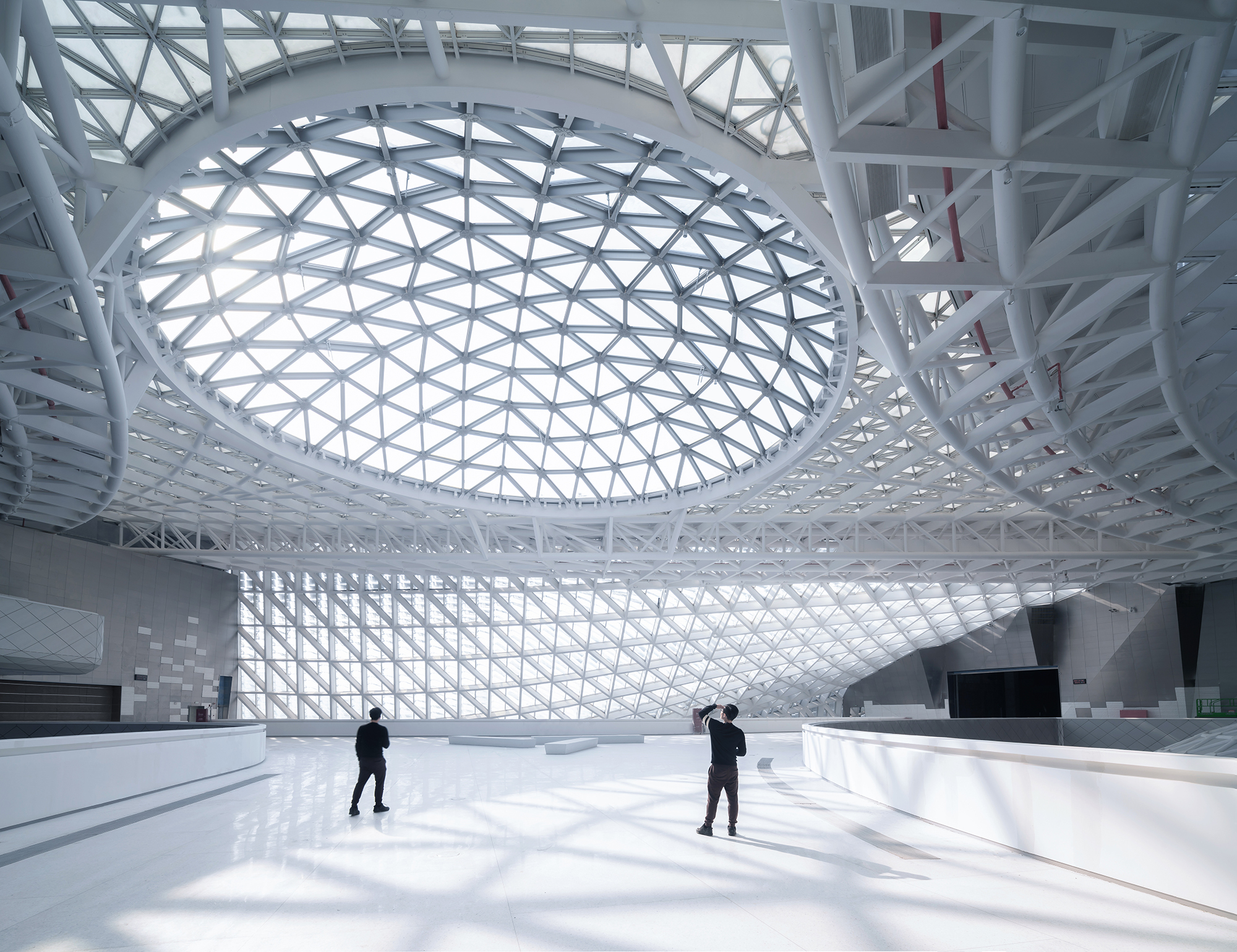
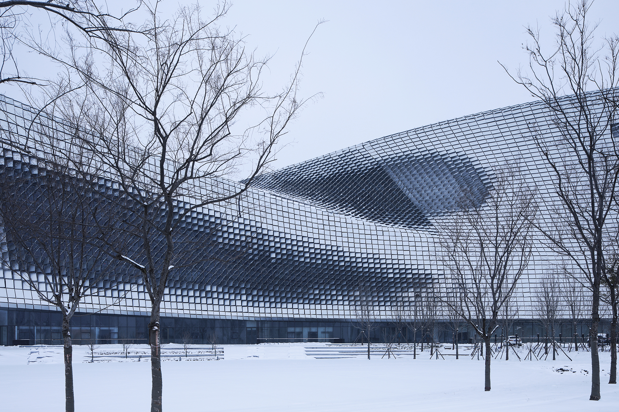
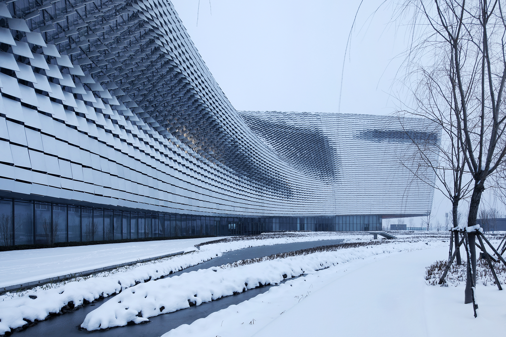
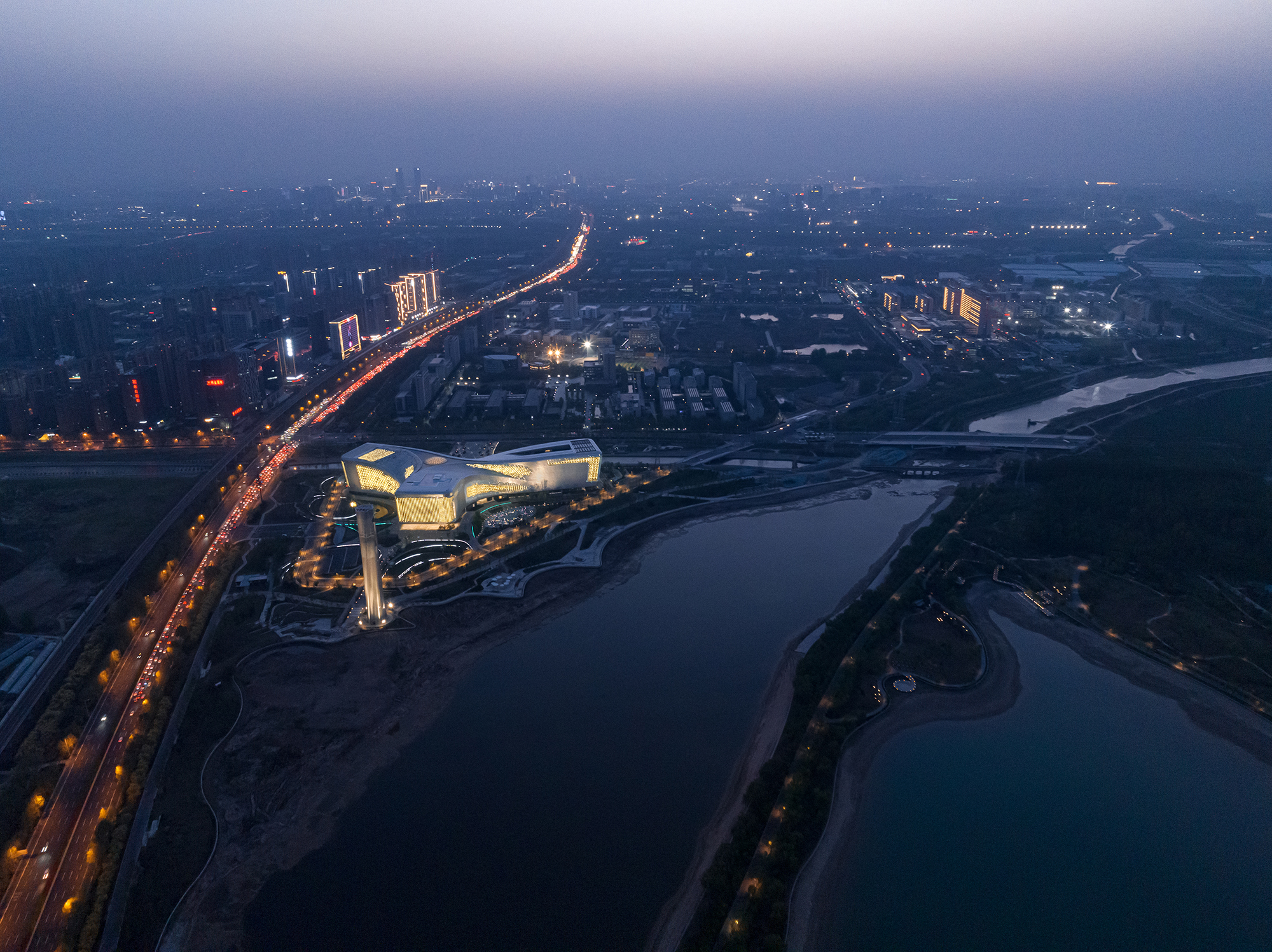
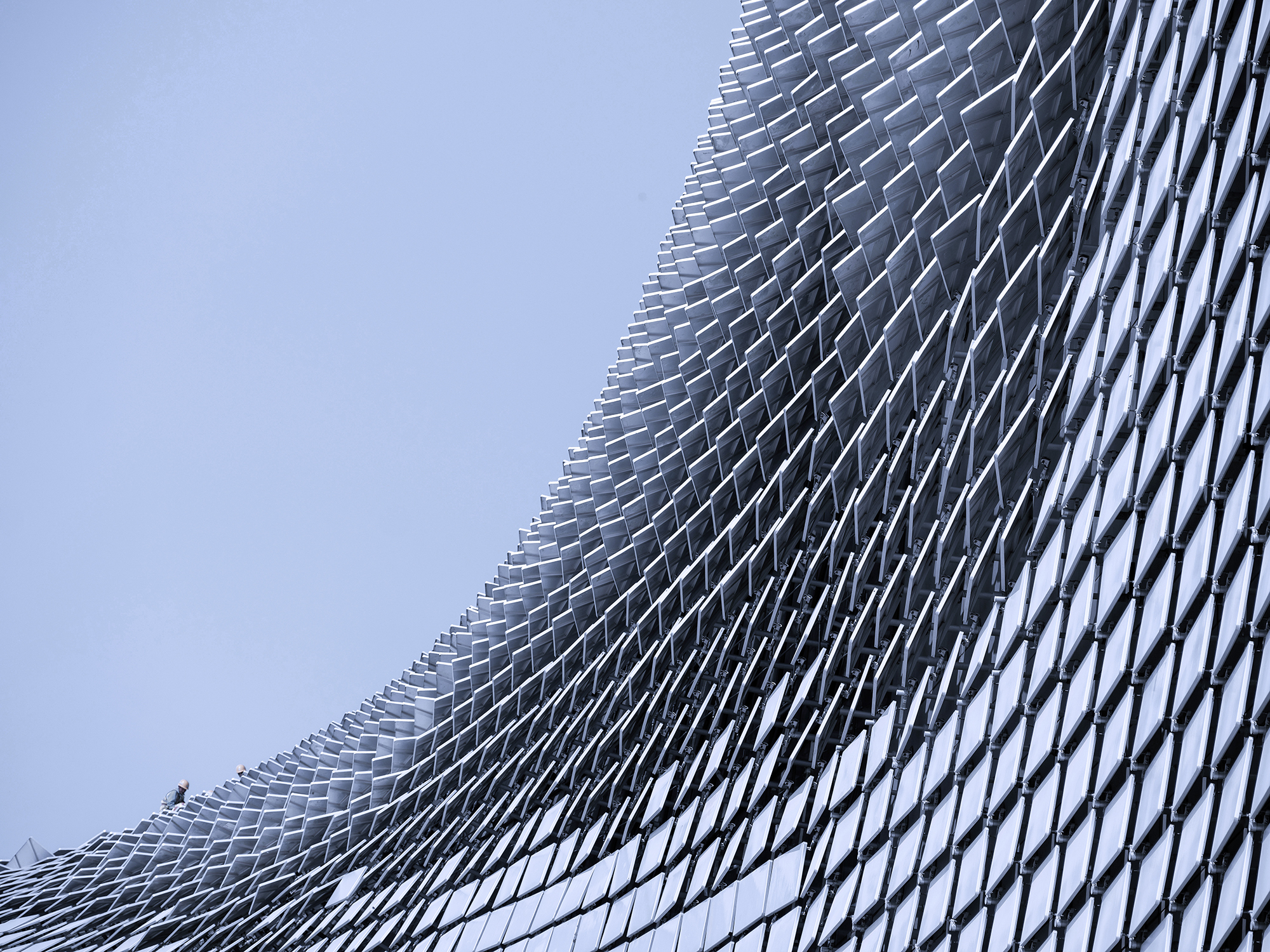
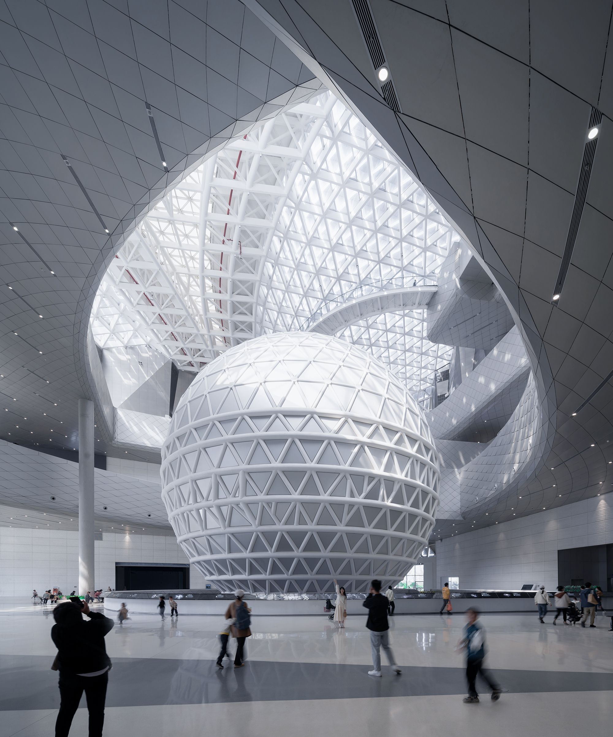
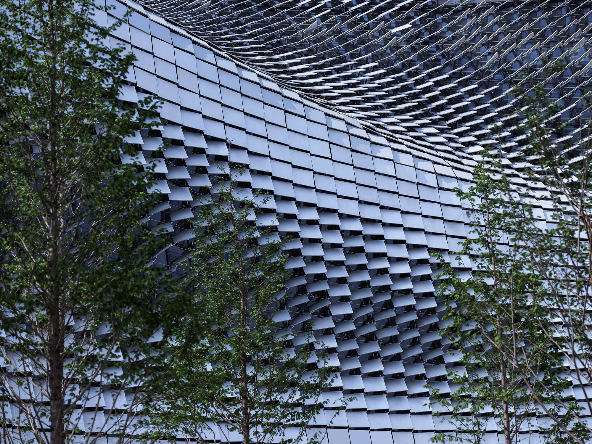
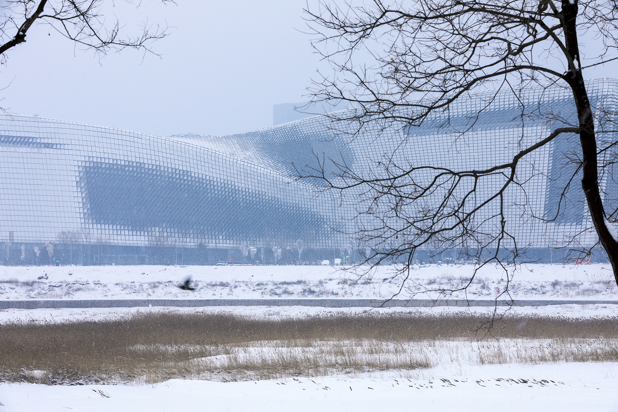
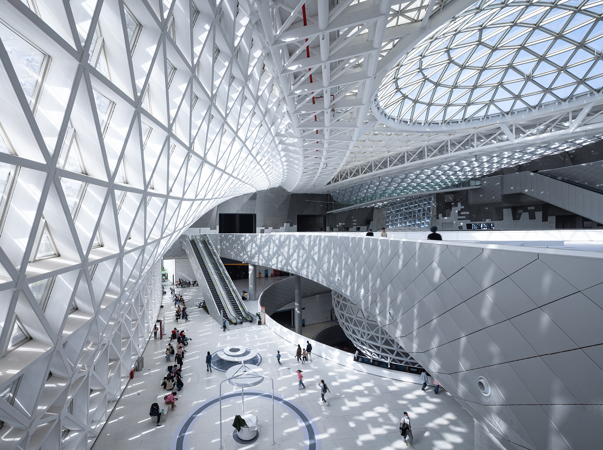
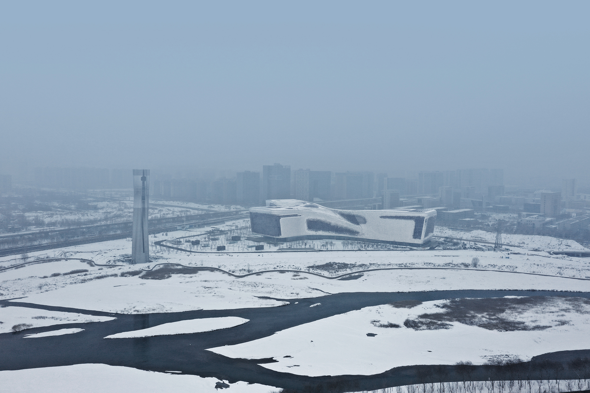
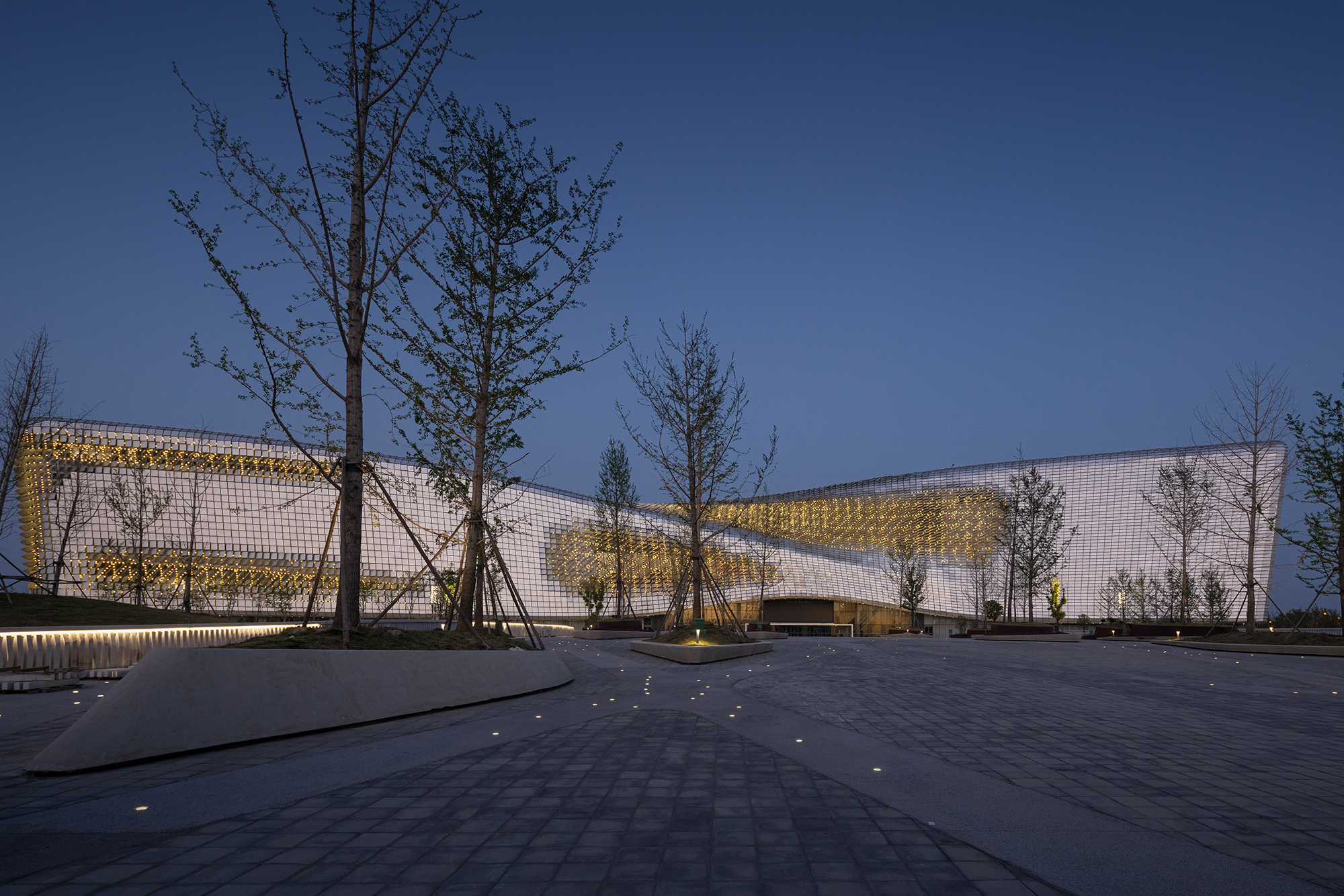
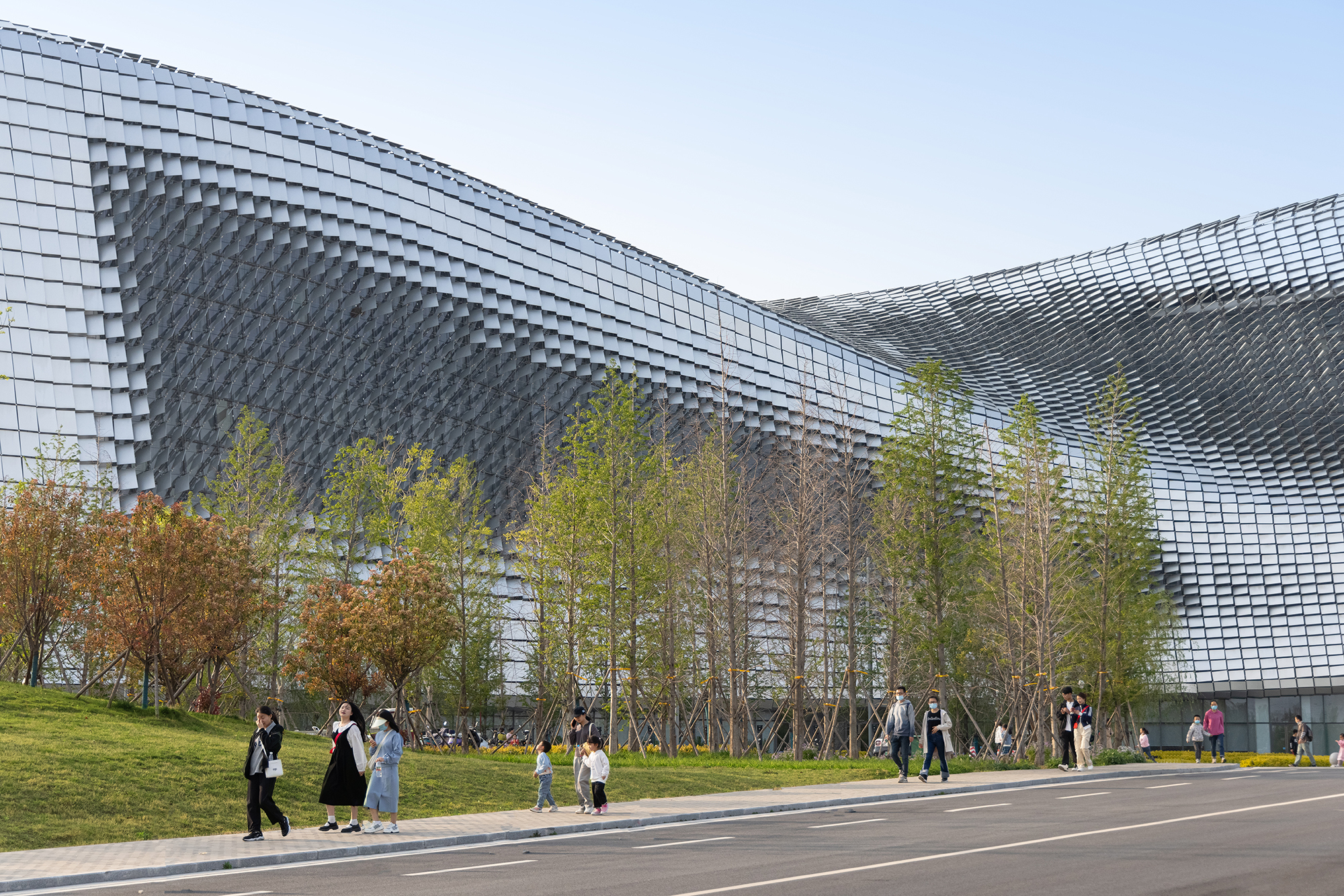
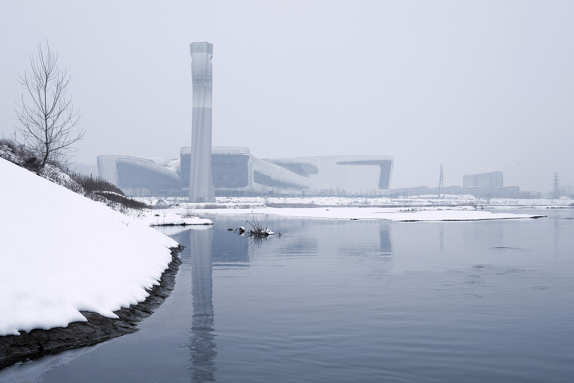
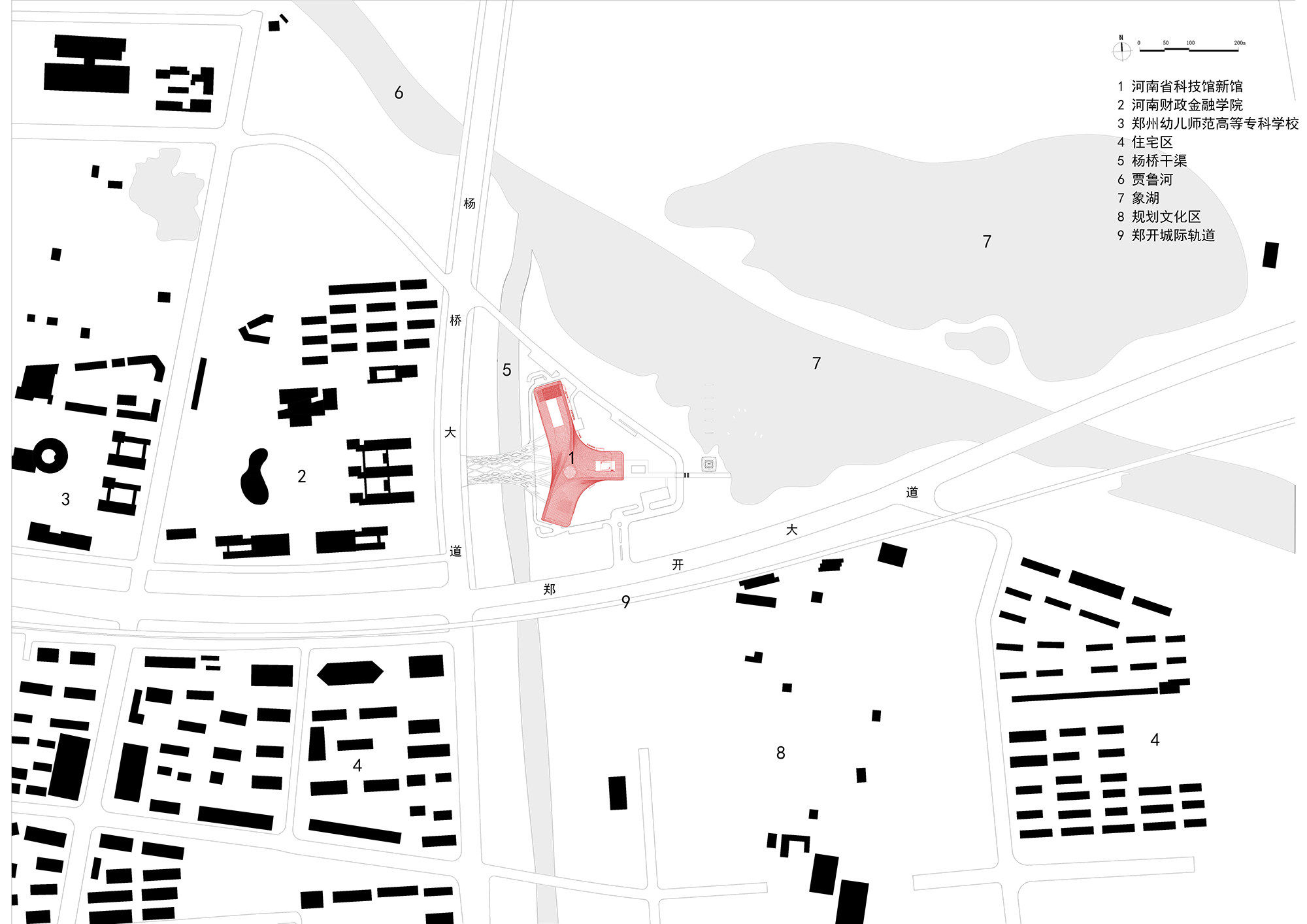
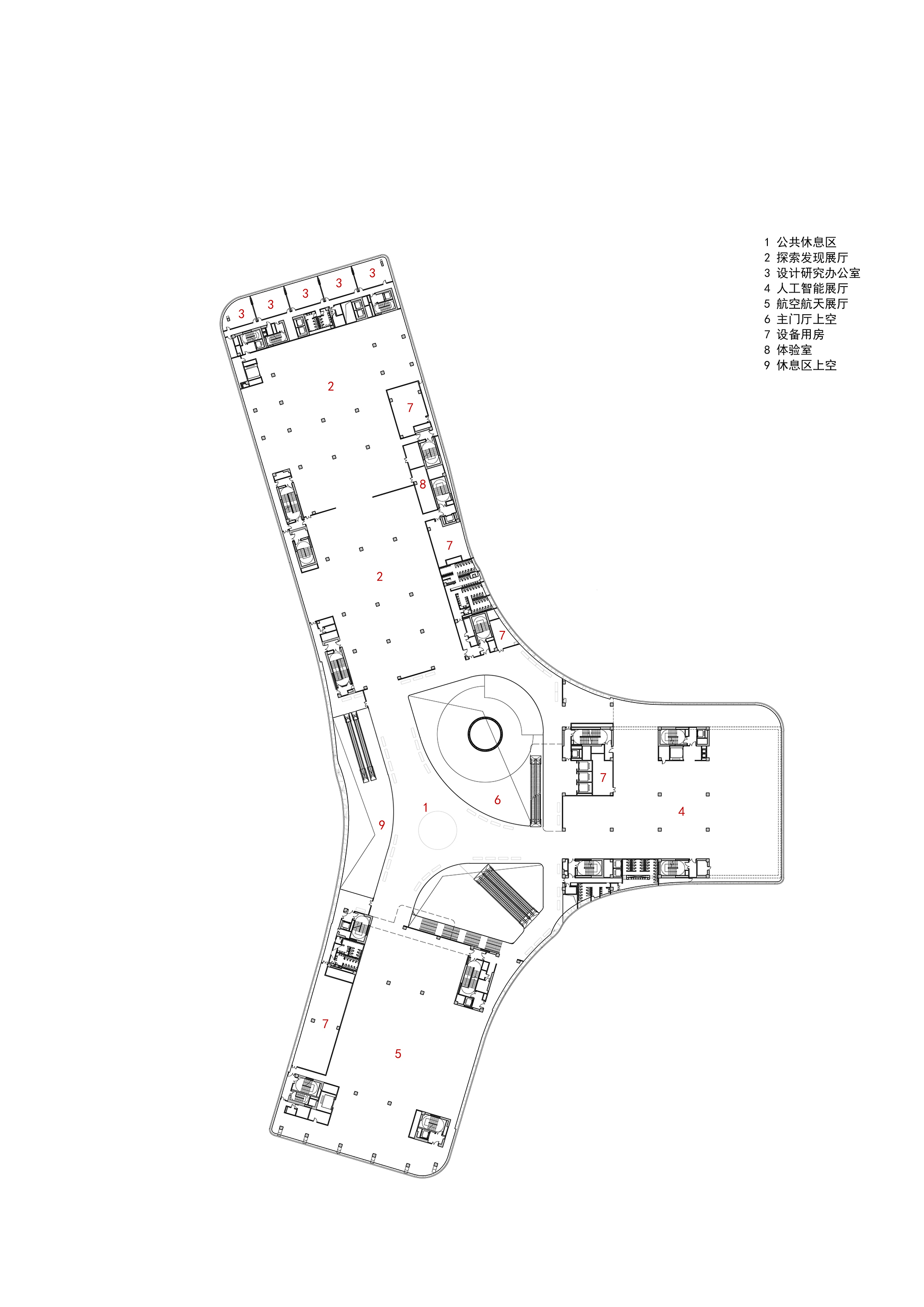
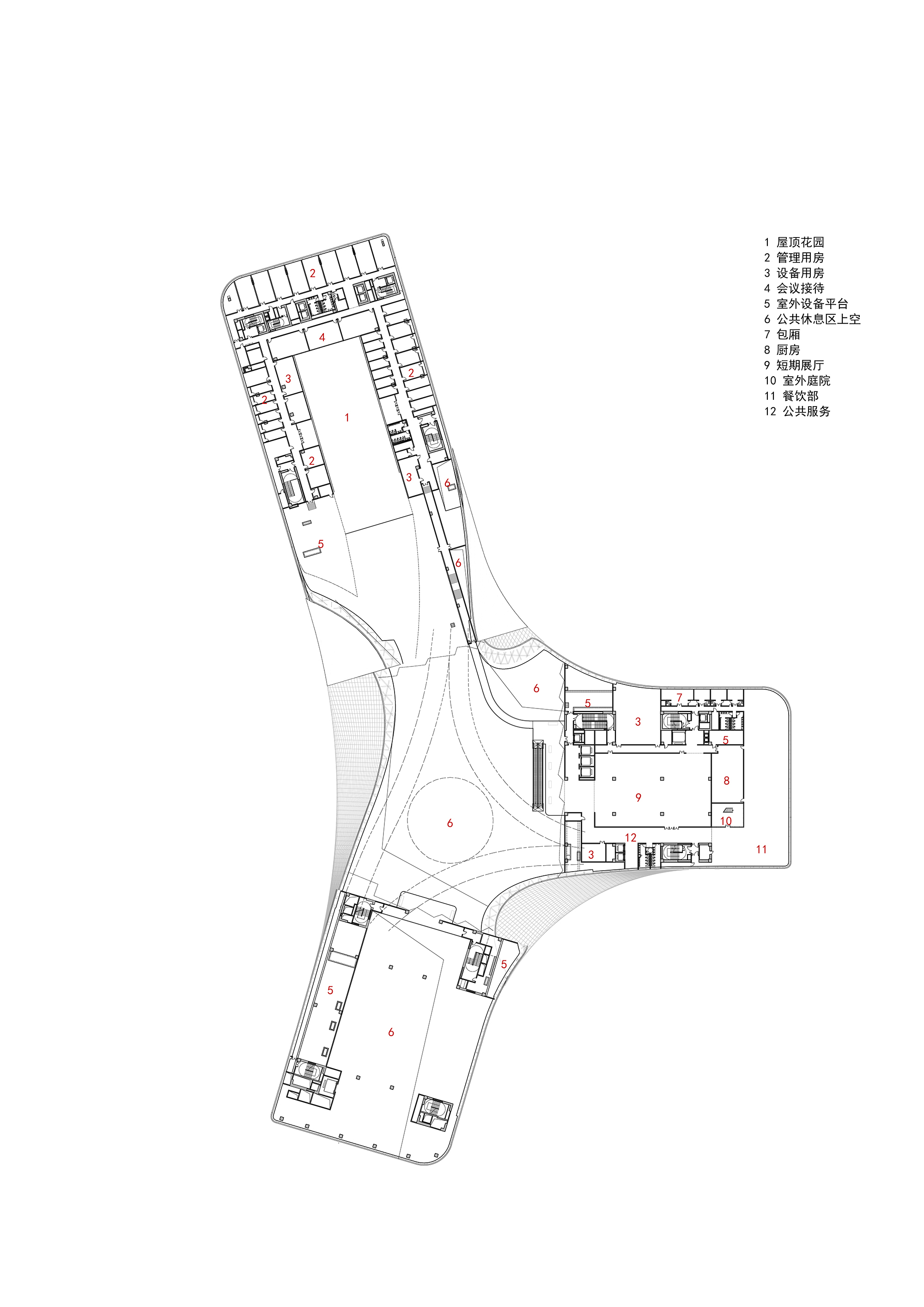
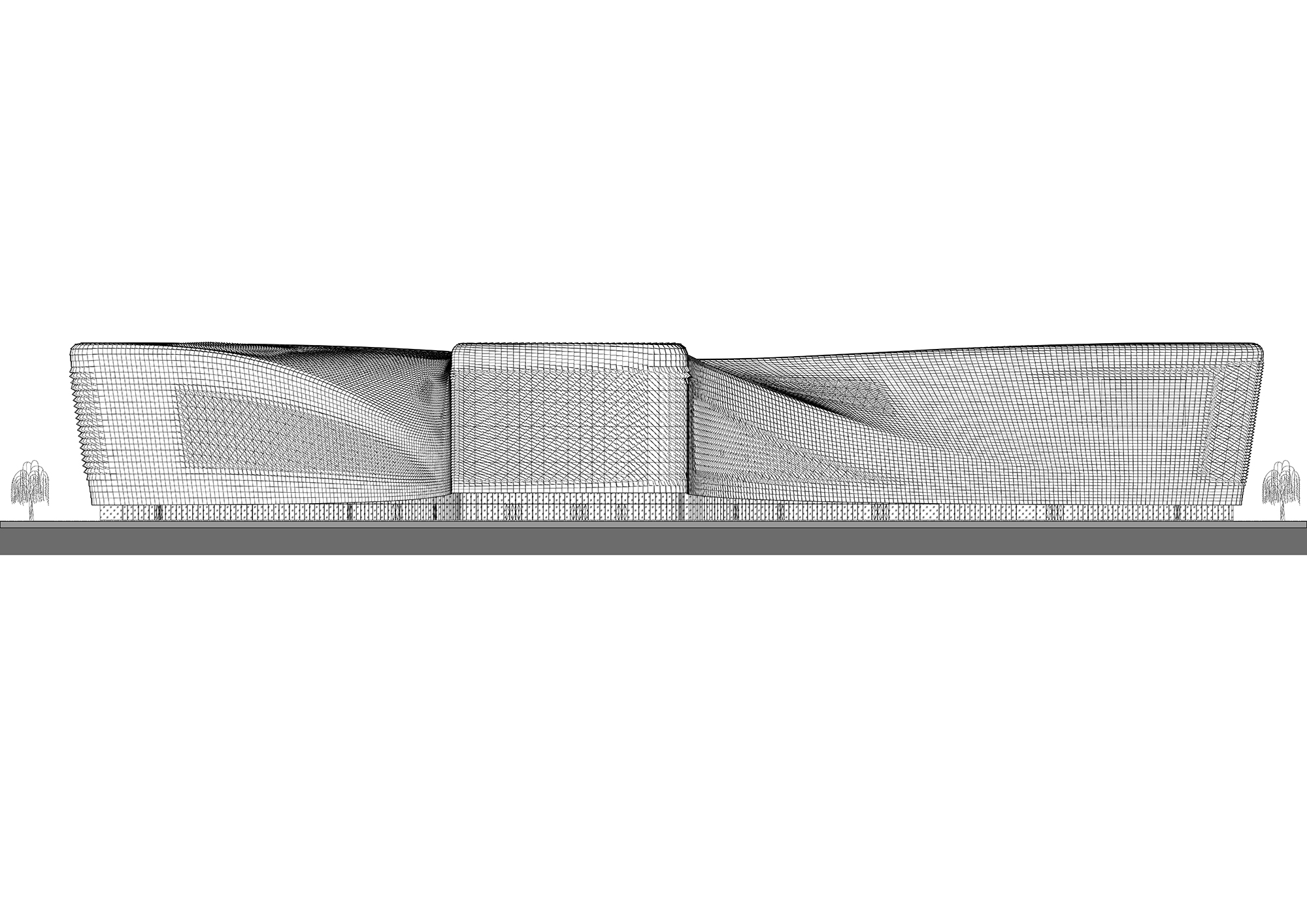
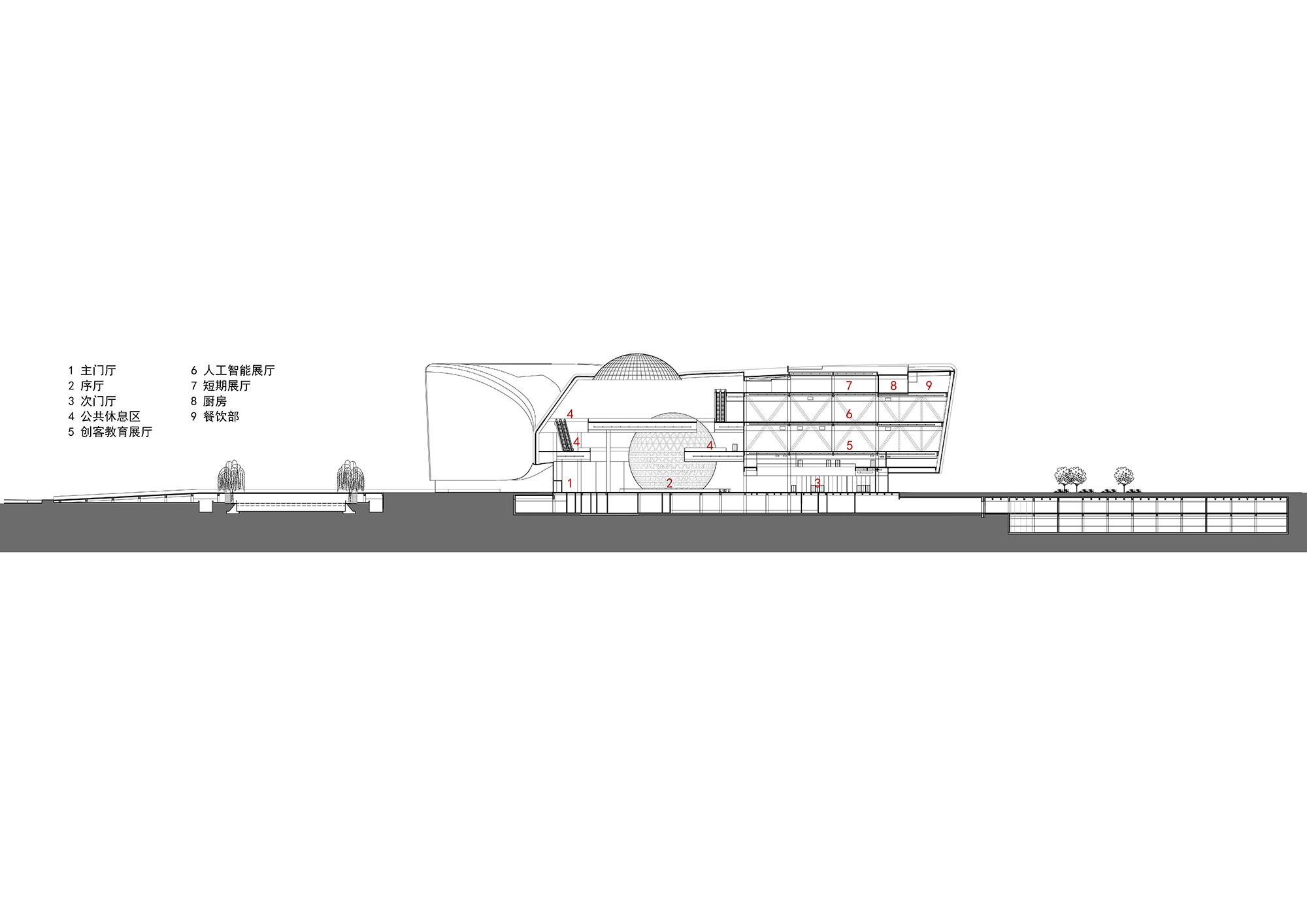
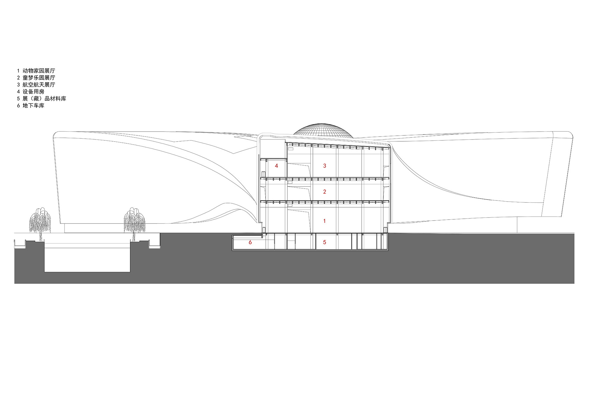
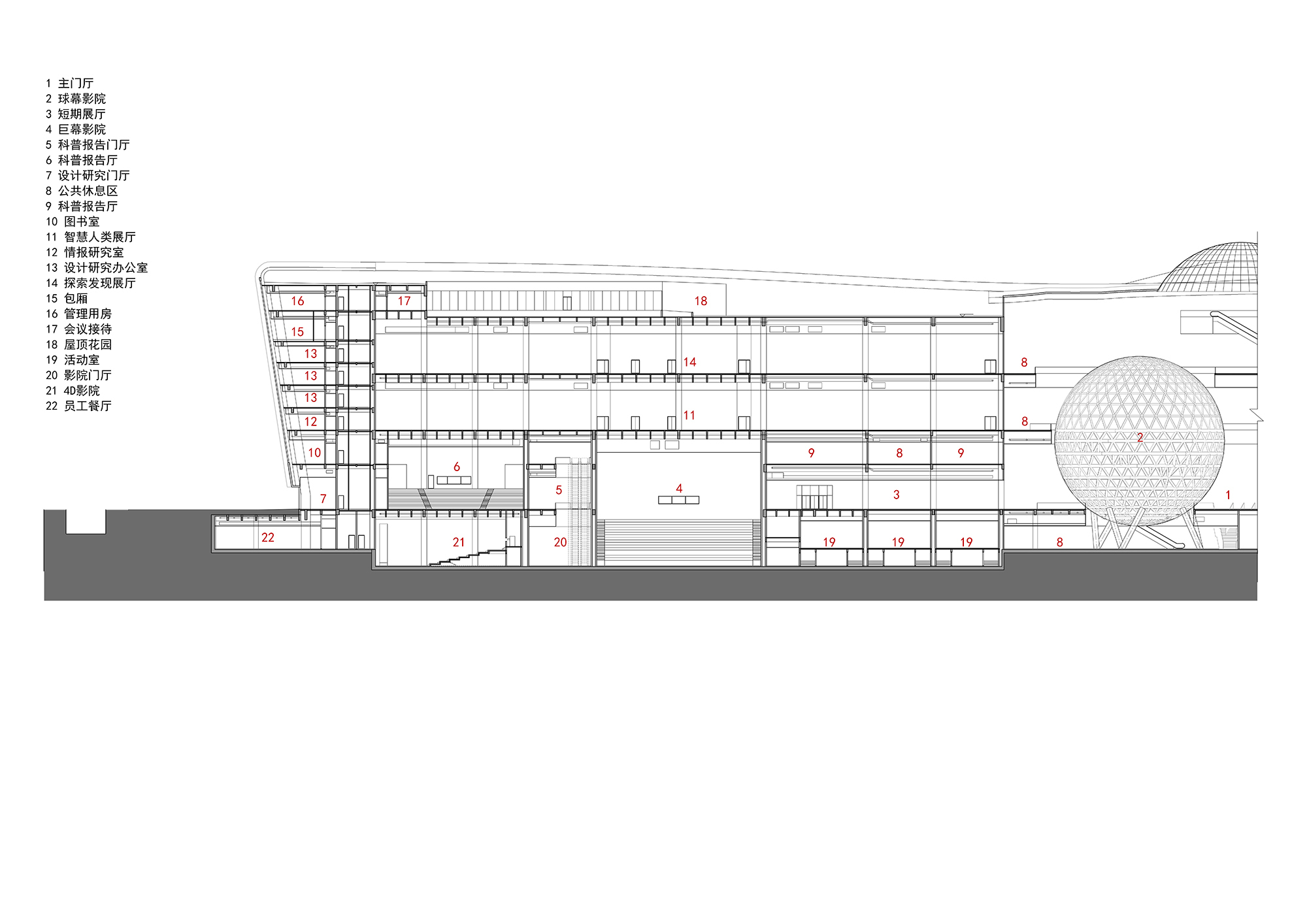
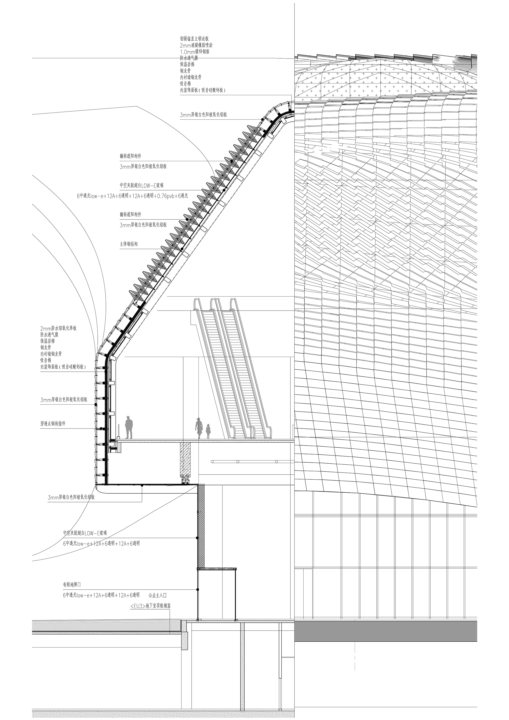
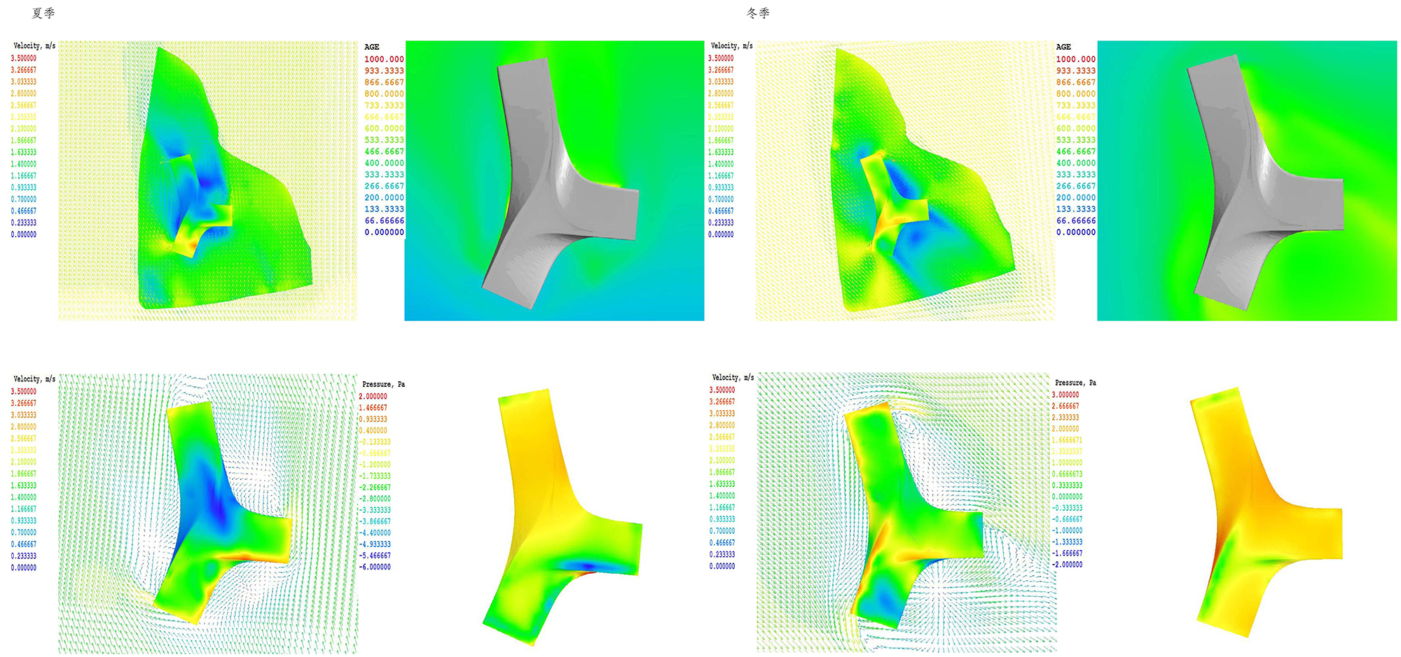
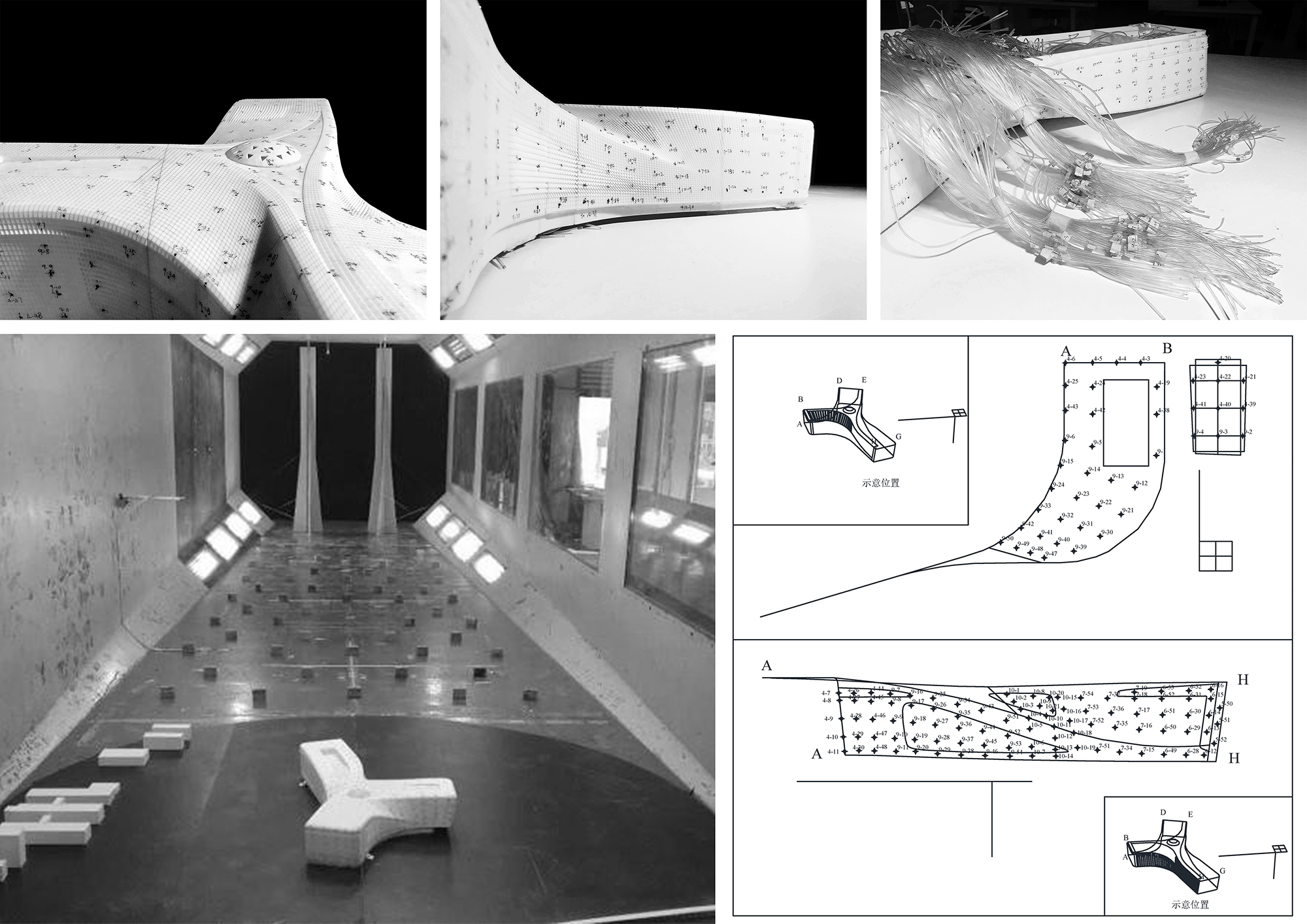
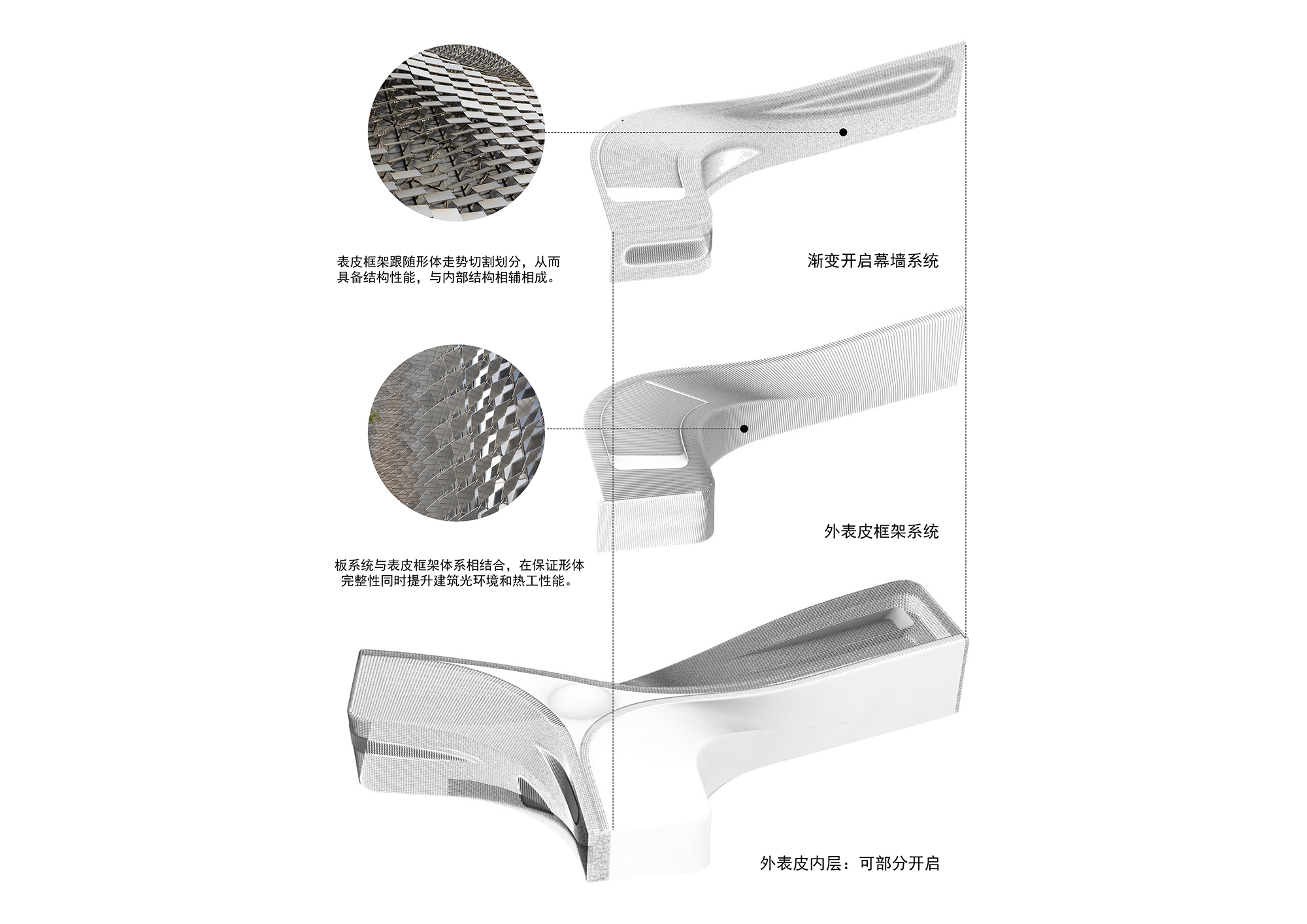
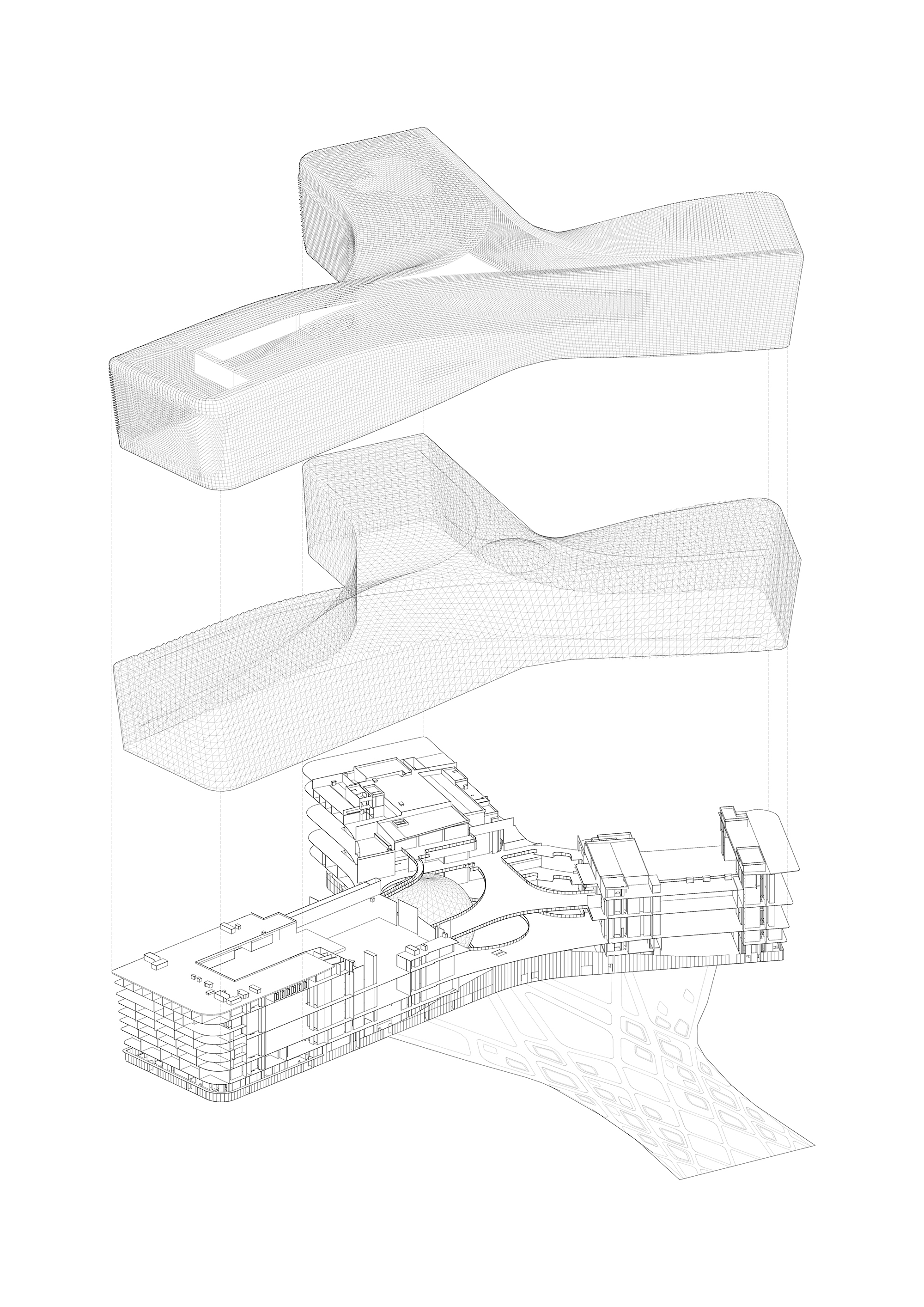
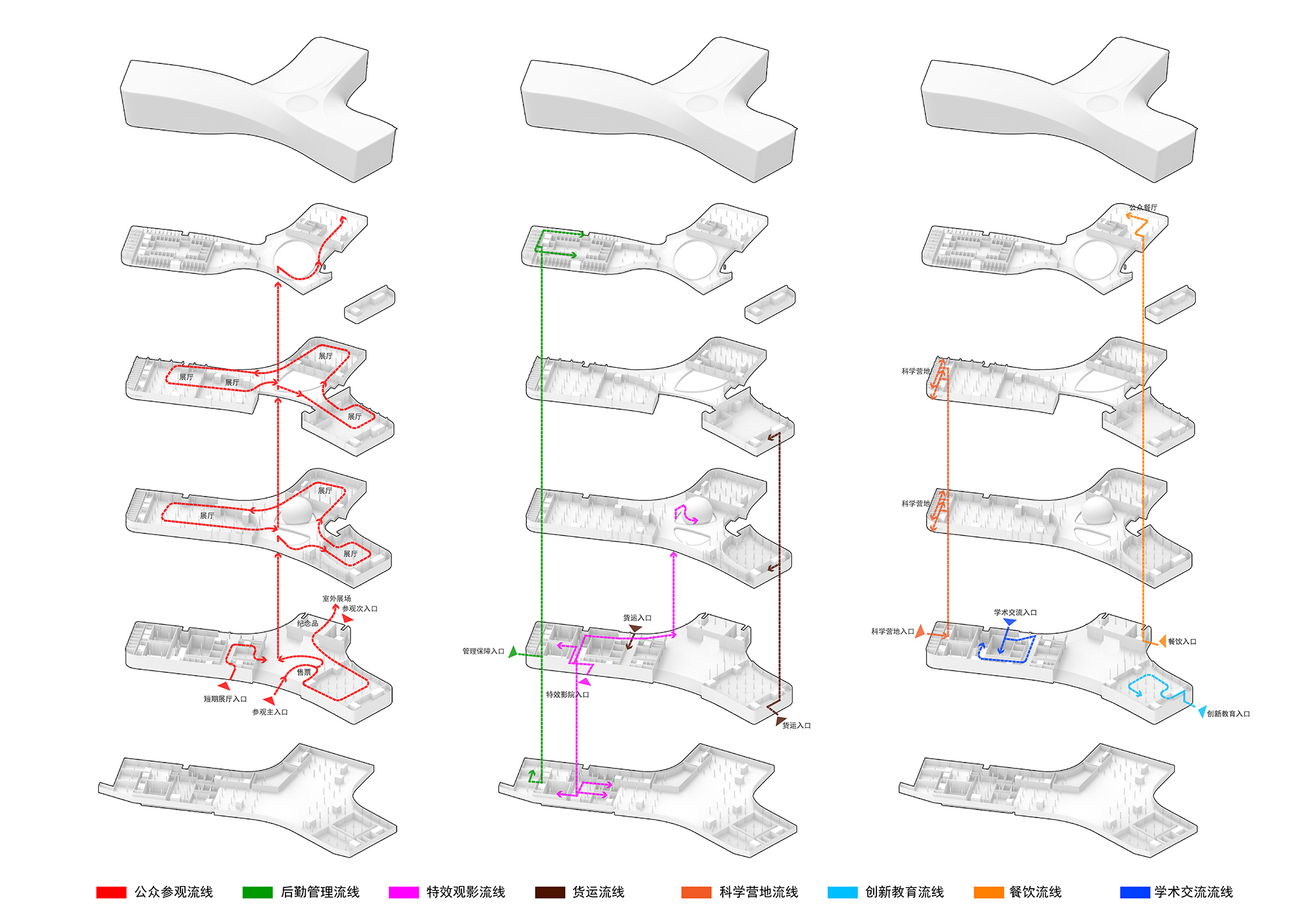
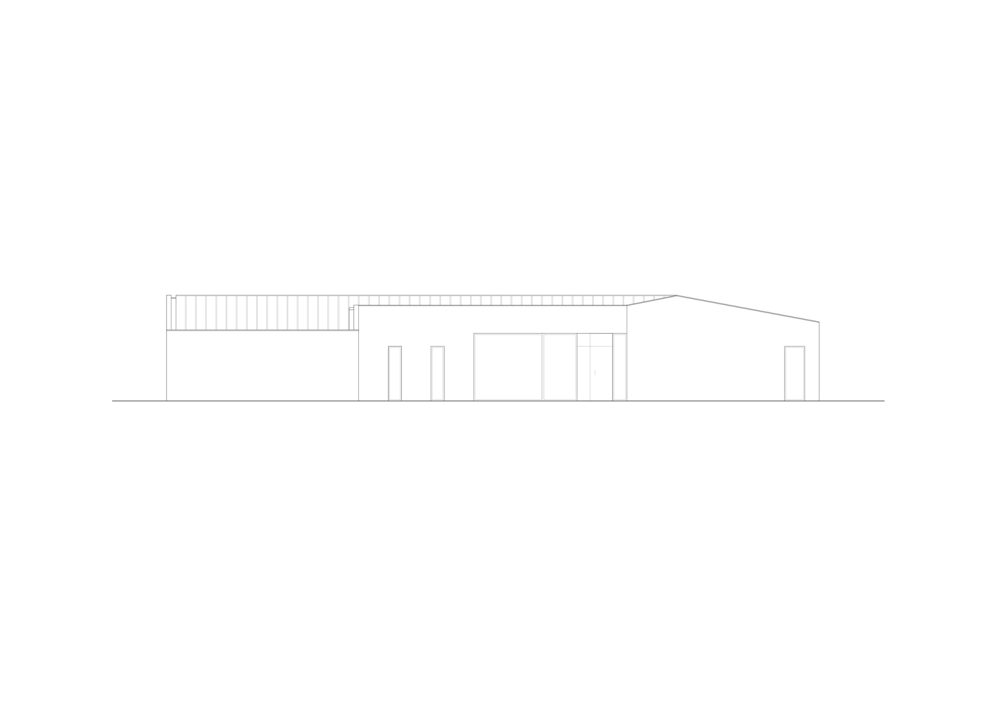
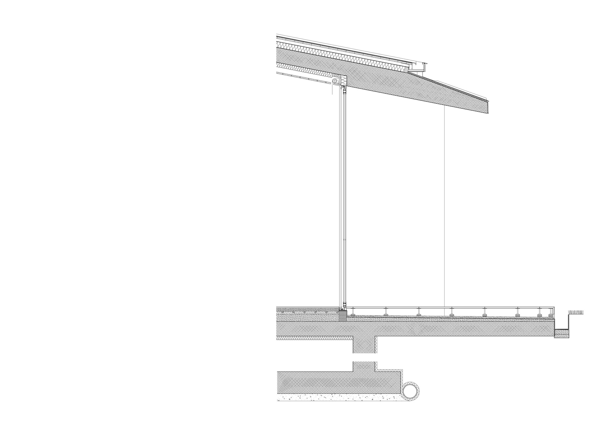
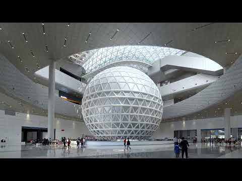 New Science and Technology Museum of Henan Province
#architecture
Architects: TJAD Atelier L+
Area: 129365 m²
Year: 2024
Photographs: Schran Image, ZY Architectural Photography
Lead Architect: Li Linxue
Project Leaders: Li Linxue, Ren Lizhi
City: Zhengzhou
Country: China
New Science and Technology Museum of Henan Province
#architecture
Architects: TJAD Atelier L+
Area: 129365 m²
Year: 2024
Photographs: Schran Image, ZY Architectural Photography
Lead Architect: Li Linxue
Project Leaders: Li Linxue, Ren Lizhi
City: Zhengzhou
Country: China


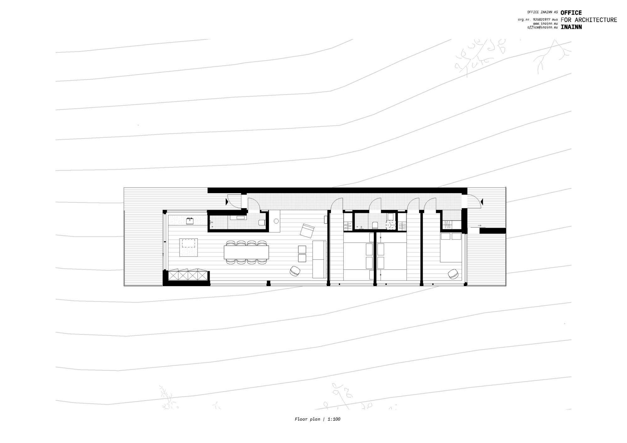
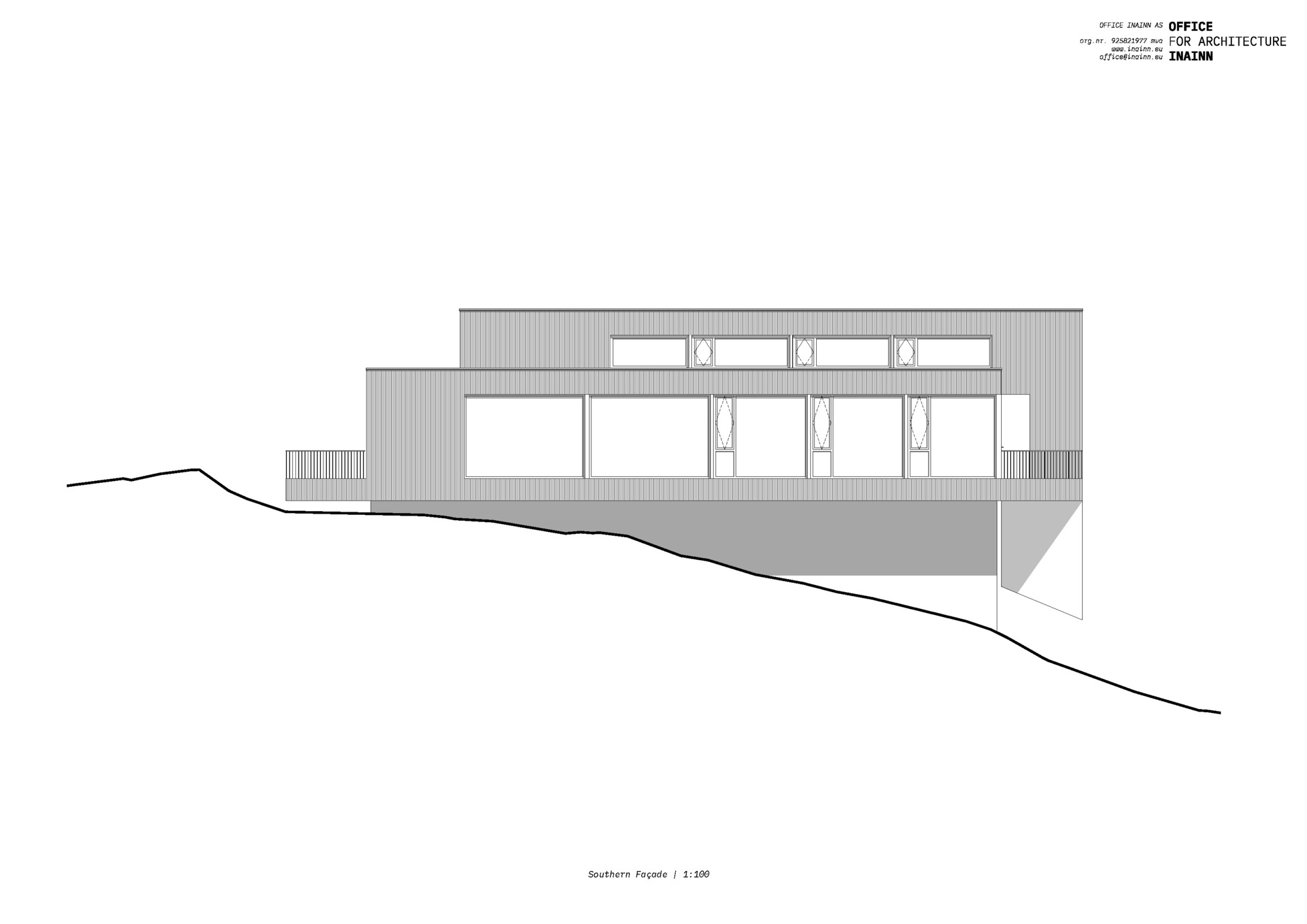
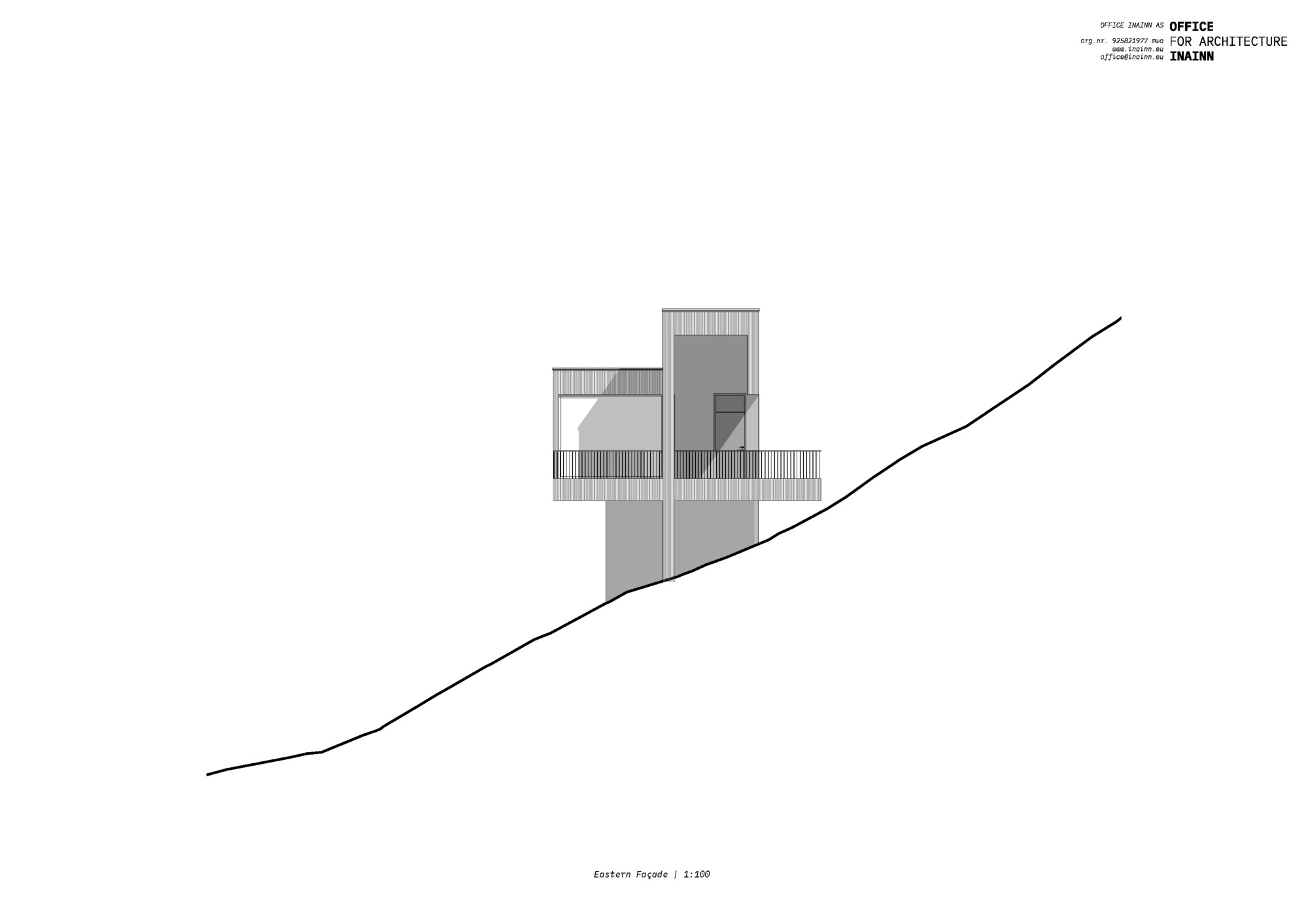


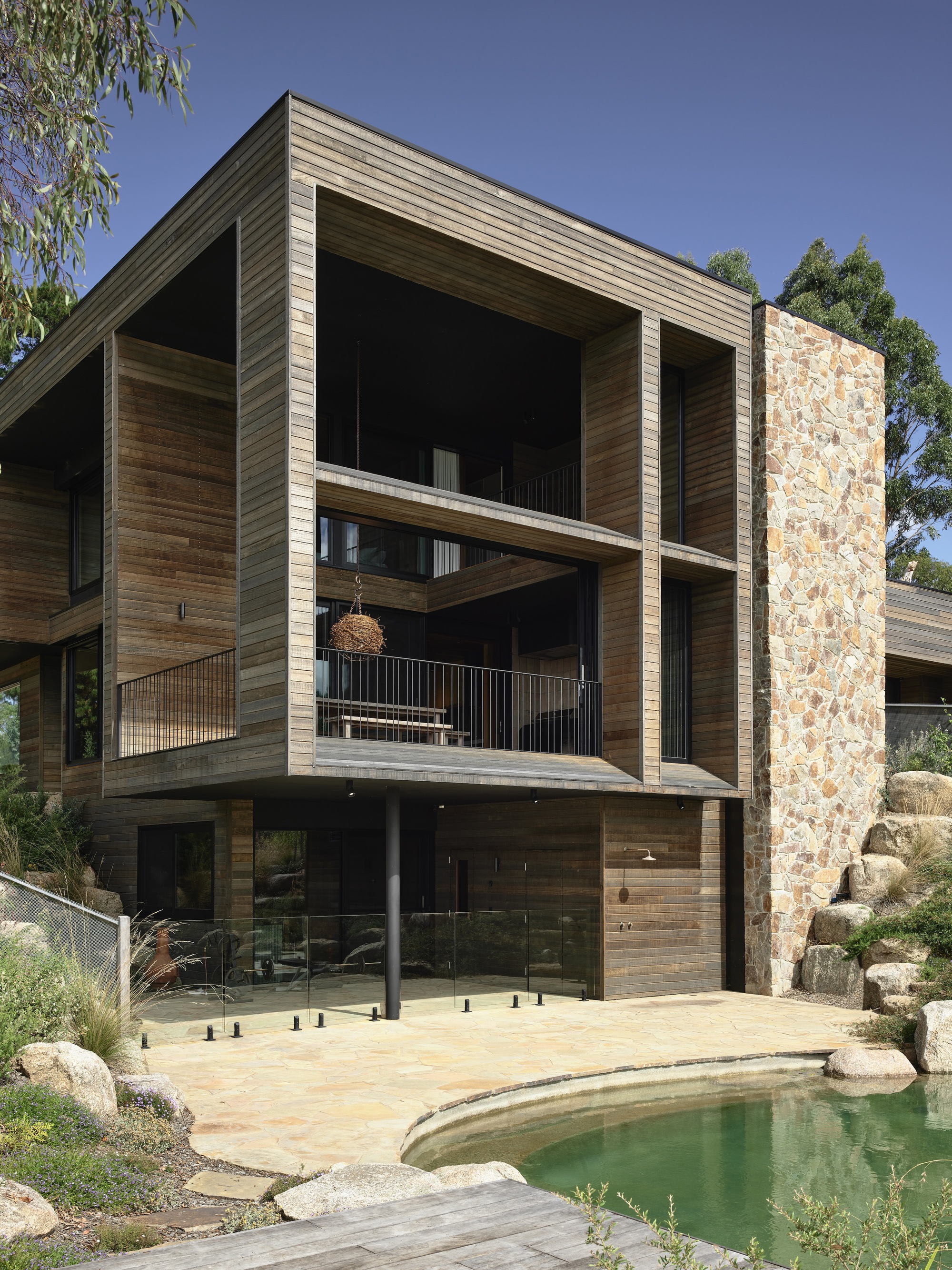

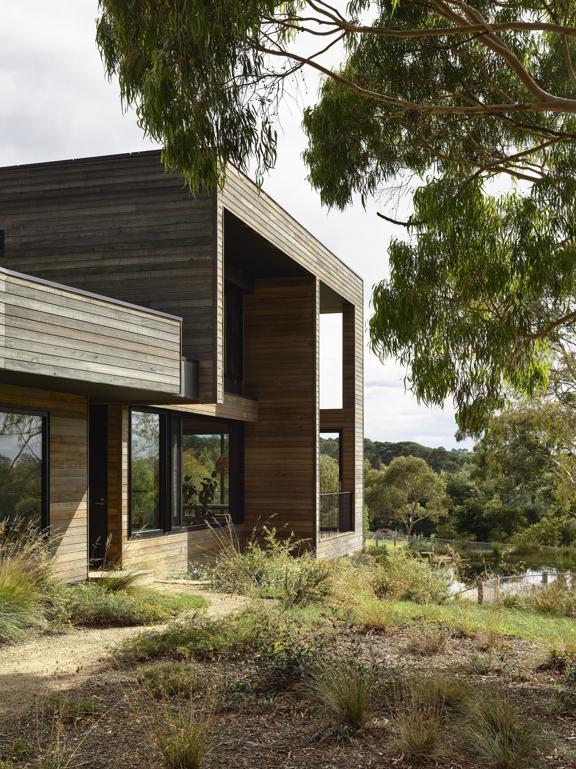
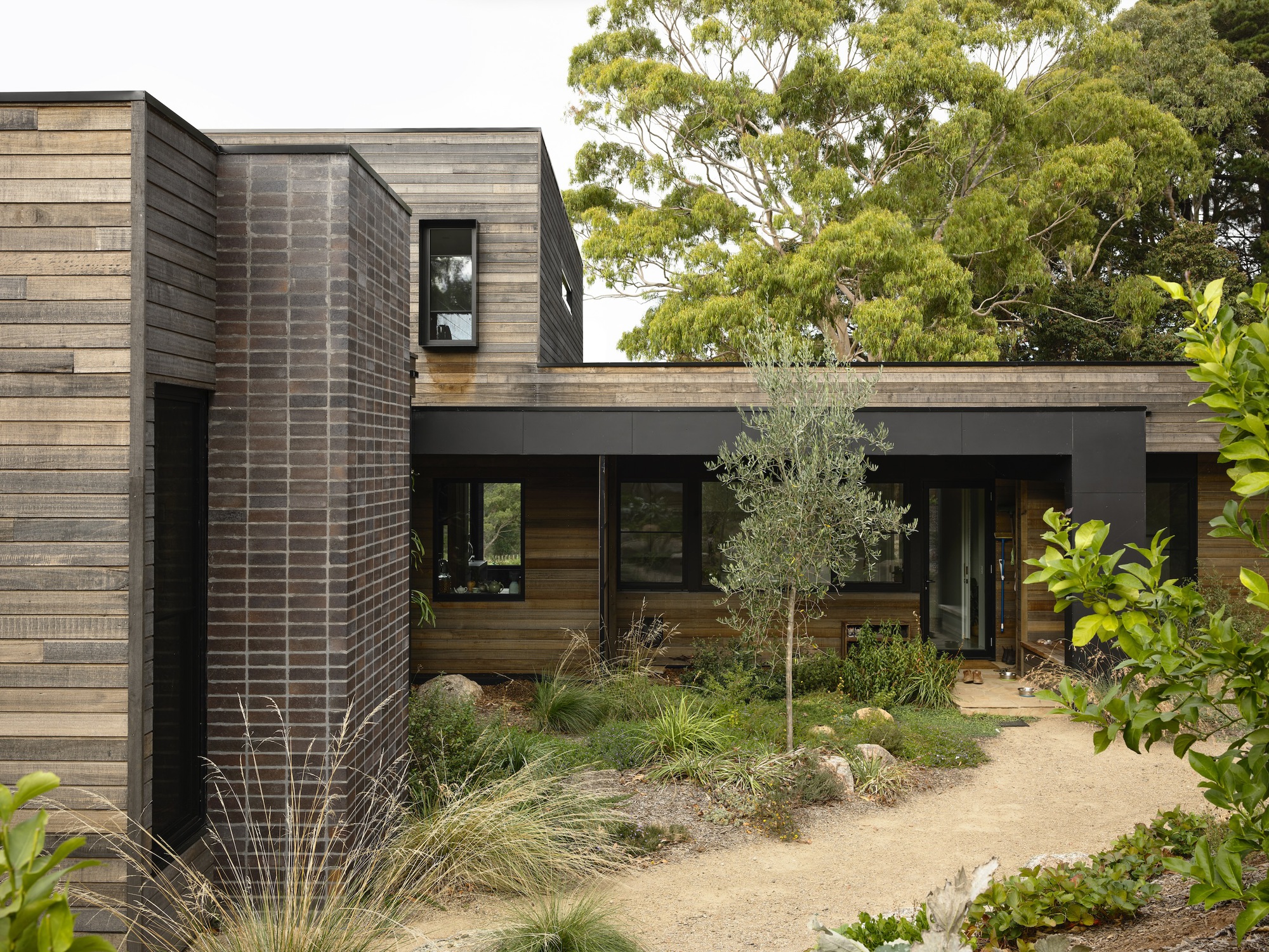


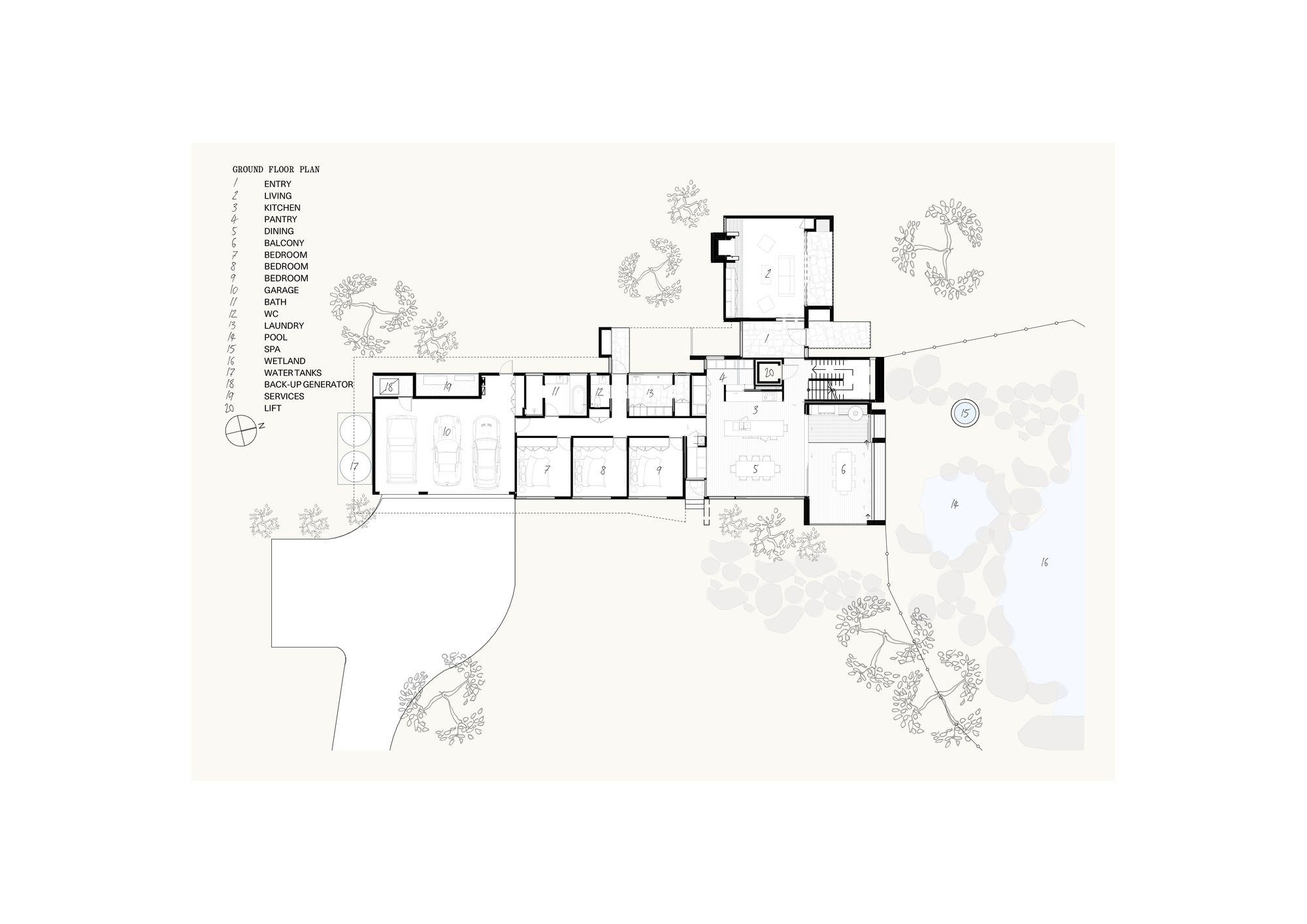
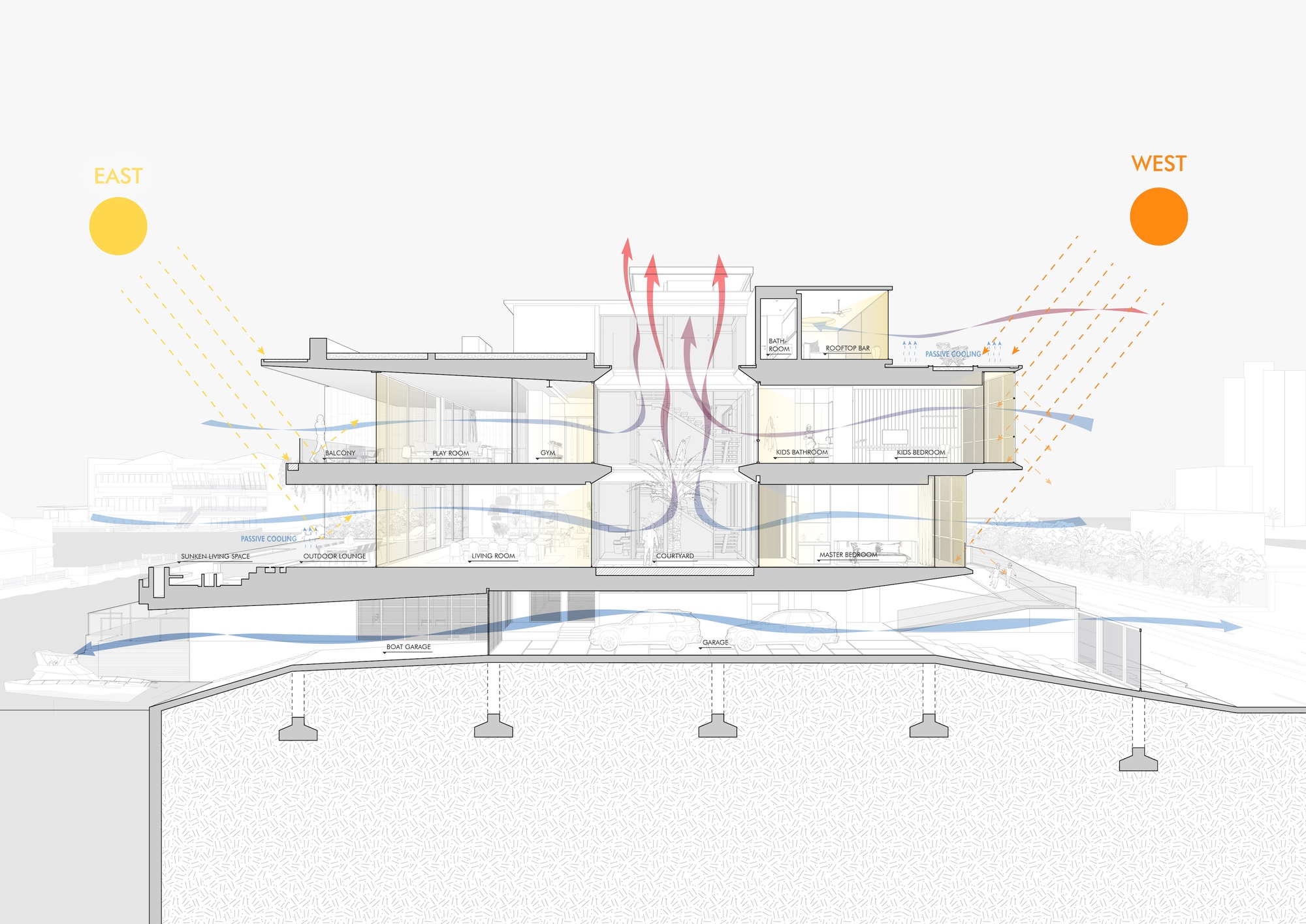
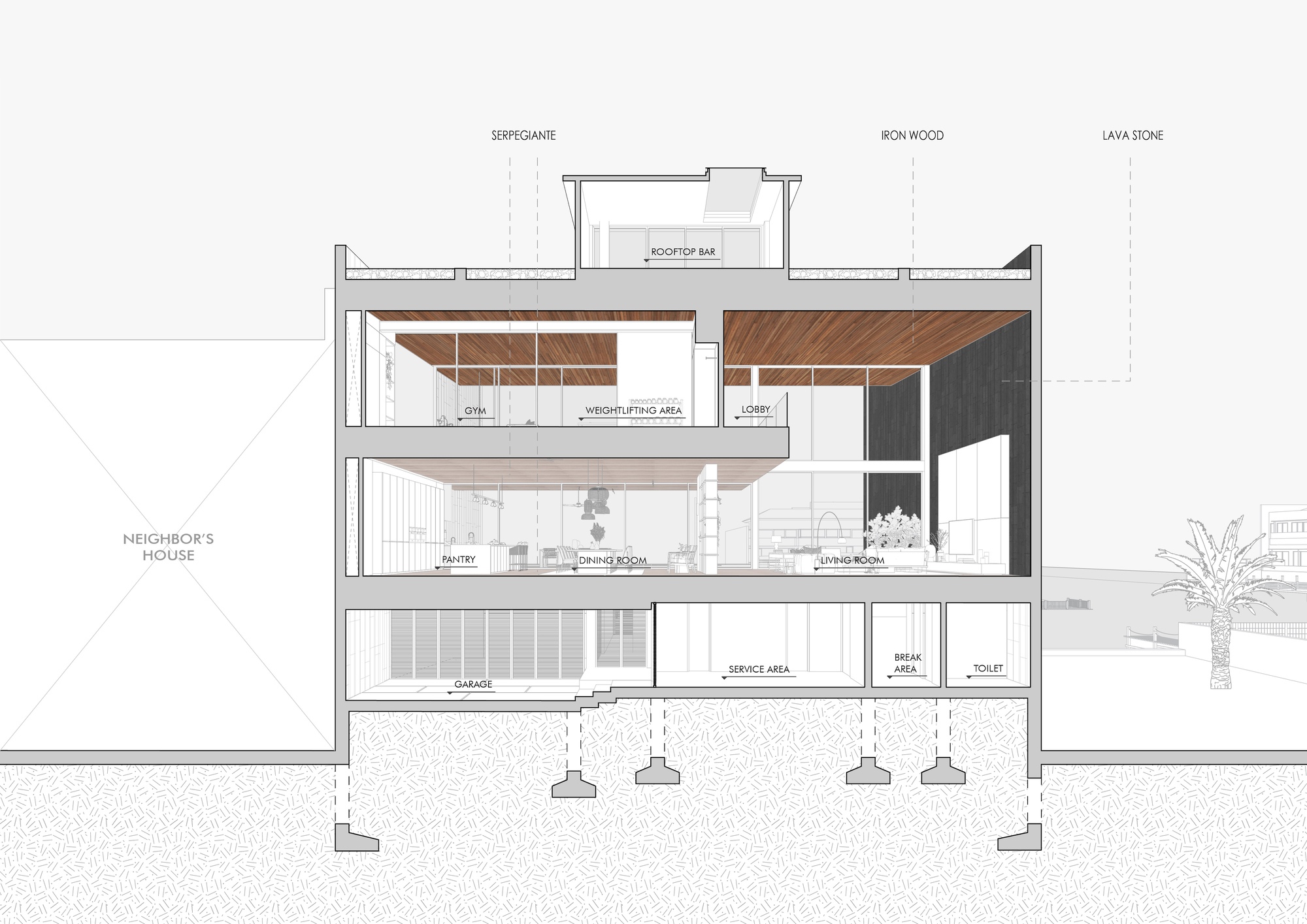
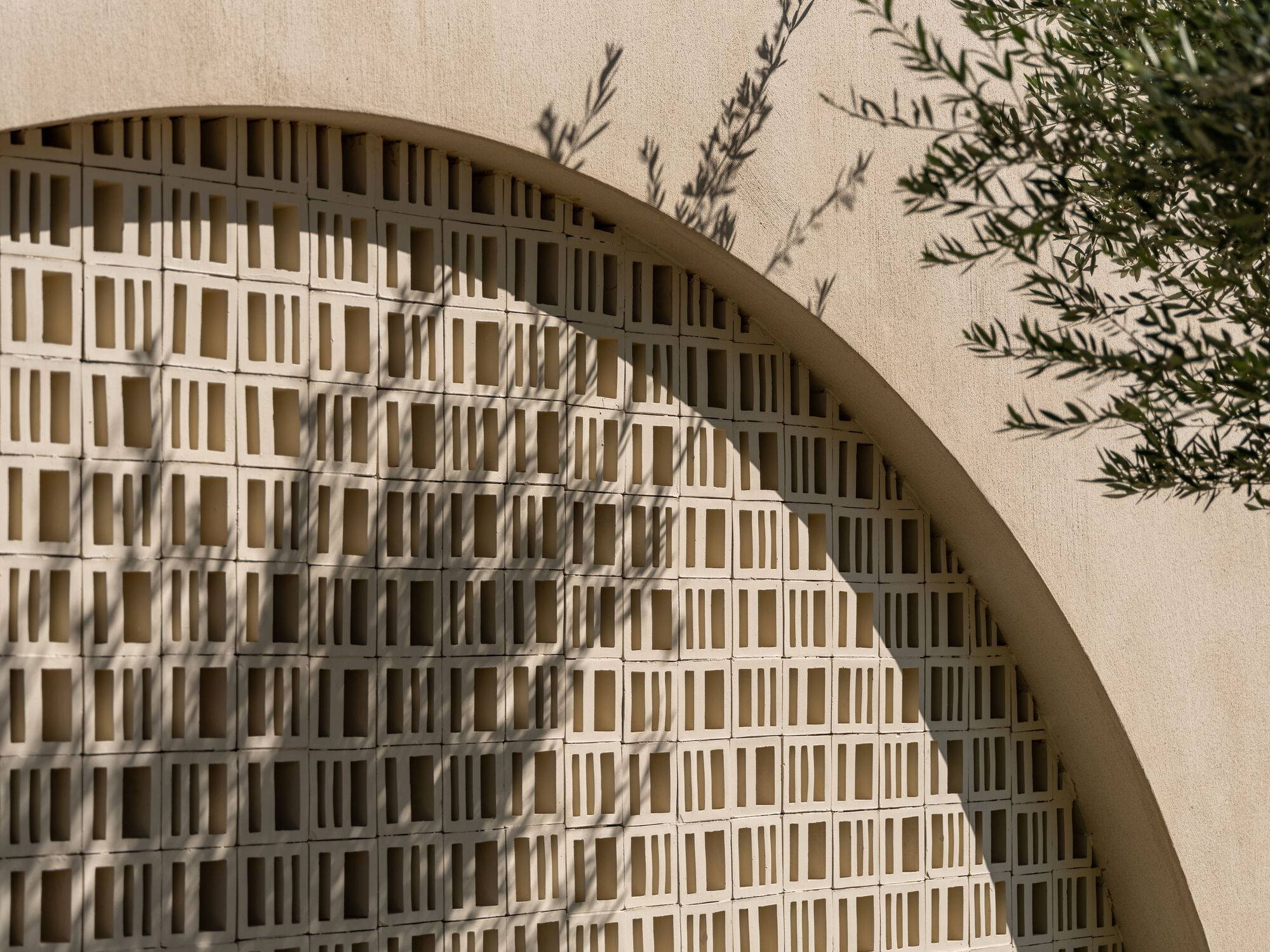
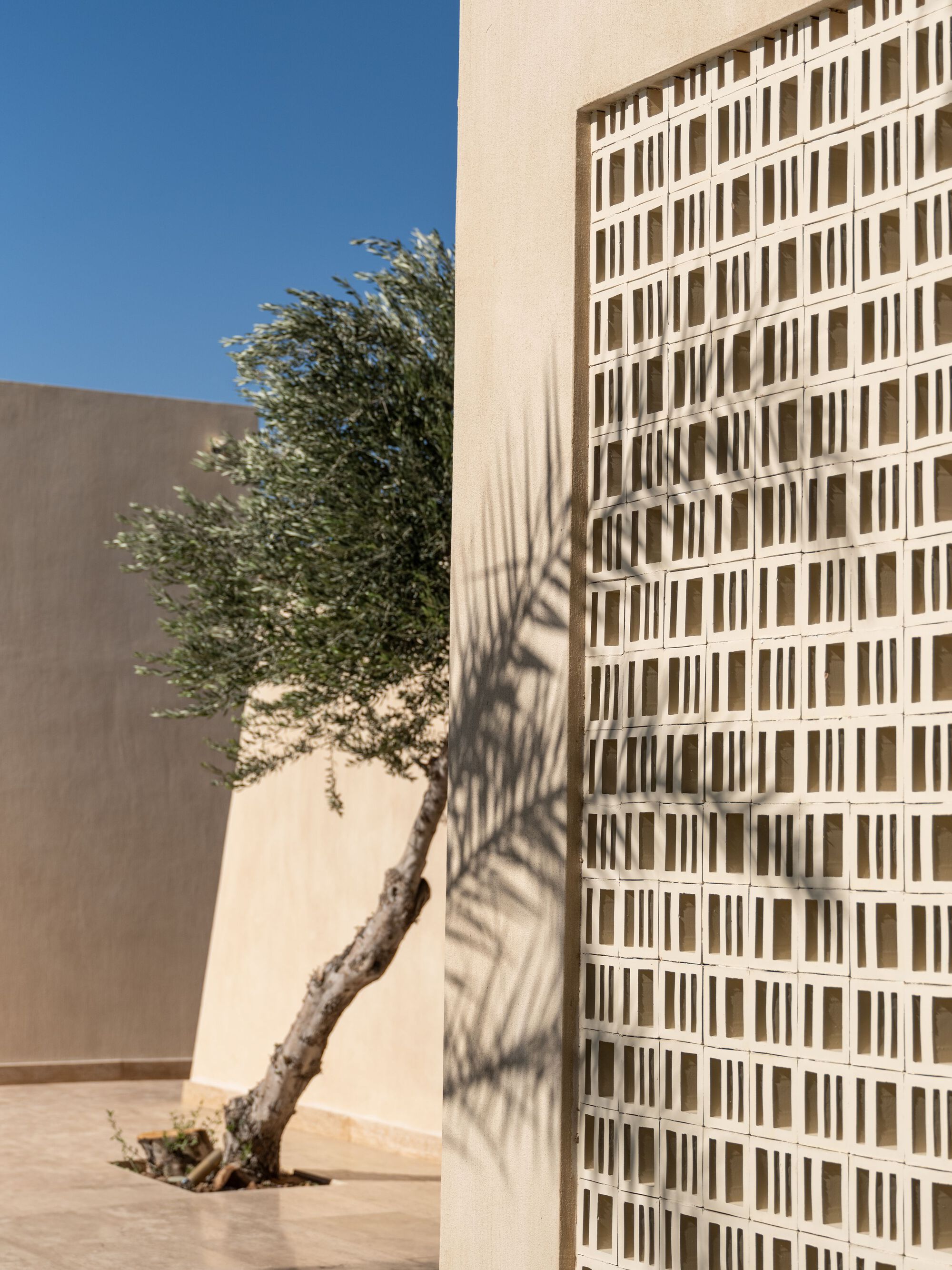
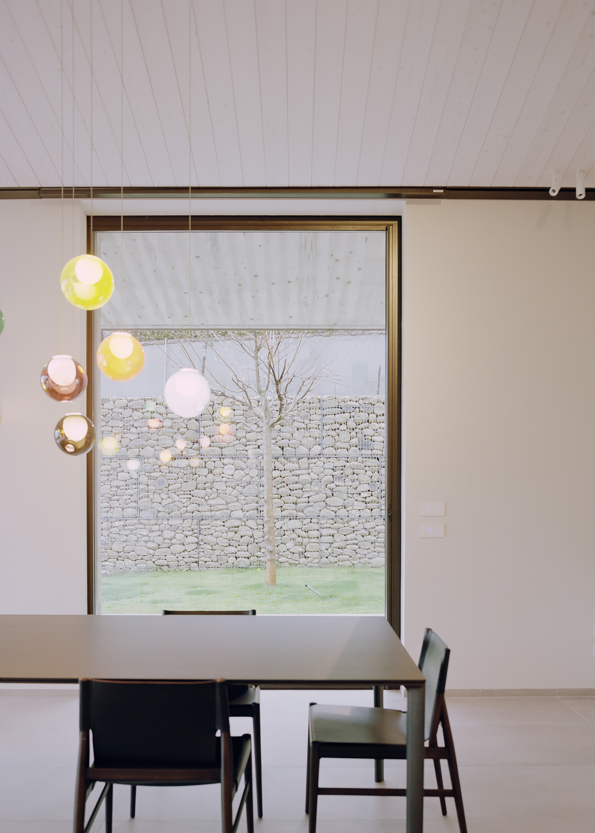
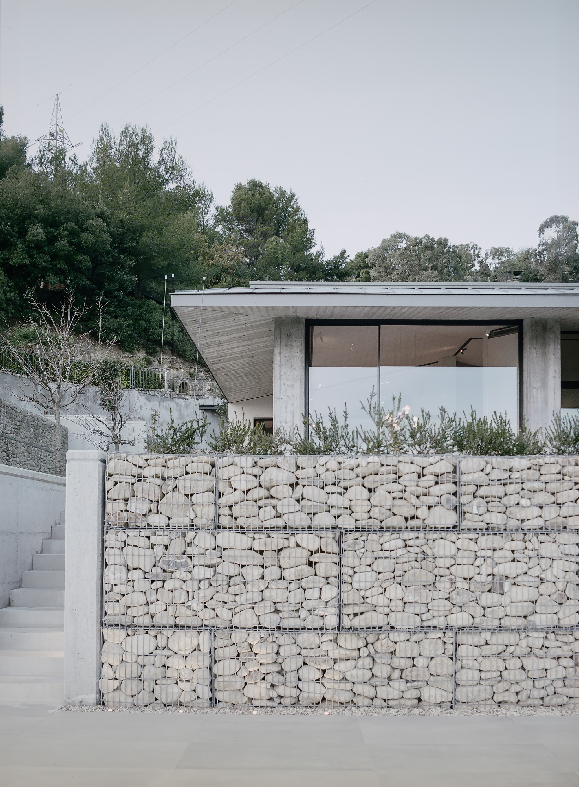
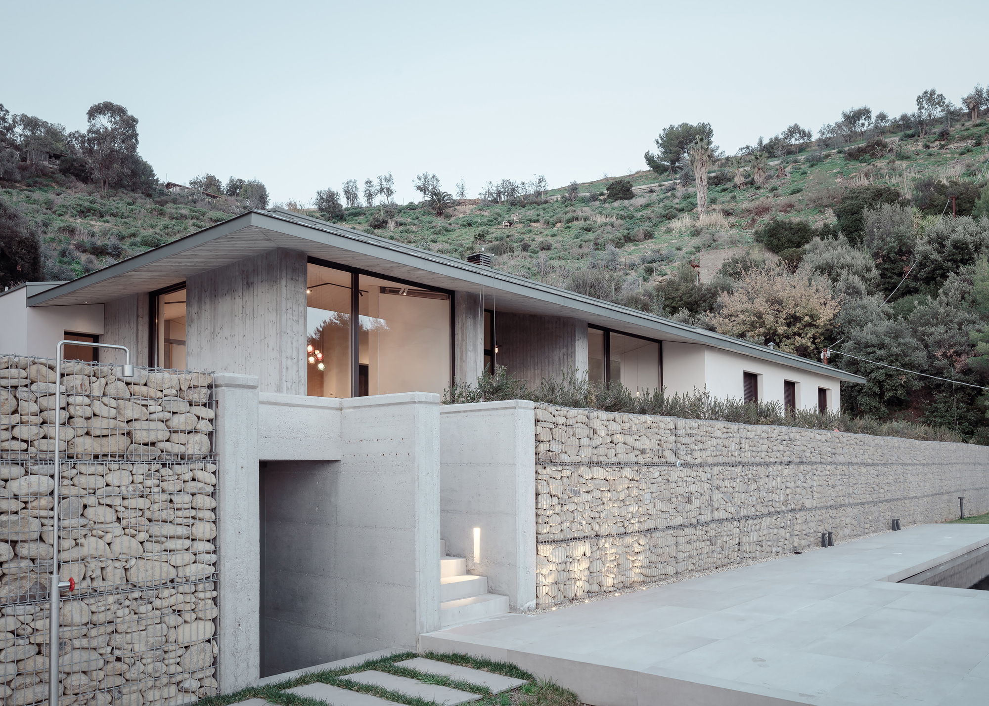
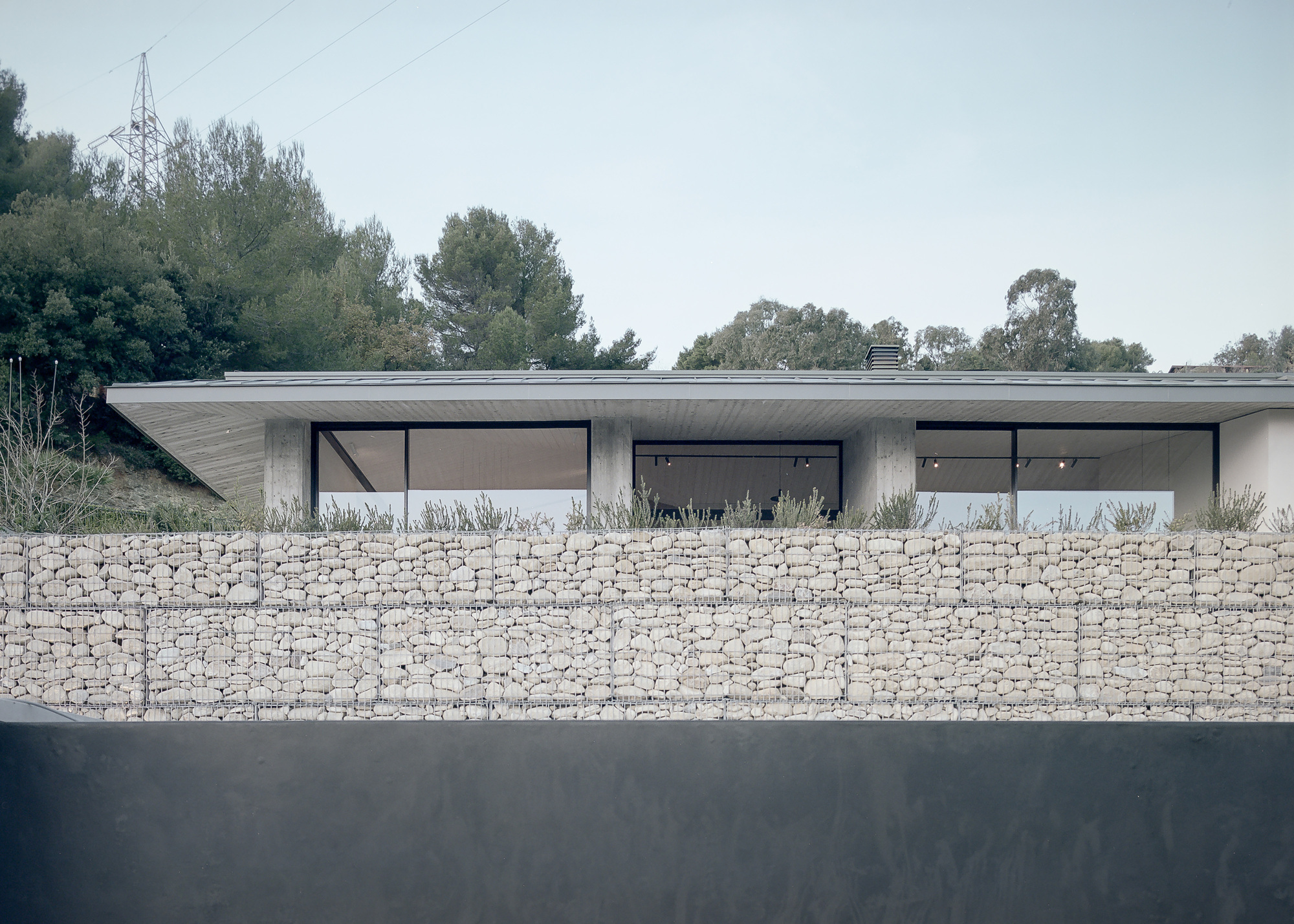
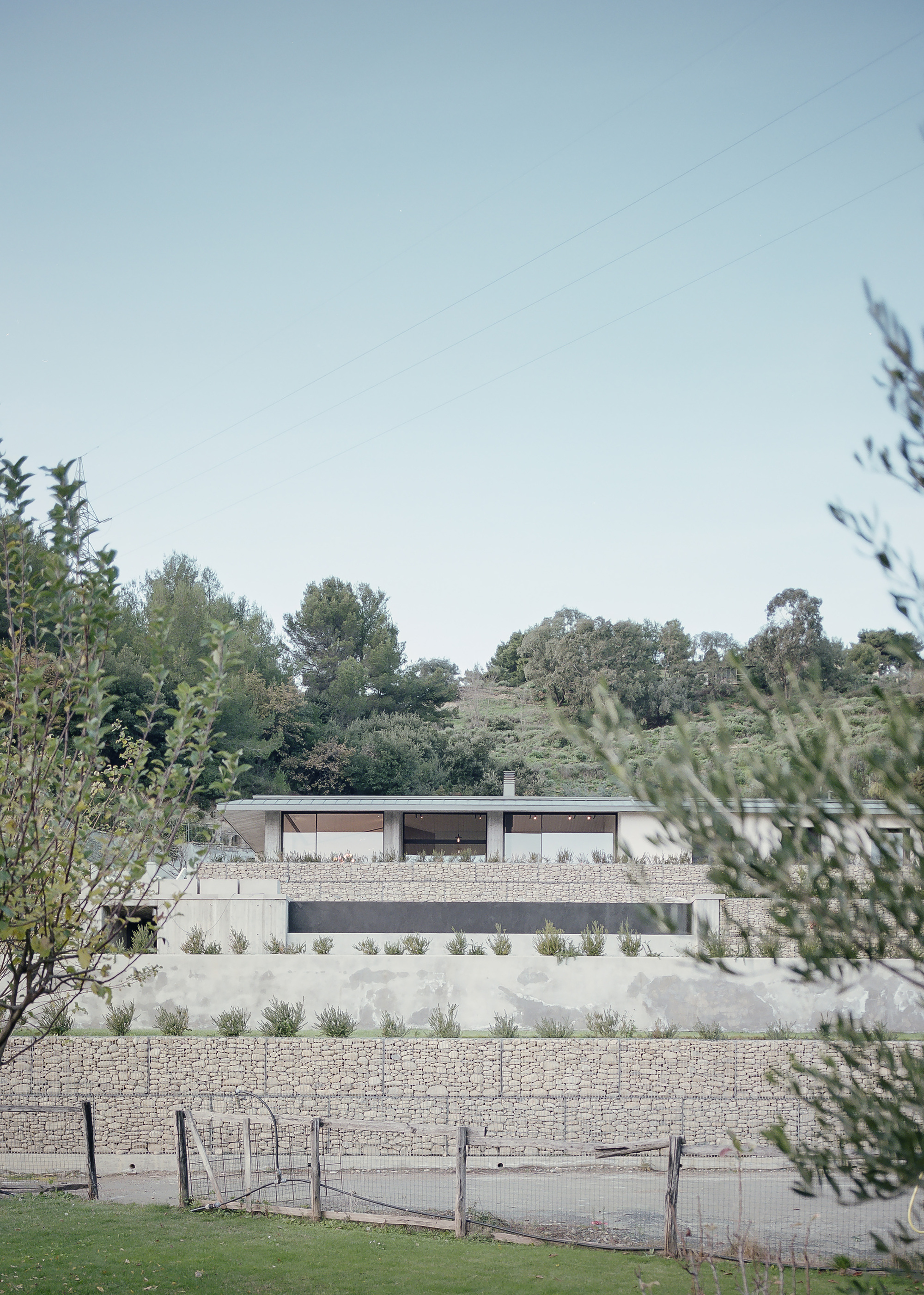
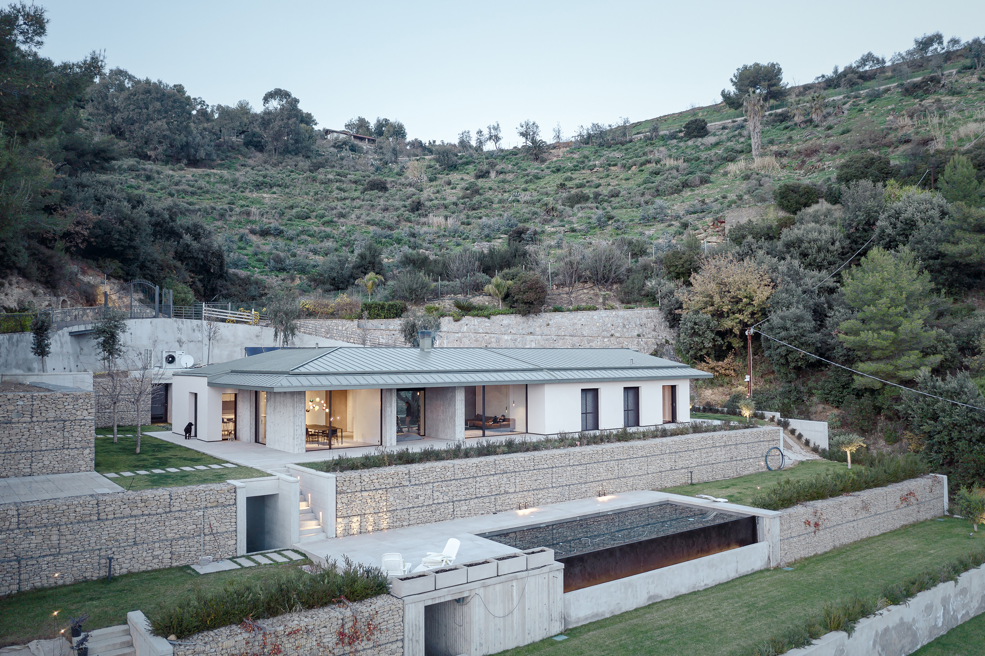
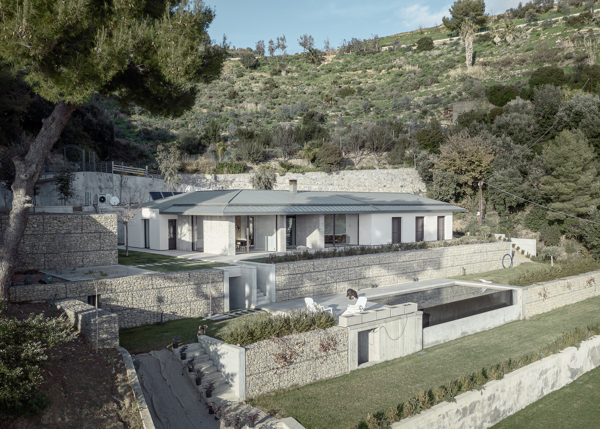
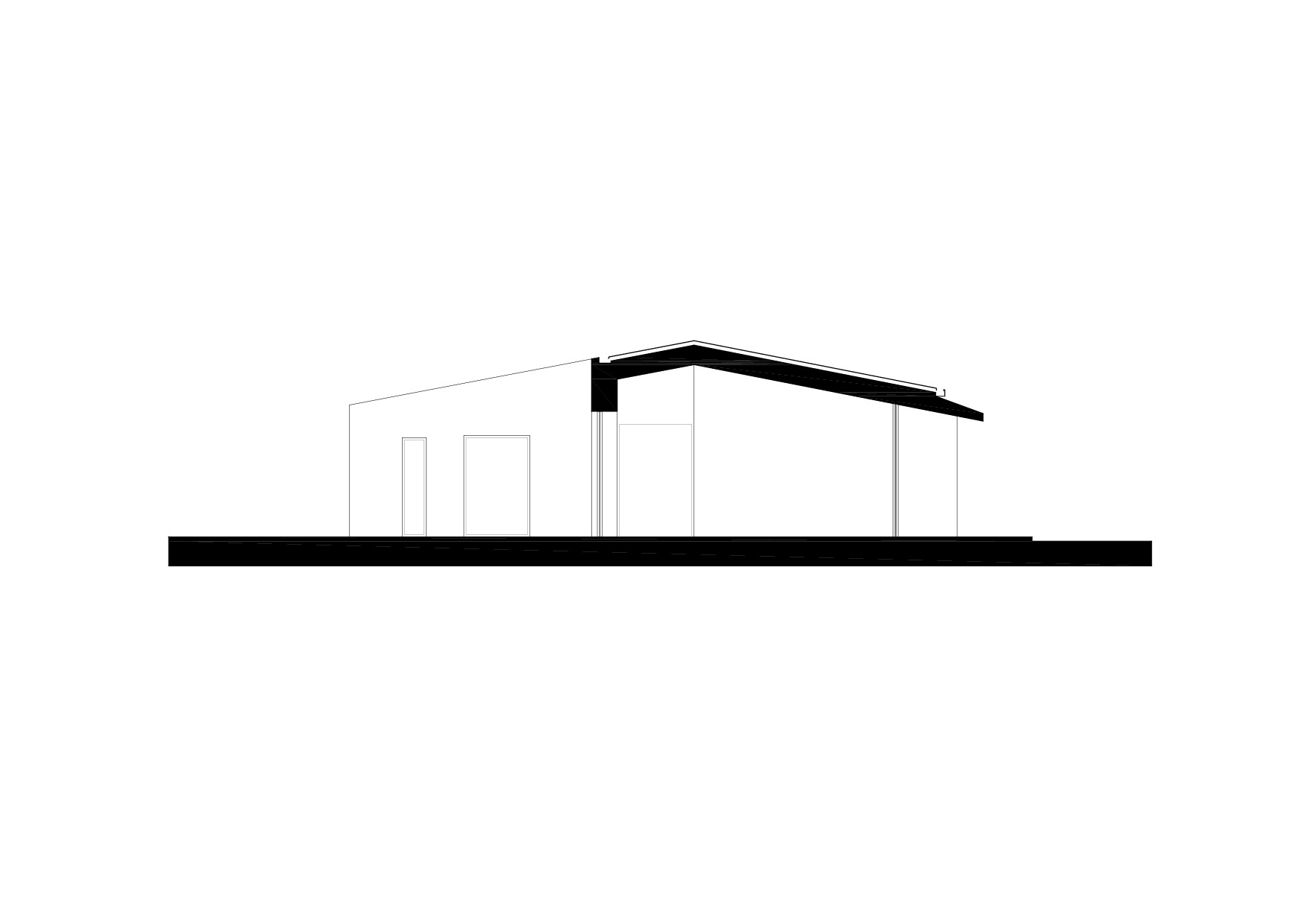
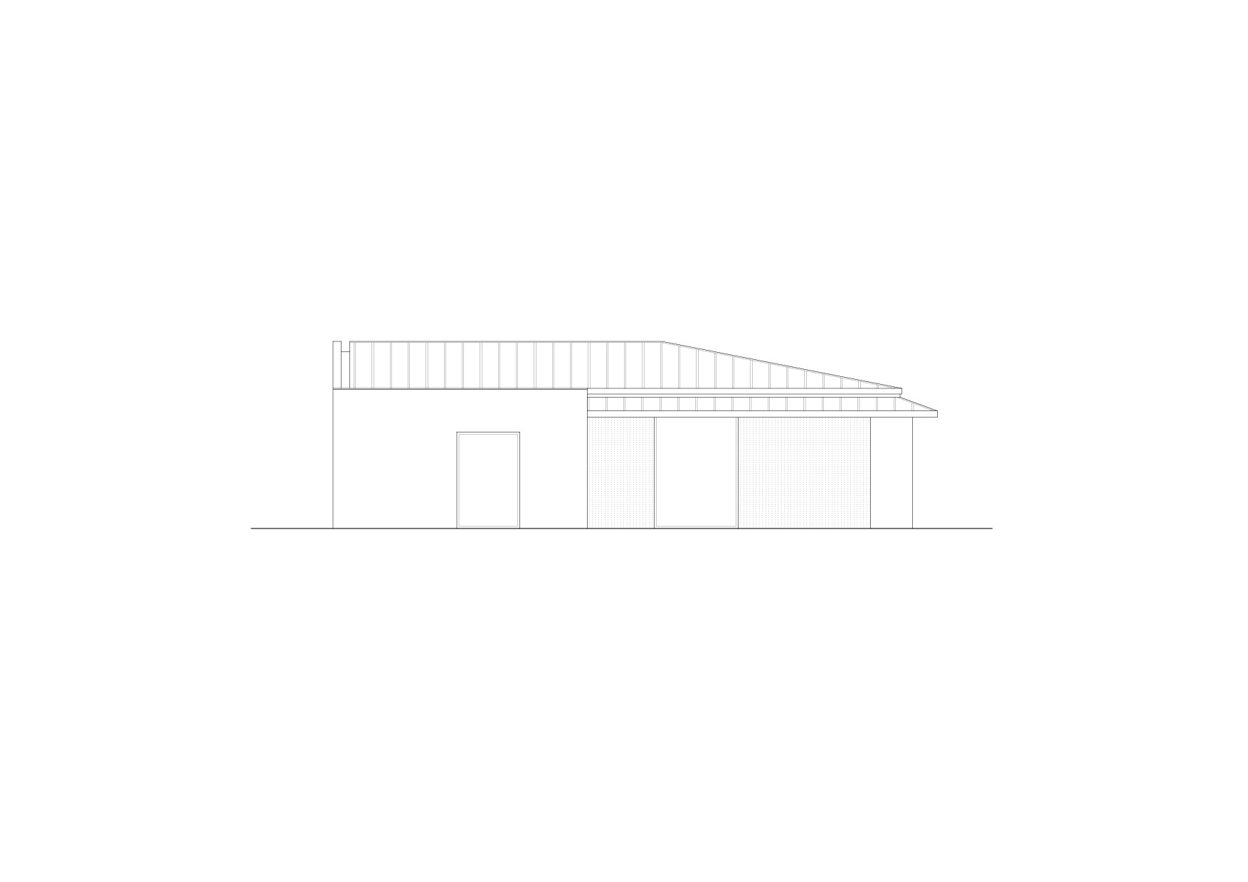
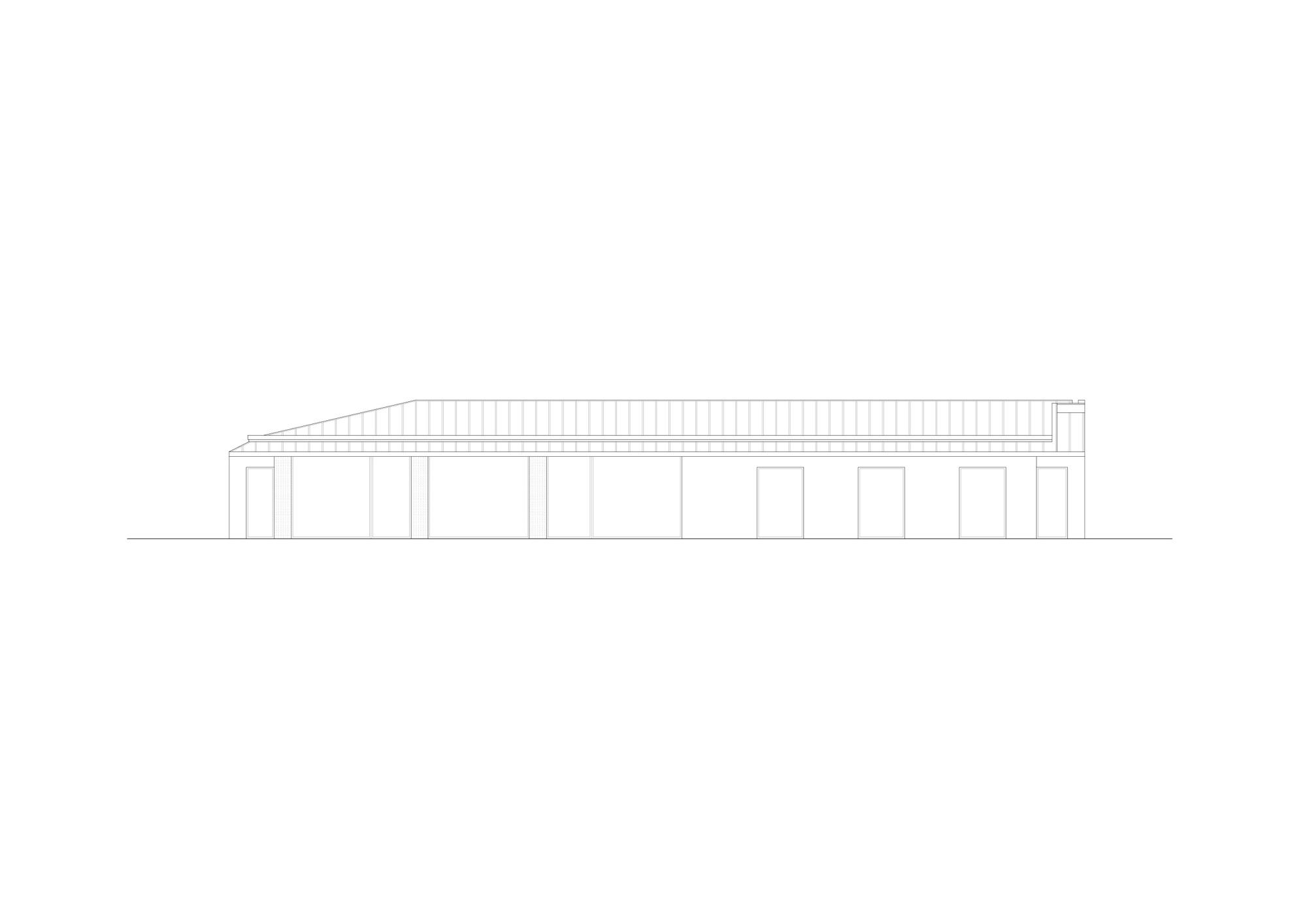
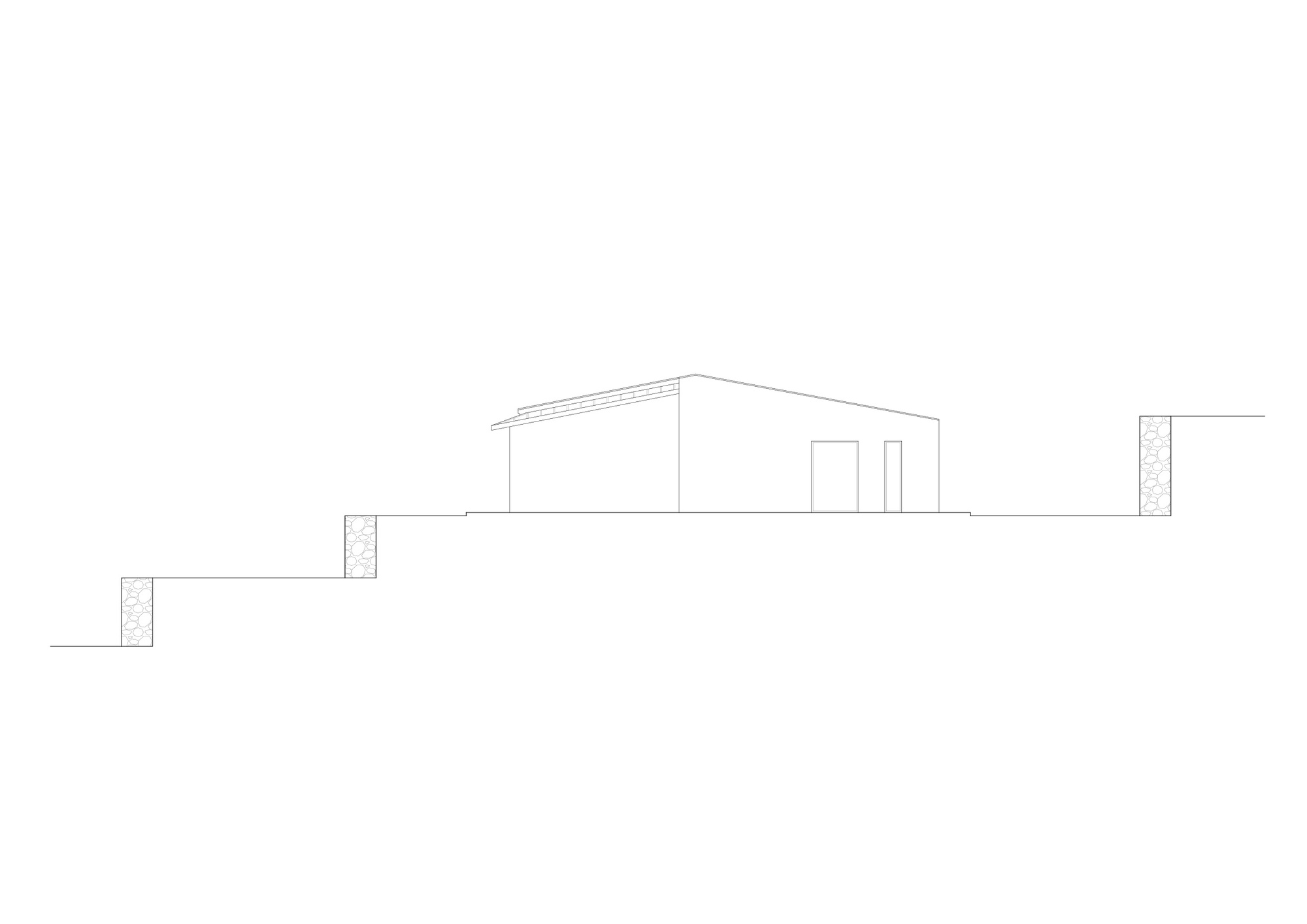
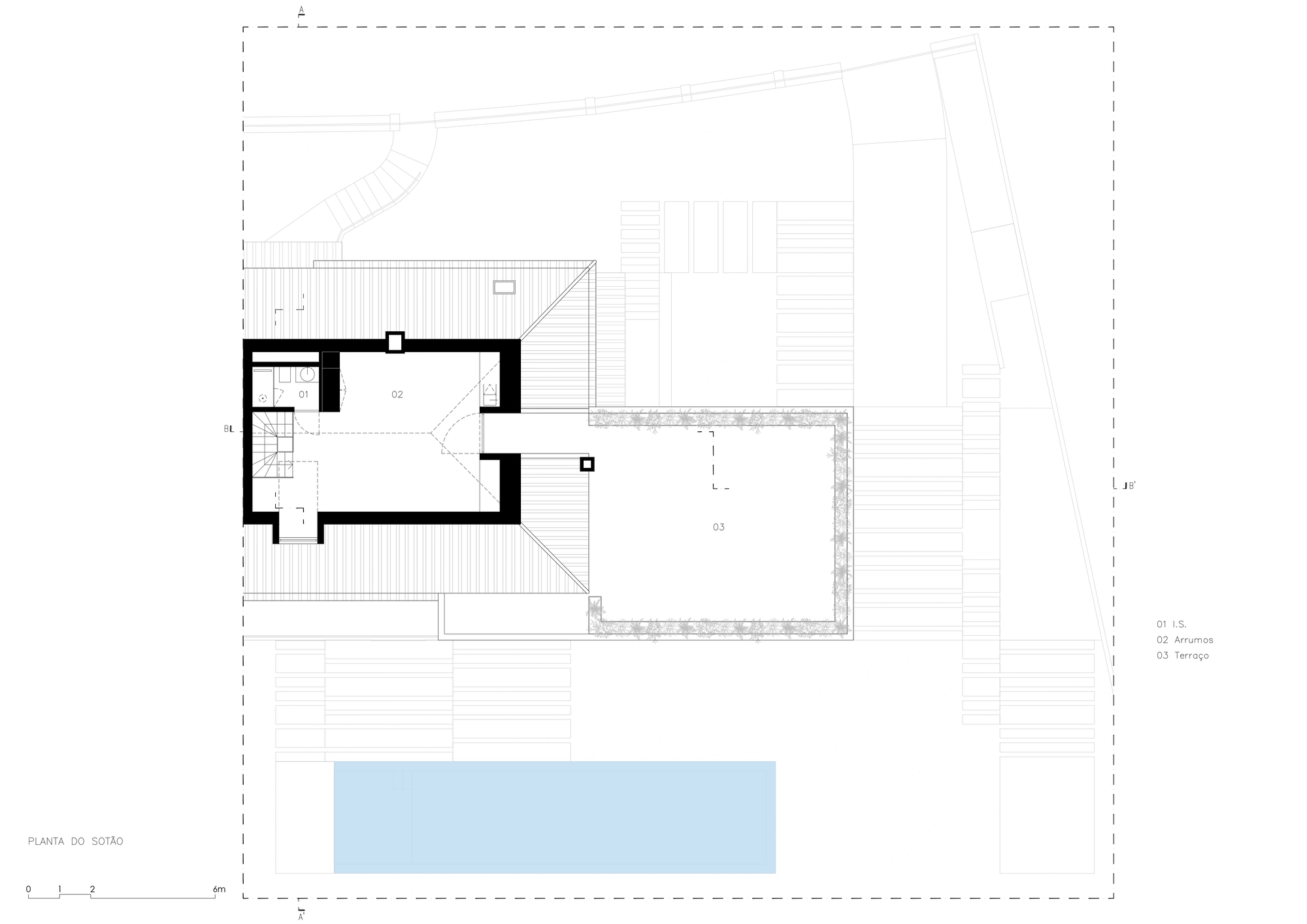
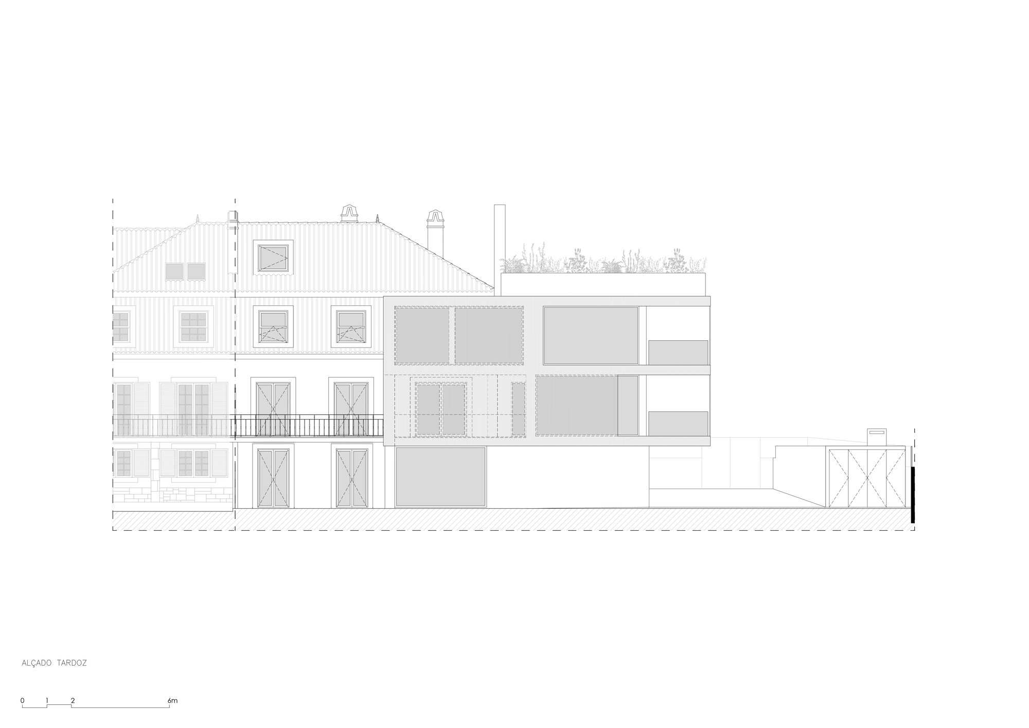
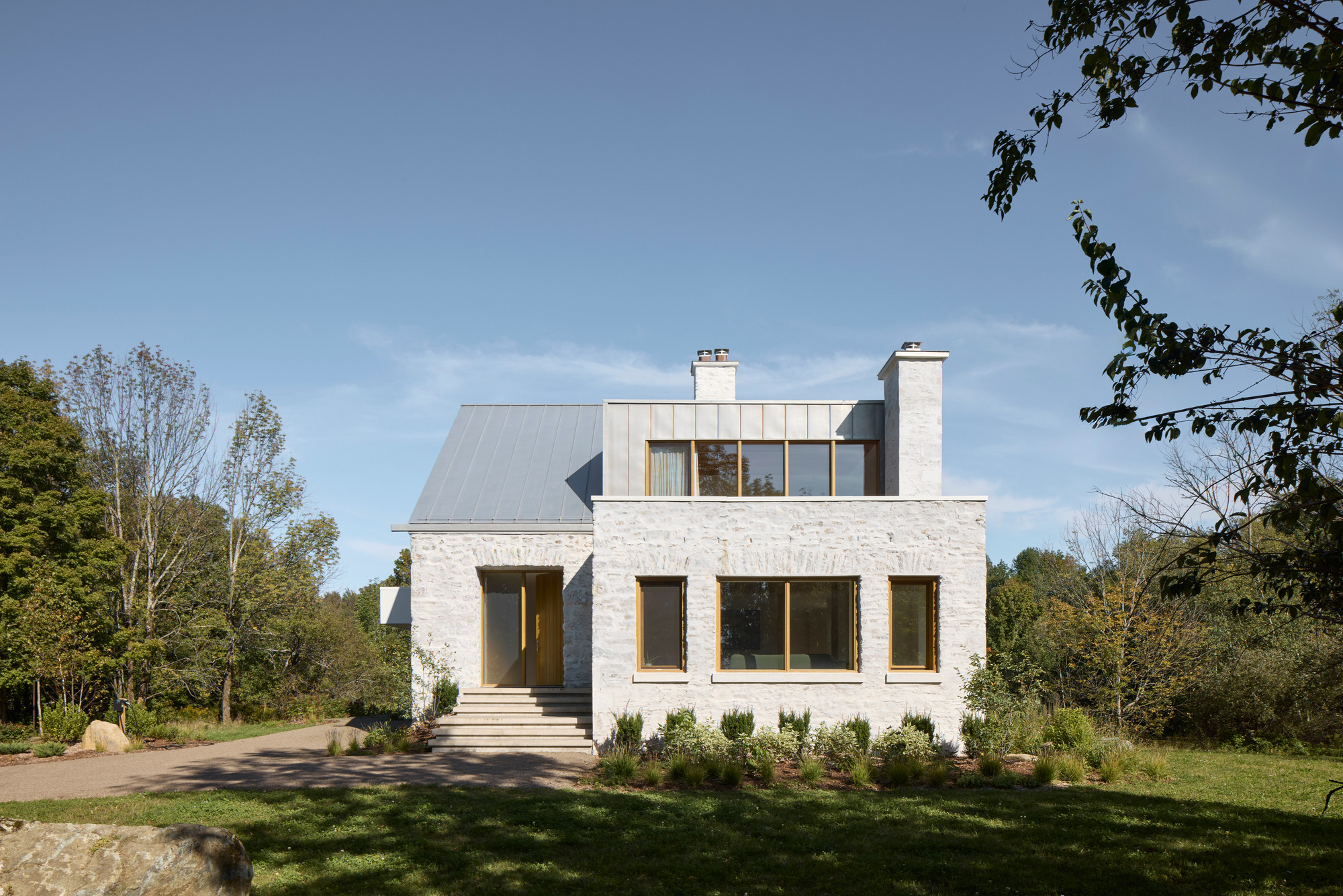
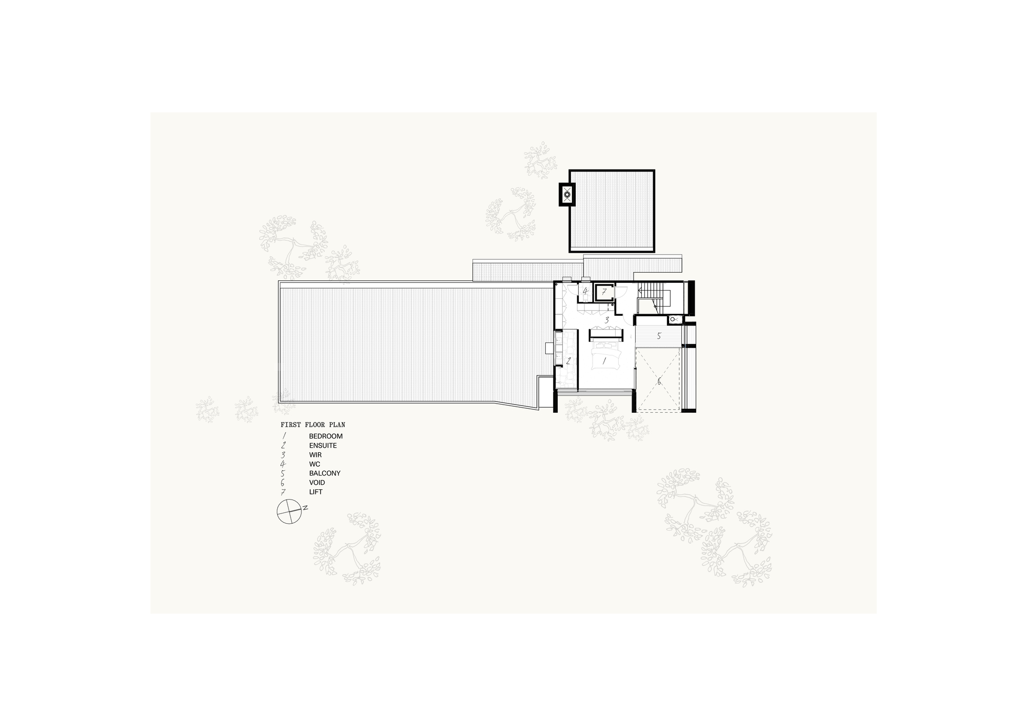 The brief was constructing a new rural home for a hands-on client to replace a dilapidated farmhouse on the Mornington Peninsula in Victoria. Key to the design response is a series of sustainability initiatives, including replacing a non-permeable existing tennis court with wetlands. Sustainability initiatives were integrated into the design brief and were driven by the client just as much. Along with solar passive design principles and air-source heat pump radial heating, isolating zones with sliding doors minimizes operational energy.
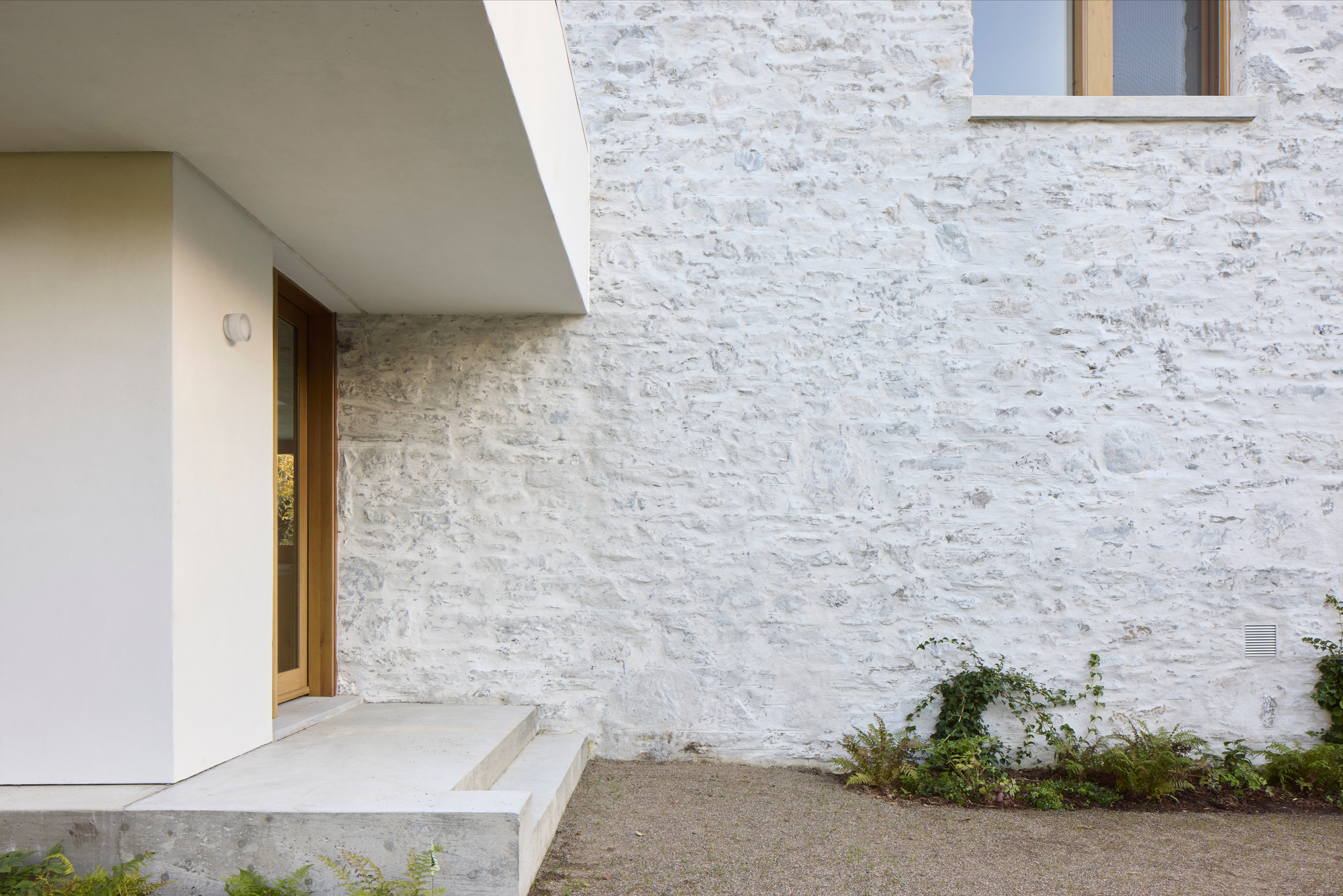
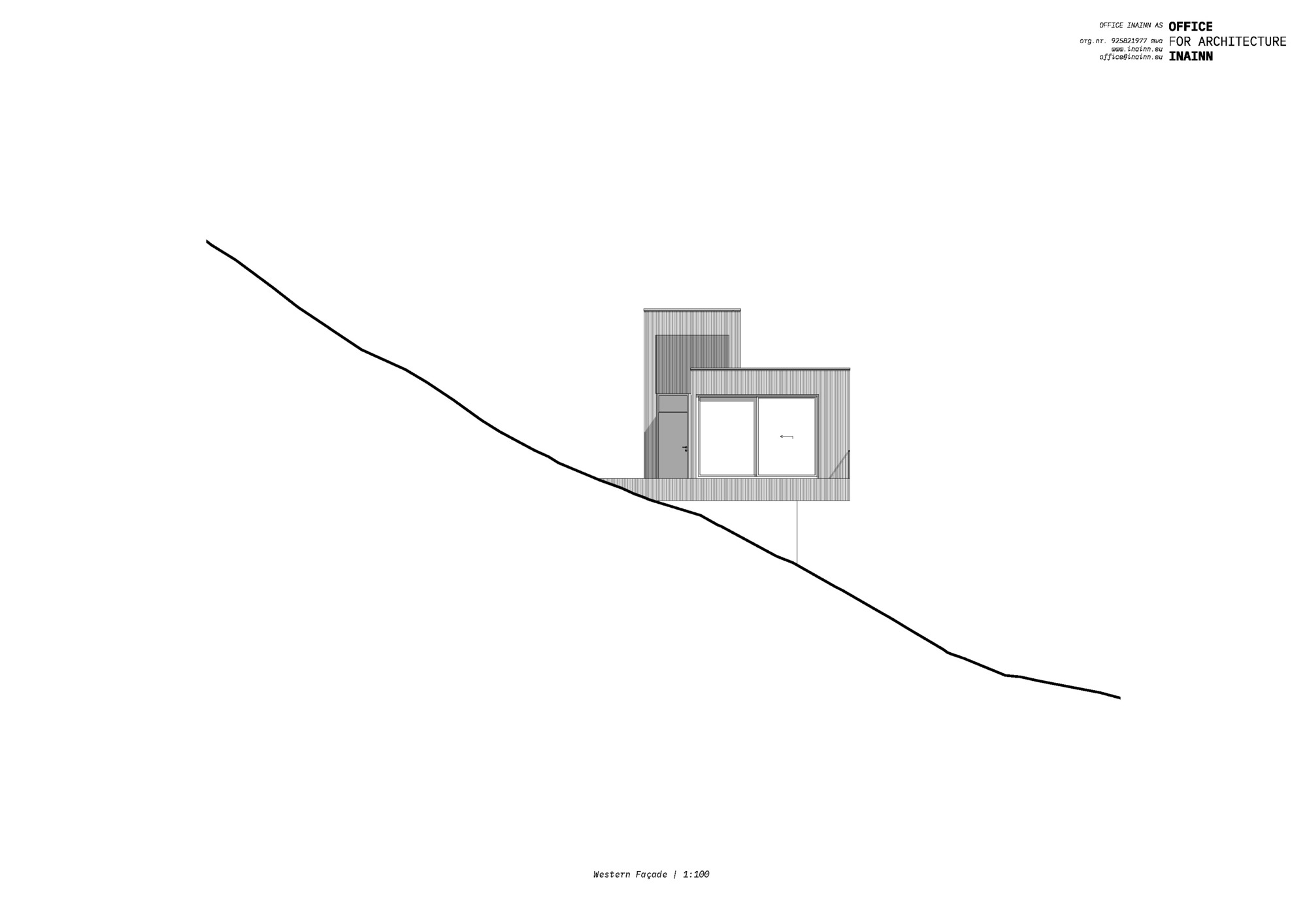
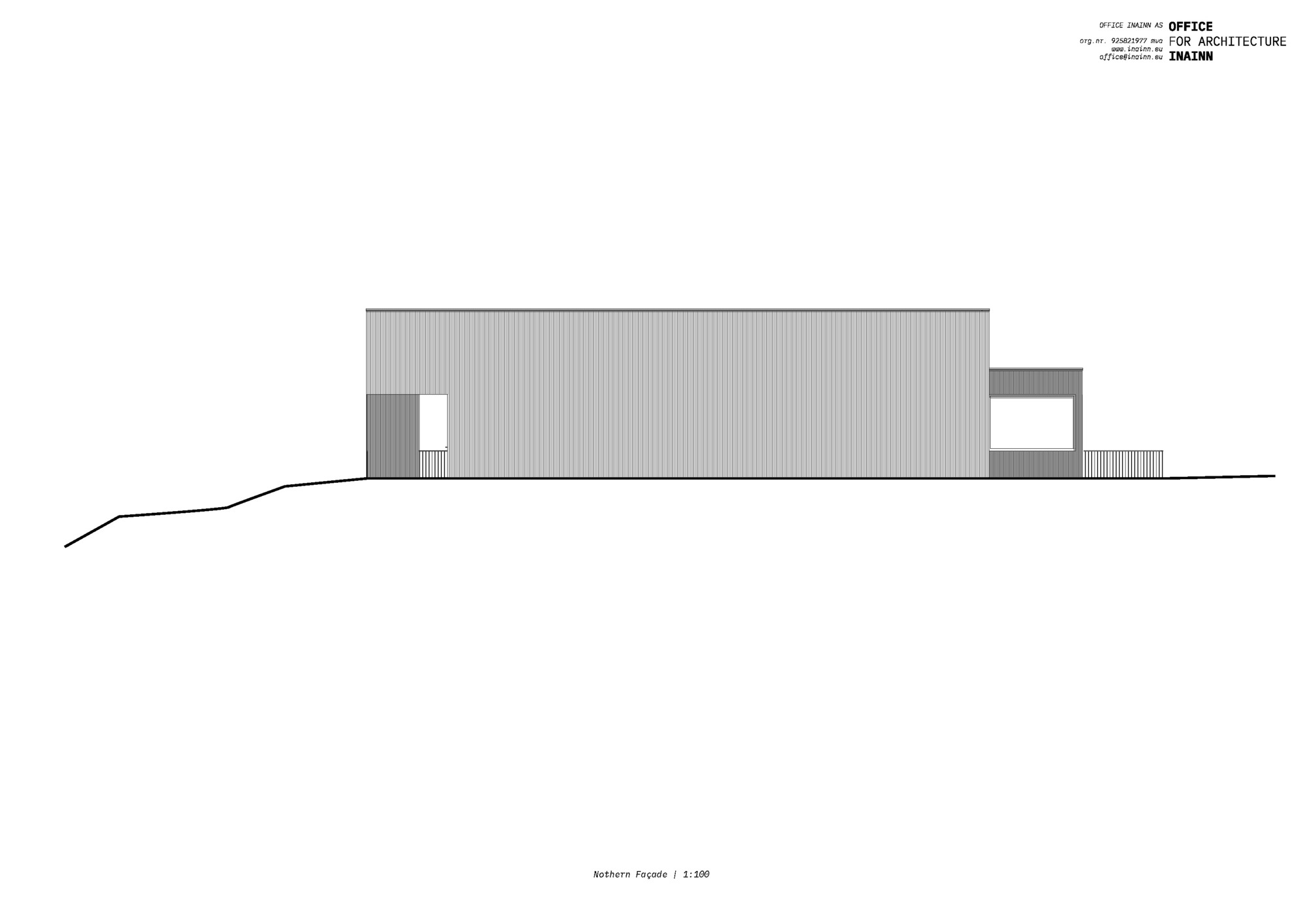
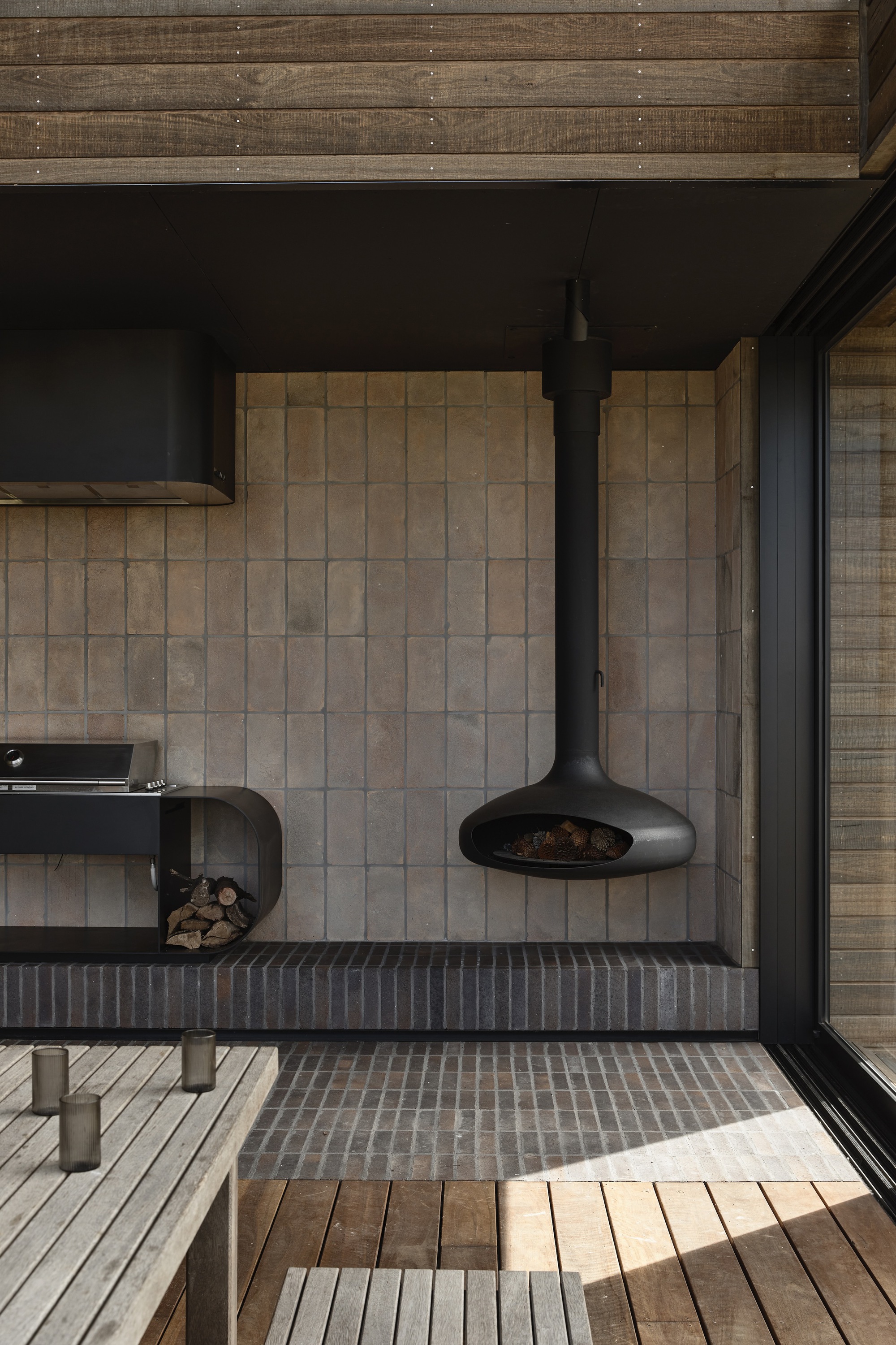
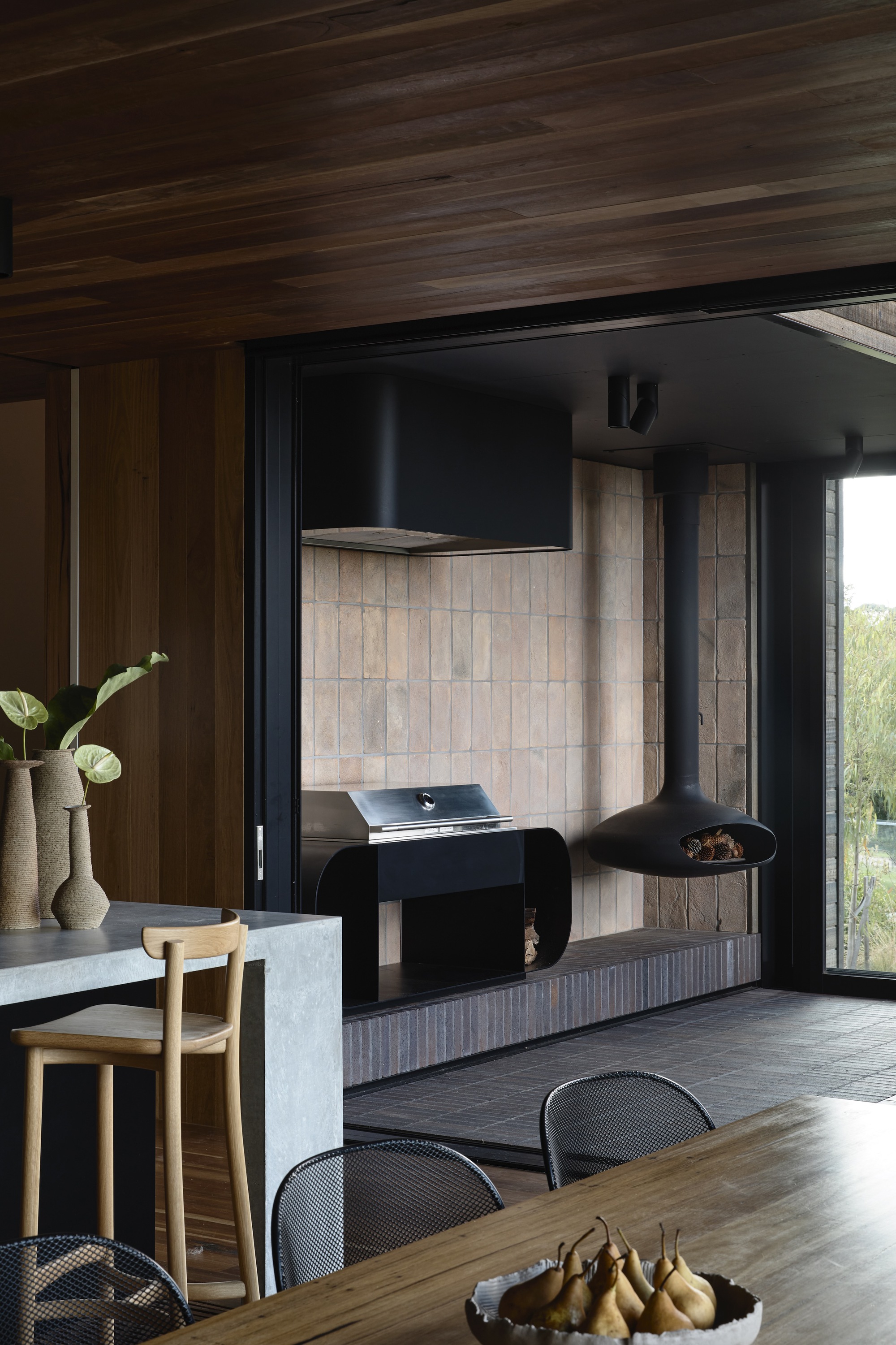
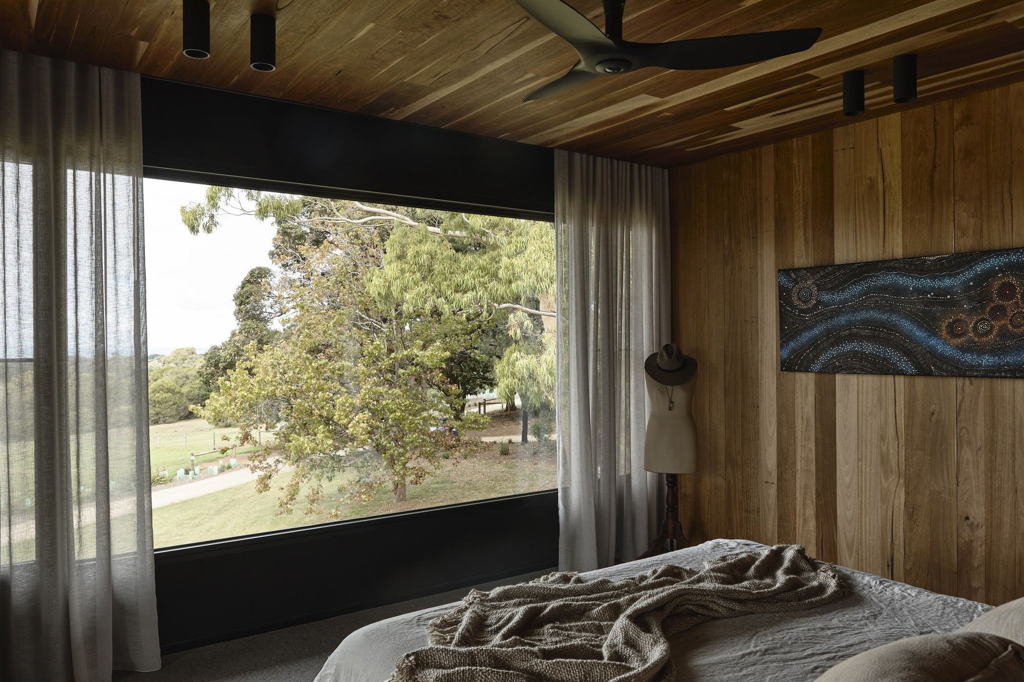
Natural, robust materials such as granite stone from the local Hillview quarry have been reclaimed to form the external wall of the stair void and the fireplace. Internally, rich Australian hardwood line wall surfaces minimize the use of plasterboard in the home. The artist and tradesman client couple were deeply interested in sourcing natural, robust materials such as reclaimed granite stone from the local Hillview quarry. Balanced against the dry stack stone is a ship-lap hardwood timber cladding - reminiscent of a farm cottage building tradition.
The home has a generous apportionment of space. However, it was created with the empty nest in mind so it could be inhabited by a couple on one level without feeling cavernous. The floor plan's zoning around an east-facing courtyard enabled a generous range of private family and less private entertaining spaces, each offering unique garden links. The kitchen was provided separately as a cozy family space for meals and daily get-togethers.
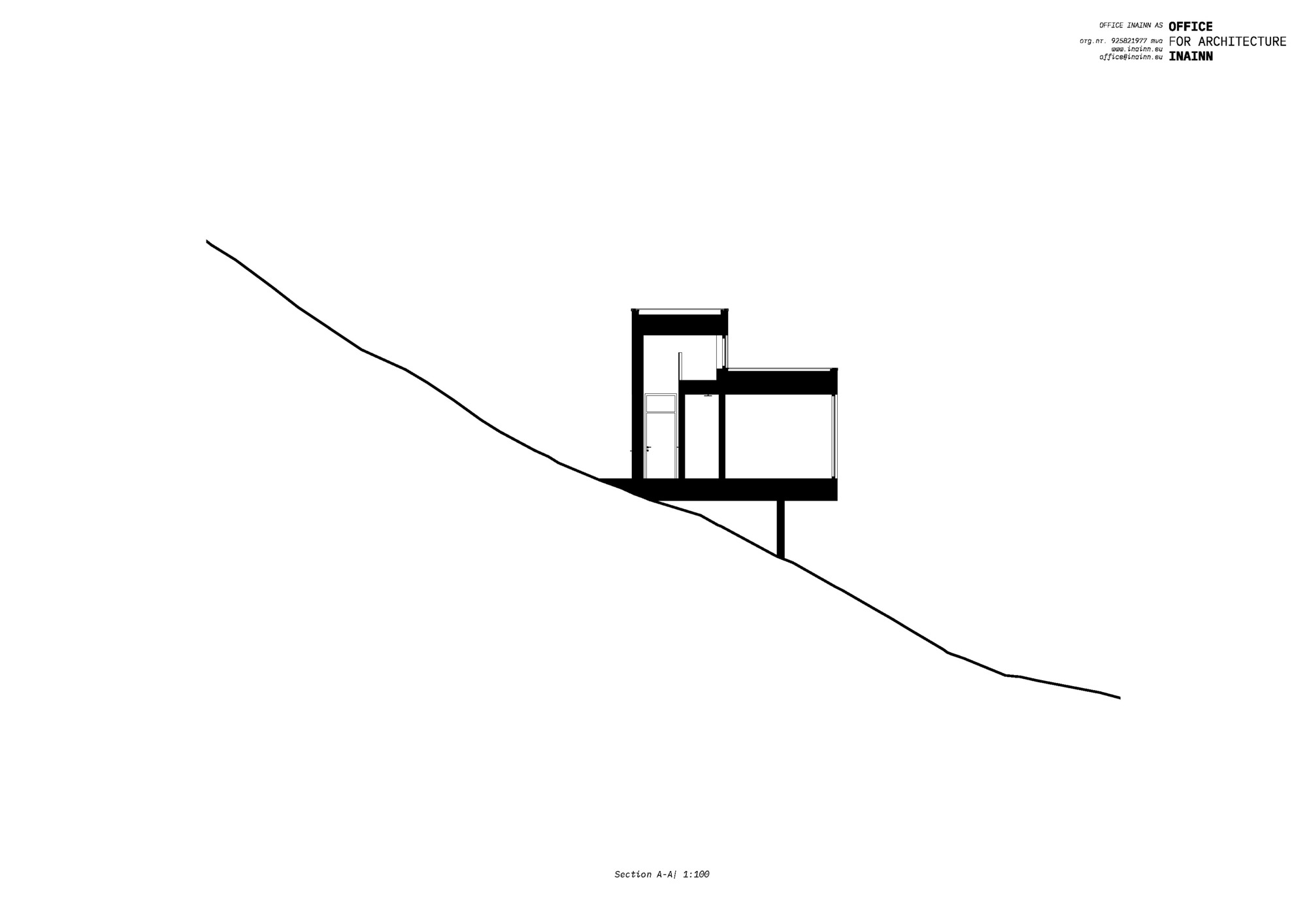
The home is on a generous allotment in an area characterized by large setbacks, established landscape, and tree-lined streets. Creating a large storage basement with a single driveway crossover and providing the main living with landscape cutouts across the site responds to the established character. These notions are further enhanced with the first-floor form comprising a minimal floor area to lessen any suggestion of bulk.
The clients had lived in the existing house for many years and, therefore, were able to shed light on their experiences and local knowledge—particularly in terms of seasonal weather patterns and views. The project quickly became about working with our client's knowledge of the site and fostering a shared interest in making timeless architecture that works hard to minimize its impact on the environment.
The brief was constructing a new rural home for a hands-on client to replace a dilapidated farmhouse on the Mornington Peninsula in Victoria. Key to the design response is a series of sustainability initiatives, including replacing a non-permeable existing tennis court with wetlands. Sustainability initiatives were integrated into the design brief and were driven by the client just as much. Along with solar passive design principles and air-source heat pump radial heating, isolating zones with sliding doors minimizes operational energy.
Natural, robust materials such as granite stone from the local Hillview quarry have been reclaimed to form the external wall of the stair void and the fireplace. Internally, rich Australian hardwood line wall surfaces minimize the use of plasterboard in the home. The artist and tradesman client couple were deeply interested in sourcing natural, robust materials such as reclaimed granite stone from the local Hillview quarry. Balanced against the dry stack stone is a ship-lap hardwood timber cladding - reminiscent of a farm cottage building tradition.
The home has a generous apportionment of space. However, it was created with the empty nest in mind so it could be inhabited by a couple on one level without feeling cavernous. The floor plan's zoning around an east-facing courtyard enabled a generous range of private family and less private entertaining spaces, each offering unique garden links. The kitchen was provided separately as a cozy family space for meals and daily get-togethers.
The home is on a generous allotment in an area characterized by large setbacks, established landscape, and tree-lined streets. Creating a large storage basement with a single driveway crossover and providing the main living with landscape cutouts across the site responds to the established character. These notions are further enhanced with the first-floor form comprising a minimal floor area to lessen any suggestion of bulk.
The clients had lived in the existing house for many years and, therefore, were able to shed light on their experiences and local knowledge—particularly in terms of seasonal weather patterns and views. The project quickly became about working with our client's knowledge of the site and fostering a shared interest in making timeless architecture that works hard to minimize its impact on the environment.