Bitcoin Is Data's avatar
Bitcoin Is Data
bitcoinisdata@bitcoinisdata.com
npub18ukd...arvp
Beautiful visualizations of challenging Bitcoin metrics, with raw data available in CSV/XLSX/JSON formats. Updated hourly. www.bitcoinisdata.com
Bitcoin Is Data's avatar
bitcoinisdata 1 month ago
Our MSTR page is now back online with updated data. Not a good picture for Saylor's strategy, as its mNAV fell below one, which means the company’s total stock value is now lower than its bitcoin holdings. image
Bitcoin Is Data's avatar
bitcoinisdata 4 months ago
China's central bank hasn’t updated its money supply data for several months. Normally, they release the previous month’s figures in the last days of the following month, but the most recent data available is from May 2025. Did something go wrong? image
Bitcoin Is Data's avatar
bitcoinisdata 4 months ago
Just added a CDF (cumulative distribution function) to the Bitcoin supply histogram by price. As of today, approximately 10% of the coin supply is at a USD loss (and 90% is in profit). image
Bitcoin Is Data's avatar
bitcoinisdata 5 months ago
How to Know if We Are Close to a Bitcoin Price Cycle Peak? Here we are, with Bitcoin breaking one all-time high after another. Everything looks fantastic, and it seems this honeymoon will never come to an end. “This time is different! It’s a supercycle!” I’ve heard that before… For those who have been around for a long time, we know that at some point over the next 6 to 12 months, things tend to go south. But before that, and based on prior cycle, we should see an euphoria phase, with Bitcoin’s price rising significantly. Exciting times ahead! So how do we know when the price might be near its peak? Nobody has a crystal ball to see the future, but we can use some on-chain indicators to guide our decisions. One of them is the MVRV (Market Value to Realized Value) ratio. MVRV divides Bitcoin’s market capitalization (the current value in USD of all bitcoins in circulation) by its realized capitalization (all the USD that entered the Bitcoin network at the time of purchase). You can think of it as how many times, on average, BTC holders are “in profit.” For example, an MVRV of 2 means the average holder has doubled their value in USD terms, i.e., a 100% fiat gain. We’ve revamped our MVRV chart to make it more visually appealing and added a one-year moving average (the red-dotted line), usually called the “MVRV Momentum.” That’s because, in bull markets, the MVRV tends to bounce off this line. As of now, the average holder is up 2.18x on their original cost basis, in USD terms, as shown in the chart below. You can also view the MVRV ratio for specific holder cohorts, either short-term holders (STH) or long-term holders (LTH), from 1 month to up to 4 years. For example, below we show the MVRV ratio for STH, who have held Bitcoin for less than 5 months. They are almost at the waterline, with an MVRV of just 1.05. A new addition to our suite of charts is the MVRV Rolling Window Z-Score, in which we standardize (subtract the mean and divide by the standard error) of the MVRV series, so that the resulting series have a mean of zero and a standard deviation of one. We also calculate a rolling MVRV over a two-year (720-day) window, so that ancient history doesn’t skew current values. You can change this time window to any number of days using the input box provided. The interpretation of this metric changes slightly: when it’s zero, MVRV is exactly at its historical mean. A Z-score of 2, for example, means the current MVRV is two standard deviations above the mean. So, how can we use these metrics to identify a potential cycle peak? If we analyze MVRV peaks from previous cycles, we find that in 2017 the MVRV topped at 5.3, and in 2021 it reached 4.01. With the current MVRV sitting at 2.36, there still seems to be room for further upside before things get too hot. We’ll continue monitoring the situation, but for now, the most likely scenario is that Bitcoin’s price keeps climbing. That’s all for today, have a great one!
Bitcoin Is Data's avatar
bitcoinisdata 5 months ago
New Chart to Celebrate Bitcoin’s New ATH - This visualization makes it easy to see how much money is flowing into Bitcoin. It seems that the Bitcoin bull market has finally kicked into its most parabolic phase. For those who were into Bitcoin in previous cycles, you know what this means: Bitcoin’s price multiplying several times rapidly (often following a sharp decline). Exciting times ahead! To celebrate, we’ve released the Realized Cap Dollar Change chart. With this new visualization, we can easily see how many dollars have entered the Bitcoin network over the past 30 days, at each point in time. By default, the chart shows data for all holders, but you can use the buttons below to switch between different cohorts, short-term or long-term holders, across various timeframes. The group I like to analyze the most is STH<1y, that is, holders who have held Bitcoin for less than one year. In the Realized Cap Dollar Change chart, you can see that local tops and bottoms in the Bitcoin price often coincide with reversals in this metric. It's now starting to rise again, indicating that dollar inflows into Bitcoin are increasing. Here is the live chart: That’s all for today, have a great one! image
Bitcoin Is Data's avatar
bitcoinisdata 7 months ago
This week, we want to assess whether Bitcoin holders are in profit or loss in USD terms — and by what margin. To explore this topic, we're releasing a full set of charts. Let’s delve into it! The first chart is “Coins in Profit or in Loss,” which shows the proportion of Bitcoin UTXOs that are in profit—i.e., coins that were bought at a lower USD price than the current market price—and the proportion of coins that are in loss, also in USD terms. Currently, about 97% of all coins are in profit, while the remaining 3% are in loss. We can also visualize how much the average holder is in profit or loss. That is, for coins in profit, what’s the average return? And for coins in loss, what’s the average drawdown? Near all-time highs, as is the case now, the average return for coins in profit is 4,170%, while the average loss for coins in loss is around -1%. Finally, we’ve also implemented the Bitcoin NUPL chart, which addresses the same topic from a different angle. NUPL stands for Net Unrealized Profit/Loss and represents the proportion of the Bitcoin market cap in USD that is currently in profit or loss at any given time. At the moment, approximately 56% of the Bitcoin market cap—around USD 2 trillion—is composed of unrealized profits. As always, the new data fields are updated hourly and available for direct download in CSV/XLSX formats or in JSON via our API. That’s all for today—have a great one! www.bitcoinisdata.com
Bitcoin Is Data's avatar
bitcoinisdata 7 months ago
Just in: Bitcoin NUPL and Coins in Profit/Loss metrics are now live on our site!
Bitcoin Is Data's avatar
bitcoinisdata 7 months ago
New Data Available for Download: M2 Global Money Supply. Starting today, subscribers of Bitcoin Is Data can download the raw data for the M2 Global Money Supply directly from our Download Data page: The dataset includes the aggregated M2 money supply from the following central banks: China, the US, the European Union, the UK, Japan, and Brazil. It is available in the following formats: converted to USD, in local currencies, and as year-over-year percent change. That’s all for today — have a great one! image
Bitcoin Is Data's avatar
bitcoinisdata 7 months ago
Remember that in the last big Bitcoin war (block size, 2016–2017), the price rocketed higher soon after it was resolved.
Bitcoin Is Data's avatar
bitcoinisdata 9 months ago
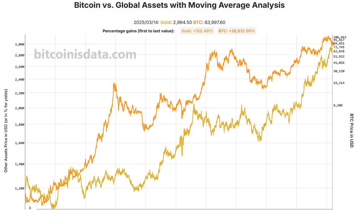
Bitcoin versus Gold since the bottom of the last Bitcoin cycle (circa November 2022): image
Bitcoin Is Data's avatar
bitcoinisdata 9 months ago
How does Bitcoin perform relative to a broad range of commodities and other global assets? That’s the question we aim to answer today with our new chart: Bitcoin vs. Global Assets. You can choose from 44 global assets to compare their performance against Bitcoin across the following categories: energy, precious metals, treasury yields, stock indices, currencies, and agricultural commodities. You can also apply moving averages to the series by entering the period (in days) in the field below the chart. The percentage gains in USD for each asset are displayed at the top of the chart, reflecting the period shown on the screen (from the first to the last value). For example, in the image below, WTI crude oil gained +20.76%, while BTC increased +689.74% over the same period. You might even spot some curious (or spurious?) correlations, such as Bitcoin vs. cocoa or Bitcoin vs. coffee. That’s all for today — have a great one!
Bitcoin Is Data's avatar
bitcoinisdata 9 months ago
Today, we introduce the Bitcoin Supply by Price chart on Bitcoin Is Data! This chart shows where the percentage of Bitcoin’s total supply (currently 19.84M coins) is located relative to price, measured in USD. In other words, it visualizes how many coins were last bought at each price bucket. Each bar in the chart represents a bucket of $1,000 USD. We can see that the majority of coins were last moved below the first $1,000 mark — meaning they belong to the first bucket. At the top of the chart, we’ve included buttons that allow users to navigate through time. You can view the Bitcoin supply by price in the present, last week, the last 15 days, or at monthly intervals up to one year in the past. We can also observe the concept of "price gaps", introduced @therationalroot . These are price zones where relatively few coins changed hands, making them likely to be retested by the price — something that indeed occurred during Bitcoin’s recent dip. I also think this would make a great animation if @Wicked is interested! That’s all for today — have a great one!
Bitcoin Is Data's avatar
bitcoinisdata 9 months ago
New bitcoin supply distribution chart coming soon... image
Bitcoin Is Data's avatar
bitcoinisdata 9 months ago
New chart: Strategy (MSTR) BTC Total Balance and Purchases Over Time We now have our version with purple dots! Today, we launched our version of the chart, which accounts for BTC purchases made by MSTR over time. You can also hover over the purple dots to see the amount purchased. That’s all for today—have a great one!
Bitcoin Is Data's avatar
bitcoinisdata 10 months ago
Bitcoin price (in orange) alongside key support levels: 1️⃣ Realized Price: STH, Total, and LTH; 2️⃣ Moving Averages: 200-day & 200-week SMA/EMA.
Bitcoin Is Data's avatar
bitcoinisdata 10 months ago
If you want a free trial of our premium subscription, which allows you to download raw Bitcoin data easily in CSV, XLSX, or JSON formats, just drop us a message with your Bitcoin Is Data username, and we will promptly grant you access. image